
Recently uploaded to my fonts!
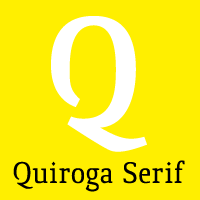
Quiroga Serif
(Selected in TiposLatinos 2008)
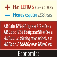
Economica
(Selected by Typographica.org as one of the best sans serif of 2007)
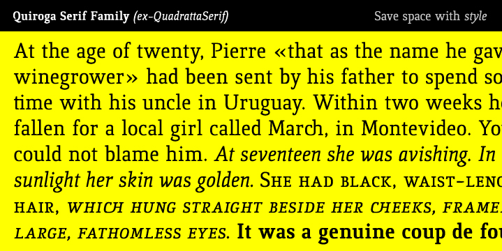
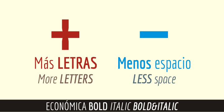
Please take a look
Best Regards!
Recently uploaded to my fonts!
Quiroga Serif
(Selected in TiposLatinos 2008)
Economica
(Selected by Typographica.org as one of the best sans serif of 2007)
Please take a look
Best Regards!

I like very much this typeface since it was released as Quadratta. Its horizontal colour and the gliphs design are very readable. Hope you could improve even more the family with a bold italic style in a near future.
I think the upper C-cedilla has the diacritic positioned too much to left. The ligatures for ll and ch are very interesting. Do you know if is there some historical usage of these ligatures in Spanish? In Portuguese the ch is common but I never saw a ligature for it.
(I'd like to write in Spanish as you are from Uruguay and I live very near, in Porto Alegre, but preferred to use English due to other users.)
Hi Freiberger!
Thanxs for the feedback!
I'll take a look to the C-cedilla :)
There are many posts about "ll" and "ch" here,
when I first did Quadratta I did some reaserch,
there are a lot of material about "ch" but not too
much about "ll".
http://es.wikipedia.org/wiki/Ch
http://www.typophile.com/node/43879
http://www.typophile.com/node/19376
etc...
Regards! :)
Thanks for the links! Although I admire typography since many years, I did begun to design my first typeface just now and I wasn't aware of all these comments on dígrafos.
A Qu/qu ligature is really interesting, although it must work much better in Qu than qu.
Do you plan to release a bold italic of Quiroga?
Yes!
I'm working on it,
I'll release a bold caps, bold italic & bold italic caps.
I'm also making a new serif font, Phoenix Serif, when I finish all the basic letters I'll upload it to typophile for reviews! I'll let you know!
Now Quiroga Serif 20% OFF!
;)
Captured from web.archive.org on 16 Dec 2011. view this capture