Typophile

qu ligature, tell me why not?

Chris Lozos

My first question is--in all Latin script languages, is the Q always followed by a U?
If this is so, then my second question is--why is there not a single QU glyph?
My third question--why would we not at least have a qu ligature as a normal part of a font?
There is no hyphenation between q and u anyway so that does not figure in. Would it just be quaint or quizical to quiery quietly or do we need a poll?

ChrisL

Show us what you think it should be? I find the st ligature to be distracting (going from memory here) and so will rarely use it. I wonder if the qu lig wouldn't be moreso?

Dezcom:

Today, in Argentina some fonts are designed with "qu" Ligature.
Fontana ND and Andralis designed by Rubén Fontna are examples about this.

Eduardo

why is there not a single QU glyph?

Perhaps because the type designer knows what follows the q, so can design it accordingly.
Ligatures are for where not every character combination is good, but if there's only one character combination...

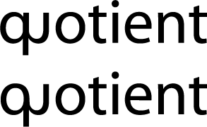
This is just a kerning job and needs work to de-mu-ify it but it should start the conversation anyway.

ChrisL

Eduardo,
Do you have examples of those?

ChrisL

In few minutes send you some examples.

Eduardo

P22 Underground has a nice one. It's not surprising that the calligrapher Johnston included one in his original railway alphabet. I agree that the qu ligature is a nice touch, but probably not for all fonts.

This looks like QJ and qi ‒ qɹ or qı would be even closer but not likely. Of course these don't occur in "commercial" languages so the confusion is not very probable.

Iraq Iraqi NASDAQ

Even "just" in English there are borrowed words (mostly from Arabic) where the "q" is not followed by a "u". But it's usually an "a", and very rarely a letter with a descender. Check out "Making the Alphabet Dance" by R Eckler for a list of words that contain every combination of two letters!

BTW, metal fonts used to offer single sorts of "Qu", but
that's because their kerns were liable to break off! :-)

> Ligatures are for where not every character combination is good

In my talk at the Thessaloniki conference in 2004
I tried to show that ligatures run deeper than that,
and I think they can run far deeper still. In fact a
ligated "qu" can arguably help reading.

hhp

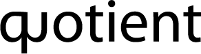
The lig I posted was certainly not acceptable. Here is another quick and crude attempt which is better but still not there.

ChrisL

Denis is quite right in his observation. At the moment, I am more thinking of a discussion about the concept rather than my poor execution.

ChrisL

Since there are occurances where q is not followed by u, we cannot simply create a qu ligature and rename it "q" but perhaps it is still of value as a ligature?

Hrant, do you have any supporting data to show that ligatures of any kind increase raedability?

ChrisL

Brad has crowned Miss Tiffany Queen of fonts. That is even more amusing given that Tiffany and I had a cooperative venture involving the playing card queen a while ago :-)

ChrisL

:^o I'm so NOT the queen. Eek!

Here is another try at it:

ChrisL

> do you have any supporting data

Nope. Just like there's no data proving that serif fonts
have higher nominal readability, but no decent designer
will set a long book in a sans.

This idea stems from the belief that divergence (at least when
properly controlled) helps our heuristic reading mechanism
extract more meaning faster. Really, humans can handle a lot
more than 26 x 2 (+ odds & ends) symbols. If they couldn't,
the Chinese wouldn't be about to womp us. :-)

hhp

Miss T. - sorry, it was just to add interest, sorta rhymed with Mary Queen of Scots. But we could take a poll...

not to forget about such essentials as greenlandic city-names:
Ittoqqortoormiit or Qaanaaq or Qeqertarsuaq

Those are really cool names Sebilar! I wish I had a T-shirt from Ittoqqortoormiit. I would love to see the faces on people as they try to read it and wonder what kind of nut I am:-)

ChrisL

I could see anopther T-shirt slogan:

"You have to be cool to be from Qeqertarsuaq"

ChrisL

what would be ultimately cool is to print the declaration of human rights in greenlandic on a t-shirt (would need front and back i guess):

http://www.unhchr.ch/udhr/lang/esg.htm

Thaat's aas maannyy doouubblle letterrs aas Ii've seen in a loonngg tiime. But would the typophile version use the modern 'q' orthography or a kgreenlandic?

There are an awful lot of "plurals of..." in that list Claes :-)

ChrisL

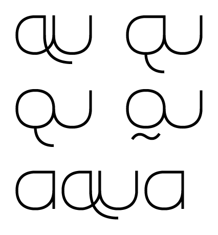
my attempt(s) at a qu-ligature:

> But would the typophile version use the modern ‘q’ orthography or a kgreenlandic?

for sure there would be an opentype alternative set :)

Claes,
Some of those examples look like butt cheeks:-)

ChrisL

"for sure there would be an opentype alternative set :)"

Sebilar, I am sure it would be a contextual substitution:
if the temperature is below zero, sub Greenlandic:-)

ChrisL

Hi:

The examples of "QU and qu" ligatures of Andralis - Designed by Rubén Fontana / Argentina -

et

Thanks Eduardo, I think the lowercase works well but am a bit unsure of the uppercase. Quite a nice face though.

ChrisL

The UC might work better if the "U" were stemmed.

hhp

I was going to say that obviously none of you play scrabble but then I saw Claes's link. Any dedicated scrabble player knows those words.

Tiffany may be the Queen but I am a Goddess ;-)

http://www.typophile.com/node/9573

Tiff and Patty are queens and goddesses. I am just a geezer :-)

ChrisL

Devi Fabricant, you must have been the inspiration
for this: http://www.alphabetvsgoddess.com/ _
(Hey, it applies to that other thread too!)

hhp

Claes,
Some of those examples look like butt cheeks:-)

and yours dont?! d:

this would be a good Type Battle.

I could be wrong, but "why not" is: you're merging two major vertical strokes. Does that happen in other (Latin) ligatures? Like a ligament, ligatures usually are fairly minimal as, um, "thingies," but serve an important function in holding two larger "thingies" together. So that's why fl, ffl, fi, etc., get ligatured -- it's across minor areas of horizontal space where they're almost already touching anyway? q and u, to be properly ligaturized, would just maybe join the q's top right serif and the u's top left. Right?

Exceptions: archaisms like AE (Æ)and OE (Œ), where the two letters are fused along long stretches of vertical stroke. I notice, though, that they're not diphthongs-- you don't say "Ay-Ee-sopp," but "Ay-sop." Not "Oh-ee-di-puss" but "Eh-di-puss." That's probably relevant.

Seems like the "why not" answer has formal/perceptual, historical, and phonological roots. Not to say it isn't worth trying, though. But if we're gonna start making lig's along big strokes, then we could conceivably have them for every possible pair of letters.

Most of the time you see ligatures (except fi,fl etc) used with serif fonts. Since the lowercase q in a sans generally has no hook on the tail it's an uncomfortable fit with the u. I'm not a font designer but there could be something nice done with a qu lig using a serif or a serif italic. Anyone?

If the letters don't actually touch, can it still be called a ligature?
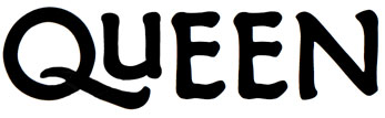
Recently I was thinking a special QU character might be handy when using all caps to give space to tuck up the tail... a rough mock-up, or muck-up!

My understanding is that a ligature requires touching. Hence the root in Latin "ligare": "to bind." Otherwise you're just talking about tight kerning. Kerned pairs involve various overshoots and undershoots, like the QU above.

Kerning is all about bringing two letters just close enough that the positive and negative space across the pair looks balanced. The more kerned pairs (where appropriate), the more balanced a font will look along the line.(Although... Adobe can do its own metrics ("optical"), but I have yet to test a kerned-pair-less font with it...)

Notice that your Q and U would look odd if the Q was spaced further out to the left. There'd be this big white space between the two. Then again, the tight kerning only makes sense because of the Q's tail and the U being an oddball small size (small cap, lowercase, or just it's own thing).

So what you have above is a kerned pair that is more than the sum of its parts. But not a ligature! Still... if you joined the right end of the Q's tail to the end of the right side stroke of the U, then you'd have a ligature that doesn't fuse the letters in a bad way.

By the way, check out newspaper headlines-- they're often so tightly tracked that you get damn near ligatures across letters, but not intentionally.

Oh, and the "st" ligature sometimes look distracting, I'm betting, because the modern "s" doesn't appear to have been used as the basis for the ligature, but rather the "f"-ish looking "s" of the 18th c. and earlier. The old "ft"-looking version invites that ligature much more readily than the modern "st." So the funky, oddball-looking st lig is probably a modern contrivance. See this example of the old version.

> a ligature requires touching.

Ah, but what about the white?...

hhp

Some hot metal faces had Qu cast as one piece to accommodate long tails. I think that Kellie's sample does qualify as a ligature, after all to create it in Fontlab one would name it as an optional ligature (I think, I'm still using Fontographer) and some fi ligatures aren't actually joined, Gill Sans for example.
Tim

> Some hot metal faces had Qu cast as one piece to accommodate long tails.

And those were called logotypes. The thing is, when you
think about it, aren't those in fact ligatures, in a way?

For a great example of how the blacks don't have to touch
for there to be a ligature, look at the descender area of the
superb "gy" in Mrs Eaves Italic. Talk about foreplay...

http://www.myfonts.com/fonts/emigre/mrs-eaves/just-lig-italic/win-t1/275...

hhp

The thing is, when you think about it, aren’t those in fact ligatures, in a way?

Exactly
Tim

Qu, sure. Ligated lowercase does better to maintain all the parts and spaces. ff, fi, fl, ffl, ffi, ft, st, cr, rt, ck, and all the others I know, are successful for this reason?

"Kerning is all about bringing two letters just close enough that the positive and negative space across the pair looks balanced."

Kerning is about bringing two letters close enough that the positive and negative space within the pair looks balanced among the rest of the text...

That is to say, you can kern an LT to look perfect until its part of ALTITUDE, at which point, since you cannot get all the space you want out of the AL pair, LT might too tight.

>Kerning is about bringing two letters close enough that the positive and negative space within the pair looks balanced among the rest of the text…

I agree but just wasn't clear enough.

In fact, I think it's an engineering marvel (but sometimes a problem!), that pairs can be formed in isolation and yet still serve the larger context of the line, paragraph, etc. Although, again, here Adobe's InDesign comes into play: I am guessing that Adobe's "optical" metrics, which substitute for the fonts built-in metrics, actually kern pairs in terms of the whole paragraph's layout, since the paragraph is the unit Adobe uses for tracking, kerning, hyphenation, etc.

As for this matter of "hey, maybe this QU can be a ligature!" I don't see the grey area (or white space, to be more accurate?) Hrant and others seem to be exploiting. I mean, of course negative space (if "white" under normal circumstances) is important. But let's not play silly semantic games for a moment: if the term "ligature" is gonna have any usefulness, it needs to refer to something specific. And I'm suggesting that it refers not to the pair of letters that are designed in one piece, and/or that may have been joined as one piece in metal, and/or that come as one glyph in modern fonts, but either (a) to the pair when joined by a specific chunk of stuff (when the letters are black, the stuff is black), or (b) the to chunk of stuff itself.

Anyway, that's my own sense of the term ligature. Otherwise, you just have pairs (or larger sets) of glyphs that happen to be real close together and happen to sometimes appear as a unit in various systems.

And I’m suggesting that it refers not to the pair of letters that are designed in one piece, and/or that may have been joined as one piece in metal, and/or that come as one glyph in modern fonts, but either (a) to the pair when joined by a specific chunk of stuff (when the letters are black, the stuff is black), or (b) the to chunk of stuff itself.

If we accept that the fi ligature is a ligature, one cannot then say that because a particular font, that has an altered character to form fi but doesn't join, doesn't have an fi ligature.
I would say that the alteration of a character when it encounters another specific character defines the ligature and that would include what the type designer considers the correct or optimum white/negative space, if neither character were altered then it would be a kerning pair. I suppose you could subdefine ligature as open or closed like a counter if you need that degree of specificity, however I don't see the benefit.
Tim

> if the term “ligature” is gonna have any usefulness,
> it needs to refer to something specific.

I agree. But instead of the black, what about notan?

I think Tim's definition ideas are very good.

hhp

Tim, I understand what you're saying about open and closed glyph-combinations, but it seems to me that "ligature" should refer to the glyphs being joined.

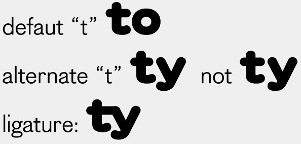
Hrant, the notan created here in the t-y combination that uses the alternate "t" is obviously an important principle, but as the idea is a deliberate NOT joining, it just seems too much of a stretch to call it "ligature".

Linotype traditionally referred to two letters cast together as a "logotype", whether or not the letters involved were non-touching standard forms, or made into a special modified shape.

> “ligature” should refer to the glyphs being joined.

Maybe you're right. But then we should find a term for the non-touching ones...
Or we could use "ligature" with a different qualifier for each kind; or maybe use
"ligature" to mean the touching ones, and "{something} ligature" for the nons.

> two letters cast together as a “logotype”

Or sometimes more than two even (but maybe not in Linotype's case).

In fact an entire printing technology venture was launched by one
of the founders of The Times newspaper involving casting as much
as possible on whole sorts. The point was to save costs during compo-
sition (and distribution), and I think it could have worked, except
then the printer's guild decided to change their charging scheme
from per-time or per-sort to per-letter... Sometimes, some people
make money off of inefficiency. :-/

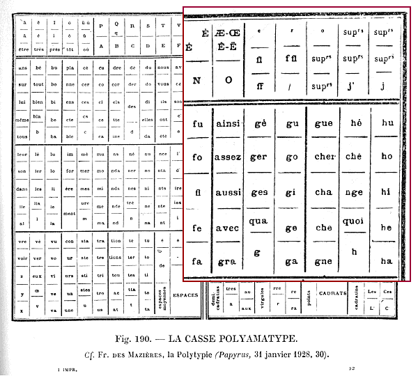
And there was a similar effort in France, where it was called "polytypie":

If I remember correctly it was carried out (or at
least attempted) by one of the Didot brothers.

> or made into a special modified shape.

Yes, that's a good point.
On the other hand, one could say that the availability
of logotyping allowed letters to be more as a designer
would have liked (such as with the tail of the "Q"),
since potential damage to sorts was alleviated.

hhp

Let's forget the term "ligature" for a moment and look at the various conditions relative to the individual glyph's nominal metrics, and controlling for tracking (i.e., track it tightly enough and they'll touch, so let's assume standard tracking):

1. Positioning changed
2. Shape(s) changed
3. Touching

Seems like there's no point belaboring the term "ligature," if we can come up with a vocabulary for all seven permutations:

1 alone: position changed but no change of shape, and not touching (i.e., "raw" kerning)

2 alone: could happen anywhere, but if shape alone is the condition, then spacing along the line may not really be at issue at all

3 alone: hard to imagine except in conditions of extremely tight tracking but no other alterations (or when kerning brings it about)

1&2: this might be like the "notan" example above-- no touching, but a stroke may be altered to improve balance

1&3: probably most examples of ligature

2&3: that wacky, contrived "st" ligature, perhaps, and perhaps fl and ffl, depending on tracking ("touching" without kerning would entail adding some stroke that wasn't there before, like the little arc that binds the lower-case s to the t in the st lig)

1, 2, & 3: all hell can break loose!

- Jay

"hat has an altered character to form fi but doesn’t join, doesn’t have an fi ligature"

I would. I mean, there are lots of fonts that have —fi glyphs—, and some that have —fi ligature glyphs—

I'd say it depends on what's done to the constituents. If the "f" and "i" are just slapped together (which I've seen done, I think by Unger, or was it Zapf) and at the default spacing (probably simply because software expects something there) then that's not a ligature. But if the shape, or really even the spacing, of one or both has changed, then there's something going on, and it's useful to have a term for it; and since the thing that's going on is almost certainly related to the notan relationship (implying some "linking" in/of the white) then maybe an extension of the term "ligature" is best.

BTW, remember Legato (and its name!) which was designed to ligate the whites.

--------

Today, learn about the Armenian Genocide:
http://www.armenian-genocide.org/genocidefaq.html

hhp

in the age of OpenType, i believe any alphabetic glyph composed of two or more alphabetic glyphs is considered a ligature. (Correct me if i'm wrong)

actually, the OpenType Spec defines a ligature as "A combination of glyphs that join to form a single glyph. It is up to the font designer to create the ligatures as he deems best for the font he is working with."

There isn't that much to be gained by having absolute supreme court votes on what is a lig and what is not. To me a ligature is any glyph the designer defines in the liga feature that replaces 2 or more other glyphs. Anything beyond that may be just a fun academic excursive for those who wish to indulge.

ChrisL

Today, learn about the Armenian Genocide

Canada recognizes the genocide:
http://www.armembassycanada.ca/embassy//genocide%20recognized.html

Yes, thank you.
And it is such differences with the US that I hope
Canadians cherish more than I do on their behalf.

hhp

I was talking with some friends about it today, and the consensus was that the EU should put pressure on Turkey re. this issue, as a condition of entry. I doubt if this is an original idea, but hopefully if it has surfaced in our neck of the woods it carries some weight elsewhere.

To me a ligature is any glyph the designer defines in the liga feature that replaces 2 or more other glyphs. Anything beyond that may be just a fun academic excursive for those who wish to indulge.

Awww, c'mon! Indulge! Seriously, though. I only would want to play these "academic" games in order to clarify my own thinking about type. I agree that it's silly to try to establish, once-and-for-all, precisly what word X refers to and what it doesn't. But I see it the other way around-- the more we wonder about what it could refer to and maybe what it shouldn't, the more the we can question what we've long supposed the term to "mean," and thereby, the more we can question our own assumptions and understandings. That's where I'm coming from, anyway.

Some really dig this term "notan," for example. Well, what in the hell is it? If I say, "notan" is "not tan," somebody's gonna bark that's wrong. And then we get to wondering what the term is about, which leads to (we hope) more interesting ideas about type than we'd previously had.

I agree with Paul and Chris, that for most uses and for clarity it is probably more productive to call combinations of characters in a font – ligatures, however I suppose you could go on to subdivide them into positive and negative ligatures (my view is that by providing more and more subdivisions one actually works against clarity, more true of typeface classification).
Tim

"I only would want to play these “academic” games in order to clarify my own thinking about type."

I am not saying it is not a worthy discussion and by all means indulge if you will. My point was that the lay user would not benefit from the discussion as well as, in type development, it makes no sense to treat it differently. That being said, this forum is here for us type wackos who often press the nuance of meaning to extend our need to dig deeper. Your "Notan" example is more befitting the analysis though. It is a fuzzier and newer term which only exists for discussion of type design/readability issues. It is not something that can be picked up and held or specified by a user like a ligature. (Go to your InD type palette opentype fly-out menu and chose "notan" :-)

ChrisL

There have been threads on the nature of notan (linked in the wiki) and of course there's the wiki
http://typophile.com/wiki/Notan

3 alone: hard to imagine except in conditions of extremely tight tracking but no other alterations (or when kerning brings it about)
Just another reason to be careful using Helvetica

Tim

> positive and negative ligatures

Ooooh, I like. Or what about Yin and Yang ligatures?
Maybe confusing. And what if a ligature has both? :-)

> It is a fuzzier and newer term which only exists
> for discussion of type design/readability issues.

?
The Japanese have been using it for ages! That's where I got it.

BTW, that wiki is great... except for the very first sentence! :-/

hhp

The Japanese have been using it for years but how long has it been used as a type term and by how many people? You may know all of them personally.

ChrisL

Just another reason to be careful using Helvetica

Yes, that is a "Helvetica" weakness, as is the r_n combination.
But any reasonably tightly fitted sans serif will have a weakness somewhere, because it is impossible to design every glyph to fit evenly with every other glyph.
If the ear of the "r" in Helvetica curled a bit more, or had a non-vertical termination, so that it fit better with the "t", that would create fit problems elsewhere.
Where a typeface's fit problems are concentrated determines its personality. Also, given the varying frequency of different character combinations in different languages, there you have a reason for linguistic personality of a typeface.

However, it should now be possible to employ contextual alternates in OT fonts to address fit-problem concentration. But not so obviously as with the long-eared "r" in Cheltenham Oldstyle. Why not have a Helvetica "r.alt" specifically for use before a "t"? -- very slightly altered in shape to avoid the present dubious almost-ligature.

This doesn't require massive class-substitutions, as there are hardly any accented versions of r and t.

I'm experimenting with this kind of feature in a sans serif I'm developing at the moment.

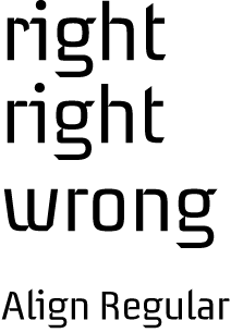
"Why not have a Helvetica “r.alt” specifically for use before a “t”?"

That is exactly what I did with my Align typeface.

ChrisL

I actually think the original Cheltenham solution
is superb, both aesthetically and functionally.

hhp

Contextual alternates would be an improvement, although your point about linguistic frequency could mean a lot of extra work for you. Multiple personalities:)
Tim

Captured from web.archive.org on 30 Dec 2013. view this capture