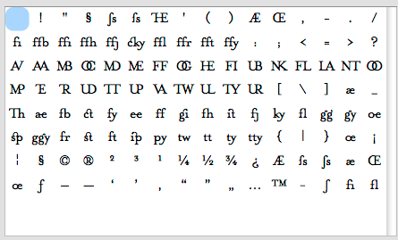
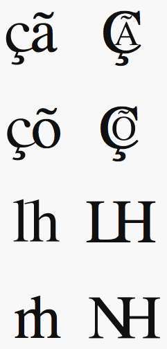
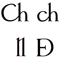
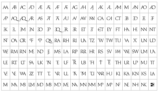
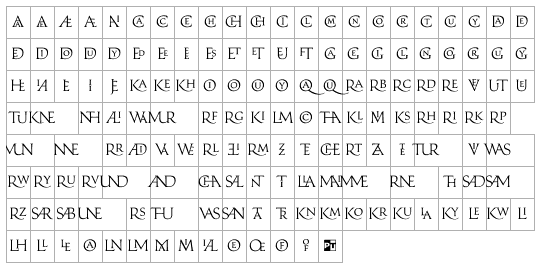
I'm at the metrics and kerning stage now with my first serif -- a roman book face of standard weight. But before I start the endless tweaking I want to make sure everything is in order and my character set is nice and complete. I made a handful of (more-or-less accidental) discretionary ligatures in addition to the standards along the way and I was wondering if anyone has suggestions for other ones. I realise some would be, let's say 'indulgent', but it would be interesting to get a list going, useful for my particular design or not. My searching drew a blank on this one.
So let's hear 'em, serious or silly. (Unicode references would be handy for them too - I don't have them for my discretionary ones.)
The standards
ff, fi, fl, ffi, ffl, AE, ae, OE, oe, eszett
Discretionaries
st, ft, ga