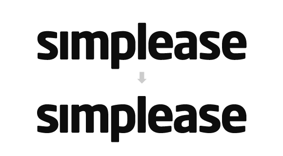
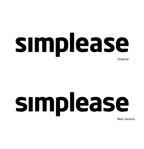
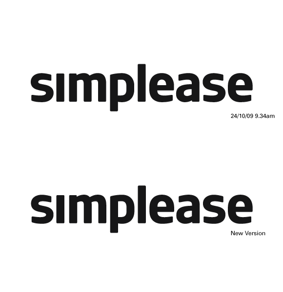
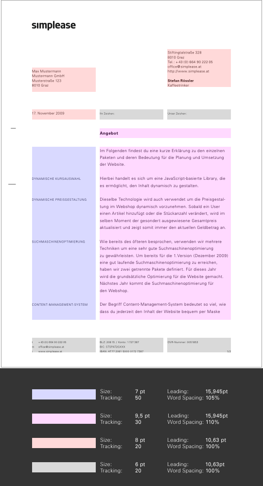
Since I just couldn't stop tweaking my letters I feel like I have to update the lastest version.
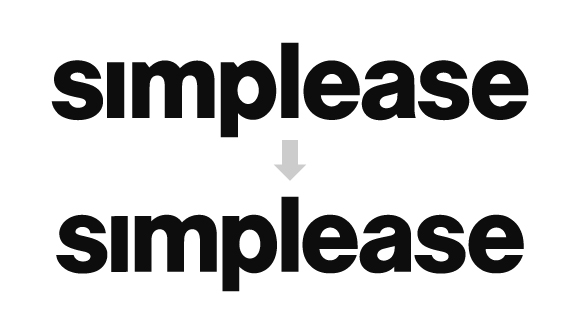
Nevertheless this post presents a different approach. After 2 months of designing the Simplease logotype I started to become a little worried about this "beating a dead horse thing". Next thing on my mind was let's go back to the drawing board -- mentally as well as physically.
Actually I wanted to communicate simplicity -- the current approach kind of communicates usualness. Allthough I was never doubting the connection between both of them, at some moment I started to believe that there must be a more distinctive way of telling the story. The first thing that came to my mind was a more "constructed" type. Maybe one that's based on a grid-system. That was about the time when I started to sketch.
It took some time to realize that a very strict grid-system would just be a little too ... hmmm ... strict. To get an impression of existing typefaces that might convey the message I initiated a "widespread" search and after a 30 minute long search-odyssee I found Neo Sans. It turns out to be perfect. Everything I had to do was kerning. It's everything I was dreaming of. The grid-shaped letters have such pleasant roundings -- it's both, simple and pleasant.
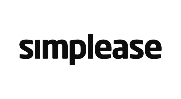
I especially like the subtle connections between the letters of 'ease'. Finally the awkward negative space of the self-made version is gone. Maybe I'll put my hands on the 's' and the upper part of the 'a' ... just trying, because I think it's already great.