Since the previous topic became too hard to follow I decided to start a new one to gather some feedback from you. If you are interested in the whole process please read the first topic.
SUMMARY
Simplease is a User Experience Company located in Austria. The company delivers simple solutions for all kind of Application Software and Websites/Web Applications.
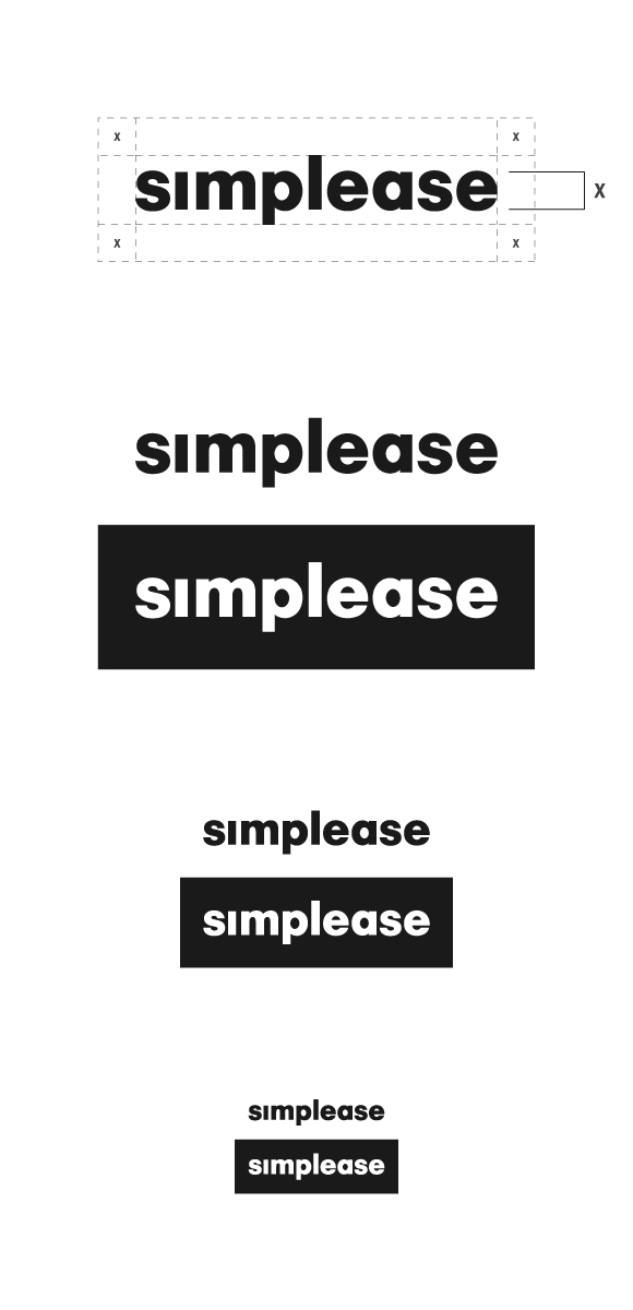
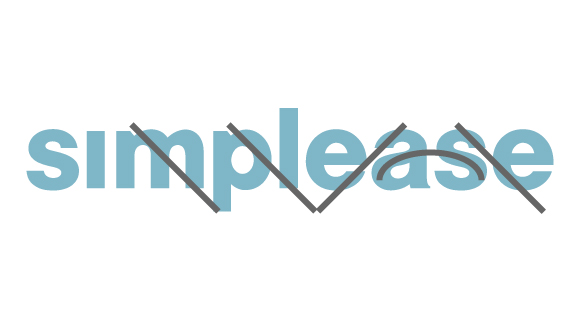
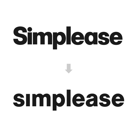
The finished logo should on one hand represent the company and on the other hand be simple enough to use in footers at very small sizes. To achieve this goal I decided to create a wordmark only. The letters are custom-made characters mainly based on Futura Bold and Helvetica Neue Black. By replacing the capital "S" with a small caps "s" I was able to balance the logo better then in the previous versions. Removing the dot of the "i" was the logical consequence.
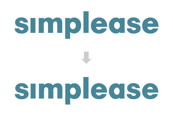
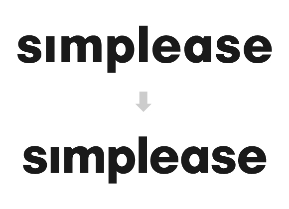
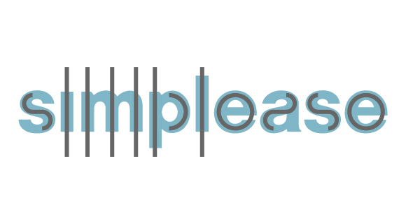
Last week's process: Brand new "s"; Refined "a", "e" and "p"; More slender "i", "m" and "l", wider tracking to improve the reproducibility at smaller sizes
STATUS
At this time I dispense with colors and concentrate on a proper kerning as well as the right clear space.
I would really appreciate your feedback on the current version.