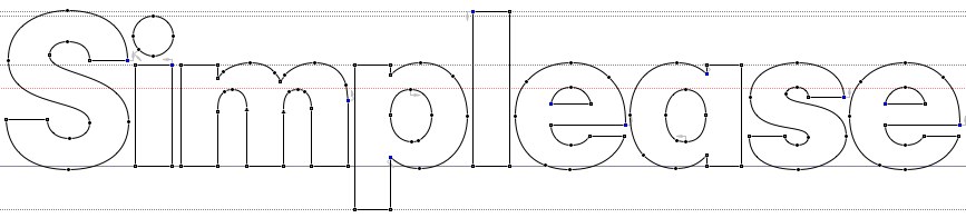
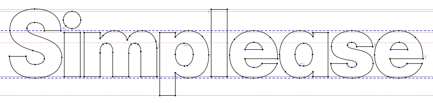
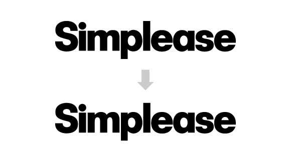
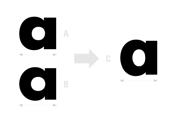
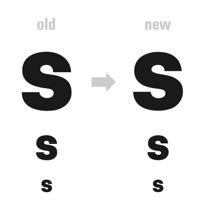
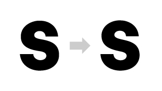
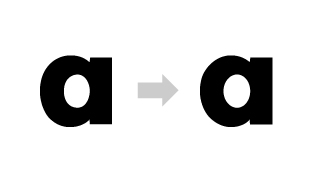
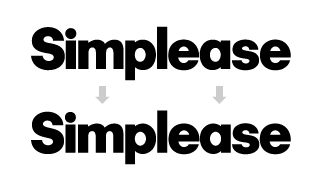
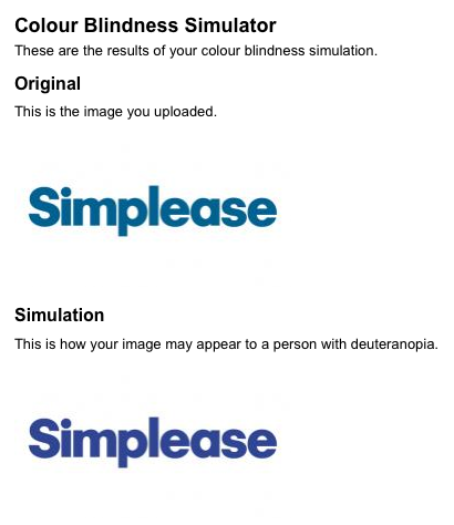
Simplease is a User Experience Company located in Austria. To support the meaning of the name I decided that the simplicity and geometry of Futura might do a good job. For this design I slightly adjusted it (especially the 's'). In general I changed the x-height as well as the bowls.
I would really appreciate your critiques on this first iteration of the logo. What do you think of the adjusted Futura? Did I get the kerning right? Anything else?
| Attachment | Size |
|---|---|
| simplease.jpg | 39.8 KB |