Typophile

Ginkgo and Dolly

Frode Bo Helland

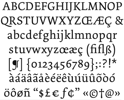
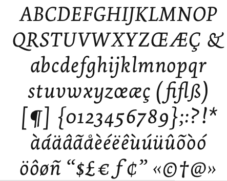
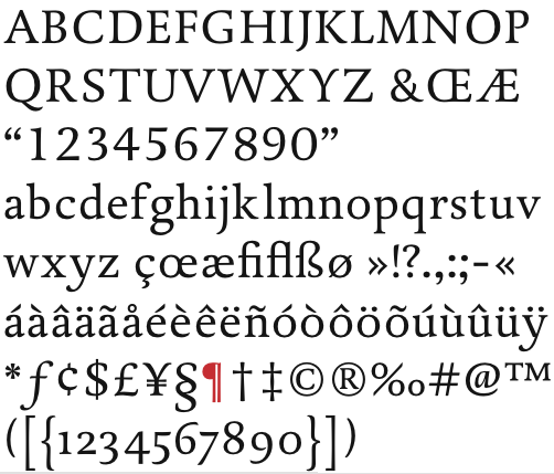
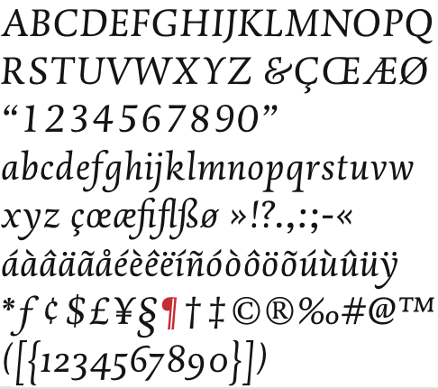
In this thread SuperUltraFabulous (Mike) refers to Ginkgo as a ripoff of Dolly. Have anyone here used it, or have any opinions? My first impression was that this was a very affordable text typeface. I saw the Dutch/Underware-ish touch in it, but never mistook it for Dolly. It looks lovely, though I'm concerned with the bad spacing in the online type tester.

Ginkgo is a TDC Award (09) winner, btw.

The guy just probably went to KABK...

hhp

{Duplicate - sorry, out of practice}

Hrant, he didn't go to school in the Netherlands. He studied in Trier, actually. He isn't a KABK graduate. I think that he's quite a fine designer, actually. His website (in German) is here – http://www.formsport.de/

I was kidding. Well, it was a "ges gadag", a half-joke.
You decide if the glass is half empty or half full.

hhp

sorry :(

I'm not sure you need to apologize, since I was
in fact trying to make a serious point, that you
might object to. Except for Klimax, it's all the
same to me.

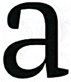
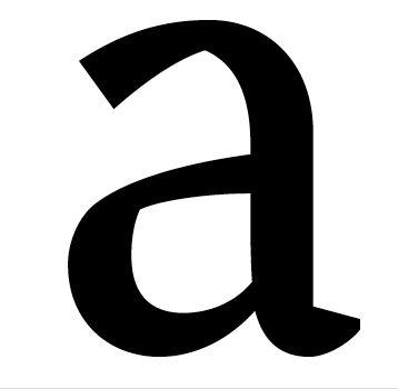
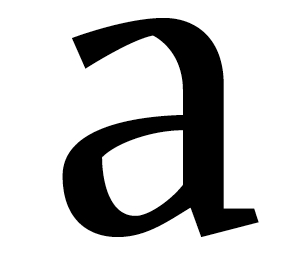
And look at the lc "a" in Rütten's Suhmo.

hhp

Elaborate, Hrant! KABK = The Hauge?

Somewhat brushy and sturdy textfaces seems to be the fad, ey? :)

Brushy and sturdy is part of the curricula at Reading and the KABK. Haven’t you read Noordzij?

Sturdy? You can call your daughter George, but that won't
make her a boy. And Reading is WAY less chiro than KABK.

hhp

My first impression was that this was a very affordable text typeface.
Yes, $156 is lower than $205.

Brushy and sturdy is part of the curricula at Reading and the KABK. Haven’t you read Noordzij?
Did the folks at Underware write the curricula?

Hrant, the lc “a” in Suhmo looks like...?

Mikey :-)

hrant>>> LOL!

Suhmo: follow the link in Dan's post, click on TYPEDESIGN and
then SUHMO. Actually I meant the Italic "a" - sorry if I confused.

hhp

“My first impression was that this was a very affordable text typeface.”
Bad phrasing. I meant to say that it was a good looking typeface, and all the while affordable (a: it's opentype, b: the three weights you get with Dolly is only $156).

+ the bold isn't as black.

Actually thanks for bring this topic up.

I know what you meant Frode, and I’m not picking on you, :-) but by even mentioning the price you made the key point about how type designers who make obviously derivative fonts get the attention of graphic designers and make customers out of them—lower prices.

A scenario:
Frode, I’m sure that you are very familiar with Dolly, perhaps this is one of your favorites.

Let’s say you don’t own it. A client or a project necessitates “friendly low contrast” type— tho not any one particular design or foundry. Your smart. The gears start rolling in your head, you have 10 different tabs open in your browser with different designs, you’ve even printed out some PDF’s. You winnow the chaff from the wheat. (I happen to consider myself the expert in and comparison-shopping)

You’ve got Dederon on your screen and now your thinking. It’s expensive, but thorough. A little wide, but that does emphasize reading direction. It has a sans counter part, but you happen to hate the wobbly looking lowercase g. The repertoire is extensive—yes, but you can develop a hierarchy with other fonts and the sans looks like Lisboa which you might already have or get .

Dolly is nice. You like almost everything about it except lc g because the ear is too small, you can also forget about opentype automation or numeral options. AND WHERE ARE ALL MY SEXY BUT UNNECESSARY LIGATURES AT? The kerning in Dolly is leagues better so much that it makes Dederon seem downright unprofessional (type a couple of choice words in FontShop or Myfonts)

And now we have Ginkgo. Looks very similar to Dolly and it’s fabbed in OpenType. Cheaper. Linotype or Fonts.com don’t seem to let you preview the kerning, but did I forget to mention its CHEAPER?— you can actually snatch this for about $94. Oh and there’s the thing you mentioned about the bold too. You even get a bold italic. The lowercase g has a more defined ear than the other two.

I might have different design priorities than you do or quality expectations. Fonts that have poor spacing and kerning are always a big no-no for me, even if the paux pas lies with international characters. For some folks, such as an American user that will probably will not work with a letter beyond the alphabet, it might be fine. You might care more about convenience, you might like this or that... you get the idea. But the dollar or euro does seem to help us along with our decision making doesn’t it? For $94 Ginkgo isn’t looking that bad.

The point is that sooner or later someone is going to land on Ginkgo and buy it for whatever reason. Should they? I don’t think so. Why? Because the like the graphic designer that’s doing some serious comparison shopping, so does the type designer making his or her sketches. They ask themselves: “Has this been done already?, Did I base my design on historical models, my own genius (like Unger), or is it a matter of ‘I want to do look like XYZ foundry or XYZ font—I want some of that business’’’?

Gingko’s type designer had to have known he was making something very close to Dolly and for the reasons stated in the other thread (I can really visualize Dolly behind Ginkgo), I don’t think Ginkgo is a sincere attempt. I don’t think there’s any excuses left for the “me-too” design. The font development cycle takes too much effort and time for an accident.

More wrinkles:

There have been designers who have asked or at least stated they were inspired by XYZ font and maybe even got the blessing of the foundry because wanted to try a variation on the original theme. Delicato is an excellent example. I find that honorable.

I’m also okay with the type designer that explores another type designers styling but uses unique techniques St. Atmos is another excellent example. (Please correct me on my usage of the words technique and styling.)

Questions (some I’ve asked before):

When does a design turn from being a member of the same genre, into a competition design, into a derivative design, and then mostly gravely into a copy?

Is it using a similar stylistic affection (like brushy foxtail terminals or blocky terminals) onto of a different skeleton or structure?


Is it the other case: somewhat similar skeleton different details?


What about borrowing a glyph or two and making the rest different?


Could we say that Dolly originated the genre of brushy low contrast type?

Would that constitute Dolly as the historical model or prototype for all the following inspired works and should we view it the same way we would new release that’s spin on the—let’s say—the gerald genre?

There’s more to add. But I’ll let you talk amongst yourselves,

Mike Diaz

Thanks Mike, that's exactly the opinions I'm after. I brought up spacing because it matters a lot to me. I wouldn't say Dolly is the origin – it ows (a lot) to earlier designs. Still I understand where you're getting at.

Bram de Does's Lexicon predates Dolly by at least a decade. Lexicon is far pricier, too… but it is just simply divine. Dolly is its own typeface, and I would never see it as a Lexicon-copy. To say that Dolly initiated the brush-terminal oldstyle serif genre is not the case. Even Lexicon is probably not the first example of this…

I think that Ginkgo is different from Dolly. But don't take my word for it! If it is different enough for this year's TDC judges to have selected it as one of the best typefaces that they saw in the competition, then that is good enough for me.

Do the judges really verify for originality or is it case by case, design by design?

Cassius, Geneo, Novel, and even the genius Alda share some genetics with Dolly—some more distant than others—tho all stand on their own.

It’s the application of a global softness— no hard points as if drawn by a wide tip marker. It’s the puffiness of a leg or a spine that imparts humor, friendliness, or even femininity. There is also a 3D quality to the serifs or slabs that Dolly started.

The except is Gingko, which I think does not on its own.

Even though Lexicon has more contrast, I do see what you are talking about.

(I’ve brought this up before)
Structurally Dolly does have a progenitor... ?:


Take a look at DTL Dorian then look at Dolly, especially in the italics.

What do you think?

PS... Those same judges awarded Optica Normal so their sanity is a little questionable with me... KIDDING :-)

PS Deux... The pretty Malabar reminds me of the pointiness of Big Caslon and with sheared terminals of Charter.

> But don’t take my word for it! If it is different enough for this year’s
> TDC judges to have selected it as one of the best typefaces that they saw
> in the competition, then that is good enough for me.

What is this, an infomercial?
A jury is made up of humans, so mistakes happen. Don't you remember the Alex White stuff? But most of all, as Mike suspects, even if a jurist is inclined to research originality he's absolutely not given the time. In fact my biggest complaint about how most competitions are run is the hopelessly breakneck speed - it's almost like the point is raising money and publishing results, and the actual judging is a necessary evil.

But here's an idea that might allow competitions to gauge originality within the very short timeframe: a font jury could have an expert ID hound (chosen of course from the incomparable pack here) who would quickly identify a potentially too-close precedent and bring it to the attention of the entire jury on the spot. Of course that presumes the judging is NOT seen as a necessary evil, but instead something to be done delicately and diligently... just like type design itself.

hhp

Why use a single expert ID hound, when there is a whole pack of them right here on Typophile?

. . .
Bert Vanderveen BNO

They would never go for airing their laundry, live, in public. Now, if you're talking about a public* JUDGING, then that might totally rock, and initiate some awesome discussions along the way.

* I mean Typophile members, not just people off the street.

hhp

50 percent of the people on here seems to be kidz asking for ID's of Trebuchet and Impact :) I thought I was a noob.

I'm sure we can think of a nicely undemocratic filter.

hhp

Most people are good at giving opinions—not me of course. ;o)

What's Trebuchet? I only give opinions about things I know bugger all about.

So what’s up Frode?

Have you decided?

I would send Linotype an email with a kerning script asking for a custom PDF sample and tell them that their website does not show the kerning.

Mike Diaz :-)

I wasn't really about to buy. Had my eyes set on another fine serif. I only asked for your opinions.

Ginkgo and Dolly are quite different. Both are of the same genre (brushy, Dutch-like type?) but that's where it ends.

Captured from web.archive.org on 23 Jan 2015. view this capture