
I finally released my first professional Typeface.
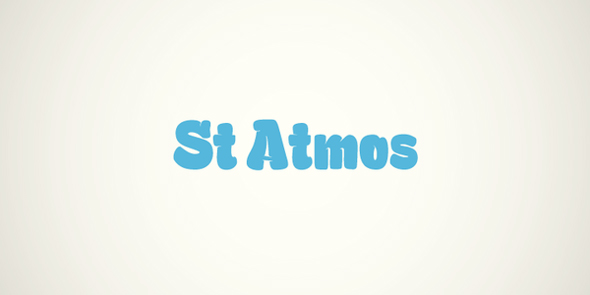
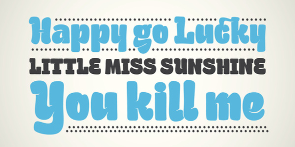
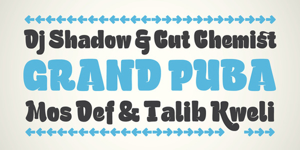
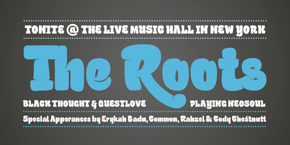
St Atmos, a bold Headline Typeface with some nice Ink Traps.
It's available right now on MyFonts.com.
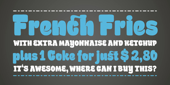
I finally released my first professional Typeface.
St Atmos, a bold Headline Typeface with some nice Ink Traps.
It's available right now on MyFonts.com.

THE CARACTERS ARE NOT REALLY SHARP, MAYBE NOT A GOOD SCAN.
LOOK AT SYNTAX FOR GOOD RELATIONSHIPS TO 'T' 'A' KERNING, MEIER IS NUMBER 2 FONT DESIGNER KNOWS WHAT HES DOING WITH THE HANDWRITING FONT EH?
GENERALLY NEEDS MORE WORK, ALTERNATE 'R' PENIS LOOK IS NOT NEEDED.
THERE ARE SO MANY SANS SERIFS THIS DAYS, A NEW ONE HAS TO BE SOMETHING VERY SPECIAL.
SAD. BUT I'M SURE YOU COME UP WITH GOOD IDEA IN THE FUTURE. BEAUTIFUL DESIGNS, GOOD ON YOU MATE.
HOFE.

Wow, I'm seeing something very different than you are, Höfe. To me, St. Atmos looks lively and playful, with unusual (but not *unusable*) details. It reminds me of work by Underware and Storm Type -- it follows its own internal logic to surprising but interesting conclusions.
I love the phallic R, too.

@Höfe: There are excellent remedies for stuck shift keys out there, you know.
@Sasha: Congratulations on your release!
I too think this is a good, original and well-made typeface. It looks like you've taken great care in working out all the quirky details, both separate glyphs and word shapes look very good indeed. Could you please post a pdf? I'd really like to take a closer look at this.
GOOD ON YOU MATE
You forgot the umlauts, I'm afraid:
GÖD ŐN YŰ MÄT.
Now it sounds right. Are you sure you are not another bowerbird incarnation?

I think it is awesome! Great work Sascha!!!!!!! I hope it sells a million copies!

Really impressive, I've never seen a typeface that looks like it's smiling before :^)
I think Höfe is attempting humour?
Nick Cooke

Wow, Sascha! This is very nice.
And dang...$29!? That's a sweet spot for impulse buying...

Styling is very Underware, but this is no clone or copy; this is excellent. I, for one, am putting this on the purchase list.
Good Job,
Mikey :-)

Nicely done!
For some reason reminds me of the big soft Oldenburg pieces, eg:

I took me second to figure out that those are supposed to light switches—at first I thought those were two ducks looking out narrow windows.
It’s the medication.
Mikey :o)

Really nice work, Sascha. I, for one, appreciate the phallocentric constructs. Congrats.
Thanks all.
Yes, i love Underware and it's inspired by their styles. I steal the best of them and will make something better.
@ Höfe ... I think i will make me a shirt „I never saw a Penis in my alternate R“ :)
Damn, it's monday morning again. Let's start the work. Have a nice week

Excellent, I love it. :)

Wow, how nice is this! Font pastry - delish.
hhp
Captured from web.archive.org on 23 Oct 2013. view this capture