Typophile

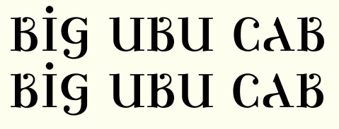
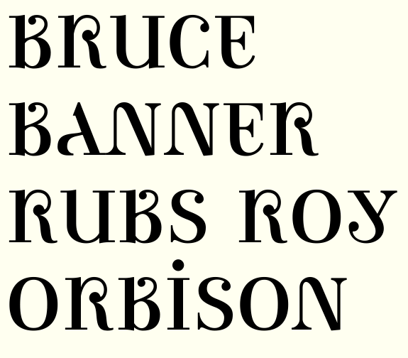
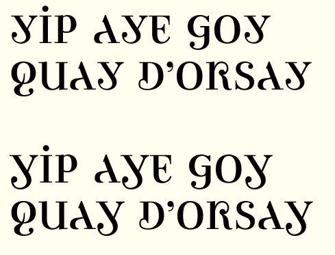
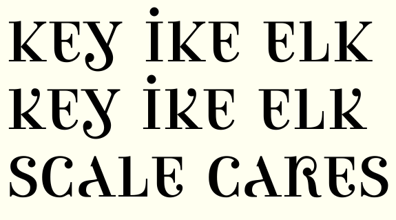
Ambicase Modern

Craig Eliason0 votes

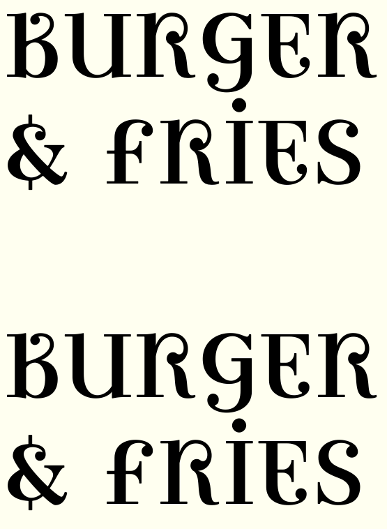
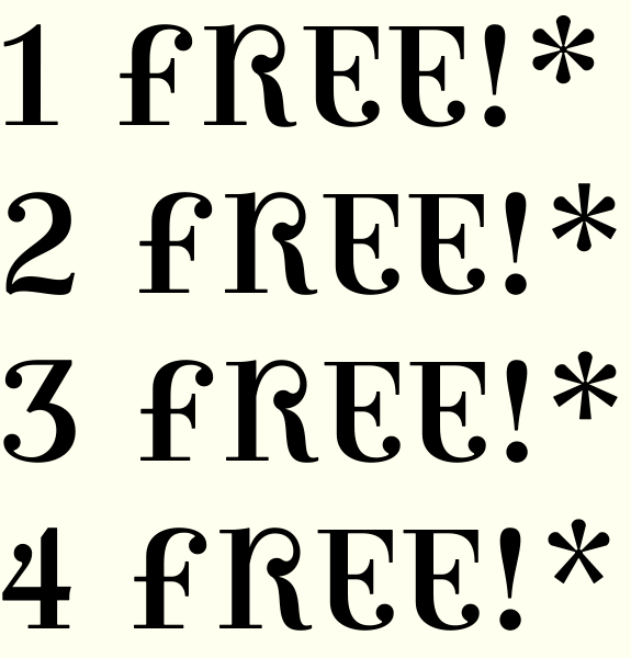
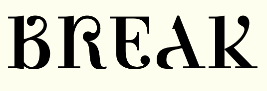
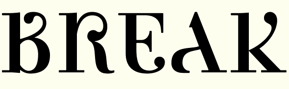
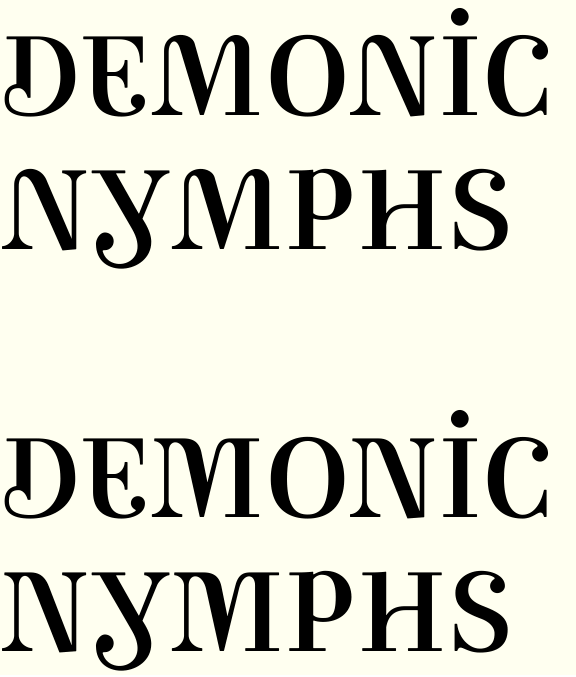
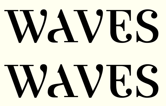
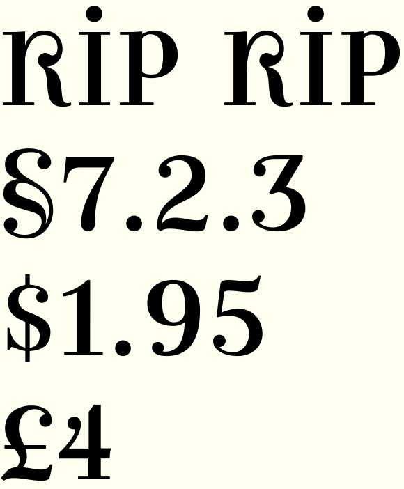
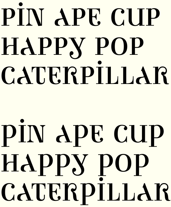
Inspired by the funky Romanian 'A's of the images posted by Florinf (for example here), I have begun to develop a single-case font. Where uppercase and lowercase conventional forms of a given letter differ, I've tried to make hybrid letters that borrow from both forms.

The results are far from graceful, but interesting and more readable than I expected. Does this have any potential?

PDF icon ambicasespecimen.pdf PDF icon ambicasespecimen9july.pdf PDF icon ambicasespecimen18july.pdf PDF icon ambicasespecimen1september.pdf PDF icon ambicasespecimen3september.pdf PDF icon ambicasespecimen13september.pdf PDF icon ambicasespecimen12january.pdf PDF icon ambicasespecimen14january.pdf PDF icon ambicasespecimen23january.pdf PDF icon ambicasespecimen4february_0.pdf PDF icon ambicasethicknesstest.pdf PDF icon ambicasespecimen11april.pdf PDF icon esandts.pdf PDF icon ambicasespecimen20July.pdf

Wonderful job!
Just a couple of thoughts:
1) The “A” seems a little misplaced/light compared to the other letters. Maybe you could’ve dared a little more in borrowing from the “a” letterform.
2) The “D” stand out, both because of the taller ascender and because of the prevalent lowercase letterform. Maybe you could try to make it more like a mirrored “6” (borrowing from uncials).

Thanks Riccardo!

'A' and 'D' have been through many iterations - both started close to your ideas, but I couldn't get them to work.

'A' began with the stroke coming down from the 'a' top around like the top of the bowl of an 'a', but then dropping down to make the left leg of 'A'. The problem was that if this was a thick stroke (my first impulse) the letter as a whole got too dark. And if I made that stroke a thin, the windiness of it looked weak. I even tried thick down to the crossbar and thin below that, but that was hideous.

D has been problematic from the get-go, because of the differences in the forms of uppercase and lowercase. My first idea was the uncial-like d, but I found that the thinning top was unconvincing as a D-like shape. The resulting form didn't fit the style of the other letters, and also threatened to read as an 'a'. Here are some more recent attempts:

Any of those preferable to the one in the first post?

I also have some ideas for revisiting 'M', and I'm toying with giving 't' an ascender.

Ooh, it's fun experimenting with type design, isn't it?! ;) Seems like there's a lot of possibilities with this...

I think your Q is very clever! I like the way you've shrunked the capital portion of G to make room for the descender...did you try a two storey descender there? Y and T are interesting.

I think A looks a bit narrow, or the crossbar could be lower? Could Y be flipped vertically and the stress changed to make the A?

E isn't quite working for me, the top seems to need more squareness, perhaps.

Rhe bowl of R is a funny shape...what about if there was a lc arm with ball terminal used to form the bowl of an uppercase R, then the leg connecting only to the stem? (not sure my description works so here's a quick thingy: Perhaps that won't work though, this has turned out looking a bit Celtic :S ...)

I hate to touch the G since I like the way it's working.
T ascender experiments led nowhere.
I widened A and lowered its crossbar too.
My wife didn't like E either! A new version below.
Played with your R idea but I kept winding up with Ks!
Refined D, changed M entirely.

A different go at 'R':

A: the new one is better to my eye (have you tried to tinker with flat or curved top shaped As?). One problem I notice now, though, it’s that it seems swashed, leading the reader to expect more swashes in other letters too.
B: a little too uppercase (I would try to do a “R” treatment).
D: I liked better your first or third revisions (have you tried to separate the vertical stem from the top of the curve?).
E: better (maybe a little bit too uppercase, maybe you could consider making E and F more similar).
G: don’t change it!
M: though it’s a tricky one, I liked much better the first one. What's with the Y inside? Also, the first one works with the N, whereas the second one stands out, so lonely...
R: not sure which one I like better. Sure, that second R is black, almost blackletter...
T: don’t change it!

In general, if you like to experiment with ascenders (or swashes), I would “confine” them to alternates.

A: the new one is better to my eye (have you tried to tinker with flat or curved top shaped As?). One problem I notice now, though, it’s that it seems swashed, leading the reader to expect more swashes in other letters too.

Such tinkering came to nothing, but see below for a completely different structure.

D: I liked better your first or third revisions (have you tried to separate the vertical stem from the top of the curve?).

Ending the vertical short of the bowl make the 'a' reading too strong. See below for a widened structure.

M: though it’s a tricky one, I liked much better the first one. What’s with the Y inside? Also, the first one works with the N, whereas the second one stands out, so lonely...

I raised the middle join to try to make it more 'm'ish (and less 'Y'ish), and I made an N to match. But I think you're right, the originals are working better.

R: not sure which one I like better. Sure, that second R is black, almost blackletter...

Yes, the right side of the new R needed lightening.

Mmm, you could have both A designs, one for UC and one for lc...makes me think you could almost design alternates for every letter...the new A is really interesting. Prefer the original M and N. With the new D, can the lowercase bowl be larger or does that go funny?

With M, there's another possibility...
(Again just an idea, maybe don't take too seriously, not sure how it'd translate into N :)

makes me think you could almost design alternates for every letter

It's hard enough just coming up with ONE plausible design for each letter!

Here's a D with a bigger lowercase bowl, and one that removes the thickness from the bowl.

I added a bracket to the left head serif of the old M and N - I think I'll keep those.

I'm reading that 'D' as 'nd' (e.g. DOG BEND / MAINDEN).

- Lex

I was worried about "Id" (for both of them). Hmm...

Time to throw a bunch of stuff and see if anything sticks! Here's 11 D's (along with both versions of A):

I say... D!

But also E and F could work.

(have you thought of numerals that are a mix of standard and old style?)

>numerals
Or Roman and Arabic?! ;O

Or Roman and Arabic?

I almost suggestet that, they seem too clashing. With standard and old style, instead, I can imagine some nice forms for 1 and 0, and maybe 2 too...

I was planning to do the figures pretty straight. The distance between oldstyle and lining is too small to make much of, and the distance between roman and arabic is obviously too big!

Here are a couple more versions of A. Perhaps it's too swoopy but I rather like version "O"

And some F variations to consider:

I like that A with the complete bowl, but maybe the bowl needs to be a touch more extended for some extra balance. Really cool typeface - very interesting!

I love the last two Fs, the second and fourth As. Not sure which D, maybe versions C or F.

Ben, does this last F work for you? I thought the lowercasey ones that you love were getting too fiddly at the top, so U shows some proportions altered and V shows a structure without the stem cut in. I think V may be the best of the bunch.

EDIT: Or these proportions, which fit with the other letters better.

Actually I moved the f hook out even further. Along with a bunch of other small stuff. Here's where it stands now.

I think the letters are shaping up nicely. Should start on the figures I suppose.

BTW thanks Natalie for the input and compliment!

@eliason:

This project of yours has reached memorable proportions! I would very much like to see where it leads to.

Of course all other posters have made suggestions much better than I could dare to offer, but I would appreciate being able to use this font - even if still tentative - in some of my work. Mainly titling, strictly private ;-)

Good luck - keep up the good work - expect to see more of this at Typophile!

Best, 8^)

Ronald Kyrmse
http://kyrmse.googlepages.com

Thanks for the compliments. My plan is, once it's done I'll make it available for purchase online, and I'll certainly announce that here on Typophile. So thanks for both your interest and your patience! :-)

Check out the 'I' here. I guess Goudy was right about the old guys stealing all our best ideas!

Returning to the troublesome R.

A was my first go.
B was the revision I proposed earlier. Clever, I think, but maybe distractingly so.
C has a ball terminal that becomes a thick stroke
D, well, now that I look at it it makes me blush. Forget D.
E is too convoluted, and reintroduces the K-reading problem I wrestled with before.
Hmm. At least I like my new ampersand and at-sign.

I’m unable to help you with the R: I like the first two equally. The second one remains the less K “ish”. The fourth is... funny ;-)
Not that I want to nitpick, but isn’t & a little too plain?
And @ is based on the earlier design of A...

I thought I'd play the ampersand pretty straight, though after your comment I couldn't resist playing around a bit:

I'd take the regular & and stick a vertical stem on the top and bottom.

The first one remains the prettiest.
The second one is good and more in line with the rest.
The others, to me, aren’t recognizable as &.

Ooh, thanks Kevin for the idea. What do you think of this:

Craig, this is so wild. :-) And a really interesting experiment – I'm surprised how "workable" it is throughout the alphabet (and how weird is it that nobody has attempted something like this yet?!).

In case you're still looking for feed-back on the "R": my favorite is #2; I wouldn't think it's too distracting, and as you say, it definitely is clever! (I like Ben's sketch a lot, too; but can see how it might become too "K"-ish.)

FWIW, I'm more distracted by the "H", but I wouldn't know how else to solve it. :-\

In the "S", did you try playing with different terminals – think one ball and one serif, like in the "C"? It looks strangely "untouched" now; maybe one ball terminal would make it feel a bit semi-lowercasey.

And maybe I'm weird, but I love (and actually prefer) the old "E"! Maybe you could leave it in as an alternate? (This might be the sort of font that calls/allows for a bunch of alternates anyway – think logos and funky headlines and stuff.)

Thanks Nina. Glad to see you in here!
I'll try that on the S. I was basing the serifs on Bodoni but I think your idea might help impart a little funkiness to it.
What do you think of this H?

("F" is as before, "G" is new.)

Here's the S ("I" is new):

I like it!

Very beautiful H... a little too “usual”, perhaps?
Wonderful S!

Yeah, I'm back. :-)
I think the new "H" is better in terms of legibility (I read the old one as a "W", or as a strange ligature) but I agree it's not as exciting… sorry, I'm feeling very uncreative here. Maybe if you bring the left-side join of the crossbar a bit lower, and make it springier – more different from the right-side one essentially?

Love the new "S". (Remember this? http://www.typophile.com/node/53395?page=1#comment-334989 – but in your font it actually makes sense! :-) )
I wonder if the top bowl is pulling/leaning to the right, but I'm *ahum* no expert on "S"s.

BTW, I know you didn't ask, and I know you know I'm going to say that, but I'd make that tittle bigger. :-)

&: Right on.

R version b is the best idea, but it lacks the waist to distinguish it from an n. See if you can make something similar with the ball located closer to the center of the glyph.

For H, have you tried bringing the thin stroke up from the middle of the wide stroke, instead of the outer edge? And it would help if the serif on it was as long as the other serifs.

Old above, new below.
R according to Kevin's suggestion.
S and H tweaked after Nina's suggestions.
Reproportioned the ampersand.

All great improvements to my eyes. Nice work Craig!

Oh, and I didn't show it in the pic, but I enlarged the tittles. Made stroke widths more consistent, cleaned up a few more problem spots. I'd like to build more graceful transitions into the ball terminals. And I suppose I have to get to the figures soon.

This is all proceeding very well! What a fun solution to &. The new S and H look great. Can we have pdf?

Here's some figures.

Thanks, Ben. PDF will come soon, maybe after I find time to get these ball terminals closer to what I want.

Okay, PDF attached to first post.
I think 1 is too slight and 8 might need starting over from scratch.

New ideas for 3 and 8.

And 4, too.

The new 3 and 4 sure are more in line with the alphabet, but now you’ll need to rework all the remaining eight! ;-)

Here are some 1s, not too sure they're working...

I still maintain you should try something involving old style numerals (also the 7 could gain from a stroke).


Please forgive the crudeness of the example image.

I'm not sure that works for me with three numerals so different to the others. I really like the new 3 and especially 8...the unequal bowls are a clever solution to the UC/lc mix.

On the pdf:
Loving CFGQST!

I wonder if V and W (and why not X too) could have ball terminals perhaps on the right side? Or would one curved bowl suit W? To me these letters look a bit too capsy, though I do like the serif treatment you've come up with.
Could U do with a foot? Y may need a bit of tweaking...the uneven slopes of its arms look slightly unresolved but it's definitely heading in a promising direction.

Would you consider a zero with a dot inside? 6 and 9: ball or fish-hook terminals?

Thanks for the input.

@Riccardo: Doubling the parts (as opposed to morphing them into one) doesn't fit the concept as well, IMO.

@Bendy: Had thought of the VW ball, but hadn't yet mocked it up. Here's a U with a foot - I do think it fits. Some Y variations to consider, too. ("L" is as before)

I like the middle Y. The last one is interesting though. Your call!

I'd like to see if U works with the head serifs switched (double serif on the right).

Another Y that's kind of between #M and #N above. And #P is Ben's suggestion for the switched U serifs.

Doubling the parts (as opposed to morphing them into one) doesn’t fit the concept as well

Yes, I completely agree! (but some sort of slashed 0 could be useful ;-)

I still prefer the “original” Y.
And the U number k.

Another direction for the Y (but not nearly as fun, I guess...)


I think I prefer U #K too.
(Now that I have figures why am I still "numbering" with letters?!)

>why am I still “numbering” with letters?!)
Yup, I'm refraining from referring to them with letters!
Agree the switched serifs on U looks best.

The spot where the curve joins the stem in the U is too abrupt.

Hi Tiffany!
Which do you mean?

(BTW I just caught that the right head serif is too high)

Number 2 :)

The top of the R seems flat. Can you post a larger image of it?

So it was just my eyes good to see. And the U is better too.

Not that I'm suggesting this, but I wonder if all the sharp corners (on the serifs specifically) should be rounded the tiniest bit. You have the interesting organic shapes happening within a lot of the letters but then you end the shapes with a sharp serif. I realize at small sizes, text sizes, it won't really matter, but I wonder if the tiniest rounding or champfering might remove the rigidity. (This is my perception.)

About the Y with the tail. The curve, I think, needs to be exaggerated slightly more or removed altogether to create a smooth transition from the upper stem to the tail?

The alternate A. I'm not finding it in the PDF. But I think it needs to be skewed from the apex to the left a hair.

The cap R. I've highlighted where I think the center of the curve is, but I think it should be down a bit more.

Because the left side of the A is a curve I think I should at least drop down a little more. Not necessarily equal to it.

A similar issue with the @ sign. I think the left side should drop down a bit more. I also think the A within is slanted to far to the right.

(Please tell me to be quiet if my comments are annoying.)

The curve to stem in the G is too abrupt as well.

And I think the left curved apex on the M could be smoother (rounder?)

J - is the terminal a little squooshed?

2- I think the bottom left corner could be pulled out just a hair more. -OR- push the upper terminal in a hair.

I really like this or I wouldn't be poking at it. :)

(Please tell me to be quiet if my comments are annoying.)

No, please, keep it coming. These are sharp and helpful observations.

A couple of requests for clarification:
"I’ve highlighted where I think the center of the curve [of R] is, but I think it should be down a bit more." Do you mean where the extrema are, or something different by "center of the curve"? (Do you want the whole pseudo-bowl lowered, or just the thin not to arc as much towards the northeast?)
"About the Y with the tail. The curve, I think, needs to be exaggerated slightly more or removed altogether." Do you mean a sharper curve (or an angle) cutting further into the black near the join?? (And which #version of Y are we looking at?)
"And I think the left curved apex on the M could be smoother (rounder?)" Maybe on the underside? (This is tricky because the hump has to turn and head down pretty quickly in order to maintain a rough symmetry and approximate the massing of a cap M.)

Here are four H's with increasing softening of the corners (and trapping of the acute corner). Or actually the top left is as before, with right angles and no trap.


Maybe lower left is best?

I apologize. I really am rusty with the terminology.

R - I think the bowl is a little egg shaped. But on an angle. I think the bowl could just be more round.

Ok. Without vectors to monkey with here are some super rough sketches of what I mean.

Either exaggerate the curve.

Or eliminate the curve.

Right now it is isn't either.

I think the top needs to have a circle in there. and the blend down from there. Here's my attempt.

And here's my attempt to show you what I mean about the R.

On the Ys, that wimpy vertical played an important conceptual role in suggesting the vertical of a capital Y, but I suppose not well enough. Here are some more directions on the Y that bring in more of the uppercase form. Maybe #4 or #5 would work.


Here are those H's again with increasing softness, this time at a different scale. Is even the softest (rightmost) treatment perceivable?

I'll work on suggestions for VW690RAGMJ2 and alt A at some point soon... Thanks everyone for the constructive feedback!

Two more Ys. Maybe I can work on the lightness at the bottom, but perhaps this is what I've been after?

>Is even the softest (rightmost) treatment perceivable?
Not really! But I like the idea of softer terminals a lot.

With Y, I prefer #2. Perhaps all you need to do is slide the right arm join up the heave stroke a bit to give more curve sticking out like Tiffany suggested. That way the arms could be at a more symmetrical angle.

My eyes aren’t what they used to be, but I cannot notice a sensible difference between the Hs.
As for Y, I think that trying too much to have it uppercase-like will end in losing the lowercase feeling. The last ones increasingly seem hybrids between Y and J...

@Bendy You mean #M? X-\

yup.

Thanks - maybe #10 is it?

I like 11 actually, though 10 may be less distracting.
Here's what I came up with!


First is roughly what you had as #10, then I brought the stem over but kept the curve. Then I remembered there's not many fonts with a reversed tail on y but that might be an interesting alternate? :S ?

Why do these Ys have me thinking of this?

Think I might aim for one like your middle one.

#11 for me. :)

But I do like the first of Bendy's proposal.

H - And of the original image with the 4 I like the bottom right.

Still more Ds!

On the rounding of corners: In each pair, the left is the fourth example from before (the most rounded of them) and the right is even more rounded.

Rs (new rounder bowl on right)

W-ball experiment:


Other fixes and tryouts:

Beautiful Ds, 1 & 2, but, I’m afraid, too wide.
3 & 4 are more ornate than lowercase.
Go with the ball on the W!

Yet another A possibility:

Please, don’t.

Ouch!

R - YES!
D - #4 is interesting. Maybe with a little more restraint?
A - I really like that new alternate. But not the one just above me.

The left side is still sitting too high.

Should the tail be tucked in just a bit more?

The A looks a lot lighter than the 2. Maybe a review of your thicks and thins? And maybe this A is a bit wide?

Reining in the Ds (bottom three are new).

A refinement of the controversial new A form:

Hmmm. I like 5 and 7 ...

And the new A is interesting because I'm almost seeing a lowercase a.

G - I'm now wondering if the tail needs to bee so long?
A - the left bottom curve. I think he needs to drop a bit below the baseline. I adjusted it in the middle word.

I love D4 even if it's more extravagant than the other letters.
I think the ball on W is great, perhaps it could be larger?

I'd be tempted to go with an uncial A, with a simple straight diagonal on the right (representing the uppercase) and the bowl starting quite high up (lc)...I'm sure you're well acquainted with the historical roots of upper and lowercase and how they diverged. But perhaps your approach to this is more a fusion between UC and lc than finding a common ancestor to build on?

Overview of front-running As, including two new ones (#3 and #4).

@Bendy #1 started me thinking about uncial forms, too. One concern is that a closed bowl with that kind of diagonal starts to read like a 'd'.

Some other changes.


Gave some curve to the thins of V and W. Brought in top corner of 3; lightened horizontal stroke of 4; increased weight and height of middle horizontal of 5.
@Tiffany Does this G look better?

I like the curves and those numerals are looking sweet!
With A, what about the crossbar being angled rather than horizontal? I think you're right not to close the bowl. 4 is most successful for me.

Thanks!
You mean something like this?

Gee, this is a funky and fun face! I wish I had the imagination to do something like this ... Could you post a new pdf showing status quo? That would make it easier for someone who just saw this to criticise.
I really like the direction this is going, though. The new A is fab. The R is weird, but brilliant. I think the G suffers a little for looking too much like a raised, upright swash G. Could something be done to the inward pointing middle serif?

Oh yar! That's exactly perfect!

Thanks both of you. New pdf up top.

Some quick thoughts, jotted down in the dead of night. My eyes are blurred from insomnia, so I might not have the best eyesight right now. So take my critique with quite a few grains of salt.

A: Lovely, just lovely. Perhaps it looks a little too simple compared to some of the more complicated glyphs?

B: I understand why the lower bowl curls up before meeting the stem, but I think it looks a little cluttered. Perhaps it should be more curled?

C: Should the top half be more like the F top half?

D: Perfect.

E: Is the bottom curve just a little too sharp?

G: See last comment.

J: Perhaps the curve is a little bumpy.

K: Looks upside down. Cool, but might look awkward in context.

M and N: I think these are slightly too complicated compared to the A. The N has too much white to the left of the diagonal, perhaps.

Q: Very cool shape, but it gets very black where the hook joins the circle.

R: Delicious.

S: This S looks very polite, and a little shy. Great!

T: A little weak in the left side?

W: A little too black?

X: The fat diagonal looks a little broken.

Y: Jolly good! Just lovely.

Z: Too conventional?

Lovely numerals, but I think the 4 is too fat.

Looking forward to see further development on this.

Thanks so much Sindre for your encouragement and your valuable suggestions. Your tired eyes are working well!

Here's still another new A, #6. The difference from #5 is that the "crossbar" changes direction slightly. I think it fits the character better than the swoosh-like #5, and perhaps helps with the too-simple issue Sindre observed. #7 has the little notch at the top that #3 had.

I'll review the other suggestions.

EDIT:
C: Should the top half be more like the F top half?
Do you mean with a more horizontal curve and higher ball terminal?

Okay, I was in love with my G but since you're not the first to take issue with it I think I should at least consider options. Here's a two-story tail as Bendy suggested a while ago. Obviously a rough sketch, but what do you think of the concept?

A different B, N, M for your consideration:

Yes, I think this is step in the right direction. The settings look more balanced now. But your new N needs a lot more weight, compare it to M and W. Is there slightly more air at the lower B join now? It's not easy to see at this resolution. I'd give it even more space. Er, your B is a very closed glyph. I think it needs a hole somewhere.
Your first G is much better than the new one, I think.

>Do you mean with a more horizontal curve and higher ball terminal?

Yes.

Keep up the good work!

Still another B, M, and N.


This M's too crazy, huh?

I think I prefer the previous versions of M and N (adjusted). How about a B matching the R, with a light upper bowl (and perhaps a ball connection)?

Ooh, what about this?

Yes, but try and make the gap wider, and use the original, downward-pointing middle stroke (like the B in this picture).

I think I communicated poorly earlier, I meant that the bottom of the B needed a little more air at the junction, not the middle.

(Criticising type design is hard when you lack the proper nomenclature and write in a language other than your own. I really have to do some studying soon.)

Is this diagonal too strong? Does the letter look narrow now?
I'm really liking this - thanks for pushing me to try it.

(I understood you fine earlier; the change in the middle was my own experiment)

Yes, this looks fab! Just as I imagined it. (Perhaps the upper bowl of B could expand yet a few notches to the northeast.) It'd be great to see it close to an R,

Enlarged the ball and fiddled with the curves a bit.
Looks pretty trippy next to the R.

Yes! This is good. The B works just fine, perhaps the ball could be even larger. That Y needs to go a little deeper, but that will only improve its form, I think. The AN combination is very airy.

This is looking really cool now! The B looks a bit like Thai letter cho chaang, which I've always thought looks like a rabbit's head.
An idea: what happens if you reverse the thick and thin on the right side of R, making the bowl heavier and the leg thin (with a ball)?? Something about it makes me want the bowl to be bigger or darker.
That A is gorgeous!
Think the serif (and ball) on S could be heavier/larger. In fact, on C as well I think. Did you try a ball terminal on the bottom of E?

I think this design would work very well for Cherokee...

André

Now there's an idea! :P

Y descending like GQ:


A little wide yet, I think.

An idea: what happens if you reverse the thick and thin on the right side of R, making the bowl heavier and the leg thin (with a ball)?? Something about it makes me want the bowl to be bigger or darker.

It's light but I think reversing the contrast will be too strange, and just move the too-light problem to the stem (see my current N!)

Think the serif (and ball) on S could be heavier/larger. In fact, on C as well I think.

Agreed, I'll adjust.

Did you try a ball terminal on the bottom of E?

No. Wouldn't occur to me there, but then I had doubts about one on B, too. :-) I'll give it a try.

Like the Y (but yes narrow it down a bit), the new D is wicked, all in all this is starting to look very elegant indeed. I'm not a fan of twiddly but here I say the more exuberant the better!
R — I meant to keep the stem heavy. I think the bowl could be larger and the leg shorter. Have you tried also making K have a curved leg like that?
Without ascenders and descenders it was reading like an uppercase font, so the latest image with all those descenders is really turning this into something outstanding, in my opinion.
It's so much fun to watch the development of a font right from the start!

Oops, about the R, careless reading on my part, sorry. But I'm still not sure I'm picturing what you're describing.
Here's a new structure for K. Actually this is how my first sketches (on paper) for K looked, but for whatever reason it didn't make it into the FontLab file until now. Strange, because I think it's a nice fit.


Bottom line also shows beefed up terminals of S, C, and the ball-terminal experiment on E. Opinions on the latter?

Nice K...I actually meant the bottom leg to curve like the swish of R, but what you have could be successful too!

Like the S and C a lot. I think the spine of S could come down a fraction? With E, I think I'd open up the lower counter some more by moving the ball outwards a bit.

Very nice display face, indeed! Loved the new A.

Thanks satya!

@Bendy: Yeah, this time I knew what you were saying but freelanced anyway! :-)

Lower setting shows changes: E's bottom terminal is lowered, and R's ball has become more lachrymal.


I've been thinking of making some or all of my ball terminals more lachrymal, but it certainly makes sense to me to start with R as that allows me to sneak a little more weight into that top bowl.

Asterisks!

I'm going to have to be boring and say number 1. That is one hell of a great asterisk. I think your alternatives are better in theory than they look, and in smaller than huge sizes I think they're going to look weird.

The new R is possibly even cooler than the old one. So is E.

Mmm, new R suits my taste ;)
My vote goes to asterisk 1.

B and K join R in the teardrop club.

Looking good! Perhaps the B tear wants to go just a few FL units to the north, and even fewer units eastward, making the curve a tiny bit smoother?

Looking great! Agree with Sindre on the B, the tears are looking really perfect. The curve on E looks a bit flat in comparison to the BR and A, can it be rounder?


Here's a very slightly adjusted B. I moved the tear eastward a few notches (though I'm trepidatious about the gap opening too large. I actually didn't move it north, but rather dropped the "ramp" of the stem's top terminal (and made corresponding reductions in that flare throughout the alphabet). You can see those changes also here at the bottom of B and top of R.
Fiddled with the E a bit - how's it look to you, Bendy? This is tough - I had made it flatter because a) I didn't want the letter too topply and b) as noted before, the interior space of that glyph can get crowded. I moved the ball up and out a little and raised the break into the curve from the stem.

Okay, here's a new M and N. More similar to what I had before the naked humpy versions of three days ago (which I don't really find persuasive), but this time with modified proportions, and not quite as complicated at the northwest corner as that earlier one was.

W and V join the teardrop club.

I say yes to all your latest changes. M and N needed that blackness, all of a sudden they are the authoritative glyphs they have to be. New E is just right. I think E, S and Y are perfectly happy without teardrops. New B is much better, but I can't help thinking the tear terminal should go just four or five units upwards, it still looks ever so slightly squashed to these eyes.

Yes, all those are very nice developments, especially M. I agree with Sindre about the top of B.


Small adjustments to R and P, right side is new. On R, I lowered the branching off the stem, and fattened the top of the tail a touch. On P, thought I'd try patterning the bottom of the bowl after the uppercase form.
A few funky new symbols: section, dollar, and sterling. (I guess dollar is a bit light yet.)

I never had a chance to comment on this, but this is a great display typeface with a lot of ornaments and goodies. W look like Wordpress logo.

My favorite would be letter A, because you get rid some of its anatomy, but the other letter, you add more to it or change it to different anatomy.

I like the process of you working on letter A, previous A kinna reminds me of Art Institute Logo.

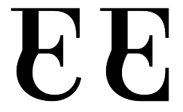
So is the old "E" dead? :-(
I guess I'm alone in this corner of the room, but to me this one still looks very much like a "F" with an unexpectedly curvy base – it doesn't parse as an "E"/"e" as well as the first one. What made you switch?
(I'm going to stop mentioning it after this post if I'm the only one!)

Thanks, Anh!

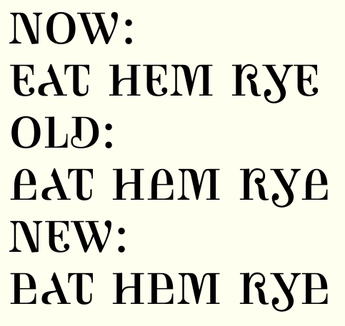
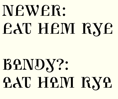
Here's the current E, the previous one, and a new one.


I'm not sure any of them are "IT"... I think "old" was too lowercasey in many people's eyes - that's what made me start to rethink it. I think "new" is elegant relative to "old," but I'm not closed to the idea of rethinking it.

Also for everyone's perusal, opinions on making the P descend?

(That should say "I think “NOW” is elegant relative to “old...")

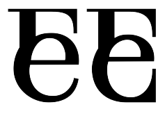
What about if the lower bowl of e poked out left of the upper stem, in a similar way to the Y?
I think P is good with the descender but needs to descend a little less than Y, which has overshoot. It looks like it's the other way rount at present.

"Newer" is something I just worked out. I think it's less ugly than some of the other options, but is it too close to a pound sign?
Is the lower what you are envisioning, Ben?

I think P is good with the descender but needs to descend a little less than Y, which has overshoot. It looks like it’s the other way rount at present.

Actually that's all illusion - P already descends less than Y. But obviously it needs to descend even less than that!

Ongoing thanks for your feedback.

Hey, that "Bendy" "E" looks a bit like Ben's avatar. ;-)
Interesting, when I read his comment I thought he meant letting the top part curve out of the stem instead of shift it outwards. Dunno, that might be interesting too.

I think the "newer" one is interesting. It's vaguely reminiscent of a pound sign, but not sure if it's close enough to be problematic.

Not quite, other way round. Try this?

Or even

Whee! This is fun! [Sorry for hijacking your font Craig!]

?:

Ohh, the right hand one in your 1.04pm post is very cool!

??:

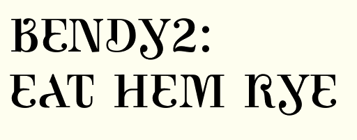
Looks like you have to make a lot of alternate glyphs, Craig. Tons of cool options now. I think your last one is probably the best candidate for a default one. I think it could work even better with a serif on the cross stroke, perhaps.

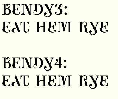
I like Bendy3 a lot, though I think the point where the curve meets the straight on the left of the stem could be a bit higher (just the left side). Bendy4 is pretty nice too, it may be more recognisable as an E?

Er, I was referring to Bendy2. I see I got my wish fulfilled in Bendies 3 and 4. I agree with everything Ben wrote.

Here's that last one, with some adjusting and cleaning, and at a bigger scale:

Mmm, looks great! I think S needs a bit more weight in the spine (compared next to I). Do you think C could have its top ball terminal further down to make a more curly top? At any rate I think the ball could afford to be bigger.
N may be a bit wide?

Still on E, tried bringing in the curved part a bit to align with the straight stem above a bit more.


Do you think C could have its top ball terminal further down to make a more curly top?
You mean like it was before Sindre advised me to raise the terminal? :-P

Gosh, not sure. It just seemed a little restrained in comparison to the new R and E which have gotten quite extravagant now.

I think a little balance is a good thing.

I like that idea. Ignore my tendency to make this all flowery ;)

That's been an interesting part of designing this font: to fit the concept, some letters require all sorts of bending and twisting, and others none at all. I do think I'd want the latter more to counter the craziness rather than match it. But that said, I think the drawing in the C is not yet satisfactory...

I like that the C seems normal in comparison, but if you look at it alone you see that it is a little crazy with the different terminals.

Just a crazy thought on the numerals - how about combining them with the character you get by using the shift key with on your keyboard? i.e, combine "1234567890" with "!@#$%^&*()" respectively. Not sure if this would work, but it makes sense with the combining uc/lc theme...

Interesting idea but after sketching I've concluded that that lies beyond my melding powers!

Besides, it would make sense for English keyboard users only. My Norwegian shift-number row reads !"#¤%&/()=

I've been messing with something like this for a couple of years, but I'm glad to see somebody making a hard effort on the ground! I'll try to read the whole thread and hopefully have some useful input. Keep it up!

hhp

Great, I look forward to hearing your feedback, Hrant.

Considering a descending J.

This typeface is shaping very pretty.
My feeling is that it is slowly drifting away from a uppercase/lowercase mix towards a more decorative direction.
Not that it’s a bad thing, mind you.

It looks like the ball of the descending J needs to go under the baseline. Perhaps that glyph is a good candidate for alternates, as the semi-descending J is very nice, but highly problematic. That AJ hole makes too much whitespace, I think.

This typeface has had a marvelous evolution, by the way, you really must finish this.

My feeling is that it is slowly drifting away from a uppercase/lowercase mix towards a more decorative direction.

Yes, it's interesting how some of the more difficult combinations of late have led it in that direction (BDR for example). Sometimes I feel like I'm just along for the ride to see where it goes!

It looks like the ball of the descending J needs to go under the baseline.

Yeah, my reaction was similar. I like the shallow descender space of PGQY but J creates "highly problematic" spacing as you said. Initial attempts to leave the terminal lower than the baseline looked bad, but maybe I should keep working on options.

This typeface has had a marvelous evolution, by the way, you really must finish this.

Thank you very much. I certainly have every intention to see it through!

New glyph: german double s. I had some fun with it. Can I get away with this? :-)

Aw. I read some German, and I must admit that I have a hard time recognising this as a double s. (But it is a cool glyph! Perhaps the second s and the right part of the joining stroke needs to be softer.) The first half is based on the long s in all typefaces I've ever seen, even in upper case versions. I think the obvious solution for a double s is to make the long s descending.

Maybe you could start with an Esh joined into a lowercase s? The curve of the cap part makes the whole thing a bit wibbly to me, though I did recognise it as an Eszett...but I don't read German so Nina might be in a better informed position about this one.

When I said recognise, I meant in the context of reading, not deciphering. The main problem with this glyph, is that it is an ss-ligature, not an ſs-ligature (or ſz-ligature).

Now THIS is what I call a can of worms! :-)

"The main problem with this glyph, is that it is an ss-ligature, not an ſs-ligature (or ſz-ligature)."
Actually, there are severe limits (IMO) to how much the eszett should be seen/interpreted as a ligature at all. It essentially is an autonomous character; and it's not even 100% clear that it was a ligature to begin with (much less which one). So I'm really not sure connecting two "S"s would fully do justice to the character. (And so far yours didn't parse very well for me.)

I can't really offer any ingenious ideas right now, but as to inspiration: http://typophile.com/node/33647
(But I see you're on that thread, Craig.)

It essentially is an autonomous character

Yes, I know, the same is the case with Norwegian æ, ø and å. But I was thinking of the physical construction of the eszsett glyph rather than its evolutionary history. Isn't it the case that it always starts with a long s-shape, and never with a short s?

Hmm. The concept here, in keeping with the concept of the font, was to make a glyph that melds "ß" (the lowercase double-s) and "SS" (the form it often takes when uppercased).

Oh. Well but since there finally IS an uppercase form, why not try fusing "ß" with u+1E9E? Scary, I know. :-)

Sindre, yes it starts with something like a "longs". Historically the second component is unclear (IIRC it might originally have been a "longs" with a modifying squiggle of sorts, not necessarily a ligature – but I'm no expert).

Oh.

:-) If that's not coming through I'll have to rethink it.

Well but since there finally IS an uppercase form, why not try fusing “ß” with u+1E9E?

I suppose that's my next step. In the meantime I've pushed my first attempt around a bit and wound up with this.

Back to B - is #2 too swashy?

Even though I always see #1 as a upside down я, I still prefer it to the other two. (Yes, #2 appears a little too “swashy” and #3 appears somewhat disharmonic.)

I think I agree.

Here's another go at a descending J, this time with the descender reduced dramatically so that it can tuck under the preceding letter.

And here's an attempt at a german double s that incorporates some of the controversial capital form (new design is at the bottom). Is this way too wide? Boy I find it hard to judge this character.

I think the last eszett is by far the best one. Yes, it is wide, but I think you could make it a little narrower on the right side. Perhaps that vertical stroke could be a little thinner?

Another solution would be using a foot serif and a straight descender, like the P, with the right side of this eszett.

New J descender terminal looks a little too small to me, why not use the same descender as your new eszett?

Slightly narrowed ß, and a version with a P-like terminal:

New J descender terminal looks a little too small to me, why not use the same descender as your new eszett?

Actually, I did build J's descender by enlarging (mostly widening) ß's! (Different scales of samples above may make it seem otherwise.) At any rate, here are some options for the J descender:


1 is the version posted previously
2 is the form taken verbatim from the ß.
3 is #2 with the ball enlarged a bit.
4 is #1 with the ball enlarged a bit.

I think #3 may be best.

Actually, I did build J’s descender by enlarging (mostly widening) ß’s!

Aw, I'm embarrassed.

I agree that J no. 3 looks best, the ball mustn't stray too long from the stem, as I think is the case in nos. 1 and 4.

I think both new ßs could work, but perhaps there is a slight conflict between the two serifs in no. 2? Could the bottom of the right part have a ball terminal, perhaps?

I too prefer the old B to your new ones.

Another crazy thought - I'm guessing this is an all uppercase/unicase, so how about inverting what you currently have for lc or alternates? Like on your 'T', you have uc on the top half of the character and lc on the bottom half. So on the alternate or lc character, it would be lc on the top and uc on the bottom hallf.
This is beautiful! I reminds me of some kind of modernized ancient writing, then upon a close look. Wow - Awesome!

Thanks Kermit. I've had the same thought about generating a whole "case" of alternates, but I'm finding that for most letters the satisfying ways of combining forms number either one or zero...

Here's a new treatment of the E, particularly the middle.


Top is as before. Middle and bottom show new middle, which takes more from the lowercase form. The only difference between middle and bottom is the lower terminal. And here's those two with the serif-like bit in the middle removed:

And here's some more tries at ß, trying different terminals on the P-like ß. (first two are as before)

I really like the second E on this page and prefer the two Eszetts with the fishhook terminal.

I like your tries to adding back some “lowercaseness” to the E. The risk here is that it could easily become too “busy”.
As for ß, it’s a tough match between #1 and #3, but I think #3 flows better with the rest of the letters.

Old E for me. Yes, I'm a boring guy. Eszett no. 3 is my favorite. (Lye-eating is actually very common where I live, à propos.)

(I knew I should have numbered these!) For clarification and consideration, here are the E's.
Bendy, you prefer "number 4" and Sindre "one," is that right?
"Eight" is new but is probably too c-ish. Any merit to "nine" or "ten," also new?

THREE (even if it’s a little THRFF).
I’m no big fan of the bottom left “bump”.

Four's cool because that chopped hairline in the centre echoes the chopped diagonal on A. This is really going in a nice direction.

I find the bottom right corner of N unconvincing. Did you try making the diagonal join to the vertical in any different ways?

Some more bumpless options for riccard0:

Eleven is nice! :-)

I find the bottom right corner of N unconvincing. Did you try making the diagonal join to the vertical in any different ways?

That came from trying to force the cap diagonal into a semblance of a lowercase hump at the top left, which automatically pushes that stroke away from the left vertical. Consequentially, I felt I had to make the lower right connection as broad as possible so that the counters would be roughly even (i.e. so the right vertical wouldn't wind up way too close to the diagonal, relative to the left vertical).


But maybe the unconventional counter balance is less troubling than the unconventional lower intersection...
This is a persistent dilemma. I don't think knocking the verticals off vertical will work. I've thought of dropping the beginning of the hump or the entire left side of the letter down to "x-height," but that also reads very strange. Hmmm...

Eleven is nice!
Yeah, I kind of like that one too!

I dig eleven too. It is undoubtedly an E (unlike that swashy F-lookalike, and is truly ingenious in its case-ambivalence. (By the way, would "Ambica" be an even better name than "Ambicase"?)

Man, you're what I'd call prolific…! :)

I still like the old "E" (ONE), but the one in ELEVEN is pretty smart (and I think works) as well.

Re your Eszetts, you're pretty close to a (IMO very good) capital shape, so I'd probably prefer the one with the descending uh, hook (first one in your 25.Aug.2009 9.25am), which gives it back some lowercaseness.

Thought I had the answer to N here, but I was more convinced by my sketches than by what I could do in Fontlab. Here they are for your consideration, along with some thoughts on M.
For N, 0=current design, 1 & 2=variants on my new idea.
For M, 0=current design, 1=similar to what Ben proposed ages ago, 2=similar to what I had ages ago but with a thick left vertical.
(Note that these N's and M's are not paired in any way - one of the issues of these variants is that none offer an analogous solution for the other letter.)


More eszetts:
0 = best from before
1 = same with unidirectional serif
2 = nondescending, spurred version
3 = hooked version similar to the one Nina preferred, but narrower and with two ball terminals.

N, M: #0 remain the best options.
ß: #1.

I don't think it's necessary for the M and N to follow the same line of thought, and actually I really like the zero version of M. Would a pi-shaped N be out of the question?

Would a pi-shaped N be out of the question?
I tried it before - see my 27.Jul.2009 8.13am post on the first page of this thread, the lower part of the .gif that reads MEN AND WOMEN ADMINISTRATION. But here's another go that's probably an improvement on that:

And here's another try at capturing that tailed N:

And here's the same with an angle at the bottom.

This latest "N" reads like a clumsy "W" to me (think blackletter).

But: The bottom-most one in your 26.Aug.2009 8.22am post is exciting!!
The way the bottom-right corner "hints" at the diagonal (which actually isn't there) is very reminiscent of the top of your "A", where that same effect is *very* successful. It needs some fiddling but I think the general idea might be "it".

FWIW I still prefer Eszett #3, but I'm not sure. They're all looking like healthy almost-caps, not as remixed as the rest of your glyphs… but I'm being picky.

These Ns don’t seem to work to me. I would stick with the current one.

Here's the image from the 12:14 post, in case it's not coming though for you (it isn't for me):

>The bottom-most one in your 26.Aug.2009 8.22am post is exciting!!

I agree with Nina, you're onto a fantastic idea with these phantom hairlines! That's totally original and seems to get more interesting the more you look at it.

BTW I found this: Prototype, a font that combines upper with lower case and sans serif with serif features. I think your Ambicase is looking like it'll be much much more interesting but it may be a point of reference. Check the numerals...I don't think they succeed.

Thanks for the link, Ben. I guess this is not a first, but I have hopes that it will be "best of class".

How about this for an N?

I think it's seriously worth considering different glyphs for upper and lowercase. You've come up with a lot of different ideas for lots of the letters and I'd like to see the E with and without the bulge and these two Ns as well.

>I have hopes that it will be “best of class”
It is already!

The new n, kinna remid me of the devil tail thingy.

N #5: the stem and the hook aren't "glued" together.

>The new n, kinna remid me of the devil tail thingy.

This font would be perfect for Dan Brown's Angels and Demons, which plays with ambigrams.

Wow! That third 8.22 "N" is delicious! (Though it looks like the "arrow tip" needs to point downward a further few units.) I think the last one suffers from a slight structural problem, that join doesn't quite work for me.

Ben's uc/lc idea is a good one, and I would even consider contextual or stylistic alternates. You have far too many great variants for a pure unicase.

By the way, may I ask how you generate all your glyph variant images? Do you paste to Illustrator? If so, how do you line up and space the glyphs?

By the way, may I ask how you generate all your glyph variant images?

Everything is in FontLab. Got some tips from this thread I started a while back. I copy and paste a glyph onto itself and let FLab generate a replacement, which I then edit. Then I choose all the variants I want in the sample in the Font window and open a metrics window. Then I add all the other characters for context, copying and pasting the variants as needed for multiple appearances. Make sure the metrics window is on preview mode, then take a screenshot.

(For the screenshot, I use Quicksilver plugins to quickly capture a region of the screen, convert it to .gif, and rename it suitably.)

Thanks a lot! That's really valuable information. I've been generating new font versions all the time, and that's boring and time consuming.

Closer to topic: That excellent half-arrow "n" half-serif really rocks! I hope to see it on more glyphs, if you choose to use it.

Now I know what your typeface reminds me of! Pierre Didot's wonderfully weird 1819 typeface!

These are glyphs from a revival by Optimo, I hope it's okay showing this image from their online typetester here.

Aw, I thought I was onto something with that lachrymal experiment.
Okay, here's variations on the barbed N without the funky intersection.
0 = current
6 = pi-shaped one from 8.22 post, but with point lowered.
7 = same, with lowercase top
8 = same, with northeast detail to suggest the diagonal.

I think 8 works pretty well.

Oh boy, I think they're all great. Yes, 8 is really good, but then you'd have to repeat that NW notch in other glyphs, I think. 6 is way cool too, but I think my vote goes to 8. But then 0 really should be an OpenType option.

Don’t know why, but those down-pointing barbs continue to remind me of this:

What is that?

What is that?

:-D “That” is the graciously downward pointing foot of a classical dancer…
But, yes, I think that I could have made my point with the same words (albeit really too rudely).

X was the sole pristine letterform left, so I decided to play with it as well!

Nice movement, still a bit unbalanced.

Cool shape! I think the balls should be larger. The glyph is a little left-leaning, and needs some more support. Perhaps the vertical is a little heavy, too?

X was the sole pristine letterform left [...]

Oh really? I think I see an unadorned "O" up there ...

Rebalanced X (#2):


Oh really? I think I see an unadorned “O” up there ...

(But seriously, would an O like this be too whimsical, or workable?)

I like it. You could have it as an alt.

I'd really like to see an ambigram of the word 'ambicase' made with this font. Who could do that?

"X" no. 2 is really well balanced, but the thick vertical looks perhaps slightly broken -- though this is hard to judge at this resolution, it may be that some wrong pixels makes the join look a little cluttered.

Great comeback with the "O"! I would,'t use it as the main O, though.

As already was said, beautiful but a bit excessive O.
As for the X, have you tried reducing the curve of the light stroke (something more along the V or K, perhaps)?

How about these for an O?

As for the X, have you tried reducing the curve of the light stroke (something more along the V or K, perhaps)?

Here's a couple of attempts (3 & 4). Only difference between them is 4 is soft rather than cornered on the sides of the intersection.

Maybe I’m too conservative, but I would keep the O unchanged. As something plain that quietly balance and sustain the general decorativeness of the typeface.
As for the X, I like these new attempts better.

Ambicase Modern phase II has commenced. Check out the last two pages of the new pdf attached to the top post.

Having fun with my first swashes. I've invented initial and final swash forms for A-Z, as well as medial (?) forms for CDQRS. I have no confidence about what I'm doing here - I think the scale of the swashes may be way off, and I think the amount of tension in the curves varies too much. So what, if anything, do you think is working here, and how might I improve what isn't? As always, brutal honesty welcomed.

Wow, this is impressive. Those swashes are really something! I have only had time for a very quick glance now, as I unfortunately very soon have to leave the house (and my laptop) for the remains of the day. However, I promise you a thorough critique in the morning. Now I just want to say that I, a connoisseur of "boring", conservative type, and who normally have no interest of swashy display type at all, think this is bloody brilliant!

OK. Here are my thoughts on each glyph. (I'm sorry I can't give you much advice on the swashes.)

A: The outer bowl curve now ends in a short straight line at the bottom. Could it perhaps continue its arch upwards instead? That would also take some strain off the whole curve.

Left side of foot serif is now softened where it meets the stem, right side is not.

B: I still think it's a little tight at the bottom. Pulling the part of the stem under the bowl join a few units to the left would open it up.

C: Just right.

D: Slight bumpiness too the inside of the swashy curve, but that might not matter.

E: A little abrupt transition from stem to curve on the outer side?

Also, is the difference between top left serif height and "roof thickness" of D and E (and bottom of L) a little too great?

F: Absolutely brilliant.

G: Ditto.

H: Perhaps the crossbar bend should be a little smoother.

IJK: Great.

L: Se note concerning D and E.

Lslash: To thin and boring slash.

M: Top of thin vertical a little bumpy on the inside.

N: Brilliant, but perhaps too alone? Could that top left notch be repeated at the bottom of B and U and the top of P, perhaps?

O: Booooring! ;-)

OE: Too black at the top, I think.

P: Se N note.

QRS: All beauties.

Eszett: I still prefer the foot serifed version, but this one is also good.

T: Slightly stiff bend on the hook?

U: See N note.

VWXYZ: Just right. Have you considered slanting both of Z's serifs?

Great pilcrow and section mark! Lovely!

Copyright, Trademark, number sign and Registered look a little light.

Cent bar looks unconvincing.

I think 4 is too black.

Swashes are all great, perhaps except initial S, its curves looks a little awkward. I'm mightily impressed, I couldn't draw a swash to save my life, I think. (I've never tried.)

All in all, wonderful work! Keep it up! I want to see this released!

Thanks Sindre so much. I'll do some revising along those lines.
In the meantime here are some swash redraws.


New here are initial M, S, and B, medial Q, and terminal Z.
I like the idea of that B though I'm not sure it's working yet.

I second Satyagraha on the ß (my favourite remains #1 from the 25 Aug. post). And I too am not a big fan of the N…
I like § very much!

As for the swashes:
A - feels a little squeezed. You could enlarge the loop under the baseline in order to smooth the curve.
B - the PDF one is a bit plain. The new one is wonderful! (not sure about the upper terminal of the stem)
E (and others) - I like the curl very much, but would make it just a little bigger.
G (and others) - Doesn’t seem to “flow” to me.
H (terminal) - I would rather go extending the crossbar.
L and Z - you could dare more.
O - maybe you could try a curly one as medial.
Q - the new one seems to me a step in the right direction.
X - I can clearly see a medial which extends the left-to-right stroke.

Oh wow Craig's going wild. :-D
I'm not generally a swash kid, but these swashes are awesome! Is it just me, or does the whole thing get a nice art nouveau flavor (but very current/"new" all the same)?

Some spontaneous comments on the swashes, but bear in mind this is very uneducated opinion.

The "B" in your most recent post is awesome. It might be interesting to experiment in that direction more – where the distinction between what's letterform and what's swash becomes blurred. Maybe.

The way the top-left swash on your "Z" extends from the straight horizontal looks a bit stiff to me. Can you wave/curve that more maybe?
(Same applies in milder forms to "V" and "X".)

I agree the one on the "G" doesn't flow (I see you have the same squiggle on the "Y", "W", "V", and "Q" too). I think generally it might be too small/thin, but the one on the "G" also looks like the curve is too flat/squished a bit. Looks a bit embarrassed to be there. ;-)

I'll have to look at the rest more in-depth. Just needed to say this is exciting!

Great input, thanks to all. Lots to work with! Good changes underway and I hope to post an update when they're complete.

A: The outer bowl curve now ends in a short straight line at the bottom. Could it perhaps continue its arch upwards instead? That would also take some strain off the whole curve.

Like this?


Before the idea was that the curve ends where and how the serif on a capital A would, but now that I see this I don't think there's much reason to hold on fast to that conceit.

Left side of foot serif is now softened where it meets the stem, right side is not.
Yeah, I rather arbitrarily decided to leave obtuse angles as corners, to soften right angles, and to trap acute angles. Should I put corners on everything?

Lslash: To thin and boring slash.
How do I make a slash not boring?! :-)

N: Brilliant, but perhaps too alone? Could that top left notch be repeated at the bottom of B and U and the top of P, perhaps?

Here again we run into my weddedness to concept - the angle there is supposed to suggest the diagonal of a cap N, so (in origin anyway) it isn't analogous to those other letters. Maybe that's stubborn of me (or I'm putting to much faith in the ability of that line to suggest the cap form?)

Eszett: I still prefer the foot serifed version, but this one is also good.
Okay, I'll make the curly one a swash letter!

Have you considered slanting both of Z’s serifs?
I thought giving different treatment to the terminals would help it fit in with the funky ambivalent character of the other letters.

I’m mightily impressed, I couldn’t draw a swash to save my life, I think. (I’ve never tried.)

Try it, it's more fun that I thought it'd be.

New pdf up top shows a few more glyphs but mostly a lot of work on the swashes - nearly every one has been changed or adjusted.
- Which forms of the swashes work and which don't now?
- There are many different weights here which should be made more uniform - on which letters are the weights of the swash strokes and terminals most satisfying?

Thanks again for your careful suggestions, Sindre, Riccardo, and Nina. I've agreed with and incorporated nearly all of them.

Man, this is really getting seriously nice. All your improvements are ... improvements. New "A" is even more delicious.

The only thing I notice now, is that the tittles of "I" and "J" perhaps should go a little to the right. Or perhaps that's just a convention, I don't know.

And that Eth/Dcroat doesn't work for me, I thought it was some kind of measurement symbol first. (I do read some Old Norse, so I'm quite familiar with that glyph. But perhaps you should ask someone from Iceland or the Færoese Islands. And don't forget the thorn, by the way. Just move the bowl of "P" downward, and make it a little flatter, but as wide.)

Should I put corners on everything?

I don't think it matters much. I've softened every corner on Mondegreen, even the insides of ink traps, and I'm starting to think I've done a lot of work nobody will ever notice. Leave the decision till the final polish.

Try it, it’s more fun that I thought it’d be.

I will, but I don't think it'll be any good. While I'm decent at lettering with pen and ink, my manual swashes really suck. But I'm seriously considering, inspired by your effort, giving Mondegreen Italic some swashy cap alternates.

I'm afraid I again must refrain from commenting on your new swashes, I think they all look brilliant, perhaps with the exeption of the leftover "O". Its different weight from the other swashes makes it stick out, I think.

I'll have to keep working on the Eth.
Here are some updates - all new or revised glyphs except the figures.


'I' has joined the list of swashed medial forms.
I tried to set up an OpenType ignore rule so that the medial letters with long legs (KQRX) use their regular forms when preceding a letter with a crashing descender, but I got errors I couldn't debug... maybe the Build forum can help.

Which Z.fina is better (difference is in the bottom of the diagonal stroke)?

And more revised swashes - all of these initial and final letters are reworked, as well as the interior N and L.

Or here's a little different treatment for U.fina, patterned after M.init

And here's an E.init that doesn't descend (with the middle reworked a bit, too). And a new L.init.

The "texture" of the this font remindes me somewhat of Plantagenet Cherokee:

Interesting - I can see the resemblance (but that's certainly not a model I had in mind consciously).
That's probably why somebody (in a comment a month ago) thought to suggest I could adapt it to Cherokee.

Or maybe a simpler E.init is better.

New pdf up top - again, most changes are refinements to the swashes.

I'm not happy with any of the swash Ls. Pretty unsure about the terminal N swash too. I loved my medial swash Q's tail at first, but now I'm wondering if it's working.

Happy to say I solved the opentype debugging so that the tailed medial letters KLQRX are kept as normal when followed by a descending letter with which they would crash.

Waah! I missed all the excitement! I'm on an incredibly slow connection in Bangkok so will leave the pdfs until I'm back at my desk next week...this is looking *wonderful* Craig!
Is there the possibility to have just initial letters swashed with your opentype features? I don't know offhand what the swsh feature conventionally alters, but you could make use of stylistic sets too?
Will look forward to seeing your pdfs! :)

Is there the possibility to have just initial letters swashed with your opentype features? I don’t know offhand what the swsh feature conventionally alters, but you could make use of stylistic sets too?

Presently all changes are encoded in the swsh feature: if a designer wanted just the initial letters swashed, he/she could either just apply swsh to those letters, or insert the glyphs manually.
I asked a related question in the Build forum about this.
Do you think just initial swashes would be a setting frequently sought by designers using this font? If so, it'd be trivially easy to copy that part of the swsh opentype code over to a stylistic set too, I suppose.

I eagerly await more feedback when you get a chance - thanks for the encouragement.

This shows that I've gone all out on I.init.
Also, I'm working on D.init - the current one (DECOR) seems a bit tacked-on, but the new one (DIVINE) may be too round?

I like them both.

I find the upward stroke of the “I” a little too abrupt.
Of the two Ds, I like the first one better.
The O could be smoother.

These aren't working for me. Are they trying to be lowercase n ?

The bowl is too flat at the bottom

The loop seems a little flat on the top.

This is A LOT of fun!

This seems too heavy for the size. :^| In the spine maybe?

I wonder if having this open in two spots is too much?

Thanks for the suggestions Tiffany


B: This was the other possibility for B.init.
N: This is what the standard N looks like now. Those tailed ones you called out were an experiment that was abandoned.
P in the middle: Does this bottom of the bowl look better? I made the transition from curve to straight smoother, but I wanted to keep the stroke entering the stem horizontally if I can get it to look okay, because that's the nod to the capital P form here.
S: You were definitely right about the weight of this swash S. I've lightened and readjusted it a bit - not sure if the balance is right.
P at the end: I rounded the top.

Would something like this work for the Eth?

Those changes work for me.

I still think the top half of the S is too far to the left. Not by much, but still...

That’s a very pierced eth…

I wonder if the eth isn't too tall now, if the bowl is already the full "cap" height? Have you tried making it flatter?
And I agree with Tiffany about the "S" FWIW.

By flatter, do you just mean scaling down to fill only the cap height, like this? Or something different...


It IS very pierced, I agree. To temper that, I could either
- remove one of the crossbars
- remove one side of one or both of the crossbars
- reduce one side of one of both of the crossbars to a nub (akin to the suggestive little bits of A or N)
I'm willing to try any or all of these but I just don't know the letter well enough to know which would be most logical or least disconcerting.

Yes, that's what I meant by flatter. It's a bit small now, maybe make the bowl wider? You know, so it'd have sort-of the proportions of the lowercase eth but with the flat left side that makes it cap-y.
I agree it's a bit cluttered with all the bars. Briem says you *can* leave out the left side of the crossbar in the lowercase eth if there's no room for it, and also the right side of the cap crossbar. So maybe removing both "inner" parts might be interesting. (But as you know, I'm not a regular reader of eths either.)


(1 and 2 are as above.)

Wow, something in the direction of #4 could be really cool. I like how it plays with the "invisible diagonal", as in your "N" & such.
You'd probably need an Icelandic or Faeroese person to test this though. I can't judge how recognizable it is…

I second #4, a little bit taller maybe (not as tall as #1, though).
But, of course, mine are only aesthetic considerations, given my utter ignorance of nordic orthography.

Craig, sorry I haven't given a crit of your latest revisions. I'm loving what you've done with all the swashes: excellent work, nicely drawn and very effective. In fact I'm finding it very hard to spot anything to crit! So my observations are about the non-swash shapes.

With your Eth, I think I find the uppercase section of it too small. Is it the same scale as the G?

There's something catching my eye about the spine of S. The curves seem to not quite be unified between upper and lower counters. Especially in the bottom right section.

I'm really liking some of the glyphs. ADEKNQ and Y are fantastic. B and R are not quite working for me. The top counter of B is such a strange shape it makes me worry about legibility. With R, the teardrop terminal gives the overall shape quite a high optical centre and I'd like to see what happens if that is brought down a bit.

Did you try a teardrop terminal on the top of Z?

Your braces and square brackets might look better more standard shapes.

Again, the swashes are *really* cool. Something a bit Art Nouveau, very classy.

Thanks for the compliments and help, Ben.
The Eth uppercase section was smaller than G's (460units vs. 500). Lower line below shows it matched more closely.
Lower R shows dropped center (maybe a touch too far?).
Lower Z shows teardrop terminal - is that what you had in mind? Hmm.
You may be right about the brackets. I thought you liked my cho chaang B! ;-)
Can you clarify what you were saying about the S? I didn't follow that.

Hey, glad you found my comments useful :)
I think the Eth is definitely better proportioned like this. Could the ascender afford to be taller and steeper? Also I'm slightly fearful of its scythiness with such a sharp point. Could its left side bar curl up around to join into the arch of the uppercase bowl? (Just throwing ideas around again!)
R, yeah, maybe a touch too low but I think more R-like. What do you think?
Z. What about the teardrop on the bottom? Looks a bit far out from the spine at present.
S. Looking at the lower bowl, tt looks like the outer extremum needs to move down a notch, or the curve might need tightening. Do you have an inflection point in the centre of the spine? I'm not really quite sure what pokes my eye but there is something either too square or too hexagonal about it. Perhaps I'm just looking at it too long and my eyes have turned to nonsense. Don't put too much stock in what I say. Others might think it's perfect already.
:)

Played with the loop idea for Eth. Fun but it's getting more complicated when it actually needs simplifying, I suppose.
And yeah, that top terminal has been horrible all along.

I like the R better, but now there is some sort of small cap quality about it.

I think this reads straight of as an A and adds to the quirky flavour

@Gary: are you commenting on the last post of the first page? (We're on page 3 now!)

Blowing the dust of Ambicase in the last week.

One problem I had was that the Y tail that came up into the x-height space prevented it from getting close to an A that it followed. So I'm trying out a contextual alternate: whenever Y follows A or L, it gets a shorter tail that allows it to sit closer.

It's uglier but fits better.

Have you tried to accomodate the tail under the preceding letter?

I've created such a relatively small space for descenders - since the face mostly resides in the "cap height" zone, shorter extenders seemed appropriate - that I think there may not be room for a tail to go under the preceding letter and still curl back up. Perhaps I could rethink the terminal on the tail... hmm...

Here's a couple of straighter, lachrymal y-tails. Thoughts?

Whoops, looks like image upload isn't working. I've attached it as picture.gif to the top post of the thread in the meantime.

I like these new ones. Maybe with the "dot" a little wee rounder?

New attachment shows some full-fledged ball terminals. (4 & 5 are new)

I'm afraid to me these look inelegant. The Y is trying hard to maintain its character but in a too-squashed space. I think I'd recommend creating the alternate with a straight vertical stem for this situation. Or what about something a little more unexpected like flipping the tail to face the other way completely?

New attachment shows straight, descending stem; Ambroise-like thin balled stroke; flipped tail. (I note that we tossed around some of these ideas back in early August on this thread.)
The last of these is fun. I had feared it wouldn't solve the spacing issue with A but rather merely move it to the other side (AY better but YA worse), but because my A design doesn't reach that lower left corner, perhaps it does fit better.

I think 8 is wonderful. I've never seen that tail treatment.

I love the playfulness of #8! :-)

Since image upload is back to working, here are those recent y gifs for convenience's sake.


Glad you like the flipped /y/. Ben, I'm laughing at your "never seen that" response, since I based it on a sketch you did back in August - see the first page of this thread!
With all this enthusiasm for my new /y/ I considered making it the standard glyph, but I think it might be too much flavor for that. So my present thinking is to have it as the contextual alternate appearing after not only /A/ and /L/, but also /K/ and /R/ which also have relatively weak upper right corners.

I've also updated the pdf specimen at the top post.

(And I forgot to add that the reversed Y made a better base form for the final swash Y.)

A candidate (below) for a more normalized B.

And stretching out the lachrymalization of the /r/ "terminal" to normalize the R.

Interesting the way this is developing. I like the way you're using alternates to balance the dynamics and colour between glyphs rather than just fit the arms and legs together neatly.

Funny I'd forgotten about my sketches for the /Y/! I think you've done something really clever with the transition from thin to thick on the curly tail, the shape is nicely balanced.

>With all this enthusiasm for my new /y/ I considered making it the standard glyph, but I think it might be too much flavor for that.

Aah, but this font is pretty tasty generally. I think the right-facing tail really brings everything together nicely. But let me see it neighbouring other glyphs.

With /B/, how about: truncate the left stem before it reaches the cap line. take the new top counter and develop the top left curve into a ball terminal that overshoots the stem? Your new B is definitely nice.

With /R/ I can't quite put my finger on something that looks uncomfortable. If you're going to pull the teardrop more into the bowl I think you should do the same with /B/. What about taking the first /R/ and adding colour on the top of the bowl instead of on the right? That way it would echo the lowercase perhaps.

/N/ looks a little wide. I think C needs more colour on the right.


Right of C darkened; N narrowed.

Bs:
1 - Present B
2 - Closed version I just posted
3 - Present version with thickened teardrop
4 - Is this what you meant, Ben? (similar to and based on present B.init swash form)
5 - Now that I'm being more generous with the teardrop swelling, thought I'd update my old funky idea for B.init.

Rs:
1 - Present R
2 - Thickened version I just posted
3 - Following Ben's idea. I'm onto something here, no?

Below you'll see some word settings of the present Y compared to the flipped Y.calt.

I find the last R pretty good (even with the inevitable K factor).
The new Y should stay in calt.

I was thinking to keep the teardrop on the right of the bowl:

A little too black, maybe?

Yeah, I think the thickening at the top conceptually can serve as the arm of the /r/ on its own, without the thick-thin-thick that starts to look like weird reversed contrast.
I think I'll pattern that blobby end of the inward angle on mine to be a beveled rectangle, akin to the end of the leg.

>weird reversed contrast.

Oh, I'm quite a fan of weird contrast!


Some new or revised glyphs:
dagger and daggerdbl; F.init, F.medi, and F.fina (newly slanted)
at; florin; germandbls.fina

I'll update the pdf at the top.

I like the swashy ß! :-)

Thanks Riccardo.

My better half has issues with the /M/, so I better try out some options. :-) Any reactions to this (top line of each pair has present /M/, bottom has the new one)?

That didn't pass muster, and neither did this, but I'll keep trying.

Glad to hear you're being pushed on this M. I quite like the first alternate with the diamond terminal. I wondered if it would look fitting for that middle stem to descend?

What about a (very, very subtle) arrow terminal?

First two lines are the previous pointy-legged version descending a little more, as Ben suggested. (Descending still further, as you might have intended, didn't look good at all.)

Next two are an arrow terminal as Riccardo suggested, and the two after that a variation that removes the sharp angles on the sides of the arrow.

Then, what I think may be the breakthrough I have been searching for! I figured out that by crossing the strokes, I could retain both the humped lowercase profile on the top of the glyph and the angular uppercase middle vertex at the bottom. Granted this makes for a complicated glyph, but I hope I can get it to work. There are three versions (two lines of each), which differ in contrast pattern. I think the middle two (the first lines in the last of the three images) may be the happiest shape.


Daring and ornamental! :-)

Here's the /M/ I just called happiest, along with a new version of it with a more restrained, narrower loop (and cleaned up a bit).


Palatable as a default /M/ yet?

Too narrow, that last one. This is in incredible idea though, so I hope you can get it to work. I'd personally like to see the middle v more pronounced, making a diamond in the middle. I'll try and draw what I mean.

Otherwise, I like the last version in the third image previously very much.

You mean the loop is too narrow, or the letter as a whole?

p.s. 300th post of the thread award to Bendy!

The loop.

How does this strike you? Not sure of the stress pattern but I like the way the uppercase M is more apparent.

That may be promising, if I can supress the distraction of the diamond somehow, which I think makes it rather harder to read in context.
Here is my previous narrow one, my take on your diamond idea, and a version that tries to be more diamondy while avoiding angular corners on the sides of the loop.


(The thins on the latter two are yet too thick, but this gives you the idea.)

I think that's getting there, the last one. Nice work, Craig.

The last one seems the one that better flows with the rest of the lettershapes.

Good, here's a go at swash versions of it.


And here's some experiments with ligatures.

What do you think of this third T.init?

Yes. Really good solution to the dark join. Yes.

Lovely blackletter! Just when you'd think you've seen it all... ;-)

Riccardo, thanks for that comment, which got me reflecting on the top part of this T, and how the contrast pattern is really alien to the font. Another light bulb went off and I realized that not only this piece, but almost every other part of the font that didn't look quite right to my eye has the identical problem: a stroke that modulates like a broad-nib rather than split-nib pen (i.e. that uses translation rather than expansion). Moreover, some of the things I was most excited about (like that reversed Y tail) take a more daring approach to more sudden expansion of stroke. So I've been rethinking a bunch of glyphs, most especially those with prominent horizontals (TLZ257). Feels like a real breakthrough. I'll post an update some time soon.

Okay, new pdf up top. And below is a shot of some of the new or adjusted letters.


Check out the swash /T/s on the fourth row!
(Obviously that Z.init swash on the fifth row needs rethinking.)
Besides the f-ligs (which are actually set not to appear in swashed text) and the 25 and the percent & permille, these are all swash forms.

Wow!


This is completely amazing.

Thanks Bendy, I thought you would appreciate that. I was beaming when that solution came to me.

I still maintain that you could do something along these lines with X.medi swash:


(sorry for the horrible crudeness of the sample)

That kind of X would probably require designing and complex coding for eight different glyphs: init forms preceding letters with and without ascenders, fina forms following letters with and without descenders, medi forms following letters with descenders and preceding letters with ascenders, or following letters without descenders and preceding letters with ascenders, or following letters with descenders and preceding letters without ascenders, or following letters without desenders and preceding letters without ascenders.

...

Okay, I'll do it!
:-)

Here are all those new swash Xs.


I hate to say it (since coding these permutations alone is already going to make my head explode), but: doesn't XI scream for another ligature? :-\

(* the last line is the old X.init and X.fina for comparison)

What can I say? I like them all! :-)
And, sure, that XI ligature is tempting.

X_I ligs

Crazy. Looks at all those loops!

I think the N is too wide.

Oh boy, I just realised that you've done a lot of amazing work on this since I last read and contributed to this thread. I just want to say I'm mightily impressed by your work, and your stamina. I'm not sure if I dare offer too much critiquing help at this stage, though. As I'm still learning how to make basic letterforms, typographic ornamentation at this level is something I simply do not feel I have much knowledge on.

Still, that "t" in "marxist" is glorious. It looks like the SW ball of the "XI" and "XI" ligatures should go a little deeper, optically they sit a little high on the baseline, I think. That new "M" shape is wicked. And I think I have to second Tiffany's view on the "N", though then the "U" is probably a little wide too. Make sure their widths are harmonious with the width of the "H".

Keep it up! How many glyphs do you have now?

You may be right. I'm trying to fudge the width between the lowercase and uppercase forms, but I may have missed it. I think the hump breaks into vertical too high and/or too suddenly at the northeast, too.

Here's a taste of the fun I'm having with the OpenType programming:

It sits at 210 glyphs; that will grow quite a bit when I get to adding the diacritics. I don't know how it got so big considering there's no lowercase! :-)

Don't be modest about your critical authority, your suggestions are always helpful and welcome.


New Z.init

Amazing! Haven't been here for some time, and now I see all this!
When, oh when is this going to be a font we can all use? (Could even be a "normal" ttf)
:-)

Wait a second! The swashes automatically change depending on the position in the word?
Is the code that does that included in swsh?
Is it a lot of coding?
Can you still use classes?

I love how the brackets are almost monoline. The whole thing is looking beautiful, but I think it was a great idea to add the swashes. The typeface looks very useful and the open-type features make sense.

Good stuff.

@ kyrmse: Thanks for the encouragement. It feels like it's entering the home stretch, but unfortunately I can't give a deadline for release more specific than "soonish"!

@johnnydib: Thanks to you too. Yes, with the font set for swash, it will recognize when a letter appears at the beginning, middle, or end of a word. By that I mean I've had to program it that way, with a byzantine (and probably laughably inefficient) set of rules I made up myself. Here's a thread I started which helped along the way:
http://typophile.com/node/60990
So it starts with one lookup that says ignore these rules for anything with a letter preceding this one (to separate out the initial positions), then if it's an X before an ascender, use the special X.init, else if it's a K or R before a descender, use the special K.init or R.init, else replace the letter with its .init version. (Yes, you can use opentype classes and would really need to to stay sane.)
Then it has a lookup that says ignore these rules for anything with a letter following this one (to separate out the final positions), then if it's an X after a descender, use the special X.fina, else replace the letter with its .fina version.
Then it has a lookup that says ignore this rule if the letter is K, Q, or R followed by a descender (to prohibit tail crashes), then change out the letters that have .medi forms to those.
Then it has still more complicated coding for the X.medi (since that has to take into account both the letter before and the letter after).

Wow, Craig, wow. The opentype demonstration looks amazing, I'd be addicted to trying different words!

The new z.init? I'm loving it. Sindre's right: what stamina!

Okay, some questions:
(1) What do you think of doing this with the Z.init?


(2) Opinions on these pounds?

(3) Are any of these N's on the way to something better than the present default (#0)?

Z.init: the second one.
£: not sure. None of it gives me the "ah!" vibe other glyphs do. Just a thought: the pound sign starts as a capital script L...
N: I'm afraid that none of these really conveys the N+n idea. Could we see them along the M for comparison?

I like the third £, but I think maybe try a loop on the bottom left?
N: hmm, yes, I'm not sure either. Are there any other, crazy ideas you can try?? ;)

Other, crazy ideas:


Maybe #10 has something?

Yes, 10 is promising. What about giving it something like the right leg of 6?

The £ reminds me of this ;-)
http://it.wikipedia.org/wiki/File:Gondola_ferro_di_prua.jpg

The N is nice, and in some way it share something with the M. But I think it is maybe a little light compared to other letters.

That new pound sign is a very strong shape! Greatness! Nice association, Riccardo. I see something of this in it as well. Your last "N" is very clever, and becomes a defining glyph, as it now shares the "eaten by white"-characteristic of the "M" loop, "A" and "4" (and possibly others). I think this is a keeper. I was going to suggest joining the Z.init swash to the foot serif, just as you did. Perhaps the loop is a little too large? Your glyph substitution demo looks mouthwateringly promising. What's your thoughts on the optimal size range for Ambicase, by the way?

Same altered N in the second and third lines. I darkened it, and tried to move the thinnest part from the side to the top. It also occurred to me that this could be a place where the Y.calt could kick in, which the third line shows. Though I could also kern over the regular Y and probably be okay.

I also enlarged the swashy parts of those figures, and on Z.init I lowered the swash, and also made the top right less pointy.

What's your thoughts on the optimal size range for Ambicase, by the way?
Ugh, I was afraid someone was going to ask that. I came to realize with my first font design attempt that I didn't think about that question early enough, and it was gnawing at me that I'm probably doing that again!
At what sizes do you think a font of this character would be useful? 48pt and up maybe? It did occur to me that when the design is finalized it might be useful to make a large display cut with thinner hairlines.

So, I liked that new N but in context it kept looking backwards to me... So I flipped it!

That may work, but perhaps the diagonal then should be more ... diagonal? The NE part looks a little cramped, I think, and the NW a little too open.

The difficulty is the design is trying to split the difference between a lowercase form (a 100%:0% counter relationship) and an uppercase form (50%:50%). So I guess the question is, if I make the diagonal more diagonal, will the roundedness of the hump be enough to suggest the lowercase even though the overall shape is far closer to uppercase. Here's some adjustments: 0 is as above, 1 narrows the hump, 2 is the same with the thin stroke on the right kicked out a touch (which I don't think works).

Option 1 looks good, although the glyph looks a tad wide to my eyes. How about a compromise between Options 0 and 1?

That new N/n is insane. In a good way.

#0 and #1 are as above, #3 in between is, well, in between them.


although the glyph looks a tad wide to my eyes
I think you've been looking at Telefon Ns too long! ;-)

:-)

Aw, this is difficult. Number 1 is in my opinion the most harmonious shape, while number 3 is possibly the best choice for this typeface. Still, number 0 is perhaps the most conceptually correct.

@Tiffany: thanks!

Think I'll use N #3.
Here's some work on swash forms of D: new D.init which I'm not sure about, new D.fina which I'm sure is better, and thinking of cutting D.medi.

The medial "D" in the second line (not sure which is old and which is new) relates nicely to the whiteout-theme. I think some unexpected simplicity is crucial to this design.

The initial and finial (is that the right word? Someday, I'm going to read up on English typo-nomenclature) in the second line look best to my eyes. Perhaps the loop in the finial gets a little close to the stem.

Just had another look at your latest specimen, by the way. Those are the coolest daggers I've ever seen. Section mark and pilcrow are also wicked. I'm envious of your graphical imagination.

I should have specified old and new, but glad to hear you like the second line as that's the new!

Thanks for the compliment.

I second the second line! ;-)

What do you think of this idea for a swash form of /E/?

I think it's brilliant.

Thanks! Here it is tweaked (bigger ball), with init and fina forms. First row shows the previous forms of E. (The middle one would still be the default, no-swash E.)
Second and third row shows new ones. Only difference is in the E.init: the incoming swash/crossbar turns a harder corner in row three.

Or actually descending is kind of nice for the init form.

I like the descender, and love the way the swash creates an e!

Looking through old Bodoni script caps inspired this new D.init.


That also shows U.medi which I like in concept but I can't seem to de-uglify.
And the D.fina which I pulled apart a bit.

And along similar lines here's a different idea for swash forms of Q:


I really like the concept (a 2-like italic Q form combined with a lowercase q form). Is it readable yet?

I like that A shape very much. It's not either a lower nor an upper case A. Pretty interesting.

Interesting Q! It seems really non latin.

Wow, that's terrifying*! Nice work. I think it's instantly recognisable as a Q. Maybe you can do something to take some weight off the descender where it crosses the bowl — looks a little dark. As Riccardo said, it does look non-Latin. Looks like you've been studying that Cherokee font someone mentioned earlier.

I like the new U, but I'm not sure I understand it.

*that you're pushing the envelope so creatively and persistently!

Now that I think about it, it reminds me of this, too:


;-)

Some adjusted Qs:

Once again, very nice touch, the Q also shapes q. Really, this is great design.

Thanks creamdonut!

Going with Q#5, here it is with some curve refinement and .init and .fina forms.


Here's a better U.medi

Wow, that last one is sweet! Shame there aren't more words ending in Q!

Wow, this Q solution is brilliant.

Thanks!
Allowing the init and medi form a little tail. That makes the glyph less abrupt, fits better with the usually enusing /U/, and may actually make it read more easily as a Q:


(That doesn't become to L-ish, does it?)

Boy, that's insane. Both thumbs up.

>Allowing the init and medi form a little tail.

Ha, I was going to suggest that! ;)
Are you having those as stylistic alts for the init and medi forms? The features could get very fiddly!

No, I think I'll jettison the stubby tailless ones.

Or rather, only have them come out in contexts where an ensuing descender would crash.

Ah, yes. Is your coding already quite complicated?

It is, and I keep piling more into it (just added an IJ trigger, including swash forms, to go off for Dutch text yesterday).

I'm hoping my double encoding trick (http://typophile.com/node/67092) will work, because if not I'll have to double the coding to work the (identical) lowercase letters in.

I thought in context my newish D.init (first line) looked a little too soft, so I'm trying a new one (second line) that borrows the stem treatment from B.init.


Also pictured: the aforementioned Dutch /IJ/s. I'm deciding between the two .init forms on the bottom two rows. The swash off of the J tail in the last one required lifting the I connection off of the baseline (which I think may be okay).

And yes, the N.fina is not quite there yet...

While beautiful, unfortunately I think your IJ resembles too much a ÿ.

That's true of the proper written form of /ij/, which is one of the things I had in mind. E.g.:
http://en.wikipedia.org/wiki/File:Dutch_handwriting_sample.png
http://nl.wikipedia.org/wiki/Bestand:Aap_noot_mies.jpg
Maybe since that's mostly done in cursive, I should restrict the substitution here to the swash forms.

Whoa! I would have never imagined. And, in your first sample, the fact that it's placed between X and Z makes things even more confusing. Now I almost wonder if that's how ÿ came to be.

Craig, to me the second /IJ/.fina makes much more sense. If you had to handwrite the shape of the first, you'd start with the swash. I have no problem with the connection being slightly lifted, but as you might have seen in the Dutch IJ/ij flickr-group the Dutch are used to seeing many different shapes for this character.

I'm usually not a fan of what I could call "swirled didones", but I think you've got something great here.
It's funky without being too "intellectual", works for me!

Just one thing, I don't like much your M, the wave in the top of the loop seems very disturbing to me.

Thanks Bernard for the compliment, and for the feedback. I really appreciate it!
I'll keep tinkering with the M - I agree that it's still rather distracting.

Here's where the M is after lots of curve pushing. It's similar to what I had a bit ago.


(Top is former, bottom is new.)
I'm still afraid it's just kind of ugly.

For me it's really better like this, but I agree you should work your curves a bit.

More on M
0 and 1 are what I just showed before.
2-5 are more nutty variations
F is what I had formerly (before trying the loop structure).


2 reads too much like an N on the left, I think.
5 may read most easily of the nutty variations.
Is F actually better than any of these new ones?

I'll go for 1, but maybe with a little teeny bit more contrast.

Seconded. But I'd keep alternative f too. Those in the middle are just too weird, I think. Have you tried an "M" modeled on the "N" trick (but in reverse), by the way?

1 is just smashing. Did you lighten it slightly in the middle? My idea of "N" mimicry was probably not very good, now I think "N" and "M" must be approached differently in a typeface like this.

That #1 is the same as the previous posting (as is the one below). I still will do some curve pushing on it though it's driving me crazy. Looking at it now, I think I could widen the whole thing.
#6 is certainly readable but just looks bald on top. Here it is (#7) with some serifed corners, so that it approaches that former version in shape (#F).

Oh yes, 6 and 7 are absolutely readable. I meant that I think it suits the ambiguity theme that those two brother glyphs have disparate solutions. Perhaps "M" no. 1 could be just a touch wider, but not much. That shape is still my favourite.

Craig, my recommendation would be to work on number 1. It's by far the most interesting shape. Failing that, 7 could be worth investigating further, perhaps if you slightly slightly took the narrower proportions of variant F?

Thanks for the feedback as always, guys!

Here (in the 2nd and 3rd rows) is a reworking of M#1, a touch wider and the loop is more relaxed and, hopefully, more appealing.
#9 is the same as #8 with the middle vertex raised off the baseline instead of overshooting it.

Although the M is beautiful, indeed it is, I think that in terms of word texture, is very much darker than most other letters, bring it out popping. I agree with Bendy it terms that it would interesting to explore variances between 7 and f (perhaps lose the lower serif in the middle of 7). I actually believe this M suits your swash variant better.

[...] very much darker than most other letters [...]

I honestly can't see that at all, and generally I'd say that that requires a print to properly judge. Besides, in a typeface like this, perfect evenness of colour is almost impossible to attain, and in my opinion not even desirable. This is a quirky display face, it should sparkle and pop and dance around.

I see a slight problem in the top middle of nos. 8 and 9, it looks to me like the thin curve is ever so slightly broken and bent by the intersecting thick stroke. That said, and you may call me stubborn, I still dig no. 1. There is something elegantly evil, or perhaps Gothic, about that curl that I really, really like.

the thin curve is ever so slightly broken and bent by the intersecting thick stroke

Agreed; my plan was always to get the curves right and only then do the offset adjustment. Below is #9 with said adjustment made. It also has a couple of units shaved from the side verticals to lighten the whole.

Hmm, "evil"...? That's kinda the look I'm trying to smooth out of it.

I've been working on cleaning this up and may have much more to show soon, but in the meantime here are the two latest versions of the /M/s.
row 1: latest version of the looped M, almost identical to the previous post's.
row 2: unlooped one which is a narrowed version of #7 above, as Bendy suggested.
row 3: same looped M as row 1, but set among the swash forms of other letters. (For the moment I'm forgetting init and fina forms)
row 4: same unlooped one as row 2, among swash forms.


I'd be open to using one as the regular and one as the swash, or using the same for both but also providing the other design as stylistic alternates. I'm thinking of also doing the same (either regular & swash, or regular & alternate) for the N, using the form above and the humped "n" form with the pointed toe that I had going a while back.

Much cleaning up happening, procrastinating on the glyphs and coding I'll have to add to make diacritics in all the various swash forms. :-/

In the meantime, here's a question for you. I've been toying with the idea of thinning the hairlines. Due to the nature of the font, I can see it working well very large, but at those sizes (pt size near or in the three digits) the thins look a bit clunky. One alternative would be to have a "display" cut as an alternative.

Check out the ambicasethicknesstest.pdf attached to the first post and let me know which cut looks better at those three sizes.

(To make the thinner cut I just used Fontlab's "bold" action with negative numbers - didn't do any cleanup on the results yet.)

So question one is: which cut looks better at each of those sizes?

Question two is: if I were to offer both cuts, what would be appropriate labels for them? Usually the thinner would be "Display," but of course even the thicker is definitely a "display" font...

Hey Craig, I can't believe how nice this is looking!

I'm personally not a fan of thin hairlines, so I'll avoid giving an answer about which looks best. You could call the large optical size 'poster'?

I noticed your swash s followed by a colon. I wonder if there could be some kind of ligature or interaction between the swash and the dot.

With all the crazy shapes and stroke modulation, this must be a really hard design to get the spacing right.

Thanks for the compliment and for weighing in, Ben!

I'm personally not a fan of thin hairlines, so I'll avoid giving an answer about which looks best.

So does that mean you as a designer would use the thicker option in every case? (I have to squeeze an opinion out of you since you're the only one who has replied so far! :-) ) Or if you still demur, could you answer at which sizes do these look best (or, which sizes do you think it'd be useful to target with a design like this)?

You could call the large optical size 'poster'?

Yeah, that occurred to me. "Display" and "Poster" — or //blank// and "Poster"...

I noticed your swash s followed by a colon. I wonder if there could be some kind of ligature or interaction between the swash and the dot.

That's an error. To this point, I had created a class of punctuation marks, which "turned off" adjacent swash forms. (Apparently I forgot to add /:/ to the class.) Not an entirely satisfactory solution, but it beat crashes between quotation marks, periods etc. and init/fina swashes. Here's what the colon should have looked like, along with some other examples.

Just the other day I pondered making custom kerning pairs for all those swash/punctuation combos. I hadn't thought of custom ligatures, but I think that'd be too tall of an order for me at this point. Even the thought of doing it with kerning seems daunting to me right now.

"Titling".

Okay, here's the results of my swash/punctuation kerning pairs experiment. First, the "before" picture, showing the init & fina forms turning off when next to punctuation.


And "after": showing the init and fina forms allowed next to punctuation, and kerned to not crash with it. The punctuation that allows this are the ones that only come in high (e.g. quotation marks), middle (e.g. hyphens), or low (e.g. periods). (Things like parentheses and colons still shut the swashes off.)

As you can see, there was an unforeseen consequence: a fair number of swashes crash with glyphs on the other side of the adjoining punctuation (/K-A/, /O-”/, /W.T/)

I'm leaning towards trashing all this kerning I just did and going back to the "before."

"Titling".

That's good too. Thanks.

I like the thinnered hairlines. I think they work well with the hinted ones (as in the A).
Unfortunately the Bold command makes the wide strokes thinner too...
As for the naming, I would go with something more creative.

New .pdf up top (ambicasespecimen11april.pdf).

I think I'm getting close here. Still have to polish the "poster" cut, including putting its de-bolded thicks back to the width of the regular cut. The specimen uses a bit of this poster size on some of the larger settings, but I suppose I should make that more explicit. Besides that cleanup, maybe some spacing/kerning checks. Let me know if you see anything else - anything at all - that you'd think I should reconsider or fix.

My plan is to release this for sale as an .otf. Each of the two cuts available individually, or discounted as a pair.

Fantastic work Craig. Exciting to see this nearing completion. You're sure getting close.
Here are a few comments, focusing not so much on the alphabetics but other stuff less discussed. Being extra picky – mind the salt.

- To my eye some of the spacing/kerning can indeed do with some polishing. For instance the "T" and the final/swashed "E" seem potentially unhappy.

- Diacritics: Why leave the breve and circumflex monoline when the tilde, acute, and grave are modulated?

- Dieresis seems a bit timid – it looks possibly ok on "E", but too small on "O" etc. I'd make them a little heavier overall (& maybe move the dots a hair farther apart).

- The ring on the Uring might be too far to the right.

- Why are Math symbols heavier than the parentheses/slashes etc., but not the "logical not"?

- The parentheses have a bit of unexpected reversed stress? I would have expected them to be completely monoline. (I especially see this in the bottom of the closing parenthesis.)

- Something funny going on with the second "D" on p. 8 (I see an overscore?)

…and those Drop Cap examples are gorgeous. Great usage idea; and that initial "T" really is one of the nicest glyphs I've seen lately.

(Before you make this the official specimen, be sure to fix the "RHTHYM" on p. 2!)

Fantastic, thanks so much for the feedback, Nina!

Splendid! :-)
(I'm just not sure of the blue on page 2, both as a choice of colour and of randomness)
Just one thing about the type: the A on the last page seems to have a little artifact at the end of the bowl.


- added some contrast to breve/caron/circumflex
- made the dieresis dots larger and spread them a bit
- made the ring larger/heavier, and moved it up (rather than sideways)
- still unsure about diacritic weights/placement. as I look at this now, maybe circumflex is a little too high and caron a little too low yet.
- thickened logicalnot (though what such a glyph is doing in this kind of font I have no idea!) :-P
- fixed monoline weight on parentheses


A different approach for final swash forms of Z/L.

I like! :-)
Though, it could appear a little too open (leaning downward) on the L.

I can see what you're saying.
Here's some options:
1 is as before
2 fills the area by extending the curlicue.
3 fills the area by raising the whole stroke
4 does both


I think I like 2.

Seconded #2

I actually quite liked the original 'A', and like that you are coming back towards the idea- the ball terminal seems too dark however...

Hi Beau. Thanks for the input, but I'm wondering if you're looking at letters at the bottom of the first page of comments? (We're now on page 5!)

Working on the "poster" cut, and on pulling back on the .medi swash characters - their proliferation was starting to make swashed words lose their sense of wordness. So I've cut the descending A.medi I had added, as well as U.medi and T.medi (though it may be my favorite glyph I've drawn for this. My consolation is that shape will live on within the T.init and T.fina forms I'm keeping.)

What do you think of this:


At (1) is the regular font and at (3) is how it currently looks with the swash feature. (2) shows what it would look like if I abandoned the E.medi, which I am tempted to do.

Dunno. Judging by how decorative the typeface developed, I'm tempted to say "the more the merrier"...

Some more evidence for you: This shows the possible combinations of keeping or cutting medial swash forms of /E/ and /T/.
(Ignore, if you can, the little comma diacritics under some of the /T/'s - some glyph pallette issues...)
I have posted a pdf of the same attached to the top post.

Either 'E' works for me, but I prefer the swashed one. I think the unswashed 'T' lonely next to all the other swash characters. So I vote yes for both swashes.

This is a hard question. In the end I agree with Travis. This is a poster cut after all.

Hmm, thanks for the input, all. I'm going to lower the top of the swash /T/ and see if that makes it stick out a little less.

I'm not sure, but I wanted to say I really enjoy the multiple personalities of this typeface. The unswashed version is so strange and stern, and the swashes really take it to some different, much more playful place. In the image above, line #1 and say line #5 feel almost like different fonts. That's a good thing in terms of the ton of options you offer users; but makes it more work to produce (I don't even want to imagine the number of glyphs) as well as trickier to *use*, too. An easier option might be to make a swash version (perhaps in this case only with the swashed medial "E", not the standard "E") and a standard version and sell them as 2 fonts? Obviously less versatile though, but simpler and perhaps clearer. Just a thought.

Hmm, I'm not sure why switching fonts would be easier than switching an OpenType setting. Can you elaborate?

One feature I have already implemented is a stylistic set that just substitutes swashes for the initial forms. So that would be an out-of-the-box setting for someone who just wanted a little swashiness, I suppose.

Ah, so for the user it's just a matter of switching swashes on or off? I was under the impression that it is (or should be) possible to get different degrees of swashiness, maybe via different features or something. Which, I would wonder how many users would actually fiddle around with it in that amount of detail. But yeah, it's quite possible that I got something wrong, and/or that I'm not making sense. :) Mostly thinking out loud.

Yes, as set up now, the user can:
- select a stylistic set to automatically get initial swashes; or
- select the swash feature (or another stylistic set) to automatically get all swashes; or
- select his/her preferred glyphs from the palette.

Making progress on the "poster" cut (shown at bottom).


Changed the ball terminal at the bottom of the swash E to a swirl; then changed the remaining fishhook terminals (bottom of C and top of G) to swirls in the medial swash forms too. Also made a medial swash form for D.
(Top line shows the unchanged non-swash forms for comparison.)

Also since recent updates, lowered the tops of the swash T forms, and raised the bottoms of swash L forms (and Z and £) which makes swashed words stay on track a bit better.

We're coming up on one year after my first post about this font idea, and I think Ambicase Modern may be done! I've attached the lastest specimen to the top post (ambicasespecimen20July.pdf). See anything that still needs fixing?

Swashy question marks! Wonderful! :-)

I think it looks great, Craig. Congratulations!

Thanks guys!

Captured from web.archive.org on 23 Aug 2019. view this capture