

Here's something I'd love to get your opinions on! Kerning is absent. Spacing is very much there, but not good yet.
Here's something I'd love to get your opinions on! Kerning is absent. Spacing is very much there, but not good yet.

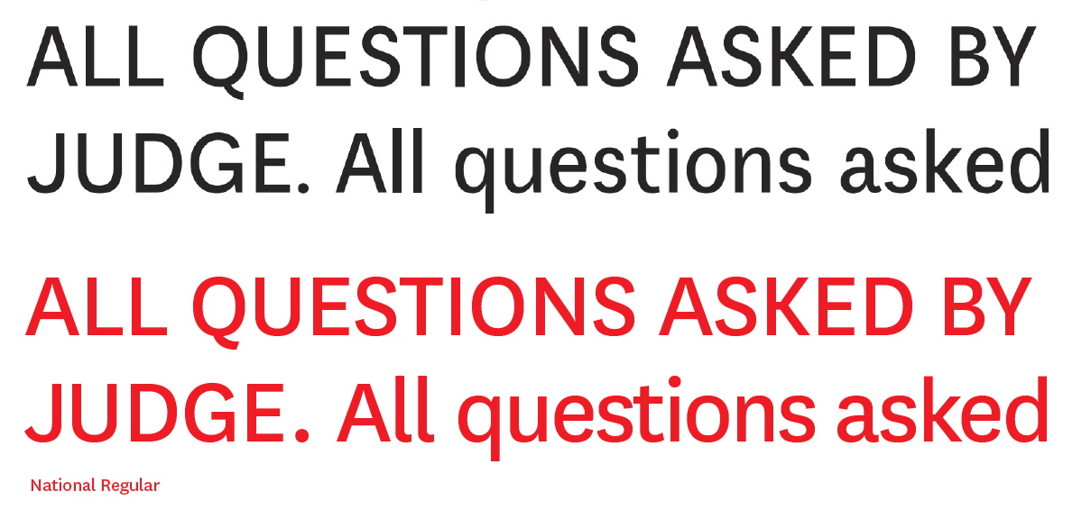
Seems Close to National Reg?
You could just use National and save your self the time of drawing it?
Seems logical to me. Obviously National is drawn better though.
H
Dude, that's not really a nice thing to say. I own National, and I am the first to admit I looked to it to find relations between character widths. It's really a lovely face, but I hope I've managed to add my own flair to it.

>>>>>>>>>Dude, that’s not really a nice thing to say.
HAHAHAHA! you asked for opintions mate dont have a bluey becuase your not getting praised like a toodler who has just learnednot to piss on the floor!!
>>>>>>>. I own National, and I am
no you dont mate!! have you read the flaming EULa??
>>>>>>>>>>>>>>I hope I’ve managed to add my own flair to it.
this si the funnienst thing i've seen since that awful g typeface in this one: http://typophile.com/node/54942
THIS WOULD be a perfect font for myfonts!!! good on yer mates!!
-----------------------
Chopper Reid says "Harden the **** up".
I both own National and I have read the EULA. Here's a link to the process: http://www.typophile.com/node/55857
I've been looking at other grotesques for reference as well. I see your point on my font being close to National when compared. "I hope I've managed to add my own flair to it" should not imply basing it on National, though I understand you can read that into it. I'm not a native tounge:)

I think he meant that you don't own National, but that you have a license to use it.
I think it would be a good thing to take your design and steer away from National very intentionally from now on. I see where you tried to add your own flair to it, but you can probably add much more of that.
Thanks for clearing that up, Jelmar. I'm thinking in the same direction regarding the design. Intentionally steering away:)
Captured from web.archive.org on 15 Apr 2015. view this capture