
Here's something I've been cooking up. The working title is "Noget". I need some fresh eyes to see what I can't.
| Attachment | Size |
|---|---|
| example.pdf | 65.54 KB |
| example_update4.pdf | 63.72 KB |
| example_update5.pdf | 64.26 KB |
| example_update6.pdf | 68.95 KB |
Here's something I've been cooking up. The working title is "Noget". I need some fresh eyes to see what I can't.
| Attachment | Size |
|---|---|
| example.pdf | 65.54 KB |
| example_update4.pdf | 63.72 KB |
| example_update5.pdf | 64.26 KB |
| example_update6.pdf | 68.95 KB |
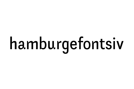

Nice. Just two ideas:
Actually, the tails fill in pretty neat in small sizes, but I am considering leaving it on the u. Not sure about the a. It's a very important letter to me, also the notch and the tail is a signature result of the technique and tools (a flat nibbed pen ran twice, first vertically, then horisontally). I'll look into b/g.
I'm still in Illustrator, so don't pay attention to the spacing.
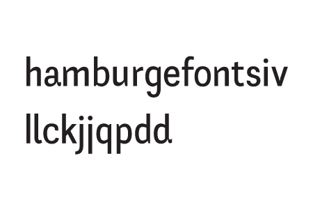

Hrm, if you're going to use the flourish on the d and the a, I'd probably make the j and r also use it and possibly the f, or at least see how they'd look with it. The r as it is now looks a bit clipped at the join compared to the m, n, and p, although all of them seem a bit slim. The q on th eother hand looks great.
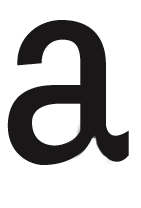
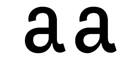
Maybe for the a (before doing other changes mentioned above), if you move over the join for the tail a little to the bottom left and then pull down more for the curve on the bowl. Right now, it feels like it's been pushed way over to the right. Something more like this (I didn't touch the bowl in this):
«El futuro es una línea tan fina que apenas nos damos cuenta de pintarla nosotros mismos». (La Luz Oscura, por Javier Guerrero)
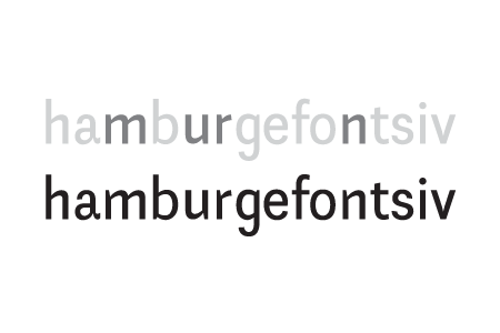
Top post updated. Thanks for commenting the a, Matt. I made it slightly less dramatic. It works better but still keeps it's spirit.
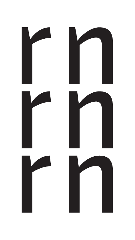

i'm only going to make one statement at this point and that is that your curves seem inconsistent. whereas the curve-to-straight portions of the h, m, n, u seem to have a certain speed and tension, the curves in a, e, o, s feel much more relaxed and easy. before going further, you should try to reconcile these two elements with each other. that is my own personal view.
Paul, thanks for responding! Are you suggestion more of a typical grotesque h m n u r curve?
I started out with a pretty clear concept based on some sketches I did and the method described earlier. The curve-to-straight thing was in there right from the start and I'm not sure if I'm comfortable moving so far away from what I first intended.
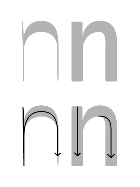
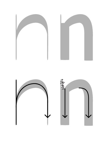
Check the latest pdf!
I think b and g need a similar treatment as well, and it begs the question: Am I loosing to much of the original style?
Binocular g and a new b in the latest attachment in the first post.

The new g looks nice, indeed. The a continues to catch the eye, though.
Thanks speter, I'll probably figure out the a sooner or later. I did a brand new g, but I'm not sure if it's worth the hazzle posting it with little to none response.
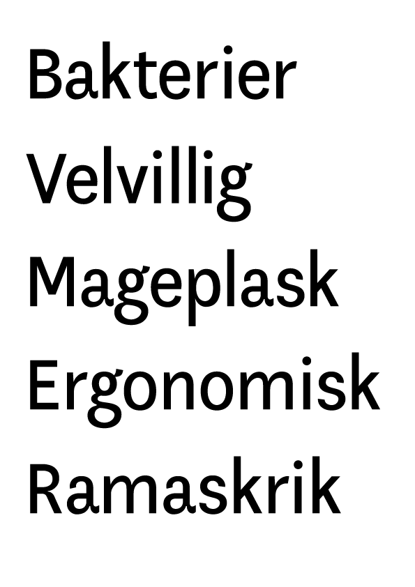
the curves seem to harmonize better now. the split stroke at the tail-join of the a is confusing to me-it doesn't seem to follow any of your usual typeface logic, but perhaps you meant it that way? in any case, the join would be improved if you moved it even slightly more towards the bowl of the a. the spine of the s is incredibly wonky, especially as it thins noticeably through the middle. the k feels static to me. most likely it's just the angles-they don't seem to jive quite right. i like the g, i might make the upper loop larger and the lower smaller, but that may just be my own personal taste.

Is it just me, or does the g seem to have a slightly different weight than the rest? Maybe it seems that the contrast doesn't vary as much....
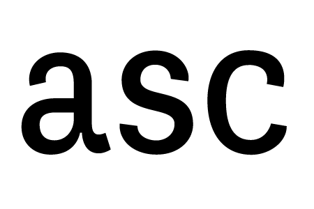
I think the lopsided g ads character. Taste is good :)


And the pdf is updated in the first post.

This is coming along nice, though I'd like to see a little more invention in the upper case, it looks perhaps a little bland compared to quirkiness of the lower case. I wonder if the round shapes are a little anemic compared to the straight stems? It's hard to tell from the parts-generated letters in the pdf, but I think there might be some weight-discrepancy all over. That might actually work on a face like this, but I'd look into it.
Thanks, Sindre. Blodfattig? Hehe.

I'm sorry, but you need to get rid of those arrows, like yesterday.
hhp
What arrow do you mean, Hrant?
In your second and third posts of 3/16.
hhp
Yeah, I was planning on doing a display version with the arrows. Good thing you convinced me otherwise! :p
Is it just me (or my computer) or are some of the longer stems a good bit thicker than shorter stems? Like the j and the alt-j, the straight one looks chunkier. Maybe it's just my eyes plying tricks on me with the way the semi-serifs are placed in there making a sequence like "un" feel like the middle two stems have different widths at the top and bottom. Not necessarily a critique, just be aware.
I echo Dan about the g, although I think it might have the same weight as most of the others, but the e and o and f to me seem a bit thin. The R looks somewhat anemic, but what might work better is to lengthen out the P R E F characters, which have a lot smaller horizontal width, so maybe make them as wide as the V or N might help.
Also you P and R have quite distinct bowls on to, is this intentional or just testing two types? If so the one you've got on the R is the one to go with.
«El futuro es una línea tan fina que apenas nos damos cuenta de pintarla nosotros mismos». (La Luz Oscura, por Javier Guerrero)
Frode, I was trying to convince you to not
think of typographic letterforms as being
built up with any directionality. Because
that can only reduce their functionality,
especially for text.
hhp
Captured from web.archive.org on 13 Jul 2014. view this capture