Typophile

A (very) simple question about OpenType Stylistic Sets

Claudio Piccinini

Although I have read about the issue occasionally in a few threads, I am unsure about this question:
Stylistic sets are ideally created to address a range of glyphs substitution, and I also think it works better to use them for full range substitutions (i.e. Swashed forms, Mediaeval forms, etc.)
Inversely, I may just wish to have a single alternate glyph, which may allow the user to have – let's say — a more traditional [t] than the one I have decided to be standard.

In these cases, how do you think it's better to place that simple alternate?
I know some designers (for example, Karsten), like the idea of using Stylistic Sets as well, even for a single glyph, but I'm not so attracted by this "multiplication of the sets"… :)
Would it be fine to use [salt], or maybe I could just include the glyph and not address the automatic handling of the substitution?
After all, in lead we just entered the single alternates manually… :=)

In my experience typesetting things with alternate glyphs I found it incredibly useful to be able to access each alternate in separate stylistic sets. So your t.alt would go in Stylistic Set 1, a Q.alt in Stylistic Set 2, etc.

This allows for someone to easily select a block of text and toggle each alternate individually. You should do it this way, unless there's a conceptual reason to group things together in a single feature. Or unless someone with actual technical knowledge of proper opentype etiquette wants to weight in.

Thank you. As I said, Karsten Lücke is in favor of the option you suggest, but I'm not the number one supporter of excessively automated things, since they tend to compensate a lack of professional skills which you should acquire to lay out a page, no matter if you see it as a "graphic designer", graffiti artist, stonecarver or plain street guy.
I already have conceptual sets, but when it comes to single glyphs I think the ability to access them relies also on how good is your layout software (and interface).

So I'd like to hear the procedures of others to see how they behave when there is a single (or few) alternate glyphs which by no means represent a stylistic set, but just a viable alternate form.

As primarily a type user, I use the stylistic sets for single glyphs when I want them "on" or "off" always in a text. For example, I usually draw up an alternate old style "1" for fonts where the os "1" looks like a small-cap "I". If I don't, sure as shootin there will be an editor who insists on not using os figs at all, because of that "1." That alternate "1" goes in a stylistic set, which will be on for the whole job; I'll switch it on in the basic paragraph on which all other paragraphs are based.

Though it is a set of two, I've also taken to making angle brackets for text fonts. I have a stylistic set where I switch them with the greater and less glyphs. The reason is, many text's have URLs where the author insists on using the form <http> as a part of the reference. So, for the bibliography paragraph style, I'll switch on that set & not think twice. If the text proper has such constructions, you have to search the text & make sure that "greater" and "less" aren't used mathematically. If not, again, I'll switch on the set in the basic paragraph style.

On the other hand, glyphs intended for occasional use should probably not be a part of a stylistic set, but placed by the compositor by hand. An obvious example would be swash letters, though that's handled by a separate feature.

For me, it is a matter of how stylistic sets are best used, not "how many" members a set has.

FWIW

So are you saying for each 'alternative stylistic character' (stylistic A, or a stylistic O), it should be placed in a separate set (SS01, SS02)?

I always wondered about that… if multiple characters are in one set the user might only want one activated over the other, no problem if it's a small amount of display text to edit but for large bodies of text having to turn on a stylistic set, only to go back through and deactivate a specific character within that set would be a lot of work.

Charles, that's interesting. So it is the old style 1 and not the old style "ring" 0 that's the problem for some editors?

Here on Typophile some folks have strongly objected to the ring old style zero on aesthetic grounds. But they don't usually mention the one, which looks like a small cap I, as you say.

I have just completed doing small caps figures, and in the process have finally understood the logic behind the design of the old style 0 and 1. --The clue was that I needed to narrow the old style 2 to make it harmonious with the regular, narrow 0 for the small caps, as opposed to old style figures.

By hanging the 34579 and raising the 68, the oldstyle design enables the part of the figure between the base line and x-height to have a width and color similar to the lower case letters, and still look properly proportioned to be recognizable. That's why they fit so well with text.

The 012 pose problems. You can make the 2 wide and be still recognizable, which is what is normally done. You could also make the top into an ascender, which I think a few typefaces do.

Making the 1 like a small cap I enables you to stretch the serifs, and push it wider than the one with a barbed top, so it fits better with the other letters and still looks not too bad. And after all it is differentiated from the lower case i and the cap I, so it works in text.

Making the 0 wide, as the design concept demands visually, can confuse it with the lower case 'o'. Hence the 'ring' or relatively unstressed zero solves the problem by avoiding confusion and keeping the width. I think the ring 0 can also look decent by 'cheating' and making it a bit oval instead of circular, and a bit stressed. There are more difficulties, as people here have pointed out, with heavier weights--which old style fonts originally didn't have.

But what I am realizing is that because there is no ideal solution you have to choose your poison, so to speak. If you have a wide stressed 0 it is going to be confusable with the 'o'. If you have the barbed 1 it is going to look less harmonious with the other old style figures.

To get around to the point, I think that if you have old style figures, particularly in a seriffed font, the situation argues for putting both an alternative old style barbed 1, and alternative stressed, wide old style zero each in its own stylistic alternative set. Then people can choose among four options, and "sei gesunt", go off in good health.

Personally, I prefer the original old style design, but then I'm old fashioned.

Charles, that’s interesting. So it is the old style 1 and not the old style “ring” 0 that’s the problem for some editors?

Yes. The ring zero, or worse, the reverse-stress "Stempel" zero are problems for graphic designers, but usually not editors. Most of the designers I know just avoid a font if they can't abide a glyph, editors are different creatures. And it is a little different, as there are those lining numbers for the editors latch on to.

I have been known to make up alternate zeros as well, for the few designers that ask. I don't countenance the argument that a zero that looks like a lower-case "oh" is confusing, for the simple reason that you almost never see an "oh" in the middle of a string of numbers. And in the style we usually (have to) follow, single-digits are usually spelled out, so you don't see just a zero by itself.

To somewhat tie this in to the original question, I suppose I'd put an alternate zero in a stylistic set by itself.

I'm more sanguine about alternate alphabetical characters -- the only one's I can thing of off-hand would be lower-case a (one & two tiered), and maybe the lower case g & y. If you're going to switch the g & y, with most designs it is best to do them together.

I do think a text typeface with too many alternate glyphs is just a real chore to use. You have to hope the font designer provided adequate notes with the font. In any case, if all those 20 stylistic sets are filed up, using the font is going to get confusing unless there is a real logic to it all. Display type could be a different matter, but then why not just get the glyphs from the glyph pallet where you can (somewhat) see what you are doing?

Charles, I think you are right practically that the 0 comes in the middle of other figures, and so is not confusing. The same argument applies to the 1, though, so in theory editors should not be bothered by the small cap 'I' style.

As to the O being confused with the o, I'd have to check, but IIRC originally they made the 012 exactly at x-height, not bigger as we do now, so then it was more of a problem. Here in Georgia you don't notice any problem. But when the year 2010 comes, maybe true old style will look better?

By the way, I suspect hinting makes the 0 and o of Georgia look more different in size here on the screen than they do in print.

Originally, when stylistic sets were conceived, the authors of the OpenType specification throught that they should be mutually exclusive. And indeed, in the user interface of Mac OS X (the Typography palette), they are accessible through a series of mutually-exclusive radio buttons.

But in Adobe InDesign, the user interface treats them as additive, so the user can enable ss01 and ss04, for example, at the same time. And there have been more and more fonts that make use of this notion. I myself am a proponent of that approach as well — or at least, of the notion that it should be up to the type designer to choose whichever method works for him best.

I guess a sensible principle is: one stylistic set should substitute glyphs that should be substituted together (at the same time).

Whatever that may mean in practice. In some cases, it may mean that an entire alphabetic range is substituted by one ssXX feature, especially if the type designer thinks that mixing glyphs from different sets does not make much sense. But if your design has an alternative "R", an alternative "K" and alternative "M", and each of those glyphs is in a way independent of the others, so selectively substituting them one by one does make sense design-wise, I would then by all means put them into separate sets.

As far as salt vs. ssXX is concerned, I've outlined my view here:
http://typophile.com/node/17887
http://typophile.com/node/32399

Best,
Adam

And should you feel experimental, here's some ideas for you:

feature ss01 {
sub a by a.ss01;
} ss01;

feature ss02 {
sub a.ss01 by a.ss02;
sub b by b.ss02;
} ss02;

feature ss03 {
sub a.ss02 by a.ss03;
sub b.ss01 by b.ss03;
sub c by c.ss03;
} ss03;

When ss01 is enabled, a will be replaced by a.ss01.

When ss02 is enabled, b will be replaced by b.ss02.

But if ss01 and ss02 are enabled at the same time, b will be replaced by b.ss02 but a will be replaced by a.ss02 rather than by a.ss01.

In other words, you can design your stylistic sets so that something happens on ss01, something else happens on ss02 and something yet different happens on ss01+ss02.

feature ss01 {
sub a by a.ss01;
sub d by d.ss01;
sub g by g.ss01;
} ss01;

feature ss02 {
sub b by b.ss02;
sub e by e.ss02;
sub s by s.ss02;
} ss02;

feature ss03 {
sub c by c.ss03;
sub f by f.ss03;
sub w by w.ss03;
} ss03;

feature calt {
sub [a.ss01-z.ss01] [a-z]' by [a.ss01-z.ss01];
sub [a.ss02-z.ss02] [a-z]' by [a.ss02-z.ss02];
sub [a.ss03-z.ss03] [a-z]' by [a.ss03-z.ss03];
} calt;

Doesn't make so much sense by itself but illustrates the idea that the stylistic sets by themselves can perform some actions but they can also trigger different behaviors of, say, the "contextual alternates" feature, so in essence, you could have different "branches" of contextual behaviors implemented that way.

BTW, you can even implement separate contextual behaviors within each ssXX feature. The ssXX features do not have to be simple "a by a.1, b by b.1" substitutions.

Regards,
Adam

That gets interesting creating the behaviors with it, didn't realize that was possible, so you basically override the previous set behavior as each additional set is activated depending on how you set it up… thanks for the reply… good information…

"In other words, you can design your stylistic sets so that something happens on ss01, something else happens on ss02 and something yet different happens on ss01+ss02."
That looks very exciting! I didn't think that was possible.
One question from the newbie fraction though: don't many users think of stylistic sets as purely additive and somewhat static, and wouldn't one risk terminally confusing some of them by introducing this kind of cross referencing between stylistic sets? Also because that would imply that as a curious user, you wouldn't just want to try out the 20 stylistic sets in isolation, but also all possible combinations between them – which would probably warrant a rather large manual, or require a *lot* of time playing around with the font.

'So it is the old style 1 and not the old style “ring” 0 that’s the problem for some editors?'

In my experience, the 1 has always been the reason an art director has requested lining instead of old style figures. In some cases this has required changing the font entirely. I've never had a problem when the 1 has a flag serif instead of the I though, and in some cases I've gone as far as substituting a more contemporary 1 from a similar font just to get the design approved.

I’ve never had a problem when the 1 has a flag serif instead of the I though . . .

How about the abbreviation for "Interstate 10", using small caps & os figs?

Adam: But in Adobe InDesign, the user interface treats them as additive, so the user can enable ss01 and ss04, for example, at the same time. And there have been more and more fonts that make use of this notion. I myself am a proponent of that approach as well — or at least, of the notion that it should be up to the type designer to choose whichever method works for him best.

I agree with the sentiment of allowing the type designer to choose whether the ssXX features should be additive or exclusive, but I can't figure out how to make them truly exclusive within the InDesign UI model. One can make the lookups map variants from all sets to the specific stylistic set variants, but the order of the lookups still means that if more than one feature is turned on the later-processed lookups will override the earlier ones, regardless of the order in which the user has turned the features on. So, presuming lookup order follows feature order, if the user turns on stylistic set 7 in the InDesign UI, and then turns on stylistic set 4, the stylistic set 7 glyphs will still display, because that lookup is processed after the stylistic set 4 lookups.

So the user, not the type designer, is ultimately responsible for making the sets exclusive through selection of only one feature at a time.
___

Regarding use of stylistic set features to implement changes to single glyphs, rather than to sets of glyphs such as alphabet subsets: this is not what I had in mind when I defined the stylistic set features, and this is also why there are only twenty such sets. If one wanted to use stylistic sets to mix and match different variants of individual glyphs one would quickly run out of features.

Peter Constable at MS, working with his former colleagues at SIL, have been working on a feature spec for a hundred character variant features.

Peter Constable at MS, working with his former colleagues at SIL, have been working on a feature spec for a hundred character variant features.

This were nice to have and to see it supported in applications. I am very curious for the interface which can give access to so many alternates!

Charles, your arguments and those of others here have converted me. I do think that the small cap "I" style is good aesthetically, but if it's increasingly alienating to editors and some readers, that's for me a decisive argument against making it the default style. And the current old style numbers being above x-height makes the stressed 0 sufficiently different from the o.

So now I'm thinking that the best thing is to follow the lead of this font, Georgia, and use the stressed 0 and barbed 1 as default. I will put the classic style zero and one in an ss00 style group for those who want the traditional look on their old style figures.

Charles_e said: I don’t countenance the argument that a zero that looks like a lower-case “oh” is confusing, for the simple reason that you almost never see an “oh” in the middle of a string of numbers

An aside: in Spanish, “o” is the equivalent for the English “or”, so it is possible to see a sequence like “1 o 2”, (i. e., “one or two”) and some people could read it wrongly as “one zero two” or, if the space between numbers is not big enough, “one hundred two”.

I hope it will never happen to a doctor reading the dose he should give to his patient. :S

OK, good reason to have the zero look different from the "oh." Can be fatter with fonts that have a narrow "oh", narrower with fonts having a wide "oh" -- like Hypatia sans.

Charles, I wish it were that easy to solve--making the old style 0 proportionally much wider or narrower than the o. The problem is that going too much one way or the other and the old style figures--and the 0 needs to be harmonious with the rest of them--won't fit in as well with the text, which is sort of their whole point.

Wow, great response, thank you! :=)

I guess Adam has addressed the core of my question, but I'll be back to read in full later on…

BTW, you can even implement separate contextual behaviors within each ssXX feature. The ssXX features do not have to be simple “a by a.1, b by b.1” substitutions.
Ho do you do that, and which would be an interesting use?
I mean, addressing ligatures is already a sort of "contextual" behaviour within sets, since the more complex they are, you have to address them first (if I recall correctly, heh I'm still a novice…)

Great question about the OsF [1] as well. Later…

About the use of [salt], assuming I am limiting its use to spare glyphs, which is the usefulness of a similar code:

sub b from [b.1 b.2 b.3];

I ask because I have never used other applications than InDesign and basic Apple apps, and I can't figure out precisely how the three [b] variants are accessed in this way.

Addenda: After creating a set for my alternate [t], I have re-read the thread Stylistic Alternatives, and Thomas Phinney's words:

Mark et al: Personally, I would not consider it egregious to have a stylistic set that only affected one glyph. I do think it would be a really bad idea to put completely unrelated things in a single stylistic set, as the whole point of a stylistic set is to get a consistent look, and it’s meant to be applied globally.
Also of note is the idea that ’salt’ is meant to be applied on a single character at a time, and implies a UI that allows the user to pick which alternate they want for the character being affected.

And once again I became undecided where to put my alternate [t]… LOL

Being a single letter it's not a "stylistic set" (although that [t] is also part of a Set where all letters are substituted, but this is not the key).

On the other hand if [salt] is meant to be applied to a single character at a time, what happens when it contains various character substitutions? If I use [salt] for the [t], I will have it currently inaccessible in InDesign, and then if another single alternate needs the same treatment what should I use?

Now I wait for Adobe and Microsoft to tell me what I should do… :P
(not a thing that over-worries me, in the end I think I will end up putting it somewhere just to have it addressed by [aalt]).

Or maybe I'm just not done for the code… :P

I ask because I have never used other applications than InDesign and basic Apple apps, and I can’t figure out precisely how the three [b] variants are accessed in this way.

The idea behind OT one-to-one-of-many enumerated substitutions is that an application could provide a dynamic mini-palette of variants for the user to select from. So, for instance, you would select a character, apply the [salt] feature, and up would pop a little palette showing the variant forms available for that character. This is similar to some of the input method editors for Chinese characters, in which one types a series of phonetic characters and is presented with a palette of the possible Chinese characters.

I'm not sure if anyone has actually tried to implement this aspect of OT in a UI. Perhaps Apple? It would adapt perhaps more easily to their approach to typographic feature menus than to some others.

Thanks John, I guessed that. This reinforces my idea that, as of now, the [salt] feature is not so useful, unless the user interface will provide this.
Do we have to wait some Italian developing a Tasmeem-like software for setting advanced Cancelleresca to have these luxuries in Latin? :=)

Regarding use of stylistic set features to implement changes to single glyphs, rather than to sets of glyphs such as alphabet subsets: this is not what I had in mind when I defined the stylistic set features, and this is also why there are only twenty such sets.

John, what exactly did you have in mind? Can you give a specific example? The examples in the spec (Poetica and Zapfino) are very general.

As I understand it, a stylistic set is a set of alternate glyphs that changes the appearance of a typeface when they are used. I don't see any logical reason why such a set could not consist of a single glyph (possibly including its related variants such as accented forms) as long as it changes the appearance of the typeface when it is used. The fact that there are only twenty possible sets does not necessarily have a bearing on this issue, unless you have more than twenty alternate glyphs that you want to use in this way.

What I had in mind when spec'ing the Stylistic Set features, and discussing them with folk at MS and Adobe, were exactly typefaces like Zapfino and Poetica in which there are sets of variants that a) are harmoniously consistent with but distinct from the other sets and b) harmoniously consistent within themselves. If you consider the sets of Poetica letters with formata and corsiva extenders, you have a pretty good idea of what I had in mind. At the time, we had recently worked on the Apple version of Zapfino, and knew that Linotype would want a mechanism to address the variants in an eventual OT version, and that Adobe were facing similar needs for Poetica and perhaps some other designs.

Of course, the definition of what constitutes a ‘set’ for such purposes is vague or, rather, design-specific. I wouldn't try to assign a minimum a quantity of glyphs, but would try to rationalise sets in terms of consistent variation of related shapes or concepts, e.g. ascenders, descenders, terminals, single- vs double-storey a and g, etc. Obviously, what happens to a base letter may be expected to carry across to diacritic forms of that letter, but these would not necessarily constitute a set to my way of thinking, unless the base letter varied in some unique way that was not applicable to any other letter.

Some of my colleagues very quickly adapted the stylistic set features to access more finely granulated and additive variation, facilitating easy mixing and matching of variants of individual letters. I can't blame them because there were no similarly useful and widely supported layout features specifically for individual characters. But I knew it would only be a matter of time before the limit of 20 stylistic set features became an issue for such usage, and I'd say that this became a significant problem for some in 2008. For example, SIL are developing fonts for large numbers of languages with fluid orthographic norms and inconsistent interpretation of letter shapes, so they need a mechanism to allow users to mix and match desired forms for individual characters. Critically, the variation in forms is not a consistent stylistic feature applied across related shapes, but fundamental inconsistency in the shape of letters that Unicode considers a single character. They already have defined more than twenty such variations. Another example is that of the very complex OT Arabic font being developed by Idris Samawi Hamid, which requires a mechanism to mix and match multiple stylistic variants of individual letters in a free way. Again, the number of variants exceeds twenty, and are not classifiable as related sets.

So we're at a point where one of two things needs to happen: either we massively increase the number of registered stylistic set features, and in the process redefine the purpose of those sets and abandon their original intent, or we register new features specifically to address single character variants and maintain a distinction between that functionality and that of set variation. I favour the latter for a couple of reasons, not least because SIL and MS have already come up with a viable feature spec (including, by the way, name string indexing, allowing font developers to link human-friendly menu names to features, e.g. 'Left hook Y' or 'Right hook Y'; a similar mechanism is spec'd to be added to the existing stylistic set features). The other reason is that rather than having a hundred stylistic set features -- with no very obvious way to tell whether an individual feature applies to a set of letters or to an individual letter--, we would have twenty stylistic set features and one hundred character variant features, which a font developer could make interactive.

as a graphic designer, i don't mind having just one glyph per stylistic set. especially if i relly want that single story lowercase g, but nothing else, it's a lot easier to make that change globally rather than doing a find/replace.

i like the way Neutraface No. 2 Text handles this (especially cap M, lower a and g).

http://www.houseind.com/fonts/neutrafaceno2

>human-friendly menu names

Yes!

so it is possible to see a sequence like “1 o 2”, (i. e., “one or two”) and some people could read it wrongly as “one zero two” or, if the space between numbers is not big enough, “one hundred two”.

Actually, "1 or 2" in Spanish would be written "1 ó 2" and the accent is placed for precisely this reason.

«El futuro es una línea tan fina que apenas nos damos cuenta de pintarla nosotros mismos». (La Luz Oscura, por Javier Guerrero)

Thanks for the explanation, John. It seems that affordances inevitably lead to unanticipated (or unintended) usage.

Hypothetically, if a typeface had only one alternate (for example, a normal "t" and an alternate "t"), would it violate the spirit or letter of the stylistic sets spec to create a set that only affected the "t"?

Incidentally, I think the proposed single character variant is a great idea.

Mark: Hypothetically, if a typeface had only one alternate (for example, a normal “t” and an alternate “t”), would it violate the spirit or letter of the stylistic sets spec to create a set that only affected the “t”?

I think it would certainly violate both spirit of the stylistic set features, and probably the letter too: I would say of such a font that it has no stylistic sets, and in terms of existing layout features [salt] would be appropriate. But since the [salt] feature is inadequately supported, it is difficult to recommend it.

The human-readable names for stylistic sets are already supported in AFDKO 2.5.

John,

1. How many glyphs is your minimum for a stylistic set?

2. Why, apart from the fact that it has not been originally conceived that way, does having one alternate glyph in a set violate the "spirit" of the stylistic set features?

A.

Adam, does that mean you can use them in a font, and Adobe's programs will read them now? Or does it mean that one step toward this has been done?

@William: You can put them in a font. Adobe has not made any statements about when they'll be supported in applications.

@John et aliae: The new character variants are a fine thing in principle. The problem is they require significant UI to work at all, and this means they'll probably never be supported by MS Office or Adobe Creative Suite. At least, "not in the foreseeable future," if "never" is too strong a word.

The problems with 'salt' for this purpose are (1) that it can't be easily applied globally across text for a specific affects, and (2) it doesn't easily do a consistent affect even for a base letter plus its accented variants, or for both the tabular and proportional versions of a number. (There are few basic English letters that don't have accented forms in a reasonably large multi-lingual font.)

I don't have a good solution, really. My personal fallback as a type designer and font developer would be to use stylistic sets for now, while badgering Microsoft and Adobe. But I don't hold out much hope on that latter front. Plus, there's a tragedy of the commons issue: we'd all be best served by getting apps to support the character variants feature, but we'd most effectively pressure the app/OS people by building lots of fonts that use that feature... yet we'd be doing the best thing for ourselves in the short term by ignoring the feature in favor of stylistic sets. Ouch.

Cheers,

T

Adam, read my lengthy reply to Mark Simonson. I don't have a quantitative minimum for a stylistic set. The set is a concept, the contents of which are recognisable by their relationships. Since a single glyph possesses no such relationships, it doesn't meet the definition of a set, and I believe that using the stylistic set features for this purpose is a hack response to the lack of a viable alternative feature and UI.

Thomas: The new character variants are a fine thing in principle. The problem is they require significant UI to work at all, and this means they’ll probably never be supported...

But this is also true of any extension to the existing twenty stylistic set features (especially if one wants to take advantage of human-friendly name strings), and those have already been demonstrated to be insufficient for single character substitutions. Any advance on the present position will require significant UI, and this may well mean that it doesn't happen, or happens only slowly. But in that case why not spec it the right way? At least we'd be pretty much guaranteed that it will be supported in XeTeX. :)

yet we’d be doing the best thing for ourselves in the short term by ignoring the feature in favor of stylistic sets.

For those who want short-term and possibly partial support for character variants via the stylistic set features, there's nothing to stop them implementing substitutions in both those features and the new character variant features. It isn't an either/or situation.
___

Of course, another approach to this whole issue would be to start defining Variant Selector sequences for common character variant forms and propose them to Unicode. That solution would have the benefits of standardisation and interoperability.

@guifa, who said: Actually, “1 or 2” in Spanish would be written “1 ó 2” and the accent is placed for precisely this reason.

Yes, I remembered that this morning. I agree with you, but not completely. As Jorge de Buen says in his Manual de diseño editorial (third edition), the accent would only be applied “In the strange case of a conjunction ‘o’ in risk of being confused with a zero” (p. 417). This would be certainly the case.

But, if there’s no room for confusion (lining numbers, for example), the accent is pointless.

Anyway, I think it is better for everyone to design a zero different from the letter o. Someday your font could find a lazy or ignorant editor or graphic designer. Or maybe simply someone that believes that there’s no such confusion. Or a book that changes from lining numbers to oldstyle numbers in the next edition, &c.

But maybe we are a little far away from the main subject… A new thread?

————

PS: Actually, the most common option for “1 o 2” is “uno o dos”. ;-)

@John:

I wrote: "The new character variants are a fine thing in principle. The problem is they require significant UI to work at all, and this means they’ll probably never be supported..."

You replied: But this is also true of any extension to the existing twenty stylistic set features...

No, it is not "significant UI work" to extend an existing menu system to support X additional entries that work *exactly* like the existing entries. No need to consult a UI designer, and the programming can be done in minutes. That's the kind of thing that I would have expected to probably easily get into a new version of InDesign, when I was at Adobe.

...(especially if one wants to take advantage of human-friendly name strings).

That part is true. Getting support for more stylistic sets (in apps that already support them) should be immeasurably easier than getting support for human-friendly names for those sets, or support for the character variants feature.

Cheers,

T

John,

> The set is a concept, the contents of which are
> recognisable by their relationships.

Oh I see. But "a" and "á" do have that relationship, so if I put the letter and its accented variants into one set, that must be fine, right? :)

A.

John: The set is a concept, the contents of which are recognisable by their relationships. Since a single glyph possesses no such relationships, it doesn’t meet the definition of a set, and I believe that using the stylistic set features for this purpose is a hack response to the lack of a viable alternative feature and UI.

Thank you! Finally you nailed my problem perfectly! :=)

Considered all that has been said, I have taken my decision:

My two stylistic sets meet precisely John's definition. Since it's not a "text typeface" they even meet it more, as they are conceptual. So they are clearly "Sets".
I think people may use the Stylistic Set workaround as they wish, until a "pop-up" function or a full support of [salt] will be available in UIs (as Karsten does), but I entirely agree it doesn't make sense to consider those "Sets", and that it's a potentially confusional method for unlearned type users.

My additional [t] (which is also part of ss02 but I wished it to be also a single alternative) will go into [salt], together with a few other variants (I have a [G.swsh01], for example), and I will not have a Stylistic Set for any of those.

Adding all the features to [aalt] will make all the variant letters available in InDesign Glyphs palette.

That should meet Thomas' long-term condition:
Getting apps to support the character variants feature, while pressuring the app/OS people by building fonts that use that feature...

Now some questions:

@John: What are precisely the "new character variant features" you talked about?

@Adam: How could you possibly use "human-readable names" for the Sets if most applications will not show them? If I use FontLab to generate the typeface, is there a way to add those names?

Many, many thanks to you all for the valuable information and for having helped me to clarify the nature of the problem, in my specific situation ("display" typefaces).

Adam:Oh I see. But “a” and “á” do have that relationship, so if I put the letter and its accented variants into one set, that must be fine, right?

No, because á is just a with a combining mark that has been ambiguously encoded for backwards compatibility reasons. So there!

What are precisely the “new character variant features” you talked about?

These are currently being discussed by OT spec stakeholders. They have been proposed by Peter Constable at MS and folk from SIL.

The status of character variants is that they are pretty much accepted for 1.6. Who all will support them is another question, but I think the feature will almost certainly happen.

Cheers,

T

Thanks, Thomas. I missed the last round of OT 1.6 discussions, so wasn't sure on the status of these features.

Heh: I just noticed the subject line of this discussion. Not such a simple question after all!

John:

first you wrote:

> The set is a concept, the contents of which are
> recognisable by their relationships.

then you wrote:

> No, because á is just a with a combining mark that has
> been ambiguously encoded for backwards compatibility
> reasons. So there!

So first you say a set are glyphs recognisable by their relationships. Then you say that "a" and "á" are glyphs that are recognisable by their relationship, which is "á is just a with a combining mark that has been ambiguously encoded for backwards compatibility reasons" — to me that is a very recognisable relationship. But then you say, "a" and "á" are not a set.

I cannot follow.

> If I use FontLab to generate the typeface, is there
> a way to add those names?

Certainly not if you use FontLab, as this is an ancient product (ceased to exist with version 4.6), and also not if you use FontLab Studio, as the current version 5.0.4 uses Adobe FDK for OpenType (AFDKO) version 1.6 to generate OpenType Layout features. Support for human-readable names for stylistic sets has been added to Adobe FDK for OpenType 2.5, which has been released only six weeks ago. AFDKO 2.5 will be integrated into FontLab Studio 6, and then you'll be able to add human-readable stylistic set names easily.

> How could you possibly use “human-readable names”
> for the Sets if most applications will not show them?

The same way people used Unicode in their fonts in 1996 even though most applications did not support it. At some point, applications caught up.

There is a chain of things that need to happen: first, you need a certain functionality registered in the specification (which is the case now, with OpenType 1.6), then you need an development tool that allows you to add this functionality (AFDKO 2.5, which will be incorporated into FLS6), then you need some fonts that actually have this functionality included (the OpenType fonts that are yet to be developed), and finally you need some applications that expose that functionality (the developers of those apps need some fonts to test the functionality with, so they won't likely develop the functionality without any test fonts in place).

Regards,
Adam

Hi Adam, thanks for the very clear explanation. For now I will keep my Set names as mere comment tags.

I keep calling FontLab simply FontLab, since "Studio" evokes confusion in my mind, as it was my beloved FontStudio (from Ares/Letraset), the program I used before FontLab.
Yes, of course I'm using FontLab 5.0.4, and I can't wait for version 6. :=)

On the [a] issue: seriously, I can't understand what you don't understand: [a] and [à] are not "glyphs in a rleationship", but the same glyph. The fact they use different Unicode values is probable to make them more easily accessible, but an accent or diacritic does not make a letter turn into another letter.
The relationship within Sets should be somehow intrinsecal, and defined by a principle, be it historical, experimental, cultural, or others. I agree it doesn't need to be a full-range substitution: even a few letters can result in enough context for a Set.

A classic example could be the Italic Set Karsten embedded in Litteratra: here the Italic (which is, in fact, a style more used than others) is treated within the typeface instead of outside.
Some people tend to prefer the opposite approach: OpenType or not, styles are considered better accessed as separate font files as it was previously, only with the benefit of Unicode full-range support.

Examples of a more experimental nature could be the four Set variants Nick Shinn has included in Duffy, which they cover all the alphabetic range, and cultural examples may be what House Industries has done with a recent script family which addresses different styles of Latin lettering sourced from varied context of countries and cultural zones.

> [a] and [à] are not “glyphs in a rleationship”,
> but the same glyph

This is the first time ever that I hear such a thing.

> an accent or diacritic does not make a letter
> turn into another letter.

Oh? That's news to me. Educate me.

Let's take the letter n.

Now let's take the following characters:
ñ h ń ȷ m ɲ j ŋ

Which of those characters are "the same letter as n" and which are not, and why?

Are the letters H and Ĥ the same letter?
Are the letters H and Ħ the same letter?
Are the letters L and Ľ the same letter?
Are the letters L and Ł the same letter?
Are the letters E and F the same letter?
Are the letters F and Ƒ the same letter?

(Seriously.)

Best,
Adam

Adam, a and á -- and à â ã ä å etc. -- do not form a stylistic set because they are a single letterform with different marks. That they are also separate characters in Unicode and may be rendered using separate glyphs is simply a technical accident. In terms of the stylistic change it is a single substitution: this letterform a to a different form of the same letter.

Now let’s take the following characters:
ñ h ń ȷ m ɲ j ŋ
Which of those characters are “the same letter as n” and which are not, and why?

ñ ń are the same letter

h ȷ m ɲ j ŋ are different letters

Let me put it this way: if the relationship between two letterforms is one of identity -- they are identical (not necessarily in the sense of having identical outlines, but of being clearly recognisable as the same form of the same letter) -- then a single stylistic substitution is being performed. If the relationship between two letterforms is that of difference but with some similar features and those features are changed in the same way by the substitution, then you have a set substitution.

Are the letters H and Ĥ the same letter? Yes.
Are the letters H and Ħ the same letter? Probably.
Are the letters L and Ľ the same letter? Yes.
Are the letters L and Ł the same letter? Probably.
Are the letters E and F the same letter? No.
Are the letters F and Ƒ the same letter? Probably.

Where I have written yes, it is because the letterform-part of the diacritic is identical and therefore consistently follow the same stylistic variations.

Where I have written probably, it is because there is an identical relationship between this diacritic and a base letterform in most designs such that a stylistic variant in one would be consistently followed by the same variation in the other; however, in some designs this might not be the case due to idiomatic conventions.

Where I have written no, it is because there is never a case where these two are considered diacritic forms of the same letterform. They are different letters that share some features in common; hence they are logically put into a stylistic set if stylistic variation modifies these shared features in the same way.

Here is another way to look at it:

Imagine all text is subject to Unicode normalisation form D (fully decomposed), and imagine that fonts only use GPOS mark positioning to display diacritic letters. You wouldn't have a à á â ã ä å: you would only have a. Hence, one can say that there is only a single substitution in stylistic variation of that letterform, not a stylistic set.

On the other hand, if fully decomposed text still makes a distinction, as it obviously does, between E and F, then those are clearly separate letters that, if following the same stylistic variation belong in a set.

The diacritic letters that do not have canonical decompositions may or may not belong in sets. I argue that if the basic form of the letter is identical to that of another letterform, then they share in a single substitution and not a set substitution. So, for example, a stylistic variation affecting the o-shape in o and ø would be a single substitution, but a variation also affecting œ would be part of a stylistic set substitution.

I don't claim this is the only way to look at this question, but insofar as the Stylistic Set features were intended not for changes to individual letterforms, this seems to me the best way to draw the distinction between what belongs in such sets and what should be in [salt] if that feature were adequately supported and what should be in the new character variant features when they are approved and, hopefully, supported. And we do need to have a basis for such distinctions if we are going to recommend any sensible use of these similar layout features.

John,

so n and ń are "the same letter" in this context we are talking about. Are ȷ and j the same letter? Are a and ą the same letter? Are L and Ł and same letter?

I guess it would be useful if we could work out some reliable terminology and distinctions in this realm, especially because the conceptual or "ideal" set-up is often not quite the same as the de-facto or technical set-up. The best example may be something like the ogonek: is ą a base letter with a mark or is it a new letter? Technologically, there is no clear answer: some fonts provide an ą as one solid outline, others as a composite glyph consisting of a and the ogonek, and yet others include a solid outline for ą but in addition include OpenType GPOS mark attachment code for dynamic positioning of ogonek under any letter.

So is your criterion the spatial separation of ink? Is it the fact of touching or overlapping that constitutes identity? Is the glyph's identity a "closed shape"?

If "á" is "the same" as "a", but "ą" is different from "a", what's with "Å" (where in some typefaces the ring is part of the letter and in others it is a mark)? What's with the semicolon? (Spatial separation of ink).

In other words: if we agree on a working term of glyph identity to separate it from the font-technological meaning of "glyph" and to denote this certain unique characteristics that makes one glyph differ inherently from another, I gather that your position is, a stylistic set can be formed only if there are two or more glyph identities involved. So now we need a clear agreement on what exactly this glyph identity is :) (And perhaps a different term.)

A.

John,

up until 2006, the Swedish language considered V and W to be diacritic forms of the same letter. In Polish orthography, Ą is considered a diacritic form of A but Ł is not considered a diacritic form of L.

> That they are also separate characters in Unicode and
> may be rendered using separate glyphs is simply a technical
> accident.
(...)
> Imagine all text is subject to Unicode normalisation
> form D (fully decomposed),

Right. So you say Unicode is "technically accidental" on some counts but should be used as an authority on others? That relativist approach does not quite work when at the same time you're trying to set some sort of objective standards such as "The set is a concept, the contents of which are recognisable by their relationships."

You know that I am a relativist, or a subjectivist at the very least. But then of course I also say to type designers "do what you want with your stylistic sets" (because, indeed, they are yours).

Of course, I, too, like objective standards, simply because we work in a service-oriented industry and our products (fonts) should meet some expectations. So I'd be interested in setting down some objective rules for this particular case.

a and á — and à â ã ä å etc. — do not form a stylistic set

Whether their distinctiveness is "accidental" or not is completely irrelevant to me. IMO, if you want the same effect on all of them (which I'd think you normally would), then it would make plenty of sense to group them in a stylistic set.

If you were constructing those forms through combining marks, you'd get the functionality of changing them all at the same time. It should be practical to get the same effect without having to use combining marks....

Cheers,

T

Adam, read what I wrote in response to your first set of ‘is this the same letter as this?’ questions. Also note that I used the term letterforms, since a letter is an orthographic concept: the same diacritic might be considered a letter in one alphabet but not in another. The term letterform clarifies that we're talking about shapes and the effect of variant substitutions on shapes.

So, once again: If the letterform-part of a diacritic is identical to the base letterform and to other diacritic forms of that letterform, and therefore consistently follows the same stylistic variation patterns, then the mapping of that letterform to a variant form is a single substitution, not a set substitution. Nowhere did I say that this was a matter of spatial separation of ink: it is a matter of whether there are corresponding letterforms and whether (see last paragraph below) the designer wants those corresponding letterforms to be affected in the same way by the substitution.

Remember, I am making these points in light of the upcoming registration of one hundred new features for character variation, and trying to come up with a distinction that will guide developers in deciding what to include in those features and what to include in the stylistic set features. This is a separate issue from whether it is ‘kosher’ for someone to put a à á â ã ä å into a stylistic set feature today. In the future, we are going to have distinct features for distinct purposes, and we need to determine what kind of substitutions belong with which features.

Let's come at this from the other side of the future: let's suppose that the character variant features are registered, published and supported. Now, should the substitution that maps double-storey a à á â ã ä å -- and also ā ă ą ǻ ȁ ȃ ȧ and any precomposed-glyph representations of a plus combining mark -- to corresponding single-storey a variants but put into a character variant feature? Or into a stylistic set feature? Remember, the substitution only affects the a letterform (consider that we're dealing with a typeface like Helvetica in which the lowercase g is already single-storey, so there is no multi-letterform set to be formed, just this one lowercase character and its diacritic forms).

It seems completely obvious to me that this is a single character variant feature substitution, changing the appearance of a single letterform. And this is the only basis on which it is sensible to make the distinction between the purpose of the character variant features and that of the stylistic set features.

Now, as Thomas indicates, what matters in the development of a specific font, is what the maker wants to happen when features are applied. And it is this desire that determines what letterforms and diacritics should be grouped within a single character variant feature. So your question about whether a and ą are the same letter is the wrong question: the right question is whether the font maker want ą to change in the same way as a when a particular character variant feature is applied. But what I think is obvious is that the choice is between whether to put both substitution in one character variant feature or in separate character variant features, and not whether the substitutions belong in stylistic set features. If the character variant features are to have a meaningful distinct purpose, then variations that only affect single letterforms must not be treated as stylistic set substitutions; otherwise, you will have a permanent grey-area between stylistic sets and character variants.

Oh? That’s news to me. Educate me.
[…]
(Seriously.)

Seriously? :)

Reading the definitions it seems to me that a letter modified by a diacritic may be treated either as a new, distinct letter or as a letter–diacritic combination, so in the end it seems what really matters is the identity of a letter.

Although I hardly understand the reason (for example) for which you should tread a letter with a modifier as accented in one language and as another letter in another.
If [ł] is not an [l] what sounds does it represent? Because if the sound is completely different, who called it "lslash", and why? And if the sound is l-based, it remains an [l], which has just a variation.

That relativist approach does not quite work when at the same time you’re trying to set some sort of objective standards such as “The set is a concept, the contents of which are recognisable by their relationships.”

"Relativist approaches" never work, but we do not hold "absolute approaches", and I simply can't understand your line of thought, that's all.

Claudio,

“lslash” was a name given to the glyph by Adobe. An American company. Why? Because they needed to give some glyphs some names, for technological reasons.

"ł" in Polish represents a sound that is pretty identical to the English "w", i.e. a labial consonant that sounds like a short "u" (not really very similar to "l"). I.e. the Polish "lot" sounds more-less like the English "lot" but the Polish "łot" sounds pretty much like the English "what".

It is futile to assume that letters have some universal similarity in regard to the sounds that they represent.

In Polish, the letter "w" stands for the same sound that in English is written "v", while the letter "ł" stands for the same sound that in English is written "w". In German, the letters "w" and "v" stand for the same sound but in English they represent two very different sounds. In German, the letter "e" represents some vowels of which some are similar to what this letter represents in English (e.g. in English "error") but is radically different from what it stands for in some other English words (e.g. "erase").

In Polish and in German, the letter "c" represents a sound that in English can be written as "ts" or "tz", and in German as "z", while in English, the letter "c" represents sounds that in German or in Polish can be written using "k" or "ss"/"ß". In German, the letter "s" is mostly used to write a sound that in English and in Polish is written as "z". Etc.

The diacritic marks have been introduced in many languages (Romance, Germanic and Slavic) because the Latin alphabet had enough letters to represent the sounds found in the Latin language but was definitely not sufficient to represent all sounds found in those languages.

Other alphabets used a different path. For example in Slavic languages using the Cyrillic script (e.g. Russian), the completely distinct and graphically unrelated letters с, ш, з, ж represent sounds that in Slavic languages that use the Latin script are written using Latin letters with or without diacritic marks (in Czech respectively s, š, z, ž) or digraphs (in Polish respectively s, sz, z, rz/ż), and other European languages use yet different letters to represent the same sounds (in French respectively, s, ch, z, j; in German respectively ß, sch, s, — and the last one does not have any representation at all).

In short, using phonetics as a means to make assumptions about relationships between letterforms is a dead end.

Best,
Adam

Claudo...

Adam...

All of which is a good demonstration of why I make a distinction between letterforms (shapes) and letters (phonetic signs).

Actually, "1 or 2" in Spanish would be written "1 ó 2" and the accent is placed for precisely this reason.

Reviving this old thread just to say that the Real Academia Española recently announced that the accent between figures is not longer necessary, so now you are allowed to write “11 ó 12” or “11 o 12”.

More info (in Spanish, sorry) here. They are saying that this is because “the computer has eliminated the danger of confusion between the letter o and the zero, which is bigger”.

…So I guess they don’t know about oldstyle figures.

I missed this. Thanks to Christobal.

So an "lslash" is not an "l" at all?

I would like to have the type awareness of John Hudson… :-(

And Ż is not Z
It is the last letter in our (Polish) alphabet and is always in indexes, phonebooks etc as the separate LETTER
<------ see here ;-)

The fact that certain sounds in a language are written with an "old letter" that comes from the original Latin alphabet, or a "newer letter" of the Latin alphabet (K, W, Z), a newly-designed letter which does not resemble any of the existing ones, a digraph (two letters), or an "old" letter with some added graphical mark — this does not influence the fact whether that given graphical sign is a "real letter" or not. Those are all real letters, and they're equally important.

Every language uses a different set of letters. In a way, the difference between L and Ł is the same kind as the difference between E and F. Or between A and Ä. Different letters, they just share some common graphical elements, and differ on others.

The naming of glyphs, or the naming of letters in the Unicode Standard is just a sketchy convention that allows us to communicate about the graphical forms, and is usually based on the English language. In Polish, nobody calls Ł a "letter L with stroke" or "Lslash" or whatever. People just call it Ł (in English, the name could be represented, in a simplified way, as "ehw" or "ehoh").

Cheers,
Adam

So, it should have been called "Ehw", or "Ehoh". A tranliteration is surely better than an "Lslash". I am bugged by this now that I know it…
You said it was Adobe's choice, but when did the name was used? In Unicode it would have been nice to use more "correct" letter names.

The Unicode consortium chose mainly descriptive names -- some "same" characters are called different in other languages. Actually, that goes for the 'regular' alphabet as well. What's a dubya? I call it a 'wee'.

("Would a Wee by any other name smell as sweet?" Nah... doesn't have the same ring.)

> So, it should have been called "Ehw", or "Ehoh". A transliteration is surely
> better than an "Lslash".

No, it isn't. The same character can be used in different languages and can be pronounced differently. "Z" describes a different sound for Polish and for German, and "Ó" describes a very different sound for Spanish, Czech, and Polish. And what about "Ż" and "Ź" — in Polish, their pronunciation is quote close: clearly distinct to a Polish ear but often not distinguishable to foreigners. There are no effective ways to transliterate this. Letters are letters, graphical marks. We need language to describe them. But every description of a graphical mark is inadequate, just like every description of a sound is inadequate. Yet it's the best we can get in order to communicate using language.

This is how language works, fundamentally.

The glyph names were picked in very early PostScript days, decades ago. This also applies to many other glyphs, e.g.: “ (LEFT DOUBLE QUOTATION MARK, quotedblleft) might imply that this quotation mark is to be used on the left side of the quotation. But this is only true for English. In German, this mark is actually the closing quotation mark, to be used on the right side of the quotation.

Both PostScript glyph names and Unicode character names have a long history, and especially the earliest additions are full of inconsequences. Today, we should just take them as they are. Just DON'T assume that the inventors of these conventions were always right, and your life will be easier. Don't treat these names as something they aren't: full descriptions, of informations about the shape, or the use. Treat them just as names.

Best,
Adam

Okay, but as a Polish person which name would you suggest for that letter?
That’s what I am interested in. I don’t think it makes sense to keep a description if it is inconsistent with other descriptions.
An "Eth" is not a "Dhyphen", so I expect an "Ehw" not to be an "Lslash".
Sure, there are things which have been named in some way, but this does not mean we could attain some consistency by asking people which actually have those letter as representative of sounds in their own language, right?

but this does not mean we could attain some consistency by asking people which actually have those letter as representative of sounds in their own language, right?

It's not a perfect world.

A number of characters came to have meaning simply because they were available. Phoneticians, being fairly clever, didn't threaten to hold their breath until they turned blue unless type foundries made up new characters for them. They adapted what was available. It is understood those characters have a technical meaning to signal sounds.

Along come anthropologists and use those phonetic symbols (in written form) to represent sounds in languages that had no written form. They're already there, and the anthropologists want to publish, right?

Along come people proud of their ethnicity, who -- after the fact -- derive a written language.

Example: L-slash is used in the written form for some Central American native languages. The written forms are late 20th century; the language is ancient.

Question: What should Unicode call those characters? In other words, who should be offended?

@Piccic:

I think 'Eth' represents a special case since AFAIK it only occurs in Icelandic and Faroese (as well as a number of Germanic languages which are no longer spoken), both of which refer to it by the same name. Lslash, on the other hand is not restricted to any single language or even language family; naming it Ew rather than Lslash might appeal to Poles but not to the Navajo (who would undoubtably prefer it be called ła (pronounced similarly to lla while pretending to be Welsh).

André

"Those are all real letters, and they're equally important."

Well said, Adam!

I think 'Eth' represents a special case since AFAIK it only occurs in Icelandic and Faroese (as well as a number of Germanic languages which are no longer spoken)

In the "no longer spoken" category, one should include Old English...

In Old English, it also was called 'eð' -- I'm unaware of any language which uses this character but which calls it by another name.

André

Charles mentioned phonology; and that's another area where Unicode chose to describe form, rather than function (at least in some cases).

Take the phoneme 'ɔ'. Its phonological name is "open o", and, as it happens, Unicode also calls it that. But another one, the phoneme 'ʌ', is a variant of 'a' and goes by the ungainly name of "open mid-back unrounded vowel". Unicode calls this one a "small letter turned v", although it has nothing to do at all with the letter 'v' -- its shape has been derived from a small caps 'A' without the crossbar.

--

Theoretically, it's possible to assign a couple of different names to each of the Unicode characters. But I think they are trying to avoid that, so the confusion of 'what name describes what character' doesn't get any more complicated than it already is.

Theunis de Jong writes:

Take the phoneme 'ɔ'. Its phonological name is "open o", and, as it happens, Unicode also calls it that. But another one, the phoneme 'ʌ', is a variant of 'a' and goes by the ungainly name of "open mid-back unrounded vowel". Unicode calls this one a "small letter turned v", although it has nothing to do at all with the letter 'v' -- its shape has been derived from a small caps 'A' without the crossbar.

'Open mid-back unrounded vowel' is a phonetic description of the vowel, but I wouldn't consider that to be its name (the usage I'm most familiar with is simply to call it 'wedge'). Calling it 'turned v', though is rather accurate insofar as that is how it was commonly produced in metal. I don't think that there is any standardised set of names for IPA characters (Pullum and Ladusaw would likely be the closest thing to a standard, but many of the names they use don't reflect colloquial usage among linguists and, like the names adopted by the U.C., tend to be graphic descriptions -- the one which always gets me is 'turned f' to describe [ɟ]).

In the "no longer spoken" category, one should include Old English...

"I don't think I have ever told you what an unforgettable experience it was for me as an undergraduate, hearing you recite Beowulf. The voice was the voice of Gandalf." -- W.H. Auden, in a letter to J.R.R. Tolkein.

Surely subsequent professors of Anglo-Saxon have picked up the torch?

Thanks all for excellent info!
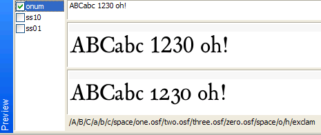
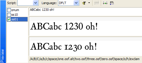
This is my attempt to resolve OSF problems with stylistic sets:


[vide: http://typophile.com/node/73413 ]
ss01 substitutes [one] by [one UC I like: \one.osf.alt]

lookup ss01StyleSet1lookup6 {
lookupflag 0;
sub \zero by \zero.osf ;
sub \one by \one.osf.alt ;
sub \two by \two.osf ;
.....
sub \nine by \nine.osf ;
} ss01StyleSet1lookup6;

hope it works...

Janek,

the problem with your code is that when a user activates "onum" and "ss01", he'll get the default oldstyle figures, not the alternates, which I guess is not what the user would expect. I'd suggest moving the "ss01" feature definition before "onum".

A.

Also, on an unrelated note, I'd recommend:
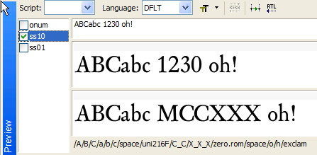
(1) Using proper codepoints (U+2160 — U+216F) and glyph names (uni2160 — uni216F) for the Roman numerals. For the CC glyph, that would be "uni216D216D" or "uni216D_uni216D".
(2) Designing the Roman numerals a bit like small capitals: somewhat smaller than the full capitals, and with some more letterspacing.

Hi Adam,
what3s the problem in using personalized glyph names, as you respect the Unicode values of a glyph?

Anyway, I still think it doesn’t make sense to have some letters named according to a criteria, and some others to other criteria, in the same system, which is Unicode. Of course, “perfection” may be deceiving, but in the case of the "slashed l" the Navajo use is an adoption for transcribing an existing oral language, so it‘s not what I asked about. The name, in this case, is OK as it was previously defined, since we use a graphic sign which already existed for a Polish alphabet letter.

Piccic,

The rationale is given here:
http://typophile.com/node/2994#comment-23796

With some additional explanations here:
http://typophile.com/node/29469#comment-404691

Glyphnames have been part of PostScript since 1982, long before Unicode was conceived (around 1991). This is why there is a set of glyphnames that have "mnemonic" glyphnames such as "A", "asterisk" or "zero". The "uniXXXX" convention has been introduced in OpenType (1999) after Unicode has become a dominant standard for text and font encoding because it did not make sense to come up with mnemonic glyphnames for all Unicode characters.

If Unicode existed before PostScript, there would have probably been no glyphnames, Unicode codepoints would be the only identifier. Which would then introduce other problems, such as the inability to include multiple alternate glyphs for one Unicode character.

You're free to engage into an academic debate about an ideal glyph identification scheme. Such exercises have been done in the past (e.g. Apple's "Zapf" TrueType table), but have not been widely adopted. There is nothing academic about PostScript, Unicode, OpenType, glyph naming or character naming. All these things come from a fairly long technological evolution, and carry a lot of evolutionary weight.

Admittedly, the PDF-compatible glyph naming scheme may be one of (many) font technology's coccyxes. I think that it does not make much sense to debate whether it is necessary, we should just acknowledge that it's there and move on.

Best,
Adam

Cześć Adam,
Thanks! Done: Roman.num - first, OSF with ordinary 'one' - second and OSF with oldschool 'one' - third. (dzięki za pomoc, jak widzę zawsze można na Ciebie liczyć :)
Yours sincerely
J

errata: Roman.num - first, OSF with oldschool 'one' - second and OSF with ordinary 'one' - third.

Hi Adam,
isn't it better to have glyph names? If they are just for commodity, and the software addresses the unicode values, I can’t see why – for example – in Arabic or Hebrew I should get mad to remind each unicode value whenever I have to design a glyph.

I understand most of these things came out of a situational layered history of technologies, but this does not mean we are forced to stick with that.
For example, what does it happen if I change just the name (within the font design software) of Hebrew glyphs?

I cannot engage in any academic debate, I have no background. I just try to figure out if I can make things more recognizable. I’m not a technician, although I attended a technical school, but as you say, every field contributed to this evolution; my questions are just for personal consistency, and possibly clarity, when I work.

I take it you didn't actually read the threads in question?

If you change the glyph names to completely non-standard ones, in some situations people making PDFs from your font will end up with the underlying text in the PDF being trashed: broken for search, broken for copy/paste into another doc, etc. It will look fine as long as the font is embedded, but won't be usable otherwise.

If you don't care about that, then go right ahead.

T

On top of what Thomas has written, I should add that in older versions of Mac OS X (10.4 and I believe even 10.5), if you don't have PDF-compatible glyphnames in OpenType PS (.otf) fonts, some glyphs may not even display in applications such as TextEdit, Keynote or Pages. (This is because the font renderer in those OSes used glyphnames rather than the font's "cmap" table to map Unicode codepoints to glyphs. This has been resolved in Mac OS X 10.6).

Thanks, Adam.

I'd almost forgotten about that odd Apple decision. I never did understand it. The relevant folks at Apple originally claimed that glyph names were more reliable than cmaps, for determining encoding in OpenType CFF fonts. I found that hard to believe. I long wondered if for some reason to do with code paths, it was easier for them to treat OpenType CFF the same as Type 1, and of course Type 1 fonts had no encoding cmap in the font. Anyway, I'm glad they stopped doing that.

Regards,

T

Thanks, but all this does not change that glyph naming is a total inconsistency.
I guess the only way to have them descriptive is to change them, and then change them back to numeric values before generating the typeface. Bah.

That's a fairly common strategy -- if you are using AFDKO tools are providing for doing this using a GlyphOrderAndAliasDB file.

Within FontLab, you can also edit your standard.nam file to include your preferred names prefixed with an exclamation mark. FontLab will then correctly assign unicode values based on those names but, when asked to generate names from unicode values will use the more standard ones. Unfortunately, this solution isn't really viable if you are using lots of alternate glyphs since it will only rename glyphs which are mapped to unicode values.

André

Adam: [...] I believe even 10.5

From: OpenType Status 2009:

In OS X 10.3, 10.4: Carbonized applications acces codepages via internal mappings. This doesn‘t work always correctly.

For COCOA/AAT the Unicode number was recalculated from the Postscript glyph name, although these fonts have a Unicode Cmap!?!

Name problems: Gcedilla – Gcommaccent Greek fonts : mu, Delta, sigma1, Omega Encoding problems with CFF custom encoding.

In OS X 10.5 and 10.6 Apple introduced Core Text and replaced the older text API‘s.
The problems have been fixed. (A good reason to upgrade!)

FEB

"(A good reason to upgrade!)"

Except if you still have a pre-Intell Mac :-)

10.5 works on pre-Intel Macs. You lose Classic, though. 10.6 is the only one that's Intel-only.

I'd say that if "gcommaaccent" only works on Mac OS X 10.5 and 10.6, while "uni0123" works in all Mac OSes dating from 10.3 or probably earlier, there is no reason to ship "gcommaaccent".

The current STANDARD.NAM and all the encodings that ship with *Fontographer 5* follow the updated naming guidelines, so "gcommaaccent" will be changed to "uni0123" if you choose "Make PDF-compatible naming" in FOG, and -- if you install Fontographer 5 on the same machine as FontLab Studio 5 -- will also work when you choose "Generate Names" from Glyph / Glyph Names in FLS5.

As I wrote earlier, I recommend installing Fontographer 5 demo if you're using FontLab Studio 5. You'll get updated glyphname-to-Unicode lists and encoding files as well as a set of new "OpenType" encodings ("OpenType Std", "OpenType LatPro", "OpenType LatPro SC", "OpenType LatCyrGrk", "OpenType LatCyrGrk SC", "OpenType LatCyrGrk WGL4" and "OpenType LatCyr Asia").

A.

"I recommend installing Fontographer 5 demo if you're using FontLab Studio 5"

OK, but this sounds quite strange, Adam. Can't we just get a copy of the revised standard.nam file?

I've made those available here:
http://www.fontlab.net/downloads/FontLabDataFiles2010.zip
but this location is not official/permanent (since this ZIP does not come with a nice installer etc.) But it's the same files as those bundles with FOG 5.

Best,
Adam

Frank,

I was hoping you could clarify something from the .pdf you linked to (I realise you weren't the author, but perhaps you know the answer since I assume you were involved in the conference).

The file states "Always use the available Unicode [value] even if the glyphs are selected through an OpenType feature".

I'm interpreting this to mean that in a substitution such as

feature hist {

  sub s' @Letters by s.hist; # s.hist = long s

} hist;

s.hist should be encoded as U017F. Am I interpreting this correctly? The impression I had received from reading other discussions on this forum was that s.hist should be left unencoded and and that a separate (duplicate) glyph, uni017F should be encoded at U017F.

Do you know the rationale behind Dr. Willrodt's recommendation?

Thanks,

André

@Adam "But it's the same files as those bundles with FOG 5"

Does that mean that FontLab Studio 5 will recognize and accept the same .nam files as FOG5? or do I need to edit the file at all?

@Chris,

Yes, the .nam file is the same for both. No editing needed.

André

Thanks André!

Chris,

yes, one of the things we changed in FOG5 is to drop its old encoding formats and switch to FontLab's formats (.nam and .enc, not .cpg, but also vendor.dat, though no alias.dat yet).

A.

Great!, Thanks Adam! Now I can just grab it from my FOG5 folder!
But? What effect, if any, will it have on my old legacy files already done using the old NAM file?

ChrisL

Chris,

you don't have to grab anything. If you install FOG 5, the files will automatically become available in FLS 5. The files reside in the same shared folder. If you open any VFBs, the new .nam files will only have an effect if you choose Generate Unicode or Generate Names.

A.

André: [...] I assume you were involved in the conference [....]

All FM conferences so far were organized by DTL, so I was indeed involved in the conference at The Hague.

sub s' @Letters by s.hist; # s.hist = long s

To be honest, I have not seen the other discussion in question, but I can imagine the preservation of the Unicode value of the s for exchangebility reasons (there was also a discussion on the ‘hist’ feature and related ligature stuff on the ATypI list recently, but I did not find time to look at it yet). Glyph variants like s.hist should be left unencoded by definition, of course (otherwise the use of s.hist here instead of longs would not make sense either).

At the conference Jürgen (Dr. Willrodt) did not discuss this topic specifically. You can watch his talk at River Valley TV (around the 20th minute the PDF page in question shows up). I will forward your question to him, by the way.

As Adam pointed out, using ‘uniXXXX’ entries instead of ‘AGLFN’ names can prevent problems under older Mac OSes. My problem is that working on the features files, character layout files and kerning pairs is not easy with the non-descriptive ‘uniXXXX’ naming, so I made simple AppleScript files that translate (in BBEdit) the entries in forenamed files from ‘AGLFN’ to ‘uniXXXX’ naming and vice-versa.

FEB

Thanks, Adam!!!

@blokland: That is a great idea, Frank! I have been using an Excel file I made with columns for each class being substituted along with an extra column which has the descriptive name. I can check row by row for compatibility and use line count to ensure equal entries but your way is WAY better!

I've just come up with a workaround how to rename glyphs (e.g. through Generate Names) including making the changes inside of the OpenType features definitions, completely within FontLab Studio 5, without using any scripts. It's not a superbly polished solution, but it works well.

1. In Preferences / Opening OpenType & TrueType, enable "Store binary OpenType layout tables".
2. Generate the .vfb font as .otf or .ttf.
3. In the .vfb font file, choose Glyph / Glyph Names / Generate Names.
4. Open the newly-generated .otf, and there, choose Glyph / Glyph Names / Generate Names.
5. Generate the newly-opened .otf again as .otf, and in the dialog box that appears, choose "Binary".
6. Close this font and open it again: note that in the OpenType panel and in the Classes panel, the data now uses the new glyph names.
7. Save the features into a file from the OpenType panel, and save the classes into a file from the Classes panel.
8. Close this font and go back to the original .vfb file.
9. Open the newly saved classes and features using the Classes panel and the OpenType panel.

This way, you'll have the classes and the OpenType feature definitions that use the new glyph names.

It's not very elegant but it works.

Best,
Adam

Bless you, my son!

Thanks for your reply,

I was unable to locate the thread in question. It didn't specifically have to do with historical forms but something similar. IIRC it involved a use of the 'sups' feature which mapped one to onesuperior rather than mapping one to one.sups.

The discussion in the handout you posted, though, seemed to suggest it was appropriate to map s to (encoded) longs rather than (unencoded) s.hist (sorry if the naming error in my earlier post caused confusion).

It seems that having GSUB lookups which convert characters to other characters rather than simply mapping from glyphs to glyphs is frowned on by many. However, while while poking around on Adobe's site I found the following in the description of the 'mgrk' feature:

Example: The user applies this feature to U+03A3 (Sigma), and gets U+2211 (summation).

Which would seem to suggest that this isn't strictly forbidden.

André

"U+03A3 (Sigma), and gets U+2211 (summation)."

If you name the glyphs as you stated and the unicoode values properly for each, how could that happen? I assume you would put both glyphs in the font. I do this (include both) for some other Greek, Omega, and the math version as well

I've never used this feature, but the description suggests you'd simply have the following:

feature mgrk { # Math Greek

    sub Sigma by summation;
    sub Pi by product;
    
    # etc.

} mgrk;

The description suggests that Adobe is advocating the above rather than

feature mgrk { # Math Greek

    sub Sigma by Sigma.mgrk;
    sub Pi by Pi.mgrk;
    
    # etc.

} mgrk;

which would seem to contradict the view that GSUB rules should only perform glyph substitution and never character substitution.

André

"mgrk" is one of the OpenType features that are in the spec, but are discouraged from being used. They are not actually being used in any Adobe fonts made in the last yen years. I think the feature should be removed (similarly to what was done to "dpng" some years ago).

A.

As Adam says, 'mgrk' is deprecated, much like 'crcy' and 'dpng', precisely because it does seem likely to be used to enact what ought to be done by a change in codepoint.

Cheers,

T

From the documentation on the ss tags, ss03, for example, can remap characters in ss01 and ss02 as well as from the default set. So ss20 has the highest priority, then ss19, and so on.

So one could have lining figures as the default, regular oldstyle figures as ss01, and an alternate short 1 that looks like a lining 1 instead of a small-cap I in ss02.

The problem is now "solved" except for applications in which there is no way to enable or disable any of these features. I would recommend font designers to make all their glyphs available as just plain characters in the Private Use area in addition to having the fancy processing for normal characters.

> so ss20 has the highest priority, then ss19, and so on.

Quadibloc,

You're wrong. The priority between different user-controlled OpenType Layout features is determined by the order of the lookups in the font. In one font, you can have "liga" to have higher priority than "smcp", and "ss01" have a higher priority than "ss20", and in another font this can be exactly the other way around. If features use multiple lookups, then those can interweave: one lookup from the "ss01" feature is processed, then a lookup from "ss20", then again one from "ss01".

There is no "canonical order" for any of the user-controllable features in the OpenType spec. It is the font developer who decides on the priorities within a font. The rule is, that some features (ccmp, locl) are applied before the script shaping, then the script shaping features are applied (this is done differently for each script, and each script shaping engine automatically picks the appropriate features), and then finally, the user-controllable features enabled by the user are applied in the order of the lookups defined in the font.

Captured from web.archive.org on 18 Apr 2015. view this capture