
My first semi-serious attempt. Intentionally not a very original typeface; the proportions are very Bodonian, while there's a lot of Fleischmann and some Dwiggins influence in the details. There's bound to be a lot of beginner's mistakes, I know, please tell me, so I can improve. Any kind of critique is very welcome indeed. The spacing is still very basic.
Er, and hello, everyone. This is my very first post, after lurking for several weeks. What a wonderful resource Typophile is! I only wish I'd discovered it sooner.
S.
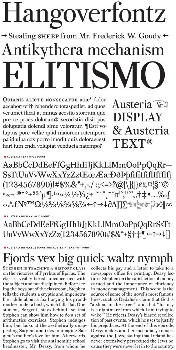
| Attachment | Size |
|---|---|
| austeria.pdf | 70.73 KB |


