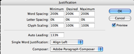
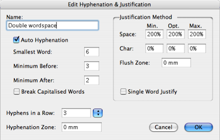
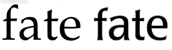
OK, yesterday I rejected Freight Sans for a project. It's simply beautiful, but I believe its narrow word spaces hinder legibility, especially in comparison with other humanist sans faces.
This morning I briefly considered using TheSans, until I got a look at that uppercase "Q" with its disconnected tilde for a tail. Please, Lucas! I absolutely love TheSans, but no alternate for that Q?!!
So it got me thinking... What common typefaces are "spoiled" for you by their quirks? And what makes these features deal-breakers?
Thanks in advance,
--Michael.