Typophile

First massive x-height?

This thread ran to 1 pages of replies and only one was recovered, so replies are missing.

George Horton

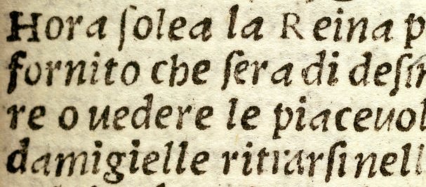
In 1516, at the impressive age of 66, Griffo made his last type for his own press in Bologna. This tiny italic, in which four line increments vertically occupy almost exactly 1 cm, has an enormous x-height and fat counters, making these 32º books surprisingly readable. Is it the first such type made? Does anyone know about other early experiments with monster x-height?
George
I mean a large opening on the right hand side of the lower bowl.

Personally, I think the only really successful lc roman g design aside from the closed binocular and typical monocular open one is Koch's g in Kabel. (Not including blackletter or italic.) The open tails that are very discrete, like Baskerville's, basically don't change the color. When they get prominent, like Meta's, I find them a bit distracting. Acceptable, but not really a success.

I'll second that, William. I've always disliked open bowls. I find them distracting and very rarely designed with much subtlety.

hrant ranted:

I’ve come to believe that there is: it’s much more harmonious with the “spirit” of the Latin lowercase as a whole; the conventional (closed) form is really too complex; especially when it’s doubled it can cause a distracting spike in the texture.

This evaluation seems a bit subjective to me. I'm not sure if there's any good literature on measuring complexity (Peter Enneson's "role architecture" concepts are the only thing that come immediately to mind), but in my seat-of-the-pants count, a Baskerville style lachrymal lower g bowl has one more thing to count than a traditional garalde: in the latter, you have the 'T' join where the bowl closes, and in the former you have both the lachrymal terminal and the gap between that terminal and the main stroke.

An open 'g' in a sharp lineale such as Meta is even worse (by my rough counting scheme), because now you've got two sharp corners on the terminal, and they don't register as symmetrical because their role is so different.

Do we really think laymen (as opposed to type designers who mostly naturally enjoy getting used to explicit features) are so -consciously no less- familiar with and satisfied by the closed form...

I tested both the binocular and the sesquiocular (Meta-like) 'g' forms in Inconsolata on a bunch of laypersons, and latter always stood out as one of the first things they'd complain about. I was tempted by the sesquiocular form because I felt that the requirements of a monospace font exert a lot of pressure to take away black in the 'g' to avoid unevenness of color, and that the join of the lower bowl was one such place. Ultimately, I decided that the binocular form worked better, and now it's one of my favorite glyphs from the whole font - and something of a signature character for the font because so many of the glyphs are pretty vanilla.

As for whether the Baskervillian sesquiocular form is superior in immersive reading, that sounds like an empirical claim, and I'm going to want to see empirical evidence before I really believe it. I'm not saying that tradition is always good, but you had a lot of really brilliant type designers (and type design engineers, I would say, who sought practical readability as the primary goal as opposed to a merely aesthetic impression) over the last few hundred years, and there's a pretty strong consensus. Of course, Mr. Eaves himself definitely qualifies as a brilliant type design engineer, but maybe he's the exception that proves the rule.

Among the ATF designs from the Benton era, a very few used a sesquiocular g - Cheltenham, which was an adaptation of an earlier, somewhat bletcherous font; the ATF Baskerville of course; Souvenir (which isn't exactly sesquiocular, but isn't standardly monocular either), and some oddballs such as Hobo. (I don't have the catalogs in front of me to flip through, otherwise I'd probably find one or two classic Art Nouveau faces with interesting 'g' shapes).

> I mean a large opening on the right hand side of the lower bowl.

Wow. I can't see how to make that work.
But I'd encourage you to give it a shot.
For one thing it might make the "g"
face the "right" way.

> Koch’s g in Kabel

I love that one (especially for tiny screen type, strangely enough).

> When they get prominent, like Meta’s

I think Meta's is pretty apologetic. But it
does have a funny whitespace in there,
and maybe that's what's getting you.

> very rarely designed with much subtlety

There I agree.
Unless you're looking for elegance, in which
case I'd say: don't look for too much of that
in a text face.

hhp

George:
"the effort to accept whatever Griffo made has consistently been rewarded by a new or strengthened perception of its excellence"

But remember, what you are looking at is not what he "made", but what "survived".

" And one’s eventual feelings about what actually exists are always more reliable than those about what might exist - which is a reason for literal revivals."

This statement makes total and complete sense, if your revival is metal. Otherwise, it's a slight increase in global warming.

"The evidence that the 1516er was designed all of a piece is as good as you’re going to find in this period."

Oh good, that means you have the punches and/or the type, and receipts for their purchase, sale or creation?

what you are looking at is not what he “made”, but what “survived”.
True, and more of your type scat info would be really helpful; but what survives contains information sufficient for us to determine the printed impresions Griffo could, with perfect knowledge of his craft, have expected his types to make, within a normally small but at any specific point unknowable range of error.
There's an element of global warming in "one’s eventual feelings about what actually exists are always more reliable than those about what might exist - which is a reason for literal revivals" but, since I care about making a good photopolymer version rather more than making a good offset version, I don't think there's any proven reason to get fundamentalist about this. I don't count scat as essential to the value of letterpress, it irritates me.
Oh good, that means you have the punches and/or the type, and receipts for their purchase, sale or creation?
Correct me if I'm wrong, but I didn't think any of that survives from before De Colines.

> This evaluation seems a bit subjective to me.

Well, a bit (i.e. in part) sure - I'm human too. But it's also based on reasoning. One way to measure complexity is good ol' topology: only the "B" is as complex as the traditional "g", and at least it has its two counters abutting. Another way to evaluate -if not measure- complexity is to just look at the thing. It almost looks like a Chinese logograph.

> latter always stood out

Let's see it.

Interestingly, I couldn't make a nice open "g" for
Coda [either]. Hmmm, something in the mono water?
Oh wait, I know what it is: the sceen's coarseness.

> the requirements of a monospace font exert a lot of pressure to take away black

On the other hand, especially in mono fonts the "g" tends to look smallish (because making it look nice gives is it a small head) and making it darkish can help.

> that sounds like an empirical claim

How could it, when there's no data?
It's a design judgement (but based on more than just my whims).

> Mr. Eaves himself definitely qualifies as a brilliant type design engineer

Richard was a type designer?!

> Cheltenham, which was an adaptation of an earlier, somewhat bletcherous font

What font is that?

BTW, if I remember correctly, the original ATF Clearface -a design which Bullen claimed was the first font designed "scientifically" for high legibility mind you- had an open "g"...

hhp

Ciao!
I was born in a town close to Soncino the town where Soncino family lived and worked.
Soncino family printed the first bible in jewish.
http://www.storiadellastampa.unibo.it/noframes/soncino.html
If you go to Italy go and visit the museum and the press of Soncino... in Soncino close to Cremona (north of Italy)

My favorite typeface of the renaissance was the one designed by Luca Pacioli. He designed it using the golden section.
From that font Garamond designed the "Garamond" typeface and from that one Simoncini re-designed the "Simoncini Garamond" (which as a beautiful italic)

Ciao again

Hello Laura!
Yes, I've seen the website for this museum. Has it got any particular typographic goodies or information on Soncino as a typographer?
Your history of type is quite new-school: it's Jannon you want to look up if you like (very sensibly) Simoncini Garamond.

Ciao Gio!
At the museum you can find all of sort of things... When my school took us there i remember my professor of typography explaining how much "particular" Soncino was in the details. He wanted everything perfect. He chose Griffo as the best punchcutter. He had to have the best inks and the best paper, etc. The research confirms that because of his high quality today we can still admire his work.
My father was a typographer handsetting for almost 40 years... so i have ink of my hands since i was 5... Thanks to that i had the opportunity to know many stories in the typography world in Italy, especially north of Italy.
In 1989 i had the opportunity to design an antology exhibition about Giovanni Mardersteig (1872-1977) and during that period i had the opportunity to view his archive... see how he designed fonts... sketches, notes, letters to other type-designers, etc. I also discovered that when he was designing the font Dante at some point he get sick and he could not go to Milano (from Verona) to view the progress of the work. The typography was the one where my father worked! and becuase my father was also a good designer, Mardersteig sent a letter asking to my father to design the letter "e" for him... to not stop the work in the foundary.
At the archive of Mardersteig i also could see many protopyes (in pear wood) of letters designed by Bodoni.

Thanks for the suggestion you gave me, i will go to look for Jannon.


Your father made a lovely e.

One way to measure complexity is good ol’ topology:

Excuse me, but that's preposterous. By this metric, 'm' is simpler than 'o'. Try to make your argument again with a complexity metric that I can take seriously.

Let’s see it.

Flash player 8 for Linux isn't out yet, so a link instead of an "insert image".

How could it, when there’s no data?

Ok, then I take back what I first said. It sounds like an empirical claim with no data to support it.

What font is that?

The one that Bertram Grosvenor Goodhue in 1896 for the Cheltenham press. I'm just trying to assign the blame to Goodhue rather than to my role model Benton, as I can't bring myself to believe that my hero would be capable of creating such a thing from whole cloth.

BTW, if I remember correctly, the original ATF Clearface -a design which Bullen claimed was the first font designed “scientifically” for high legibility mind you- had an open “g”…

Yes, a plain monocular one, which I'm sure we'd all agree is simpler than both the binocular and sesquiocular forms.

Laura Ruggeri wrote:

In 1989 i had the opportunity to design an antology exhibition about Giovanni Mardersteig (1872-1977) and during that period i had the opportunity to view his archive… see how he designed fonts… sketches, notes, letters to other type-designers, etc.

Wow, that sounds like an incredible opportunity. I'm very interested in Mardersteig's Zeno font, for which there is currently no digitization. Could you possible be able to help me out with my queries from this thread on Zeno?

Topology is a measure, not the only/best one. It's classically useful, and not inferior to your element-counting method, since that clearly failed here in revealing the over-complexity of the closed "g". :-)

> a link instead of an “insert image”.

The head is too big.
That shape wouldn't look nice even if you closed the bottom.

> It sounds like an empirical claim

Claiming the open "g" is generally better than the closed one for immersive reading is "empirical"? I guess I'll take your word for it (pardon the pun).

> The one that Bertram Grosvenor Goodhue in 1896 for the Cheltenham press.

I thought that was pretty much the same as Cheltenham. Sample?

> I’m just trying to assign the blame to Goodhue

Blame for Cheltenham, or the earlier one?
Many people don't like Cheltenham, while
many others admire it. I guess you're in
the former camp?

> Yes, a plain monocular one

You're sure it wasn't an open binocular?
Let me try to track down what I think I've seen...

hhp

Does anybody have a copy of Ch Perfect's "The Complete Typographer" handy?
I can't seem to locate mine, and I think that's where I saw the Clearface with the
open bino "g".

hhp

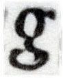
The 1516 g, averaged from 17 impressions and sharpened:

Way cool. Looks like Enigma's! :-)

BTW, that white "incision" a the bottom-right,
do you think it means you've actually averaged
two separate designs/matrices for the "g"?

hhp

Oddly, no: it's a real feature of all the printed letters. One nice thing about averaging is that it shows you things to look for that you would never ordinarily have seen in the scanned imprints: one filters out everything that isn't obviously role-architectural, because it's perceived as just noise. That side of the lower bowl is either very sophisticated differentiation or a booboo.

> nice thing about averaging

Indeed.
Virtually any designer would have normalized that,
and hence deviated from what the type in effect was.

> or a booboo.

Yeah, that one. Across the centuries I can almost
hear Griffo cursing, when the matrix slipped from
his hand and hit that damn nail in the floorboards. :-)

hhp

I had to gallop through this thread, so may have missed some things (I'll return to it), but the operative question about the binocular 'g' has to be--to my mind at least--what has criterial cue-value toward visual wordform resolution here: closure, or the presence of a counter. I'll bet it's the latter. Perfect closure is probably secondary, but more than the typical monocular 'g' might be beneficial.

The problem with the binocular 'g' is managing the saliencies around the closure point of the lower bowl so the right things (the counters) have a proper and properly coordinated cue or pop-out value / aren't compromised by the density of black action between the monocles. Or is the 'disturbed expressedness' in that area one of the things we depend on in visual wordform resolution?

(Not an answer, but a playing field for addressing the issue)

> more than the typical monocular ‘g’ might be beneficial.

I'd say that the [typical*] monocular "g"
has a bigger problem than lack of closure.

* But what do we think of the Eric Gill italic "g"?

> Or is the ‘disturbed expressedness’ in that area one of
> the things we depend on in visual wordform resolution?

If it is, then we better be doing that to a lot
more than just the "g"... Are we ready for that?

hhp

Previously:
> I mean a large opening on the right hand side of the lower bowl.

Hey, check THIS out:

It's from Cheng's book. I'd never seen "g"s
like that. And I'm not sure they don't work.

hhp

Thanks for this Hrant. What I would like to play with is most like the first g on the second line, but with the lower half rotated counter-clockwise about its centre say 10 degrees, pulled a touch away from the upper half, and its horizontals extended a little. (And also with a Plantin-style ear, 3:1 contrast and the upper half reduced in size).

"The problem with the binocular ‘g’ is managing the saliencies around the closure point of the lower bowl so the right things (the counters) have a proper and properly coordinated cue or pop-out value / aren’t compromised by the density of black action between the monocles."

Exactly, and since most g's of this sort contain two quite different oculii, the point becomes less valid the more different they are, more valid as they befome truely binocularesque.

So that means the top counter of the (binocular) "a" should be closed too? After all, it used to be (think blackletter). But we got over it. Let's do it for the "g" too.

BTW, yesterday I realized another way the open-bottom "g" can get better integrated into the whole of a face is that it has a terminal, whose shape can be like other terminal shapes (like in the "s"). I think this is significant.

--

Some people prefer the conventional binocular "g" because they're conservative. But other people who don't have that problem who nonetheles prefer it I think are discouraged by all the cruddy open-bottom binocular "g"s out there; type design is in large part about imitation, and there are simply far fewer good examples to emulate. It's easier to make a good closed-bottom "g" because there are already good ones out there. But its birth defect will not allow it to run the marathon. At least not without coffee breaks.

hhp

"But its birth defect will not allow it to run the marathon. At least not without coffee breaks."

What???

A binocular g with a closed bottom no serifs, and no fancy terminals is a reader's g. That, is why there are so many around.The others, nice or follimous as they are, are designer g's.

> That, is why there are so many around.

You really think that designers have been minding subtle readability advantages? I think they've mostly just been following fashion - which I do agree is the motivation for the open "g" for most people - just not all of us.

hhp

"...I think they’ve mostly just been following fashion - which I do agree is the motivation for the open “g” for most people..."

I didn't know it was fashionable. Everytime I post a face with an open bowl g, I get comments from folks who want it closed. It must be a very secret fashion that nobody has heard about :-)

ChrisL

Like I said, it's hard[er] to make a good open one... :-)

hhp

What about an unslanted Dante italic g, with weight taken from the chirographic swell on the upper right of the top circle and used as polyfiller (sp?) on the join with the ear, smoothing that transation while morphing the modelling of the circle into something like its counterpart in Electra?

Uh, pitchur please.

hhp

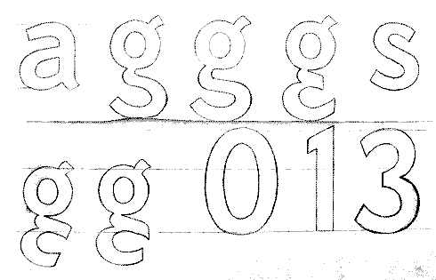
Drawn quickly, on a touchpad, with the paintbrush tool of the Gimp - it's nasty -

A tangential note to George's comment earlier in the thread about Griffo's 1516 italic beating Pierre Haultin for the "niche-interest record" of making nonpareil-size type: Although Fred Smeijers writes in Counterpunch that Haultin was the first to make such small type, H.D.L. Vervliet in his 2000 paper "Printing Types of Pierre Haultin (ca. 1510-87). Part I: Roman Types" (Quaerendo 30/2) and in the revised version in The Paleotypography of the French Renaissance seems to indicate that his was not the first (unless by a hair) but was, more importantly, the first to be widely used.

"The Haultin Nonpareil roman and italic found their way into the main stock of the major European typefoundries. They were available until the end of the eighteenth century and, in that type size, for most printers the only choice on the market." (From the 2000 paper, page 90)

"A Nonpareil type size was a rarity in early sixteenth-century typography and only owned by the better equiped printers. In France, I noted early uses by Estienne (1534) and Colines (1538). Haultin’s type is a bit smaller (though its capitals are bigger) than the second 42 mm Nonpareil which Robert I Estienne used from about 1543 on in his octavo bibles." (page 97)

I have just read this fascinating discussion. IMVHO, the only good g which opens on the right is in Jean-François Porchez's Ambroise.

http://new.myfonts.com/search/ambroise/fonts/
http://typofonderie.com

His Retiro's g is great too but more difficult to see on the samples etc.

Also, the best revival of Francesco's types may well be Frank Jalleau's Francesco

http://beta.batfoundry.com/catalogue_4_francesco_.html

As for the g, my preference would go to a monocameral g or a sesquiocular g, provided there is a reduction of the top storey size. This is, imvho, the only thing that makes the g stand out from other letters, especially if one considers that the eye will be looking at the top third of each character for identification. Once the top storey is reduced, the shape of the tail is partly irrelevant (cf Minuscule) & I would favour the simplest design; the one that matches the way people currently write their g; more often than not, they do a monocameral g, with a closed loop so a monocameral g with an open loop should be easy to read.

Captured from web.archive.org on 18 Oct 2013. view this capture