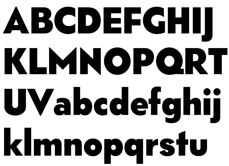
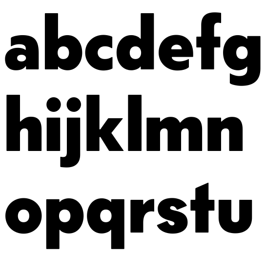
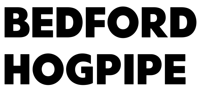
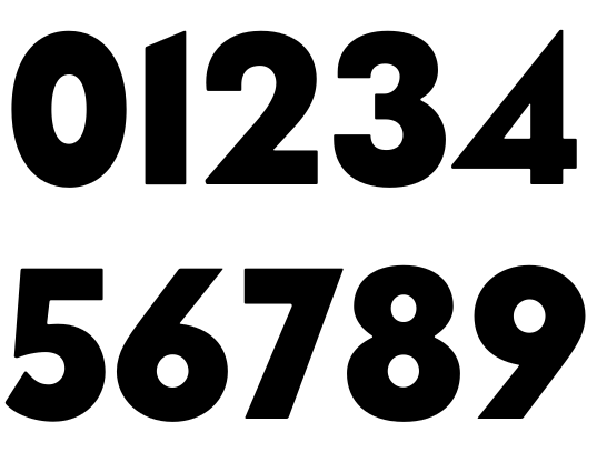
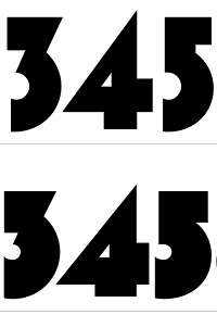
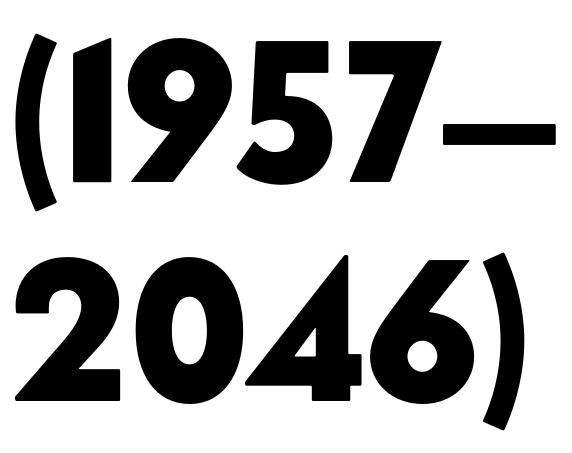
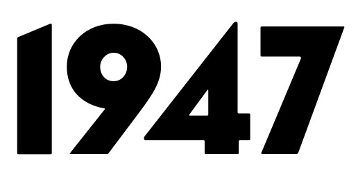
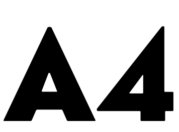
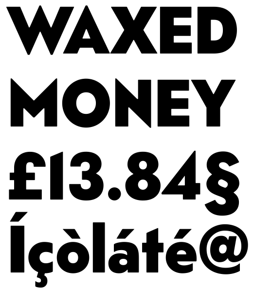
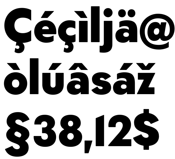
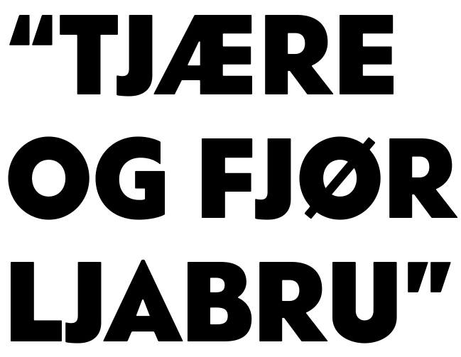
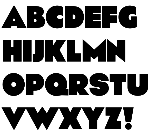
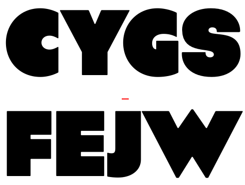
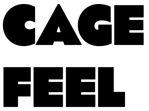
The best gift I got for Christmas was a book about the design of the Norwegian telephone box (1933). So I got inspired, and drew some glyphs, and all of a sudden I had a whole alphabet. I didn't look at the telephone box lettering while I drew, I wanted to make letters resembling the Art Deco style there still were a lot of traces left of in Norway until the 80s (now, there's only a few phone boxes and some street signs left), without making a derivative of anything.
I've made some deliberately naïve old-school choices, this is not a polished, modern take on a geometric sans serif.
I have a bold (or rather an extra bold) weight half-drawn as well, and I think that's going to be the whole type family. I need to get something finished. All my former attempts have grown too large too soon, this is going to be my first finished project. But I need your help. Any kind of criticism is very, very welcome!

For extended character set, see the pdf.
 tlf_0.pdf
tlf_black.pdf
telefon_080310.pdf


 ?