Typophile

Does VOLT Help in Developing Arabic Fonts?!

This thread ran to 3 pages of replies and only 2 were recovered, so replies are missing.

AzizMostafa0 votes

Peace be on All Friends,
In VOLT, Marks Positioning is carried out Independently for each letter and for each component of every ligature?!
So, to avoid the Collision of Marks with Marks and/or Letters in Arabic Fonts:
1 The thinest letter or ligature should be at least a bit wider than the widest mark. Just like asking 3 cowboys to stand side by side without allowing their Hats to collide. And this can be done at the expense of Beauty.
2 Marks should be horizontally centered on top of or below each letter and each component of every ligature. And this is not always possible even if Beauty is sacrificed.
Samples speak louder than words?!
Daringly

You can always do mark positioning in context of neighbor glyphs. So you can move marks higer if there are marks over other letters that can cause collision.

Dealing with ligatures is essentially the same, but may be tricky, though. OpenType model can not distinguish between mark over one or another component, except for mark-to-liga attachments. For example, for sequence of ligature and mark, lookup can say that something should happen only if mark is logically attached to the first component. There could be workaround for that, for example having separate glyphs for mark over first second etc. component.

Thanks,
Sergey

You can always do mark positioning in context of neighbor glyphs. So you can move marks higer if there are marks over other letters that can cause collision.

In addition to this, I have also contextually inserted a very narrow joining stroke between two letters when I need to accomodate a mark that might otherwise collide with an adjoining letter. This is appropriate in more linear designs, rather than in the kind of calligraphic design shown in the illustration. Calligraphy has its own rules for mark size and positioning.

Sergey says:
You can always do mark positioning in context of neighbor glyphs.So you can move marks higher if there are marks over other letters that can cause collision.

Say:
.. Higher and higher till I get all Marks on the same level (Mac it).
For the best mark positioning you can ever get with a ligature-free font, see this:
http://www.nonosoft.jifisa.net/download.php
Try Volting it!

Sergey continues:
Dealing with ligatures is essentially the same, but may be tricky, though. OpenType model can not distinguish between mark over one or another component, except for mark-to-liga attachments.
For example, for sequence of ligature and mark, lookup can say that something should happen only if mark is logically attached to the first component. There could be work around for that, for example having separate glyphs for mark over first, second etc. component.

Say:
Easier said than done!
Just tell me please where to position what out of hundreds — not to say thousands — of marks:
http://qurankareem.info/a/OthmanyFonts.zip
http://qurankareem.info/a/othmanyQuran.zip
This will make the brain of an octopus-minded to work overtime to work around Independently up and down, across and back, diagonally in 4 direction so that Marks wont collide.
________________________________
Happy Exploring

Easier said than done!

Who said this will be easy?! Of course Arabic typography requires very complex font logic, but it is definitely doable with OpenType layout.

Thanks,
Sergey

>but it is definitely doable with OpenType layout.

reminds me of the old saying "fonts are hard... lets go shopping" ;-)

John Hudson says:
... I have also contextually inserted a very narrow joining stroke between two letters when I need to accommodate a mark that might otherwise collide with an adjoining letter. This is appropriate in more linear designs, rather than in the kind of calligraphic design shown in the illustration.

Say:
After All the Automation and Volting, I have to do a manual Adjustment?! That what I did in Windows 3.11. In addition to this, I had also contextually inserted a very narrow joining Space when I needed to accommodate a mark that might otherwise collide with a final letter.

This was appropriate in more linear designs and in the kind of calligraphic design shown in the illustration, too.

Sergey says:
Who said this will be easy?! Of course Arabic typography requires very complex font logic, but it is definitely doable with OpenType layout.

Say:
Easier done with Fontgraph 3.5 on windows 3.11.
Go back and re-explore!

I don't understand - are you asking for help? do you like to work with VOLT? or you can do it without VOLT, and even better? If yes - great, but why the 'negative'* ? You don't have to use it.

[* a lot of negative here lately; negative season?]

Thanks for your Positive Feedback David
My "Uncompromisng Arabic Font" was done without VOLT.
http://typophile.com/node/19348
However, I am looking forward to transforming my (5+1) fonts into a single OTF.
But it seems that Volt does not help?! Is there a better Alternative?
Thank you once again.

You're welcome Aziz.

I need a lifeguard to go through that thread (typophile.com/node/19348)
So, if we keep it simple (but no simpler): you want a single OpenType? You can't do it with VOLT (+ hard work) ? Why not?

I get the impression that this is really just an excuse to vent on VOLT, and there's nothing wrong with that. However, Sergey & John took the question seriously and shouldn't be harshed for trying to offer some advice. Falling into the same trap I might suggest that the power users of VOLT do a lot of the number crunching outside of VOLT (eg in Excel and perl based tools), and import the source tables into VOLT for compilation - that's apparently the best approach on complex jobs.

hello there!!

I am a new VOLT user and Im facing a problem that might seem silly to you. but i wish u can help me with this: "im working on an Arabic open type font designed by font lab, when Im opening the font from VOLT toolbar or File/open menu, im not being able to view the glyphs, what I see i empty boxes with ID numbers. while when i open a font like "times new romans" lets say, i can see the letters in the edit glyphs window. so please can you help me figure out how to import a new font and be able to see the font in the edit glyph window.

i wish what i said makes sense to you.

> when Im opening the font from VOLT toolbar or File/open menu, im not being able to view the glyphs

Is the font TrueType ?

I think Miguel is correct - the font is likely an OpenType CFF font, needs to be TrueType. Reason for this is that VOLT uses its own inbuilt rasterizer (TTF) rather than the system rasterizers.

After All the Automation and Volting, I have to do a manual Adjustment?!

No no no, I mean I have automatic contextual insertion of a narrow connecting stroke within the VOLT lookups.

Here is an example, using the Adobe Arabic font created with VOLT. The insertion of the narrow connecting stroke is done automatically, as a GSUB type 2 lookup, based on the context of the mark following the alif.

By the way, I don't think that OpenType is the best way to handle Arabic text. There are, for instance, good arguments for layout systems that treat diacritic marks as a separate layer applied after word formation. Contextual mark positioning and spacing adjustment is the most difficult and cumbersome aspect of Arabic OpenType, especially if one wants refinement. The benefit of OpenType is in its wide support and adaptability. If you have a different solution that works for your needs -- even if it only works in one application and requires macros --, is there a need to make an OpenType version?

Thanks John for your input.
Though the example given does not occur in Arabic, I do understand what you mean. Any how, if it is applied to the last word in the first sample (on the left), it will be spoilt?
How if a word ends with R+TaMarbota and the Tanween of TaMarbota collides with R?

> There are, for instance, good arguments for layout systems that treat diacritic marks as a separate layer applied after word formation.

Such as?

John Hudson says:
By the way, I don’t think that OpenType is the best way to handle Arabic text.

Say:
OpenType is the best way to handle marks-free Arabic text?
So, let us concentrate on Ligatures.
In ArabicTypesetting, a number of 2&3-component ligatures were built.
In Nafees Naskh of http://www.crulp.org, instead, all the possible shapes of characters to form ligatures were built — save LamAlif of course.
Which approach do you see better and Why?

Back at the service of Friends,
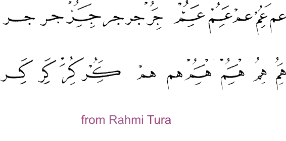
Here are 2 lines of the same Arabic Text using ArabicTypesetting OTF:
the lower is marked and the upper is marks-free.

By comparison, one can easily see:
The left significant word in the lower line is a bit longer than the above due to the narrow stroke between its first and second letters, as mentioned by John Hudson .
The 2 Middle words in each line have the same shape irrespective of Marks.
The 3 words on the right of the lower line are not ligatured as above. In other words. Marks spoilt the ligatures.

Why this Inconsistent Behaviour?!

John Hudson says:
There are, for instance, good arguments for layout systems that treat diacritic marks as a separate layer applied after word formation.
...
If you have a different solution that works for your needs — even if it only works in one application and requires macros —, is there a need to make an OpenType version?

Say:
Yes. There is a need to make an OpenType version to benefit from the OpenType wide support and adaptability to long documents not a couple of lines that can be fantastically handled in a number of applications by creating 2 layers: one for letters and the other for marks!

How if a word ends with R+TaMarbota and the Tanween of TaMarbota collides with R

There are two ways to deal with this kind of collision. I believe the more traditional technique is to contextually lower the Tanween so that it no longer collides with the R. Another technique is to introduce a contextually sensitive kerning adjustment between the R and the TaMarbota when the latter is followed by a below mark. I think the decision which method to use depends very much on the type design. In a very modern, linear design one might want to make the heights of marks quite regular and not raise or lower them contextually, so in that case the kerning option might be best. In a traditional naskh design, though, one might want to preserve the letter relationships and allow the marks to move as necessary; this better emulates the scribal approach.

So, let us concentrate on Ligatures.
In ArabicTypesetting, a number of 2&3-component ligatures were built.
In Nafees Naskh of http://www.crulp.org, instead, all the possible shapes of characters to form ligatures were built — save LamAlif of course.
Which approach do you see better and Why?

Although every Arabic font I have worked on to date has involved ligature glyphs for one reason or another, I actually think that the better approach is not to use ligatures, but instead to have component stroke shapes which are contextually substituted to produce the correct forms. This technique is much more adaptable and efficient. Consider, for example, Monotype Nastaliq, which had up to 22,000 ligature glyphs -- some for entire words -- in its late metal and final phototype versions, but which has recently been remade in OpenType using only a small fraction of that number of glyphs.

I'm aware of some fonts that even use component strokes to create the lam_alif sequence, i.e. that do not contain any ligatures at all.

David,

Tom Milo's DecoType Arabic layout system uses a layering approach which follows the way in which calligraphers construct a word. First the 'archigraphemes' of the letters are written; these are the letters, correctly formed, but without any marks at all, not even the distinguishing dots. Then the dots are written relative to the letterforms and taking into account context of nearby strokes. Then vowels are written relative to both letterforms and dots. If I remember correctly, Tom breaks the system down into about seven different layers, based on classification of marks. Also, marks in the system are not of fixed size, but may be longer or shorter depending on context, as found in calligraphy.

Although all my own Arabic work has been in OpenType, I'm pretty convinced that only an approach like Tom's can result in optimal mark positioning. The downside of such a system is that it tends to be very slow: not something you would want to use for, e.g. e-mail. But in the context of book production, it is the best thing available.

The left significant word in the lower line is a bit longer than the above due to the narrow stroke between its first and second letters, as mentioned by John Hudson.

In this case, I believe the method is not an inserted narrow stroke but a variant form of the K, but yes the result is the same.

The 3 words on the right of the lower line are not ligatured as above. In other words. Marks spoilt the ligatures.

This font contains two different kinds of ligature lookups. Some ligatures are allowed to form even when marks are involved in the sequence (in VOLT, they are set to process NONE of the mark glyphs), and some ligatures are inhibited from forming when marks are involved (in VOLT, they are set to process ALL mark glyphs). This is a design decision. In the Arabic Typsetting font, Mamoun Sakkal decided to prevent ligatures involving vertical stacking from forming when marks are applied, because in these situations it is sometimes confusing, even for the reader, to know to which letter in the ligature a mark is applied.

I use the same method when dealing with the initial lam_mim sequence, in which the mim portion of the ligature ends up to the right of the lam, which phonetically precedes it. So if the lam takes a mark, I prevent this ligature from forming because it is too easy to be confused about which letter is taking the mark.

Of course, if one is seeking to emulate the traditional naskh style including its mark positioning, then one probably doesn't want to inhibit ligation in these circumstances. But then one is also presuming a level of readership that is quite high.

Thanks John. Just read his paper (20th International Unicode conference)

Thanks John,
...... Monotype Nastaliq has recently been remade in OpenType using only a small fraction of that number of glyphs.
How Lucky! No Bites (Marks)

Tom Milo’s DecoType Arabic layout system..... it is the best thing available.
Kelk2000 has no match:
http://www.kelk.ws
Appreciatively,

I wasn't familiar with the Kelk2000 stuff. Thank you fr the link.

It isn't clear, though, from the limited English information available on the website whether the results of this system are live text. There is talk about creating 'artwork', which looks very impressive (reminds me of Tom's 'Make Calligraphy' plug-in for MS Office 2000), but does it remain live (Unicode?) searchable and editable text? That is really key in the context of crossmedia publishing, which is obviously becoming more and more important.

By the way, at the Unicode conference in California in March Tom showed a demo of the stuff he has been working on with Winsoft as a plug-in for the Middle East version of InDesign CS3. It works a little like a CJK input method: you type a word in Unicode and are presented with all the valid options for writing that word according to the rules of the script style you are using, and you select the one you want. Very impressive.

John On behalf of Tom & WinSoft:
You type a word in Unicode and are presented with all the valid options for writing that word according to the rules of the script style you are using, and you select the one you want. Very impressive.

Say: That is exactly what Kelk2000 does.

John Hudson says:
In the Arabic Typesetting font, Mamoun Sakkal decided to prevent ligatures involving vertical stacking from forming when marks are applied, because in these situations it is sometimes confusing, even for the reader, to know to which letter in the ligature a mark is applied.
I use the same method when dealing with the initial lam_mim sequence, in which the mim portion of the ligature ends up to the right of the lam, which phonetically precedes it. So if the lam takes a mark, I prevent this ligature from forming because it is too easy to be confused about which letter is taking the mark.

Sorry to say: Unsuccessful Decision!
Save in the Lam_mim sequence, sacrificing ligatures elsewhere was not justifiable!
Arab eyes do snap Marks on ligatures to their corresponding components:
The right and left significant marks are respectively snapped to the right and left components and the middles to the middles.
And this is intuitive to the non-Arab eyes too.

Worse is the shifting up of the beginning of words like the marked one here. The arm of the second letter appears higher than Alif?!
Wish the unmarked shape were maintained.

How if a word ends with R+TaMarbota and the Tanween of TaMarbota collides with R? (Right)

John says:
... I believe the more traditional technique is to contextually lower the Tanween so that it no longer collides with the R. (Middle)
Say: This wont Only look odd but will transgress the lower line (Win-Descent) also.

John says:
.. Another technique is to introduce a contextually sensitive kerning adjustment between the R and the TaMarbota when the latter is followed by a below mark. (Left)
Say: This is the Only possible solution unfortunately not applied in the said OTF.

John says:
... In a very modern, linear design one might want to make the heights of marks quite regular and not raise or lower them contextually...
Say: No way!

My last posting has changed alot.
Please check it before replying.
Thanking you and Apologizing for the inconvenience.
Happy Postings

Sorry to say: Unsuccessful Decision!
Save in the Lam_mim sequence, sacrificing ligatures elsewhere was not justifiable!
Arab eyes do snap Marks on ligatures to their corresponding components:
The right and left significant marks are respectively snapped to the right and left components and the middles to the middles.
And this is intuitive to the non-Arab eyes too.

Since I wasn't responsible for the font in question (at least, not for the Arabic part of it), I don't want to second guess the reasons for the ligature decisions. I'll just note that, obviously, Mamoun Sakkal has 'Arab eyes', and he made these decisions.

Worse is the shifting up of the beginning of words like the marked one here. The arm of the second letter appears higher than Alif?!
Wish the unmarked shape were maintained.

I agree that this looks quite unhappy.

Thanks John for your understanding and tolerance.
In the said font, no mid-word ligatures were included. Obviously, there was no difficulty in that and words like the alif-lamed here would look as happy as their sisters.
Was that up to the Decision-Maker also?

Yes. Decisions about what glyphs are font contains and how they work are the decisions of the designer.

In most Arabic fonts I have worked with, ligatures tend to be limited to a few isolated sequences, a few initial sequences, and generally more final sequences. But there is no reason why a font could not contain medial ligatures.

The issue that one runs into, though, is deciding which ligatures take preference. This is another reason why I favour a non-ligature approach, which is more flexible and is not constrained by choices about what ligatures to include and which take precedence.

> But there is no reason why a font could not contain medial ligatures.
How wonderful the font will look like then!
Medial ligatures make words shorter (less horizontal) and more comfortable to the eyes ( for Arabs and non-Arabs):

> The issue that one runs into, though, is deciding which ligatures take preference.
This should not be an issue as the priority is given to 2 middle shapes: Meem then to the sea-horse (Jeem and likewise).

> ... This is another reason why I favour a non-ligature approach ....
A better approach is a combination of the 2: 3&4-component ligatures and stroke shapes to produce 2-component ligatures.

Yours for Beautiful Arabic Faces, John

Medial ligatures make words shorter (less horizontal) and more comfortable to the eyes ( for Arabs and non-Arabs)

Less horizontal, of course, usually means more vertical, and this may have been a factor in the decision not to employ medial ligatures in the Arabic Typesetting font. This font is mainly going to be used in an application like MS Word, by users who are used to employing fonts using the default linespacing. In such a situation, having word forms growing tall through use of medial ligatures could cause problems with parts of letters being clipped as they extend beyond the font's WinAscent setting. Obviously in fonts designed primarily for use by experienced typographers such as yourself, or in professional page layout applications, this would be less of a concern.

> Less horizontal, of course, usually means more vertical
What makes you jump to this wrong conclusion?
Simply avoid Ligatures with the tall Ta&Za and Kaf and you are done!
Yours with Flowers

> ... and this may have been a factor in the decision not to employ medial ligatures in the Arabic Typesetting font... In such a situation, having word forms growing tall through use of medial ligatures could cause problems with parts of letters being clipped as they extend beyond the font’s WinAscent setting.

Another Guess?
The raised letter forms in the said font speak louder than ligatures?!

I was looking at your earlier example of the dad_jeem ligature, and thinking that if you maintained that if the lam were raised to connect to the dad in its ligated form, the overall height would be very tall: taller even than the raised letter example you show here.

In the case of Lam+Dad+jeem, the lam should be a little bit lowered and its lower end curved to shoulder Dad...
More importantly, the Dad+jeem should not be in that height and thickness...
Accurate Calculation counts?!

So far, Marks and Ligatures have been covered, but kerning was out of discussion.
Sampling 3 words in the ArabicTypesetting font created by John Hudson with VOLT, see how the kerning between (Z+Alif) and (R+3ain) has shortened and beautified the middle word. But no kerning took place between (R+Alif) in the left word nor between (R+3ain) in the right one...
Why does kerning work in some places and does not work for the very couple(s) elsewhere? Was the fault in VOLT? Or elsewhere?

Aziz, I did not create the Arabic Typesetting font: I only designed the Latin portion of the typeface. Mamoun Sakkal designed the Arabic, beginning with an initial idea from Paul Nelson, and Mamoun also did the VOLT work for the font.

I think the kerning problem you are seeing must be due to the Arabic Typesetting kerning being implemented as a width adjustment on the first glyph, which is how GPOS kerning is properly implemented for left-to-right scripts. When this font was made, no one had figured out that right-to-left kerning needs to be implemented differently -- as equivalent width and positioning adjustments to the second glyph --; I presume this will be fixed in the next version of this font. [Microsoft may be concerned about backwards compatibility and text reflow in existing documents, but this kerning problem is so bad that I think such concerns should be ignored.]

If right-to-left kerning is implemented in the same way as left-to-right, only every second pair of glyphs gets kerned, and this is what you are seeing in your test. If you were to add another character before the sequence زرع then you would see the kerning suddently applied between رع. You see this in the graphic below. The second line shows the Adobe Arabic font, in which the kerning has been applied to the second glyph in the lookups, and the spacing is consistent regardless of the number of glyphs in the run.

[Note that if one uses the kern2volt tool to convert a FontLab generated kern table to GPOS kerning in VOLT, the tool has an -RTL option that will correctly define the lookups for right-to-left scripts. You will need separate kern table sources for RTL and LTR kerning though.]

Thanks John for your elaborated answer.
> If you were to add another character before the sequence زرع then you would see the kerning suddently applied between رع.

Say: True only if R is added. Or a zero-width non-joiner!
The 2nd word from the left in my very first sample says otherwise...

And from your samples, It seems that both Adobe and Mircosoft confused Arabic with English Kerning!

Hope you will find my previous postings useful:
http://typophile.com/node/19609
http://typophile.com/node/19348

> .. Mamoun Sakkal designed the Arabic.. and Mamoun also did the VOLT work..
Say: I’ll just note that, obviously, Mamoun Sakkal has ‘Arab eyes..

I want to ask you all, how did you learn VOLT? Does anyone of you has a manual for it?

I learned VOLT by using it and by pestering Paul Nelson and Sergey Malkin at Microsoft. I had the advantage that I was developing fonts for them so they were obliged to answer my questions. :)

There isn't a really good VOLT manual or tutorial out there, although what is available is still quite helpful if mixed with experiment and trawling in the archives of the VOLT user community on MSN. I'd be interested in writing a proper VOLT manual if I had time and someone were to pay me.

In the meantime, I suggest looking at these links:

http://www.microsoft.com/typography/developers/volt/default.htm
http://scripts.sil.org/cms/scripts/page.php?site_id=nrsi&item_id=VOLT_Tu...

then go to the MSN VOLT community site:

http://groups.msn.com/MicrosoftVOLTuserscommunity

and look through the message archives for the release notes for individual updates or search for specific topics.

thank you john, it was nice of you to reply to my questions. but i still need to know how much time (approximtely) it took you to learn volt? and did you face lots of difficulties? Actually the font that im working on is Arabic and it is a very specialized language with lots of glyphs..

VOLT for Arabic is not very complicated -- not compared to, say, Devanagari, which I'm working on at the moment. The basic GSUB shaping features -- init, medi, fina (isol is optional, basically only necessary if you want to perform contextual heh shaping) -- are very straight forward, as are the ligature substitutions. Things are trickier if you start getting into contextual substitutions, e.g. if you have different glyph forms that you want to employ in different situations, but even then you just need to keep track of your contexts.

GPOS mark positioning is probably the most difficult thing you'll need to learn for Arabic, and is mainly tricky because the interface might not be intuitive at first. Read the tutorials carefully.

VOLT isn't a massive program -- it does some specific tasks for OpenType Layout development -- so there isn't very much to learn in terms of interface. The thing that takes time is figuring out the best way to do things for different scripts, and also learning what expectations shaping engines have for those scripts.

1. I can not comment on this as I do not know enough about Arabic. We did not hear any requests/complaints about current behavior of these marks. Do you have any evidence that shaping should be enforced in this case? If tatween appears at the end of the word anyway, won't last letter be in the final form anyway? If it is a choice of the user, it should be implemented on the character level, possibly using zero width non-joiner. Especially if it changes meaning of the text.

If you think it really should be done uncondtionally, my guess is that this would be part of Uniscribe rules. But font can also be tweaked if it is needed. Contextual lookups can adjust the forms of surrounding letters.

2. Justification is higher level feature than shaping individual character runs. OpenType layout rules do not have any information about actual width of the line and what other content (from different scripts) is present. There is no standard protocol defined between font and text layout engine to achive what you want. Is it would exist, then VOLT will be able to implement it but so far it can't because of lack of the rules that should be followed.

Thanks,
Sergey

Ok, I now found more information about tanween and I think I understand what you are asking for. Tanween is possible to do on font level without changing Uniscribe, using contextual substitution based on first letter of following word. One thing that will not work is context not working across the lines, because each line is shaped independently.

Working across the line is on higher level than a font, beyond OpenType layout. As with justification, there should be a protocol defined between higher level engine and the font (e.g. through applying particular feature) to communicate intended shaping.

Thanks,
Sergey

May God bless your Clicking Finger, Sergey.
> We did not hear any requests/complaints about current behavior of these marks. Do you have any evidence that shaping should be enforced in this case?

No complaints but enforcing Tanween Shaping will not only prevent connection with the following word in case a space goes missing but will also lessen the importance of preceding the following word with a space as well.

> Tanween is possible to do on font level without changing Uniscribe,
using contextual substitution based on first letter of following word

Contextual substitution based on first letter of following word?!
Since the following word is preceded by a space, then am I right to conclude that:
1 Justification is not possible by swashing though (Overlapped) Swashing is VOLTable.
2 en and em spaces (narrower or wider), are VOLT-Controlled also?

Hope Uniscribe Rules will be modified to make life easier for VOL(un)Teers.

Just rewarding the last posting: If Contextual substitution based on first letter of following word is possible, is it possible then to:

1 VOLT (Overlapped) Swashing based on first letter of following word, and
2 Adjust the spacing between the last letter in a word and the first letter in the following word in increments of en space for example.

Many Thanks in anticipation

>I hope the Duck has gone paddling progressively?!
Thanks to the Teachers and Good luck to the Paddling Duck.

First,Im proud to be a paddling duck Mr. Aziz.
second, Im a holder of a Masters degree in Information system Technologies, and there is no harm if someone learns new programs and emerging technologies.
3rd, many thanks for my teachers Sergey and John.

ps. I can be your teacher in Information systems if you want dear Aziz!

Sorry, I think you misunderstood me again, Ms Duck! Or Duckling?!
K.D. starts with K and ends with D, but Duck starts with D and ends with K?!
So the difference is quite clear.

Proud to know the definition of "Information" from the holder of a Masters degree in Information system Technologies.

Apologizing again and Thanking you in advance as many times as ...

Dear Friend,
Do you find any difficulty in walking through this getting-very-long topic?
Just look here
Happy Navigating with Flowers

hello Aziz,
>Sorry, I think you misunderstood me again, Ms Duck! Or Duckling?!
maybe the misunderstanding goes to our Arab nature. but this doesnt excuse your offensive personality.
>Proud to know the definition of “Information” from the holder of a Masters degree in Information system Technologies.
Informaton in our dictionary is simply the data that we collect, store and process for future use.

Deleted due to repetition

1. Typophile Friends have indirectly answered the last 2 questions here
___________________________________________________
2. Katia, we — Communication Engineers— define Information as the logarithm of the inverse of the likelihood (p)robability) of the news (data). Mathematically, Information (in Bits)= 10 log 1/p

So, a likely event carries no information, like the sun will rise tomorrow.
Similarly, the less likely the event, the more informative!
Accusing me of being Offensive is highly informative (to me at least)?!
Though I lived in Iraq for 27 years, I have no Arab Origin.
My Father was from Turkey, Mother Persian, I am a father of One Malaysian Son and 2 Iranian Daughters. Can communicate in English, Malay, Arabic and Persian, but unfortunately not in Turkish!
All the Best with Flowers

Wow, I’m so impressed Aziz. You have such a weird combination, but it’s nice though.
Excuse my curiosity but how can a communication engineer be interested in designing and developing fonts?
I’m still 25 years old and as u know I hold a Masters degree in Information systems. I live in lebanon while my family work and live in the ivory coast. after university all I wanted was to work in my major, I worked as a freelancer, I worked with the UN, etc. finally i ended up working with fonts, which I found not interesting.

ps. the offensive personality is what you showed on this node, if you have a different personality then accept my sincere appologies.

> ... I ended up working with fonts, which I found not interesting

Well Katia, Font Making is like Baby Making in the womb of a lady.
It starts with pains and ends up with birth pangs to deliver a well-made one?!
Some ladies hate it. Others love it. Still others pay thousands of U$ to experience it.
But for sure, it is the companion that makes the journey sweet or bitter?!

University degree just helps you step to the bottom of the ladder and you have to climb up to the top. There, you learned nothing but problem-solving techniques applicable to Info Systems and Fonts as well. So, it is you who translates that into workable ideas wherever and whenever needed from you. Only there and then, you will discover yourself...
But keep in mind that " A creative ABC Teacher is better than a useless Ph.Doctor."

Apologies and Thanks with Flowers.

P.S. Katia, please take note that I wont answer any more off-topic matters.
Feel free to email me.

thank you Aziz, dont worry I know lots of PHD loosers.
I know we are not here to chatt, I was just surprised to see a communication engineer designing fonts.
best wishes.

Hello every one.
your posted comments were very useful. thanks a lot.
I have a problem with the 'mset' feature:
After opening an existing font, editing it and compiling it (in Fontlab Studio), I dont know why the 'mset' feature dosnt work in the resultant font. Can anyone help me??
Thanks a lot again.

RahmaT, your font handled by Thomas Milo?!
Still discussing it with Thomas Milo, please keep watching:
http://29letters.wordpress.com/2007/01/15/arabic-calligraphy-written-by-...

Double Post exploited for Quick Navigatiion + Flowers
http://typophile.com/node/20638?from=0&comments_per_page=5000

John Hudson wrote:

"Although all my own Arabic work has been in OpenType, I’m pretty convinced that only an approach like Tom’s can result in optimal mark positioning. The downside of such a system is that it tends to be very slow: not something you would want to use for, e.g. e-mail. But in the context of book production, it is the best thing available."

This was not based on actual observation. The core code for ACE was written in 1984 for 4Mhz processors :-)
See: http://laits.utexas.edu/rfpit/texts/Mimesis.html

Today it runs on 1Ghz, 2Ghz or even faster computers. ACE has never been slow, and it's certainly faster than OpenType.

Moreover, what's wrong with elegant email. Ruqah, one of our projects, is perfect for (e)mail. Anyway, ACE is technology, not a specific font.

Thomas Milo
DecoType
www.decotype.com

Dear John Hudson,

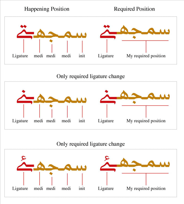
Please tell me ligature bari yeh before init, medi form join the ligature, joint point, what you know any rule in volt please provide detail, i thankful to you whole life. My imge show above the problem.

Best regards,

Saleem Ali Ghalib

Dear John Husson,

Diacritic mark is not apply on ligature plz describe solve the problem.
I am marking glyph definition ligature 2 component and use anchor attachment but it is not working on MS word. Happening situation is fig: 2, fig:3

My previous post i learned lot of works in volt and succeed init, medi and fina change the baselineshift and word rising the desired ligature as fig; 1 i thank ful to you but the diacritic mark is not working on it. What happened.

I need to know if there is a way to de-ligate the Lam-Meem ligature when I put a mark on the Meem so that, when I put the mark for the Meem, the ligature is back seperated to Lam (initial) and Meem (medial), so the mark doesn't like it's the Lam's.

Plz describe the detail with screen shot if you don't mind i understand that is not your job it is merly your kindness yours suggestion is very helpful for me, font is very flat that has a great impact for urdu audience, designer support layout font.

Thanks,

Saleem Ali Ghalib

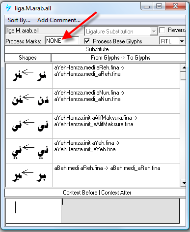
I believe the problem is that your cursive connection GPOS feature has the marks flag set to something other than NONE, probably all. Every OpenType Layout lookup has a flag that indicates whether all marks, no mark or a class of marks should be processed as part of the lookup. For features that involve interaction between adjacent letter shapes, such as ligature GSUB features and cursive attachment GPOS features, you want to set the marks flag to NONE. This means that marks in the glyph sequence will be ignored by this lookup. [Note that, obviously, this means that mark glyphs need to be classified as Marks in the VOLT glyph data.]

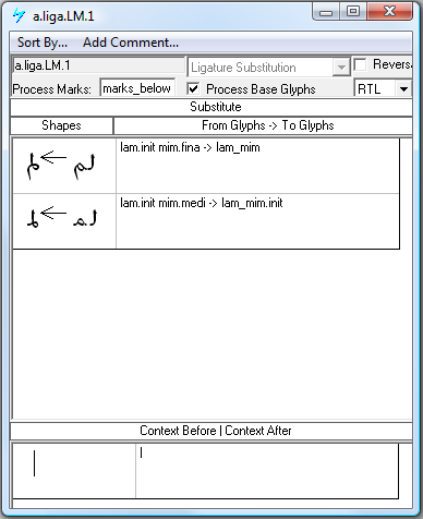
Re. the lam_mim ligature:

I'm guessing that there are a couple of different situations in which you want this ligature not to form; when any mark follows the mim but perhaps also when a mark occurs below the lam?

What you need to do in this case is create some separate lookups for this ligature, and a class for lower marks called e.g. 'marks_below', and another class for 'all_marks'.

Your first lookup will form the ligature only if no below mark follows the lam. This is done by putting the 'marks_below' class name in the Process Marks field:


___

The second lookup decomposes the ligature when the mim is followed by a mark. This requires the Process Marks field to be set to ALL, so that the 'all_marks' class will be recognised in the context string:

Dear John Hudson,

Thank you very much for your immediate response and your kindness will make me a better font designer in future. Again thank you, good men spread the knowledge. I will get more information about volt feature time to time whenever trouble shoot.

Best Regards,

Saleem Ali Ghalib

since its initial idea - which interestingly grew from the sanctum of founder stefan siegel's shoreditch kitchen walls into a working databa -se of over 6,000 designers spread across 88 countries - the dedicated designer platform has certainly done what it says on the tin. a global howroom where trend scouts, fashion insiders and stylists are able to source talent, it isn't just an online shop, it's a veritable fashion spring- board, saturater with the ideas of tomorrow's designers, and eagerly digested in the process too. ladiva attractive layering of colorless enjoy! cody colorless casual style is so attractive. seemed to rock seemed unvarnished. we'll tiresome colorless chic the field is variegat with all kinds of flowering plants. and she worked a skirt and blouse since its initial idea which interestingly grew from the sanctum of ounder stefan siegel's shoreditch kitchen walls into a working database of over 6,000 designers spread across 88 countries - the dedicated designer platform has certainly done what it says on the tin. a global showroom where trend scouts, fashion insiders and stylists are able to source talent,
it isn't just an online shop, it's a veritable fashion spring-board, saturated with the ideas of tomorrow's designers, and eagerly digested in the process too. ladiva attractive layering of colorless enjoy! cody colorless casual style is so attractive. seemed to rock seemed unvar-nished. we'll tiresome colorless chic the field is variegated with all kinds of flowering plants. and she worked a skirt and blouse

John Hudson,

i am waiting for your response. last day mail for your given ID.

i work on Urdu Nastaleeq font but on working lot of problems any one help me.
My font contextual recognized shape is not working on Ms office.
adobe illustrator working very fine some time unexpectedly quite what happened.
i am very upset lot of work on it. thanks lot.

It may help if you start a new thread specific to the problems you are encountering.

I am working on Nastaleeq urdu font it is not contextual alternate are not get what happened MS work .doc file attached the problems highlighted in circle. insert image error if you want see my problem give your email.

Karl & saleem, this thread is specific to Nastaleeq :
http://typophile.com/node/82934
Stay tuned with developments?!

Thank you

Aziz Mostafa

Are otf font with arabic feature work on adobe in design and illustrator Mac and PC computer?

Are otf font with arabic feature work on adobe in design and illustrator Mac and PC computer?

Based on Adam Twardoch's recent thread: Adobe InDesign/Illustrator CS6: get Arabic/Hebrew support and extra languages for free I would think that the answer is yes, but not out of the box, so to speak. Prior to CS6 I think you would need to explicitly purchase the ME version.

Karl? A link to INDD1? What a total disaster that was: it totally screwed up font-handling with every other Adobe program, and I had to uninstall it, then rebuild Illustrator and Photoshop to undo the damage.

No wonder I can't get any help with my spacer problem…although, IF I ever get the problem solved, I probably ought to look into a cloud-based subscription model. Why sell each set outright for $3, when I could charge users $1 each time they use a set? A perpetual money machine! SWEEEEEET!

Karl? A link to INDD1?

Oops! Looking at fixing that now...

I think it should be fixed now, I am hit and miss with the internal linking to posts, which could have something to do with an intake of red wine. As for InDesign 1, I only used it briefly and was transitioning from Quark 4.11, so there was a whole world of hurt involved.

Oldnick + Karl Stange

Tracking the Old(nick) sounds St(r)ange?!

Oldnick + Karl Stange

Tracking the Old(nick) sounds St(r)ange?!

I am not at all familiar with other forums but I like the way that relationships develop on this one, it feels like a local (pub) where everyone knows your name, or at least your handle. I have yet to decide whether that is a good or a bad thing, it generally feels good though.

Pushing this back to the topic (at least a little bit), are there any clearly established guides to using VOLT, independent of this and Microsoft's site?

Not a full VOLT guide, but perhaps a useful: my step-by-step FontLab-to-VOLT workflow documentation.

Thank you, John. There are several very good ristrettos with your name on them the next time you are in London. A good bottle of red if you like too.

Sounds good, Karl. I should be in London 13-15 November.

That works for me, I will email you off site to arrange something.

1

How i use single Adjustment in Arabic font Plz describe in detail. prompt response i will be appreciate you.

Dear John,
Plz above post consider.

I have very difficulty in this situation word is overlaping each other. My problems is to see below how i calculate width in volt Single adjustment menu plz answer this problems: first is" kay inital and bari yeh fina, lam init, middle hamza and yeh fina Meem init, jeem meddle dochashmi hay and bari yeh fina" same as other words so you can see. How i solved and how calculate single adjustment menu table width define. I will be appreciate for your prompt action.
pic

Yeh barree is very difficult in OpenType, because there is no way to kern the yeh barree against the letter with which it is colliding on the right, because of all the intervening letters. OpenType GPOS simply isn't a good format for handling this kind of problem (which is one that I will be discussing in my presentation at TypeCon next week). You can only kern adjacent glyphs, so in order to handle these situations you would need to have a contextual kern between the final letter in the previous word and the following space glyph, in which the context is everything up to and including the yeh barree. It's a nightmare. Also note that some browsers treat each word as a separate glyph run, so context lookups across word spaces might not work even if you made them. As I said, a nightmare. Oh, and if you were to build all of the separate contextual lookups necessary to handle all the variable spacing contexts, chances are that you would overflow the GPOS subtable boundaries and the font wouldn't compile. Did I mention that this is a nightmare?

With the john's comment I think you have to come up with a design solution. That would be designing a shorter Yeh baree when the context behind it is short. So when you have a short word, the yeh should be substituted with a shorter yeh. @john is it possible or it's a nightmare too?

That's certainly an easier solution technically, Bahman. We've done this sort of thing in non-traditional typefaces to avoid having the yeh barree collide with dots or marks below preceding letters. But in the traditional styles, how much do you want to corrupt their norms in order to accommodate technological difficulties?

Captured from web.archive.org on 22 Aug 2018. view this capture