Typophile

Better term for "Virtual Typefaces"? Wikipedia category

Thomas Phinney0 votes

Hey guys,

So, somebody on Wikipedia has been fairly successfully propagating the label "virtual typefaces" for what I would call digital typefaces or digital fonts. That category has been getting applied to many typefaces, apparently the distinction being that they are *only* available in digital form, and were not phototype or metal typefaces.

So, two related questions:

1) I might argue that every typeface that is available in digital form should also get the same label (whatever that label is). Agree or disagree?

2) I think the label "virtual typeface" is silly. Nobody uses that term that I am aware of, except this one person. The actual link redirects to "computer font." Some possible labels:

  • Computer typeface
  • Digital typeface
  • Virtual typeface

For the category label, "font" does not work so well because we are indeed talking about "typefaces" (the entire family).

What do you prefer?

Personally, I prefer "digital" over "computer" because these fonts are used on many devices that are not thought of as computers, even if they do have computer chips inside them.

If you follow the link http://en.wikipedia.org/wiki/Virtual_typeface you are redirected to "Computer font". Note that there are virtual fonts in TeX, with extension .vf

Definitely “digital”. How can this guy possibly insist on a term that people who make the damned things have never heard of (outside of TeX)? Good luck with that.

Virtual fonts in TeX contain no glyphs (no spline) of their own and thus may deserve being called "virtual".

'Digital typeface' seems eminently sensible, if one intends to refer to the target medium of the original design. Hence, one would talk about metal typefaces, photo typefaces and digital typefaces, as types originally designed for those media, independent of their current implementation in whatever font format.

I thought this was about font delivery via the cloud... But even for that "virtual" is pretty lousy - I would prefer something like "offline", "hosted", "proxy" or something. But for plain ol' computer fonts, "digital fonts" isn't just reasonable, it's also already established. Please get him to stop.

hhp

"1) I might argue that every typeface that is available in digital form should also get the same label (whatever that label is). Agree or disagree?"

Digital alone has never described bitmaps vs outlines vs strokes vs metafontishness.

"2) I think the label "virtual typeface" is silly. Nobody uses that term that I am aware of, except this one person. The actual link redirects to "computer font."

Silly as it is, it is word for word, accurate. It is not a font but a typeface, and it has the attributes of wood, metal, and phototype, without sharing its physical form, unless one insists on making a font from the virtual typeface.

>How can this guy possibly insist on a term that people who make the damned things have never heard of (outside of TeX)? Good luck with that.

If this fellow has enough time on his hands and an agenda to devalue digital type then maybe he can get the term to stick?

> Silly as it is, it is word for word, accurate.

I am not disagreeing that it is an accurate description. But I don’t think it is reasonable to make up a brand new term for an encyclopedia. It also seems to denigrate the category, as Si points out.

[to follow]

It is not a font but a typeface, and it has the attributes of wood, metal, and phototype, without sharing its physical form, unless one insists on making a font from the virtual typeface.

In that sense, all typefaces are virtual until implemented as a font. But that's not the sense in which the guy on Wikipedia seems to be using the term. He's using it to distinguish typefaces designed for digital media from typefaces designed for e.g. metal. I presume he's borrowing the term from 'virtual reality', confusing the computer medium of digital virtual reality with what makes it virtual (which suggests he never played any role-playing games).

Digital alone has never described bitmaps vs outlines vs strokes vs metafontishness.

A general descriptive term or category doesn't need to express distinctions of sub-categories.

I agree that the notion that a typeface only available in digital form isn't a "real" typeface is not sensible. Now, if somehow the only fonts in which it were available had some kind of DRM code in them, so that they could only be displayed and never printed...

But at one time, I coined a similar phrase. A manual for a computer text processing program assigned some EBCDIC codes to overprinted characters on a particular line printer. Since those characters didn't actually correspond to type slugs, I proposed to call this extended character set a "virtual character set".

By focusing on the means of production instead of the end product, I perhaps made the same mistake as they did here.

If the initial question refers to the page entitled "Category:Virtual typefaces" http://en.wikipedia.org/wiki/Category:Virtual_typefaces which states

This category contains virtual typefaces that exist in digital form, as opposed to actual type that has been cast in metal, or fonts made available for Photocomposition.

a page which contains "Ionic (wooden typeface)" in its list, then "digital typeface" would not be any better than "virtual typeface" as a name for the category (and the description does not correspond to the list).

The whole notion that anything on a computer is only virtual vs anything physical is, as I suggested earlier, a misapplication of the term as it relates to a particular digital phenomenon, 'virtual reality'. What makes virtual reality virtual is that it seeks to emulate things and experiences that exist in reality. This seems to me directly contrary to the usage proposed for 'virtual typefaces', which are -- ignoring the massive inconsistencies of the example list -- precisely those that do not seek to emulate actual type defined as that 'cast in metal'.

~

I think it's better to leave the word "virtual" in strictly the sense as that in LaTeX.

Say, assume that I somehow hacked libfreetype and libfontconfig to let my programs use a typeface named "Hybrid", which is just Times New Roman except an alternative /g/. Programs requesting for glyphs in "Hybrid" will get every glyph except /g/ from Times new Roman but will get a /g/ from another source. That "Hybrid" font will deserve the name of a "virtual" font, because it doesn't actually exist in my hard disk (if it would, I will be violating the EULA of Times New Roman).

Other uses of this term will cause confusion. Why not just digital or "digital-only"?

Note that the LaTeX use is virtual font, not virtual typeface. As I understand Tom's original post, the search is for a term that denotes types originally designed for digital media, as distinct from say those that are digital font revivals or otherwise versions of types originally designed for metal etc.

BTW, your example of a LaTeX virtual font corresponds to what is now often referred to generically as a composite font, i.e. a combination of two or more fonts appearing to applications as if a single font, allowing mixing of glyphs from these different component fonts to represent specific characters. The ISO/IEC 14496-28:2012 standard defines a Composite Font Representation, which is a kind of XML wrapper identifying the component fonts and to which characters they apply.

John Hudson,

Thank you! Composite font is a good name for what I had in mind.

"He's using it to distinguish typefaces designed for digital media from typefaces designed for e.g. metal"

Yeah that part is nuts.

But, we now have virtual typography, and one dont get there without virtual typefaces, and unless you like digital fonts or digital outlines or outline fonts, or digital outline fonts or digital typefaces, typeface fonts, typeface outlines, or fonts, we had no term.

Whether the fonts are imitations of metal printed on sand, Garamond in general, or Segoe on xp at 19 PX in particular, is not that important compared to the users' points of views, which are, that these things were all physical before they appeared on screen,

(and BTW, deep down in a piece of the brain you'll never find, there is the actual virtual skull of a cow lurking for every single a, and a holy cow for every a-ring.)

@John Hudson:
a misapplication of the term as it relates to a particular digital phenomenon, 'virtual reality'.

Of course, though, the idea of using "virtual" in a similar sense in connection with computers came about much earlier, back in the days when the term "virtual memory" was used for what swap files give to programs.

In that sense, isn't computer memory itself "virtual" as what it stores is probably never produced first in somebody's brains.

Perhaps for we should call the swap files "virtual virtual memory" then.

In my opinion, adopting the term “virtual” not only requires a contextual re-definition of the term, but opens up a can of worms to the tune of needing to back-label every other typeface in the world based upon its original material design. Not to mention how to deal with ones that were made in different materials at the same time. Too many combinations.

Prediction: Instead of being called “virtual typefaces” (by one-eyed technophiles with a desire to label all things new) the term will disappear within two years, and what are now being called “virtual typefaces” will be called what they are. Typefaces that only exist in a digital form (or a similar phrase that is a simple and accurate). Ore better yet, what they have always been called. Typefaces. I believe the term “virtual typeface” will eventually be seen as a fad buzz-word, the way we now view the term “information superhighway.”

I think that since digital type is the norm these days, the distinctions should be for metal or other forms of type... Which is sort of what we do already, isn't it? Type is assumed to be digital by default, unless you specify otherwise.

And I who thought that all typefaces were virtual; that once they became real, they’d become fonts.

The fact that http://en.wikipedia.org/wiki/Virtual_typeface redirects to an entry titled "computer font" should say it all .

Is it too late to propose cyberfont? Because that would be, like, cool and futuristic....

“Cyberfont” totally gets my vote. I’m still pissed that the “Information Superhighway” didn’t end up being called the “Infobahn” (its mentioned in first sentence of the Wikipedia link).

you're all crazy.

:o)

Just out of curiosity, what does he call photocomposition typefaces? How about in-between systems like the L-202 (with which bbg is intimately familiar)? The type is stored digitally, but can only be usefully rendered on the video screen, where it exposes photosensitive paper.

Digital *fonts* (what's sold) are published. Metal fonts are *founded.* Can't copyright 'em... What's photocomp, published or founded....?

The implementation of type, a "font," is a system capable of rendering random character sequences the same, if one chooses, time after time. Handwriting, painting, stone cutting, etc., perforce introduces variables in the characters each time they are created.

Wikipedia is full of errors about type and typesetting.

And so what if we're all crazy?

Chris, I'm reminded of one of my favorite cartoons from the 90s: a 6-lane freeway labeled "Information Superhighway", totally congested with trash trucks... Kind of like when TV was invented, people were so excited that it would enable widespread education...

You need a king for that.

hhp

And who can forget Typography with the IBM Selectric Composer (Frutiger, A. 1967).

"computer font" should say it all .
Sort of like saying motor car... or, um, electric light.

You need a king for that.

Oh yeah, universal education is a real hallmark of monarchical aristocracy. That's why social democrats never had to fight for it.

Have typewriter fonts been classified?


Figure 1: What is this classified as?

an antique

John, let's just say that I don't count the de facto enslavement of women to further better brainwash our children (concocted by British democracy to -further- empower Industry) as "universal education".

hhp

I guess Infobahn wasn't pretentious enough for the Inner Party.

Aside: I also like 'Infomat' for a public data terminal and sedecimal for the sixteen-digit numbering system.

Those highway metaphors were always silly. Everyone knows the Internet is a series of tubes.

"...needing to back-label every other typeface in the world based upon its original material design"

What? this is a project well underway for other purposes, but there is nothing here-related "needing" it, and no one is saying "every other typeface in the world", it's "every typeface in the world", dude.

"Have typewriter fonts been classified?"

Normally (as in since mid-60's?), they fall into a class called "Monospace", but we are thinking about subclasses and trans-classified fonts too.

"...a real hallmark of monarchical aristocracy"

...is its habit of crushing type under the free press it crushes above?

It would be funny, if it were not so sad, that the longest "successful" chain of monarchs in Euro-history, were also the last aristocracy to go genocide, (against Greeks, Assyrians and others), leaving its democratic successor state to clean up the mess. If that line had only fallen a single generation earlier, there might be a much more diverse Near-Eastern cultural landscape. But it's all virtual now.

I am surprised, nay, stunned, that a collective of contemporary type designers cannot solve the problems that have long plague the world.

That said, and borrowing from a post by Thomas in another thread, how about, in a technical environment,

Typeface = design,
Font = specific implementations of the design.

Yes, I know this moves the terminological debate from "virtual typeface" to "virtual font," but somehow I'm much less resistant to "virtual font."

For commonspeak, where 'typeface' and 'font' are collapsed, well, as always, rely on context.

David, are you taking about Germany or Turkey?

BTW the longevity of a monarchy has nothing to do with how likely it is to end in genocide. And most significantly, the worst genocide in history was carried out by a democratic country... the one you and I are standing on (which is one reason I don't vote). One could even say that the US would not have become a superpower without the Native American genocide (not to mention slavery). And it doesn't help that there's a holiday to pretend they were friends.

hhp

Typeface = design,
Font = specific implementations of the design.

Fully agreed.

I agree with that, too. “Virtual font” would make more sense, although it’s still not a term anyone uses.

I’m not sure I’m following the typeface/font distinction you are drawing in the context of this thread.

To date, my understanding has been Typeface = an entire family. Font = a specific size.

Do not your “Typeface = design, Font = specific implementations of the design” confuse the entire “virtual” naming scheme even further as it shifts the meaning of two previously defined terms?

Chris: To date, my understanding has been Typeface = an entire family. Font = a specific size.

Nooooooooo. A typeface is an individual design style, so that would be not an entire family but the individual roman, italic, bold, etc. designs. A font is a functional implementation of a typeface or some part of a typeface for a given technology. Hence, a font of metal foundry type would be a tray of sorts in a particular style/weight combination, its functionality determined by the set of languages it can cover. So a single typeface, e.g. Fubar Roman, might be spread across multiple fonts if it happened to support more characters than a single composing tray could hold and had extensions for 'exotics'. You are right that a font, in the context of metal type, would be a specific size, but it is a specific size of a specific style design: a font is not a specific size of an entire family. A family is either a typeface family or a font family, depending whether you are talking about a set of related designs or a collection of fonts.

What I like about this use of the terminology is that it is technologically independent. The notion of a typeface as described and the notion of a font map neatly to various typesetting technologies and attendant font formats, even though the referants for the word 'font' change and the elements of a typeface that can be captured by an individual font varies for different technologies.

@Thomas: That category has been getting applied to many typefaces, apparently the distinction being that they are *only* available in digital form, and were not phototype or metal typefaces.

People!
You’ve got the wrong end of the stick, from Thomas.
The Wiki page in question lists digital revivals of pre-digital type designs (with the odd mistake, such as Minion).
The idea is that digital revivals are virtual versions of metal/photocomp typefaces.
That is, if not misleading, shallow.
For instance, consider three of my faces:

1. Scotch Modern. Even though this is a digital revival, it is not a virtual typeface, because the outlines do not look like metal type—rather they look like typography done with metal type, including the artefact of press gain. So, although the fonts are not virtual, they can be used to create virtual facsimiles of old letterpress documents. The distinction is between type and typography, which this “virtual is a digital revival” concept does not address. ITC Bodoni, virtual; digital Bauer Bodoni, certainly not.

2. Handsome Pro. An original design, and hence not “virtual”? Surely, if any category of digital fonts deserves to be termed virtual, it is those OpenType scripts, with ligatures and flourishes, the express purpose of which is to imitate handwriting and/or hand lettering.

3. Brown Gothic. As an original design, this would not be considered a virtual font or typeface. Nonetheless, it has been designed specifically to imitate, when printed by offset lithography, the effect of letterpress printing. I would say that’s highly virtual.

> The Wiki page in question lists digital revivals of pre-digital type designs (with the odd mistake, such as Minion).

That almost fits the evidence, but:

1) The "odd mistake" is about 10-15 of the 149 entries on the list.

2) In the linked "talk" page (http://en.wikipedia.org/wiki/Category_talk:Virtual_typefaces), the inventor of the term seems to say that he intends it to apply to all typefaces available in digital form.

3) The definition of the list, on the list page, says something different.

The page: http://en.wikipedia.org/wiki/Category:Virtual_typefaces

Definition on the page: This category contains virtual typefaces that exist in digital form, as opposed to actual type that has been cast in metal, or fonts made available for Photocomposition.

(In the definition, "Virtual typefaces" is a link to "computer fonts")

I think they are all virtual typefaces, Nick. It doesn't matter what it's trying to look like or how it got that way. Unless one makes a digital outline font that can only function at one size, (a bitmap is a virtual font), all others are virtual typefaces. Typefaces before, were a font style at all available sizes. Typeface families before, were several font styles at all available sizes.

Typefaces now are a style able to represent all font sizes, (a virtual typeface).
Typefaces families now are one digital file, that can generate all the styles and sizes of those styles, like a superpolator file, (a virtual typeface family), or a group of typeface styles, coming in all sizes, like a normal family of otfs, (and a family of virtual typefaces).

Simple as pi.

Hrant: "..the worst genocide in history was carried out by a democratic country... "

You need a history lesson. Between 70 and 90% of the native population of north and south america was destroyed by deceases brought to the western hemisphere by monarchy-funded voyages of discovery, before 1783.

Pure obfuscation. Your Manifest Destiny was the greater disease. Everybody knows what happened, but it would cost too much to do the right thing. The democratic United States carried out a program of mass extermination to establish a more expansive country. They only stopped because they hit the Pacific. You need to fess up, individually, as a people and as a country. Most of the world knows that, but everybody has their own causes to fight.

And please answer my question, so people don't have to wonder why you left out Armenians (who lost the most) and how you think the organizers of ISType having to warn the speakers not to bring up the Armenian Genocide qualifies as "cleaning up the mess".

hhp

Off topic much?

I mean, I actually find the discussion interesting, but it seems a bit far off of “virtual typefaces”....

T

I can let people like David get away with distorting my views*, but -unless a moderator tells us to stop- I can't let them get away with distorting genocide, especially when one of them is mine.

* Like I did here: http://typophile.com/node/98443?page=1

hhp

@John Hudson: Re your (our) definitions of font and typeface, I think for the most part we mean the same thing but with different words. In the context of metal, I define Univers—all sizes, all styles—as a typeface. Nine point Univers 45 light is a font. Do you agree?

I am working at my friends farm for the next while and am away from my library so I can’t provide any proper references (as formatted in a previous thread: Two space, or not two space?)

I will most certainly do so as soon as I return as clear operational definitions are essential to this sort of discourse.

Chris: In the context of metal, I define Univers—all sizes, all styles—as a typeface. Nine point Univers 45 light is a font. Do you agree?

No. I thought I'd been pretty clear: the term typeface does not refer to a family, it refers to one stylistically homogeneous component of that family, e.g. the roman design or the italic design or a particular weight. Univers is not a typeface, it is a family of typefaces.

Now, I fully accept that many people -- me included -- use the term typeface in a general and imprecise way to refer to a typeface family, but this is a form of synecdoche -- pars pro toto --, or simply abveviation. So, for instance, one says commonly that 'I admire the design of the Univers typeface', when what one probably means is that one admires the design of the whole family.

But the more precise use is important because one sometimes wants to talk about the individual members of a typeface family, i.e. to talk about the individual typefaces.

A font is always a technical instantiation of a typeface, part of a typeface or, in the case of MM fonts for instance, more than one typeface. I think this is the fundamental concept to bear in mind when using the word font: it refers to a functional thing within the context of a given technology, not to a design, and that thing may be a tray of metal sorts, a case of brass matrices, a film strip or glass disk, or a computer binary file (or files in the case of e.g. PS Type 1 fonts). It is the functionality of the thing that defines its 'fontiness'.
_____

PS. I have no doubt that, when you return to your library, you will find numerous citations to contradict my definitions, and to contradict each other. You will also find many, many sources that use the word 'character' to refer to what we now tend to call 'glyphs'. Over the past twenty years some of us who have worked in font development have found a need, unsurprisingly, to be able to talk precisely and unambiguously about the things we have to deal with on a daily basis. That has meant introducing distinctions that didn't used to exist, or to clarify and be more consistent in our use of existing distinctions. There is no way to talk clearly about the ins-and-outs of text encoding and text display without a distinction between character and glyph. Likewise, there's a professional usefulness in clearly distinguishing between typefaces and fonts, although most people in common usage do not.

Do you have quotations from primary sources with references to support your definitions? I have not heard the terms defined this way before.

I am a primary source. So is Thomas. We've been at this a long time, and have developed working definitions that enable us to talk clearly about the work we do.

Maybe it will help if I parse your Univers example.

In the context of metal, I define Univers—all sizes, all styles—as a typeface. Nine point Univers 45 light is a font. Do you agree?

Univers is a typeface family.

Univers 45 light 9pt is a typeface, i.e. it is an individually homogeneous design component of the Univers typeface family. [We're talking about metal here, so individual sizes also constitute separate typefaces because they are individually homogenous designs.]

A font is any technological instantiation of that typeface. In the case of foundry type, this will usually be regarded as a single case of type with all the characters needed to set text in that typeface, i.e. in that style and size. If someone is working with more languages than are supported by a single case, they might have more than one font for the single typeface. In the case of hot metal type, the font will be a set of brass matrices, and again they might have more than one depending on the extent of their character needs.

That a single typeface might require more than one font in a particular technology in order to meet the functional needs of the typesetter should alert one to the disadvantage of saying 'Nine point Univers 45 light is a font'. Such usage provides you with no way to discuss technological particularities. Note also that if you talk with letterpress typesetters, they will not say 'I have the 9pt Univers 45 font'; they will say 'I have a font of 9pt Univers 45', by which they mean they have a case of that typeface.

I am a primary source.

Ah, well put! :-)

hhp

Do you have quotations from primary sources with references to support your definitions? I have not heard the terms defined this way before.

John's right, he is a source. But in the greater scheme of things, just what *counts* a "source"? I just wrote a chapter in a book (pub date 10 June 2013) that *may* get into this distinction, does that make me a source?

But an earlier work: here is the definition of Typeface from the Glossary of Typesetting Terms, Chicago: 1994, page 106 (& part of the series, Chicago Guides to Writing, Editing, and Publishing.

Typeface: One of the variations or styles in a type family. The design of a type family, including its shape, weight, and proportions, makes it distinct, but it usually exists in many sizes. See also Appendix 3.

I'd note that this was written before the significance of PostScript fonts, and one of our authors included a Brit -- though an LCP rather than a Reading graduate... The definition of font, for example, suffers because only metal and photocomp are considered.

Edit:

Sources do matter, of course. Here's another definition of virtual

Another word used in place of "cool" or "awesome" by urban white punk kids

(From the urban dictionary...)

"Off topic much?"

Hell no, we found out Hrant's a virtual voter.

John wrote:
> I am a primary source. So is Thomas. We've been at this a long time, and have developed working definitions that enable us to talk clearly about the work we do.

I am flattered, but unfortunately on this particular issue, we disagree! I use the word “typeface” like Charles E and Chris D. That is also a clear majority usage within our industry, at least as of four years ago: http://www.thomasphinney.com/2009/04/font-terms-survey-results/

Thomas, as far as I can tell, Charles and Chris are not using the word typeface in the same way. Chris is using typeface to mean type family, while Charles appears to agree with me that a typeface is one part of a type family. The definition that he cites from the Chicago glossary of typesetting terms is pretty much identical to my usage.

[That definition is from 1994, so I take its reference to multiple sizes to imply scalable type. In discussing metal type, I expect there are people who don't treat size as a constituting individual typefaces, i.e. who would consider 9pt Fubar Italic and 10pt Fubar Italic to be a single typeface, but I think that usage is influenced by pantographic production in which different sizes are closely related designs. If one looks at older types, and at things like Koch's Neuland, in which the individual sizes are quite distinctive and may even involve different letter shapes -- consider the variation of the shape of Q in Caslon's different sizes of text type -- it quickly becomes obvious that a generalised definition shouldn't treat different sizes as a single typeface.]
_____

I'm interested in terminology that enables one to talk precisely about phenomena. The use of typeface to mean typeface family and font to mean individual typeface, while common -- as your survey revealed --, strikes me simply as hopelessly inadequate to actually talk about the phenomena of typeface designs, their organisation in families and their instantiation in specific technologies.

BTW, Thomas, looking at your survey results, I see that among type industry professionals 73.2% responded that 'A typeface is the abstract design; a font is a computer file instantiating a typeface in a specific format' -- which is pretty much my definition of font, at least in the digital context (I don't like the word 'abstract' in referring to the typeface design, though) --, and only 47.9% considered typeface to encompass more than a single style and font to mean an individual style. Given the total number of respondents and the number of positive responses to the proposed definitions, it appears that some people overlooked the contradictions between them; this might have been a problem with the design of the survey.

John, no, differences in sizes wasn't particularly a reference to scalable type. We were including metal type, and remember, with photocomp, there could be different masters, an 8-point, a 12-point, an 18-point, all for the same type family. We were talking about differences in *design.*

But the point that the Glossary is from a time before PostScript is relevant, partly technical, particularly in a legal/sales context. Take "font protection": A font would only work on one brand of machine, sometimes only one individual machine. Linotron 202 fonts took advantage of a chip in the typesetting machine, so if you bought a new 202, you couldn't just load your old fonts into the new machine. Some similarities to PostScript fonts there, but I doubt the notion of copyright was the same.

Anyway, back to scaling type -- any number of books composed in hot metal were scaled in printing. People forget that the metal type was good for only about 5-7 thousand impressions. You don't print a best-selling author from the type as set, you make stereo plates, or pull repro and print offset. With repro & the subsequent camera work, you can scale. I doubt, for example, my first edition of Rex Stout's The Doorbell Rang was really set to a 21 pica, nine point measure. From the look of it, probably set to 2o picas & shot up a bit.

@John Hudson: I in no way refuting or discounting your knowledge, skill, and experience. Quite the contrary. You are significantly more specialized and experienced than I in this field. And most other Typophiles for that matter.

“I am a primary source“

To the best of my knowledge, you would have to be the originator of those terms to be a primary source. If you heard or read them somewhere and they are unavailable for reference, that would make you a secondary or indirect source, but a source none the less. A formal APA example:

————
A font is any technological instantiation of that typeface. In the case of foundry type, this will usually be regarded as a single case of type with all the characters needed to set text in that typeface, i.e. in that style and size. If someone is working with more languages than are supported by a single case, they might have more than one font for the single typeface. In the case of hot metal type, the font will be a set of brass matrices, and again they might have more than one depending on the extent of their character needs.

That a single typeface might require more than one font in a particular technology in order to meet the functional needs of the typesetter should alert one to the disadvantage of saying 'Nine point Univers 45 light is a font'. Such usage provides you with no way to discuss technological particularities. Note also that if you talk with letterpress typesetters, they will not say 'I have the 9pt Univers 45 font'; they will say 'I have a font of 9pt Univers 45', by which they mean they have a case of that typeface.” (Hudson, J. 2013).

Hudson, J. (2013, May 06). Re: Better term for "Virtual Typefaces"? Wikipedia category [Online forum comment]. Retrieved from http://typophile.com/node/102722
————

However,

We've been at this a long time, and have developed working definitions that enable us to talk clearly about the work we do.

If this is the case, perhaps we are indeed in the midst of (re)defining these terms. Which is quite likely given the multitude changing technologies, and quite exciting too. I am fully aware of the phenomenon of biolinguistics and it has to start somewhere.

The very genesis of this thread is indeed about the development of language and meaning.

Perhaps requesting a “primary source” wasn’t what I was going for. I was simply interested if there is documentation of someone else using this language the same way as yourself.

@charles ellertson:

“John's right, he is a source. But in the greater scheme of things, just what *counts* a "source"?

That’s a pretty big question. I would have to do a bit of digging to provide you with a formal answer, but as mentioned earlier, I’m working on a friends farm right now sans-library, and there is daylight, which means I need to put things in the ground. To the best of my ability, and under these conditions, I would say that a source is artifact (book, article, radio interview &c) someone references, that another person could then find at a later date and validate. Without sources, the statement would be considered anecdotal.

I just wrote a chapter in a book (pub date 10 June 2013) that *may* get into this distinction, does that make me a source?”

Yes, this makes you a source. In fact, according to APA, you already are a source:

Ellertson, C. (2013). Title of work. Unpublished work [or “Manuscript
submitted for publication, or “Work in publication”]

And in all instances, one must always be mindful of a source’s reliability.

I wish I had more time to spend. This is a great discussion. I look forward to seeing what has transpired after the sun goes down.

Yes, this makes you a source. In fact, according to APA, you already are a source:

Ellertson, C. (2013). Title of work. Unpublished work [or “Manuscript
submitted for publication, or “Work in publication”]

But I don't remember if I talked about "typeface" versus "font." Maybe not. I know I covered "character" versus "glyph." Remember I went back & changed a lot of "foundries" to "publishers" in the text itself, but probably not all. It's really hard to go back to something you wrote, even for a quick look. Nothing like having all your mistakes shoved in your face, esp. when it's you-yourself doing the shoving...

A quote/reference example I meant to use earlier:

“To me John Hudson is Typophile's most valuable member (and yes, I am counting myself :-).”

Papazian, H. H. (2013). Re: Suggestion: move Type ID Board to top of Forum Menu [Online forum comment]. Retrieved from http://typophile.com/node/101437

Wow. That was very nice of Hrant to say that, and until this moment preserving of my humility to put it in a thread that I was pretty much guaranteed not to read.

Digital Type.

John: See the answers to question 3 as well.

Yes, I saw those, but they simply don't make any sense to me. Saying that the definition of a 'single typeface' is 'a family of one or more styles' just means that you've made the terms 'typeface' and 'typeface family' synonymous. That doesn't seem useful. And your question didn't provide the option 'It is a single style within a typeface family', so that thought, which seems the most obvious definition to me, wasn't presented to respondents to consider.

People will doubtless draw different conclusions from your data, but I'm afraid what conclude is that a) a lot of people have not thought about this very systematically, and b) the survey could have been better designed.

Question 4 employs the phrase 'a single face/style of a font family'. In this phrase 'face' -- which I presume corresponds to 'typeface' and not to some other kind of face -- is equated to a single style, which is my own usage.

____

I've got nothing against sloppy language in any informal context. I'll regularly refer, pars pro toto, to 'type' or 'typeface' when I mean a type family -- e.g. 'Neuland is a great display type' --, just like most other folks do in casual conversation, but I'm aware that in such a situation I am employing a synecdoche, not a careful analytical terminology. If one wants to be able to accurately describe a complex of phenomena then one needs a systematic terminology that enables distinction of those phenomena.

That’s all very well John, but few people, professional or amateur, are going to agree with you that Caslon Regular and Caslon Bold are different typefaces.

I have always referred to my font families as typefaces.
As far as I’m concerned, that is careful analytical terminology.

I would even go so far as to say that Karloff is a typeface, because if it’s not, how can the singular principle that created and unites its family members be otherwise described? Is it a clan of families?

…the disadvantage of saying 'Nine point Univers 45 light is a font'. Such usage provides you with no way to discuss technological particularities.

Nine point Univers 45 Light (metal) is indeed not a font.
But Univers 45 Light (digital) is, and that doesn’t discount variations such as language encoding or Pro/Standard.
The default is assumed to be digital, with a minimal Latin script encoding, so there’s no need to mention that.

I think Karloff is properly termed a typeface system, but calling it a typeface is potentially confusing. And I remember calling the Rotis fonts a "clan" in a short piece I once wrote for the ATypI journal. Even the regular and narrow cuts of Emigre's new Program* I might consider different typefaces.

* See my comments (in particular the second one) here: http://typographica.org/typeface-reviews/instant/

Nine point Univers 45 Light (metal) is indeed not a font.

In metal, it must be - what else to call it?

hhp

John’s point is that it’s a description of the kind of type pieces which can constitute a font, but it gives no indication of which characters are present.

OK, Karloff is a typeface system.

Nick, do you acknowledge the existence of such a thing as a 'typeface family'? You used the term 'font family', but I'm not clear if family is a concept that you apply only to fonts and not to typefaces.

Also, can you tell me how many typefaces you consider there to be illustrated in this image, and if your answer is anything other than 'One', please explain your criteria.

Nick: ...few people, professional or amateur, are going to agree with you that Caslon Regular and Caslon Bold are different typefaces

You may be right, but then I don't require people to agree.

I would say that Caslon Regular and Caslon Bold are coordinated designs, which together are part of a family. A family of what? Of typeface designs, each design constituting an individual typeface. A typeface, in my reckoning, is the design of a set of character representations (glyphs in modern parlance) in a single weight and style, because although other weights and styles might be coordinated with it, it also stands alone. If we want to talk about coordinated typeface designs, we can talk about families; if we want to talk groupings of e.g. larger functional sets, we can talk about typeface superfamilies or typeface systems. But families, superfamilies and systems are all made up of component designs that also stand alone. You don't need all the parts of the Caslon family in order to have a usable Caslon typeface. What do we call those things that stand alone if not typefaces (and presuming that we're reserving the word font for technical instantiations, not for designs)?

So now we have:

a) Virtual typeface (computer font)*
b) Typeface
c) Font
d) Family
e) Superfamily
f) System
g) Design
h) Clan
i) Scalable type
j) Typeface family
k) Font family
l) Typeface superfamily
m) Typeface designs
n) Coordinated designs

And I am probably missing some more.

We appear to be getting even farther from defining “Typeface” and ”Font.” In addition to this, we are clearly demonstrating that many of us apply different meanings to the same words, and that our definitions are are purely anecdotal (So far, Charles is the only one to provide a reference—for Typeface).

Hence the importance of providing quotations with references. With enough quotes and references, perhaps consistent definitions that we agree upon may emerge? Or perhaps we may find that not even the history books have/can answer this question. For example, two sources defining the same word differently.

In addition to providing references, perhaps individuals participating in this conversation can begin by providing their own definitions to the afore listed terms so we can at least have an organized compilation to work from.

Presently, this is a conversation between individuals about semantics (but still a good conversation).

Looks like I’ll be leaving the farm this weekend. Not sure how long until I leave the city (and regular inter internet) before it’s back to the farm. Possibly only 24h. If I have time, I’ll try to provide some more as a starting point.

If this can be achieved, we may well be in a position to assist in the formal definition of many typographic terms, or demonstrate that to date, this has not been done.

One of the better threads I have followed in some time.

*I don’t count Wikipedia as a reliable source given people can modify definitions at will without providing references.

.

But families, superfamilies and systems are all made up of component designs that also stand alone. You don't need all the parts of the Caslon family in order to have a usable Caslon typeface. What do we call those things that stand alone if not typefaces (and presuming that we're reserving the word font for technical instantiations, not for designs)?

I think I'd be inclined to call them "typeface styles."

Do you think

After careful consideration, Brill has taken the initiative of designing a typeface. Named “the Brill”, it presents complete coverage of the Latin script..."

should actually read "...taken the initiative of designing four typefaces"?

"We appear to be getting even farther from defining “Typeface” and ”Font.”

Speaking for yourself, perhaps — my upbringing's definitions of class, typeface, family, style and font are solid into the digital era, augmented by the addition of "Super-Family", changed by an even more tenuous modern attachment to the definition of "italic" than there once was, and re frontier ed by the addition of increasingly plausible virtuality.

But the old definitions still apply, like that the angles of the same width apply across weights and sizes, nothing I know changes that, or that the font class and font family names, make it possible for each foundry to have their version of that typeface from which to make fonts, and most people'll understand... nothing can change that.

There's more, to the end-nub of the smallest un-repeating terminal, but somehow ya'al'l have to argue John's extra-galactically off off-curve points back into the em of this universe, yourselves. :)

Huh, I must've signed in to spokenwordophile.com by mistake.

hhp

Yes, you are missing Digital Type.

Categorization often bogs down in a face-off between historico-cultural considerations (phylogenetics) and empirical description of physical features and mechancis (taxonomy).

In this case, John is arguing for the precision of taxonomy.
That can be problematic, as words don’t have accurate meanings (This and That being the only strictly logical words)—or often even a single meaning.

I lean more towards phylogenetics.

From my perspective as a digital typographer, it seems clear that the professional ecology of typography is based on the style-linked RIBBI family of fonts, going under the family name which is the typeface name, and that is how one uses fonts in a layout—with Bold and Italic variants of the Regular default for emphasis and contrast. This named-family system of font organization evolved in the early 20th century, long before Microsoft and the Web.

From my perspective as a type designer, I conceive of type families as a whole, applying the collection of design vocabulary treatments, which constitute the personality of a typeface, across the various styles in the family.

The vocabulary which constitutes a typeface is comprised of feature treatments such as x-height, serif style, amount of contrast, etc.—things which the PANOSE system quantifies.

It is the uniqueness of this vocabulary which creates the virtual concept that people can hold in their heads and use to recognize and identify a unifying principle or “look” in a type family, which transcends the individual fonts, and that is why the fons et origo of a type family needs to be identified and honored as the Typeface.

John wrote: Nick, do you acknowledge the existence of such a thing as a 'typeface family'?

I am not Nick, but I do not. I have rarely if ever heard that term before this discussion. And yes, I am saying that “font family” is a near-synonym for “typeface.” (Actually, if I wanted to be very pedantic, I might say that *technically* a font family is a typeface instantiated in one particular format or set of files.)

To me, John’s Cheltenham image shows one typeface.

Thanks, Thomas. So you would consider this definition, cited by Charles from the Glossary of Typesetting Terms in the Chicago Guides to Writing, Editing, and Publishing series to be categorically incorrect, yes?

Typeface: One of the variations or styles in a type family.

_____

It seems to me that what we have is two -- hopefully not more than two, at least in broad terms -- different categorisation and labeling systems, both with some historical and conventional usage, but quite probably neither entirely systematically codified (in this, type nomenclature is similar to type design classification, but perhaps not so inherently unsolveable).

I'm beginning to see how the terminology Thomas favours can be made to cover the phenomena, especially if one includes Craig's 'typeface styles' as a label for what I term typefaces. If one can map labels to phenomena, then one can also map labels to labels, across different terminological systems. This might be a worthwhile exercise, as it would reveal the weak points or holes in either system relative to the described phenomena.
_____

Craig, the Brill blurb you cite is using the term 'typeface' as I previously described, as what I consider a synecdoche. It's a marketing text, not a technical document. If I'd written it, I would have likely phrased it thus:

After careful consideration, Brill has taken the initiative of producing a family of typefaces.

But then I'm often more precise than I need to be for the given purpose.

As something of an aside, prising open a smaller can of worms (or can of smaller worms):

While Craig's 'typeface styles' provides a neat category for the individual coordinated designs within a typeface(family), I find the term 'style' problematic at that level of distinction, since differences in weight, size and what I would term style (italic vs roman) exist at that level. Are different weight or size designs also 'styles'? Is it satisfactory to re-use the term style in this way:

Style differences:
- style (e.g. roman vs italic)
- weight (e.g. regular vs bold)
- size (e.g. text vs display)

Yes, I would say that definition was incorrect.

I would use “style” like Craig, although “typeface style” still seems like an awkward and unfamiliar construction to me. Usually I would use “font” in that situation (although technically that would include a specific instantiation).

@bbg: “my upbringing's definitions of class, typeface, family, style and font are solid into the digital era.”

When you have time, could you please provide us with your definitions of these terms? Given your experience, I would consider them a significant contribution to this discussion. No references necessary. Just your own operationalizations.

"Usually I would use “font” in that situation (although technically that would include a specific instantiation)."

Why argue with oneself in front of clients.

"When you have time..."

I have the time, but my feelings are, that Virtual Typeface is a great way to describe our products; Linked to "Computer Font", as it is on wikipedia, is not so good, and that's the easiest way to change things there; This thread is filled with confuseding messages, so functional definitions of class, typeface, family, style and font, device, foundry, designer, size, I'll take on elsewhere, if that's okay with your planting schedule.

Well, I hate to contradict a primary source who knows more about this sort of stuff than I do, but I tended to think of a typeface as an entity that has a (simple) name - like "Baskerville" or "Times Roman". That includes different sizes and weights. A font, on the other hand, is a computer file, a package of little lead-antimony thingies, or a round film negative. As for 9 point Times Roman Bold, we have no good and unambiguous name for that.

However, given there are cases where the italic and the Roman of a typeface haven't really been designed to match each other - and other cases where the companion has a different name (Bembo, for example) - saying that the bold and italic are separate typefaces is something I'm OK with too.

But the point size?

Actually, that makes sense too - at least, if the shape is not invariant with size, but instead the letters are optically compensated - 6 point Century Expanded is considerably wider, in proportion to its height, than 18 point Century Expanded, for example, if you look at the ATF hot metal catalog, and the same was true for most foundry types and most Monotype types in the old days.

But I don't think it's common usage.

Instead, if one says 11 point Times Roman with long descenders, one is giving a type specification, if anything.

Using type family for the typeface name, and typeface for the spec, has its attractions, but I think that "type family" was a phrase used only by one typefounder that never really caught on with everybody else.

“Well, I hate to contradict a primary source who knows more about this sort of stuff than I do…”

What primary source are you referring to?

A typeface is a family of integrated fonts and includes variations in weight and style.

Thomas: To me, John’s Cheltenham image shows one typeface.

So, in effect, your meaning of the term typeface corresponds to the collection of designs that are marketed under a single trademark. This, I suppose, has the virtue of being able to refer to any such collection, however composed, without regard for the nature of the design. So, for example, Karloff is considered a typeface, despite the fact that the designs are not coordinated in any traditional way, because they are produced and marketed under that name. Such a typeface stretches conventional notions of 'styles', but you can live with that I presume.

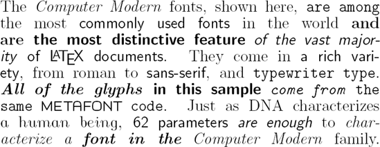
Pushing too much the "single trademark" criterion would lead to consider "Computer Modern" as a single typeface. Here is from Luc Devroye's page Computer Modern fonts (and the following picture refers to Yannis Haralambous)

I am fine with considering the serif as a single typeface but not the serif, the sans and the typewriter fonts together.

And what about Lucida? To me, it consists of many typefaces.

I agree, Michel, but I'm trying to make sense of the criteria by which the usage of 'typeface' that Thomas and others favours can be considered general and predictable. If it doesn't refer to everything gathered under a single name, then on what basis are divisions made into what, I suppose, must be called 'sub-typefaces'?

Bear in mind that it would be nice if the generic terminology of type were not something that only worked in the context of Latin script, so simply saying something like 'presence or absence of serifs' is not an adequate description of sub-typeface division: it is necessary to describe the kind of division that such a difference constitutes, so that we can identify functional parallels.

Somewhere into here, what you are asking for, John, will confront the same problems as classification in general. There are cases that get pretty fuzzy. This is not a horrible limitation in using the term “typeface” in that way, of course; even if you disagree with the usage some of us are proposing, I think you agree that there needs to be some term or phrase oocupying that same definitional space, right?

Computer Modern, like Thesis, is a kind of meta-family or meta-typeface. I agree that at least some of its members seem like distinct typefaces. But as one can blend and morph between the various fonts and styles of Computer Modern, there will inevitably be grey areas with such a meta-family. I can think of other examples that are similarly troubling: Rotis, or Penumbra.

So in any case, no, I do not think that a collection of designs marketed under a single trademark directly defines a typeface (although at least 95% of the time it will be synonymous). Such a definition would in some cases get one in trouble. For example, Caslon Antique is definitely not a member of any broader Caslon family.

This seems to me one of the better things I have read on this subject, from Yves Peters' FontShop article 'Styles, Weights, Widths — It’s All in the (Type) Family '. The article recognises the variance in usage, and how such variance evolved as type technology changed.

A type family is a collection of related typefaces which share common design traits and a common name. A type style means any given variant of this coordinated design and is the equivalent of a typeface. Just like with the typeface/font debate we understand that some divisions have become blurred. This explains why the term typeface is not only used to specify a single style, but also quite often a type family with a number of weights and styles.

I wonder if the typeface = individual style usage is more prevelant in Europe, and the typeface = family usage in North America?

From the FontShop 'Typographer's Glossary' entry for Family:

A collection of related typefaces which share common design traits and a common name. A type style means any given variant of this coordinated design and is the equivalent of a font or typeface.

Super families are very extensive with a very large number of weights and widths. Type systems are collections of related type families that cross type classifications.

And from Adobe's glossary entry for Typeface:

The letters, numbers, and symbols that make up a design of type. A typeface is often part of a type family of coordinated designs. The individual typefaces are named after the family and are also specified with a designation, such as italic, bold or condensed.

I think I am going to have to start using “family” for where I used “typeface” before. Sigh.

But at least we are all pretty much agreed that a “font” is a single style, not the same as a “family,” right?

T

I will continue to use Typeface to describe what I design, which is the coherent set of design ideas which are implemented in a font family, even if that family only has one member.

Richler, for instance, is a typeface, not five typefaces.

A symphony, in comparison, is not a movement family.
A novel is not a chapter family.
A tennis match is not a set family.
A dinner is not a course family.
And so on.

And for good measure, a font is not a glyph family.

Thomas: at least we are all pretty much agreed that a “font” is a single style

Because a font is an instantiation of a typeface in a particular technology, the relationship of font to typeface is determined by the nature of that technology. It is very often the case that typesetting technologies have instantiated typeface designs such that each font corresponds to a single typeface style. But that isn't a terminological determination. If you bought a set of Linotype matrices in which the roman and italic designs were duplexed, you were buying a single font that instantiated two styles. If you bought a license for a Type 1 roman Western European ANSI set, a CE roman, and an expert set for roman ligatures and oldstyle figures, you were getting three fonts that instantiated a single typeface style (and to further confuse the matter, each font consisted of multiple computer files and may have included both a printer font and a screen font).

It was much easier to keep track of in the old days--each font was about 30 Lbs of lead in a big flat wooden box :-)

>"apparently the distinction being that they are *only* available in digital form, and were not phototype or metal typefaces."

At Kernest, Garrick Van Buren uses the term "Web Native" for such.
I was unfamiliar with the term, but became comfortable with it.

The word virtual has been abused often in context with what people describe as the digital world. If there is anything virtual about something digital, it is our boundaries of imagination.

Virtual refers to something unreal, emulated, because it isn’t physical. If only physical things are real, every imagination would be consequently unreal, so I think we can safely say this is not the case with digital fonts or typefaces. Not to mention every computer operation, every mathematical description and every logical explanation, they all would need to be called virtual reality.

I also suspect that digital in itself is an artificial construct. We use the terms digital and analog in this transitional phase for orientation, because we want to distinguish, we want to differentiate. But in reality, the virtualization of products began thousands of years ago, throughout the entire course of the development of civilization.

Good examples are currencies and associated values.

You hear virtual reality, cyberspace and digital all in the same context, when politicians, journalists, book authors and media refer to everything that was made with the help of computers. It appears to me like a new age of mystery label, where everything that breaks out of rational explanations based on products of the past gets a magical label. It is a new dimension, unlike our vintage objects of the past, therefore it must be virtual.

But I doubt that typefaces are any more virtual today, than they ever were in the age of Gutenberg or the Linotype letterpress. If virtual applies, it should be used for the combinations of letters forming words that tell a story. The thoughts they evoke are virtual in every sense of reality perception.

Virtual is a superfluous, artificial construct that fails to describe the difference of a digital glyph in comparison to, say, one made of metal or wood.

Rich: Urm, no. Web Native suggests the typeface was specifically designed or at least optimized for screen use, and is available as a web font. For most digital-only fonts the first part is not true, and I imagine for some the first is true but not the second.

Hmmm, I was reading up on Python and ran into this perplexing bit of history: http://www.myfonts.com/foundry/LettError/

hhp

Captured from web.archive.org on 22 Oct 2017. view this capture