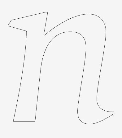
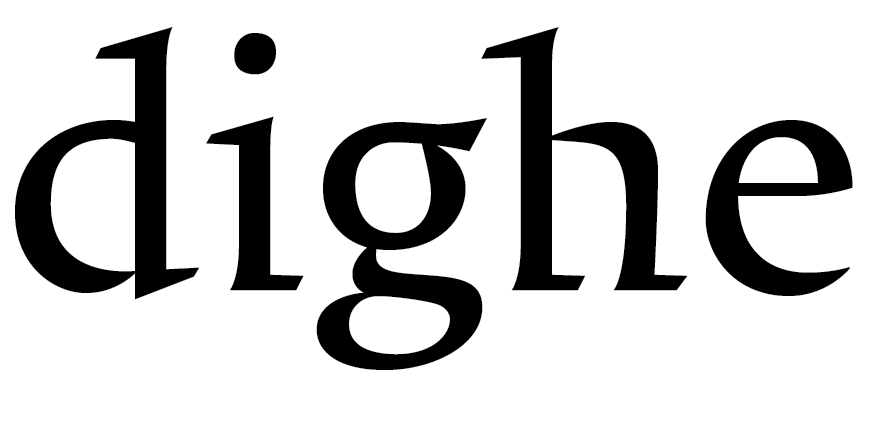
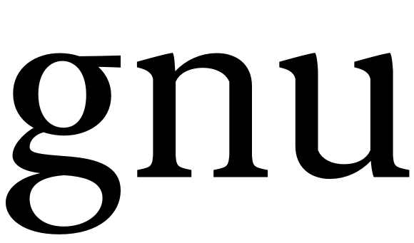
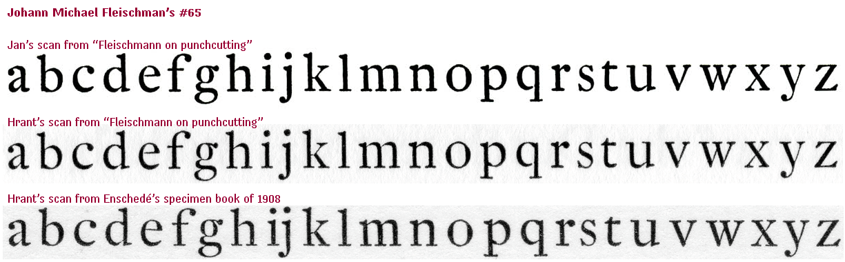
Hi guys. Do you know any (successful) examples of typefaces that mix historical models within the same design? I’m thinking of something like the attached image. Albeit, there’s a lot of strange stuff going on here, but the part I’m interested in discussing is the how the branch grow out of the stem in r/a vs. n-based shapes. The ‘r’ would need to be treated different from ‘n’ in any typeface, so I’m thinking: why not find its echo somewhere else than in ‘n’ altogether?
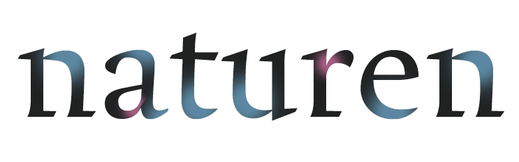
Apologies for the poor English. (And the poor design too. I’m in the process of learning how to draw serifs.)