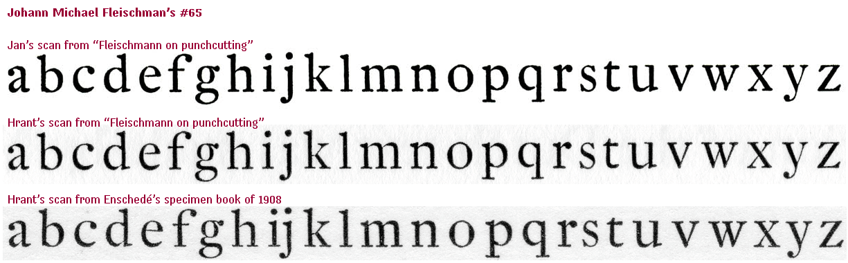
Over at Typographer Yves Peters, in response to requests from typophiles, including this one, reviews Fleishmann revivals Mercury, Farnham, Fenway, DTL Fleishmann and Eudald. A thoughtful and insightful review that was obviously a lot of work. Thanks Yves!
Overall, it seems that Yves admires the audacity and stylishness of Farnham, but favors Mercury as the most usable and elegant version.
Any thoughts from other typophiles who have used these?