Typophile

"Hardware" for typographers

This thread ran to 3 pages of replies and only 2 were recovered, so replies are missing.

Joel Santos

Hey,

I was searching today for pens to help typographers do they work.
Found out Pilot Parallel which seems pretty interesting since i'm left-handed and it's an afordable pen but... what better place to question this than typophile?

What "hardware" do you use to help yourself creating letters?

Logitech MX 300.

hhp

Well ... when I said "hardware", I was more like... saying analog tools ehehe.

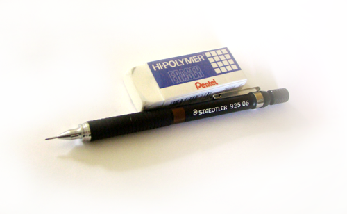
When I have to, I use a mechanical pencil, and paper like this:
http://www.draftingsuppliesdew.com/images/clearprint/clearprint-pad.jpg

Pilot Parallel

Especially if you're left-handed I would personally recommend avoiding broad-nib painting; focus instead on notan (which is determined solely by the border between black and white). Unless you're trying to start a southpaw ductile revolution* (which would be great).

* Where's that thread where John Hudson nicely showed some alternatives?

hhp

I know that. I have 3 Art pen which are just... too hard to use. But Pilot Parallel... I've been seeing nice reviews about it because it goes "both ways" while an art pen just goes one way. I already bought on ebay two parallel so I can try it out.

Here it is - a classic thread: http://typophile.com/node/48843
John's experiments start about 1/5 of the way down on the 3rd page.

BTW you might also try calligraphy pens meant for Arabic. If you must.

hhp

interesting... i'll take a closer look to that topic. thanks

The original Pentel "felt-tip"—which was, in fact, bamboo—was muy bueno. Many an ambitious project was launched on the back of a cocktail napkin…

Joel
You may wish to search John Neal Bookseller for canted edge nibs. The Parallel pens are very forgiving, free-flowing and responsive. He also has books by various artists on left handed calligraphy which may facilitate your experience.A less expensive route may be some of the chisel edge markers. Elegant writer by Speedball is by far the most durable/long lasting but there are others that come in larger sizes.

I use the Staedtler Mars 780 C Lead Holder for lettering (also left-handed). I bought some Microns but I'm not a fan of them or inking my work in general.

@joelsantos & chrisburton: Hands down, that pencil was the siht. I highly recommend it. The choice of lead is up to you. I prefer a 2B. As a lefty, I’d recommend an F.

And don’t forget the “lead pointer tub.”

It makes a bit of a mess if you carry it around as the lead shavings can fall out, so you’ll have to wrap it tightly in a small plastic bag. And see that little white thing? That’s similar to a (replaceable) cigarette filter you stick and twist your freshly sharpened lead into to remove excess shavings.

*sigh*

I miss the days when carrying around a cool pencil and sharpener made you look bad-ass in front of your friends.

That Pilot Parallel is awesome, I'm ordering a set of them with refills!

Here's a shot of what I currently roll with...

...felt tip pilots, various sharpies, lead sticks both round and rectangular, mechanical pencil n' other stuff. Plus lots more that I couldn't bother squeezing into the shot.

This time of year I go out and harvest various types of dried reed plants. They're awesome to draw with!

And ya, I keep my drawing stuffs in sterling silver vessels of all kinds that I never ever polish :)

n.

@typerror: can't find those canted edge nibs. Those speedball seems interesting to me but Parallel are cheaper and easier to get so... I'll go with those for now and let's see!

@chrisburton: What technique do you use? The scribble at 30 degrees? Do you find yourself doing more sans-serif, calligraphy, serif...? That lead holder seems pretty interesting. How is the weight and those things?

@Christopher Dean: Never seen a sharpener for 2mm here ehehe. I've always used the top cap and it sucks! No need to carry around unless it's around the house.

@5star: Refills are pretty inexpensive but I've found that it's possible to have one of those refillable cartridges from the fountain pens on the Parallel. That seems pretty interesting for me, for example, to mix with water to have another kind of transparency level. I've always found that pure black is not really the way to work on font production unless it's already on the computer. Do you really use that whole lot? :P What kind of work do you do?

By the way people, books? I have some collectible books and even left-hand calligraphy book but I think I need a book of techniques (besides this left-hand calligraphy) and sort of.

Typographers use red pencils and yellow, pink and other highlighters.

Calligraphers and lettering artists use a whole different set of tools, as you now can read. :)

@dberlow: why red pencils, yellow, pink... highlighters?

To mark/correct printed proofs! :-)

left-hand calligraphy book

I could recommend some brain typedesign books but I think you're not interested.

hhp

@hrant: what do you mean by brain typedesign?

What I (and seemingly David) have been getting at all along: stop thinking about painting and start thinking about thinking. Even at the beginning type was not made with any of the pretty things mentioned in this thread.

hhp

@hrant: so a more logical/mathematical view of typedesign?

Not necessarily so clinical, but at least try to work as directly as possible with the actual tool used to make letterforms: the bézier. It's harder to make pretty shapes that way, but to me [thinking about] marking the border -not the body- is the only way to truly leverage the medium.

hhp

well I could be interested. I'm still developing myself as a type designer so I don't really know what I want. Do you know any articles with beginner approach to that brain typedesign? :P

Nothing that stands out unfortunately. But you could start by studying the concept of notan as well as the work of Dwiggins and Bloemsma. Aicher was also a thinking designer (so worth reading) but Rotis suffers from being his first (and only) real typeface.

hhp

@hrant: I am not a type designer, but I have decades in design and typography. Shouldn’t one learn theories before, or at least in conjunction with, tools? I’ll take design as an example. We were taught about gestalt principles, rhetoric, semiotics, colour theory, heck, even some math &c. Then we started focusing on what a printing press, graphic camera, tech pen (and eventually computer) could do to help us apply this knowledge.

If all one knows is how to swing a hammer, how can they be expected to design a building?

I'm all for thinking before doing (in fact I emphasize the former too much). But this thread is about tools.

hhp

First off Hrant... lettering is not painting, so just put that out of your mind! Still, you persist in trying to sway others with misnomers.
Secondly, do you think that lettering artists/calligraphers go willy nilly into the dark when designing a font. That tells me you are thoughtless, and or ignorant of my "ilk's" process.
Thirdly... Notan is inherent in the practice of lettering/calligraphy, probably more so than laying down outlines. Outlines give no hint of black/white relationships until there is the presence of both. And you cannot calculate the "undefined" until you define those two elements and look for that "other."

But this is about tools... and your unbending resolve to disallow two different approaches to co-exist.

Did not think you would and that paints you as a demagogue... poor choice of word, it implies leadership and I don't see that in you or your work.

@hrant: Battle!

Nope, no battle. Vacate an argument before you look as bad as the antagonist. There is quite a bit of arrogance in anyone who advocates in the face of proven methods of achievement and denigrates those who chose an alternate, yet viable path. And LL is just plain idiot on parade!

hrant
18 Dec 2011 — 12:46pm

I avoid YouTube like the plague - sorry not to click.

Tee hee!!!!!!!!!!

Thanks for the link to that old thread, Hrant. I'd forgotten all about it. I suspect there is enough content for a book among the things that I've written on Typophile that I don't remember writing. Heck, some of it I don't even remember thinking. I am particularly proud of this contribution to that thread, though, which I think is one of the best things I've said on the subject of the 'software' of type design:

I think that Gerrit Noordzij's theory of the stroke provides one very strong analytical tool: one which I use every day when making decisions about shapes. Perhaps more importantly, I was instinctively looking at shapes in this way for many years before I read Noordzij's formulation of the theory. What Noordzij did was to expand my analysis, so that I saw and understood things that I had previously missed. Crucially, I think Noordzij has described the hermeneutic tradition within which type design exists, and has done so in a way that is independent of the lore, legend, personalities and advertising copy that make up much 'typographic history'. As I wrote earlier in this thread, a hermeneutic tradition is not something from which one can escape, and in some ways one is most deeply embedded in that tradition when one is critiquing it and finding reasons for rejecting it or extending it.

Obviously it’s hard to pick up on playful, sarcastic, tongue in cheek jesting. Yeesh!

I have a few Pilot Parallel pens, but I find only the larger ones very useful. The Pilot nibs are not as thin perpendicular to width as traditional nibs, so at smaller sizes the results are lower contrast than I like and tend to look a bit gummy.

PS. The little piece of thin plastic provided with the pens to clean between the nib sections is essential. Don't lose it.

.

:-) Get that Christopher? I got yours, just don't need anyone "fanning the flames." I am trying to explain to the "eye" that he isn't creating a safe haven for "everyone," no matter what his agenda is. He does not get that!

Noordzij's formulation is indeed extremely valuable in understanding what has been. Paradoxically it's also valuable because it makes it easier to escape the fallacy that is chirography; it's easier to overcome something when you know exactly what it is, and we all owe Noordzij that. The past cannot escape from tradition, but the future can, and it always does eventually. I just hope to be alive to see this particular tradition go the way of the tasty but stupid Dodo.

hhp

Re-reading that, I have to apologize for being too dismissive. I guess Michael's frothing berserker philosophy of life can be infectious.

Ideas never die - at most they go dormant. And I'm not even sure I would enjoy the total absence of chirography. There will always be a place for it - always some people who will make chirographic type, much of it nice to look at. My real contention is -and has long been- that the idea of chirography gets too much mileage it doesn't deserve, and there's not enough exposition of its drawbacks. I often position myself at extremes not because I'm an extremist at heart, but essentially as a well-meaning slap in the face, aimed at people I expect more from.

Thankfully there is a growing, if rag-tag guerrilla army of what I've been calling "liminographers": designers who consciously violate chirography in favor of the direct creation of notan. This "anti" stance is merely an initial reaction. Eventually type will be made by people who simply ignore chirography, and it will be my own favorite kind.

hhp

@hrant: For those not in the know, can you please define what you mean when you use the terms “chirography” and “notan?”

Chirography
Notan
and for good measure, since it seems to come up a lot outside the discussion of rhinoceros enclosures
Bouma

@cuttlefish: concepts hard to fully understand ehehe

This blog thread is really flowing eheh

Guys, what about rulers? Do you use gliders and stuff? What do you use?

@chrisburton: What technique do you use? The scribble at 30 degrees? Do you find yourself doing more sans-serif, calligraphy, serif...? That lead holder seems pretty interesting. How is the weight and those things?

@joelsantos I don't use pens so Calligraphy is out of the question. My work strictly consists of script lettering at this time. The Staedtler lead holder I mentioned above is quite phenomenal. It's pretty lightweight for me and doesn't feel too big in my fingertips. I would absolutely agree with @ChristopherDean about the tub sharpener. The lead holder itself has one attached however, it leaves shavings everywhere and all over your fingers (potentially smudged on your paper as well if you're not careful).

As for rulers, I just use an ordinary stainless steel one.

Side Note: Does anyone know of a modern electric lead pointer? Here is one that Doyald Young used but it's really old. http://leadholder.com/point-kroy.html

Jason, the Typowiki entry on notan is a good explication of the word's common meaning and origins. Hrant's usage carries with it a number of additional assertions, which I think result in question begging when presented as such, but which are due proper consideration when posed as questions. So, for example, near the beginning of this thread Hrant asserts that notan ' is determined solely by the border between black and white', from which he infers then that outline drawing ('liminography) is the only way to attain notan in type design. Now, clearly, neither the first assertion nor the inference is implied by the common understanding of notan as derived from East Asian aesthetics of dark and light, as outlined in the Typowiki. Notan is something that exists whenever light and dark are present in direct relationship, so obviously exists in all typically contrasted text, whatever the means of its making. In terms of traditional use of the term, what matters are canons of beauty associated with notan, and hence it makes eminent sense to talk about notan in the context of calligraphy; indeed, this is one of the main uses of the term in Japanese aesthetics, and serves to link calligraphy with sumi-e and other styles of painting that make use of light and dark relationships, and with traditional design practices. Hrant's use of the term, then, must be seen as novel or idiosyncratic, although I don't think there's anything wrong with that and find it a useful shorthand term for referring to something like 'the relationship of structure and space in type design, in which structure is presumed to be black and space white, or some similar dark/light contrast'. The problem I have with Hrant's use isn't its novelty or its independence of the common usage, but the question begging that goes into his secondary assertions and inferences. When these are rephrased as questions, the whole topic becomes more interesting to me and opens on to possible dialogue:

Is notan a functional concept in reading? In what way?

Is this functionality enhanced or impeded by (para)chirographically achieved notan?

What other design processes might be used to create typographic forms?

How do you establish criteria for functionally good notan in a writing system independent of writing?

There are other questions that follow from these.

As much as I admire Eastern cultures, the proper separation of notan from painting is indeed a paradox they need to resolve (I mean in type, not calligraphy). The upcoming ATypI conference is an ideal opportunity for this. But I'm not holding my breath.

(I'll get to your questions very soon.)

hhp

@chrisburton I also have a Staedtler lead holder. It must be almost the same but maybe your's is more confortable since mine isn't rounded. Anyway, it's my main drawing tool at the moment, the lead holder. Need a good fine point also. Mine are all over and I hate micron.

Back on the original topic: I've used T-squares, triangles, drafting machines that fulfill the roles of both. These days nearly all my graphics work is done with computers, but some of my old drafting tools find uses in painting (proportional dividers are practically a requirement, as far as I'm concerned).

Proportional dividers? hmmmm what do you use them for?

scaling, enlarging and reducing, sectioning, among other things.
A machined aluminum proportional divider like the one I inherited is ridiculously expensive, but I've seen some cheap plastic ones in the past which should serve the purpose just as well.

A reducing lens is a useful thing. It enables one to print large and then get a sense of how it will look at text size at higher resolution than your printer is capable of.

By far the best hardware a type designer could own would be one of those 3d printers that can print into a plastic cube.

Ryan I don't see why that is the best hardware for a type designer. It's fun, it's useful but not the best hardware.

John, looking for those reducing lens now...

I think Ryan was being sarcastic.

Don’t forget “French curves.”

http://en.wikipedia.org/wiki/French_curve

"John, looking for those reducing lens now..."

These can also be handy for putting out fires.

@dberlow: or freeze ants to dead!

@Cristopher: What do you use French curves for on typography?

Think of it as a pre-bezier curve drawing tool. It allows you to dray very specific curves that you otherwise couldn’t do freehand. It has been my experience that they are very difficult to use well.

Fixed french curves impose way too much of their own will on a drawing. Flexible french curves (which might actually be called something else) are a pain to use.

hhp

I bought my reducing lens on eBay. They look like magnifying glasses, but obviously with the opposite effect. Fiona introduced me to them; she'd started using them at Linotype, back in the day.

Is notan a functional concept in reading? In what way?

Yes, because it is the only thing that is read.

Is this functionality enhanced or impeded by (para)chirographically achieved notan?

Since parachirography is an arbitrary design constraint, essentially it can only hurt. When it helps (for example through the manifestation of "stroke" contrast, which I believe helps reading) that's just dumb luck.

What other design processes might be used to create typographic forms?

Others have had some good ideas. I've been working (in the loose sense of the word) on my own. I had an epiphany on April 13 of this year. I'm not saying what it is.

How do you establish criteria for functionally good notan in a writing system independent of writing?

Lacking convincing empirical findings either way, the only way is lucid thought.

hhp

Let's stick with the first question for a bit, so we don't get ahead of ourselves.

You claim that 'notan is the only thing that is read'. But that really does demand a very precise technical definition of notan from you, one which accounts for letter recognition as well as bouma recognition, since both are pretty clearly activities within reading. I'm not sure if I've ever seen such a definition from you.

Earlier in this thread you stated that notan 'is determined solely by the border between black and white'. Evidence indicates that we don't perceive the border between black and white as such at text sizes, only at larger sizes. So it might be useful to elaborate on the function of notan relative to spatial frequency in small areas and structure recognition.

I don't think "we read notan" requires a precise technical definition; I think it's more of an abstract truism - not very actionable except for laying a foundation for further thought. What does require a precise technical definition is "bouma", and I firmed that up back when I wrote the piece "The Bouma Supremacy — they should have left Herman alone" :-) for Typo magazine (issue #13):

A bouma is a cluster of letters that is recognized -in parallel with other boumas- as one thing, anywhere in the field of vision, thanks to a combination of frequency, contextual expectation, distinctiveness and clarity. It can be a single letter (in the fovea, where single letters are fully clear), it can be a whole word (deep into the parafovea, thanks to high frequency, expectation and distinctiveness) but is not necessarily either. So a letter is a special-case bouma, and so is a whole word.

As for "notan is determined solely by the border", I mean "determined" in the mechanical design sense: it is what we make when we're making a glyph (a reality that [para]chirography contradicts). The border isn't what is perceived by the reader; that would be notan.

hhp


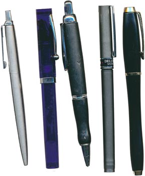
Left to right:

  • Parker ball-point—Isn’t that sleek as a 707? I’ll click it again!
  • Sheaffer calligraphic pen—laborious and needs a good warm-up.
  • 3 mm mechanical pencil—handy for developing drawings (the top harbors an eraser).
  • Uni Ball—good for notetaking in Moleskin.
  • Parker fountain pen—smoother and faster than the Sheaffer.

Reposted from: http://typophile.com/node/92299

@hrant: Please define terms such as “parachirography.” It’s important to help others participate in dialogue. If you use such genre specific terms, you only end up talking to yourself and a select few. Plain language please (or at least big words followed by definitions). This is a public forum.

And that’s a very cool post Nick.

@Nick don't you mess your head with uni ball? Never really liked (don't use them for like 5 years) the way they spread the paint. It always messes everything. Parker is always a nice ball point. I love fountain pens but unfortunately, since I'm lefty, it provokes pain!

That's why I [usually] prefer "chirography" (although it's less accurate). The "para" just refers to the fact that when you're making typographic glyphs you're not actually using a broad-nib pen with your right arm/hand to make the shapes, you're only referencing that method.

hhp

The “para” comes from me, but I don't remember when I first introduced it.

In the contention-laden forum which Hrant highlighted earlier — http://typophile.com/node/48843 — I wrote: “As I understand it, chirography is paraphrastic of the pen. This is different than saying some type is para-paraphrastic. Etymologically para- is beside, alongside of, by, beyond. For me para-paraphrastic is not a program or stance, but a [adding now: universal] type-historical fact.”
http://typophile.com/node/48843#comment-299053
i.e., my post (last page) of 1 Sep 2008 — 4:01pm

Much of this is serious word-play. The root word in all of this is paraphrase.

In the next paragraph I wrote: “Legato is para-paraphrastic” and explained what it might mean to say this.

Elsewhere I wrote that what Hrant calls chiro-graphic is actually chiro-referential.

Legato is para-paraphrastic without being directly chiro-referential. Hrant likes to use the phrase anti-chirographic. Anti-chirographic is a stance or attitude —which Hrant is keen to promote — that I would call anti-chiro-referential or post-chiro-referential.

The importance of saying Legato, for instance, and Turnip too, are para-paraphrastic is that it recognizes that nothing is from scratch, and encourges one to trace how the contrast in and construction of Legato deviate from conventional writing in it’s variants. In the thread I used the para word “parasitical” and discussed the essence of type-design as feature manipulation that involves positive and productive or beneficial norm-violation, which —adding to this now — in digital technologies is splino-graphic or bezier-o-graphic or vector-based. [same thread, starting with 1 Sep 2008 — 6:40am, point 4 of the second set of points.]

The shapes produced by actual conventional writing with a broad-nibbed or pointed-nibbed pen can, if they are well-understood, function as a template for understanding the nature of the forms in faces that are produced by para-paraphrastic feature manipulative work or play. The goal can be enhanced readability or expression.

Understanding the nature of the forms as shapes in para-paraphrastic / non- or anti- chiroreferential instances is not achieved by trying to write these forms with varying pressure on, or twists and turns of the broad-nibbed or pointed-nibbed pen, but seeing the para-paraphrastic / non- or anti- chiroreferential instances against the background of the form-templates — as form-analytic foils — these tools produce.

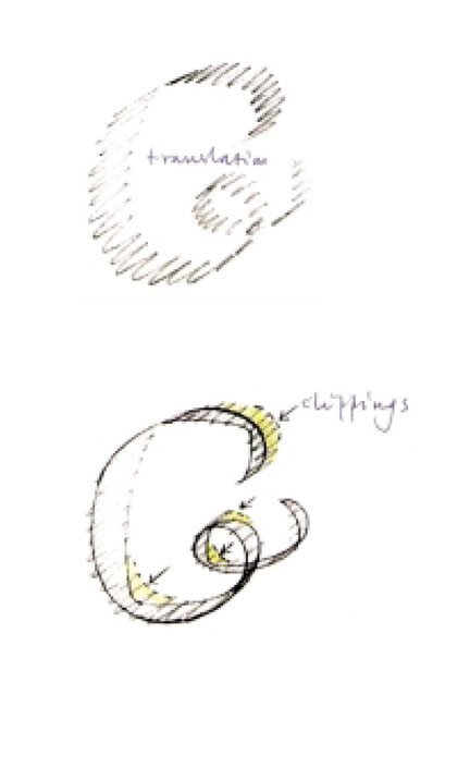
Gerrit Noordzij showed me the heuristic value of this in relation to the “clipped” forms of Henk Krijger's Raffia Initials and the similar forms of his contempory Helmut Salden.

I tried to do something in a similar vein for Legato here:
http://typophile.com/node/55783#comment-335821
i.e., my post (last page) of 17 Mar 2009 — 7:55pm

So let's not put the hardware aside.

Peter

It's a shame to reduce the genius of Legato to this, especially in the absence of Evert.

hhp

I believe I’ve captured the uniqueness and genius in Legato in a way Evert might have embraced.

See the more fully elaborated background to my analysis and the functionality-for-reading comment here:
http://typophile.com/node/16140#comment-97148
i.e., my post page 2, 25 Nov 2005 — 3:04pm
“[…] the tension caused by Bloemsma’s rotation seems to make the white of the word more active or salient vis a vis the black. Here he is in a line that includes W. A. Dwiggins. If I am right (in my understanding of perceptual processing in reading) about the place of 'the map of salient whites' in reading (see the “bouma as bounded map thread’) we can see why Bloemsma is justified in thinking he is reconnecting (optically, ‘after-helvetica’) the single units of our scripts, or restoring and extending the optical integrity of the wordform.”

In saying “Bloemsma’s rotation seems to make the white of the word more active or salient vis a vis the black,” I am alluding to the notan characteristics of the font and reflecting my contention that both the black and white of the word are information for vision.

I think what I want to argue in this thread on “hardware” is that one doesn’t have to negate what Noordzij has called, in an as yet untranslated essay, the primacy of the pen, in order to be progressive, inventive and experimental, or embrace what makes Legato so unique. In fact, my analysis reveals rather than reduces it and gives a basis to articulate it's genius.

:)

n.

I love all the directions this thread is taking and the great variety of contributions.

@Neil. I really like what you have done, very cool!

Hrant, I appreciate your gradual efforts to refine and present your ideas in more precise form, but I still think you are a long way from making sense. You can't insist that notan is a functional concept in reading, and then retreat to saying that 'we read notan' is an 'abstract truism', a phrase which prompts even more questions.

In order for an idea to be a functional concept, you have to explain how it relates to functionality, in this case how it relates to the perceptual and cognitive processes of reading (or, at least, to a particular model of how such processes function). If you can't do this, you have not got a functional concept, but only a borrowing of a word from Japanese aesthetic philosophy and that ends up meaning 'black and white relationship' in the context of typography and reading. If all you are saying is that relationship of contrasting shape and ground is what we read, well, duh!

Peter, Legato's genius is rooted firmly in the conscious "breaking" of the black. This is a clear break from chirography, and any subversive chiro-apologism is not welcome by me, because it keeps us in the dark ages.

one doesn’t have to negate what Noordzij has called, in an as yet untranslated essay, the primacy of the pen, in order to be progressive, inventive and experimental

It's certainly possible to be all those things within the confines of chirography. But it's still the same old boring over-populated continent, one where both style and reading performance are inhibited due to psychological lethargy, to an unwillingness to stop celebrating the established and start working on the possible.

you have to explain how it relates to functionality

I'll try to be more specific (eventually). But this might be where the constant reprimand I get to "put my money where my mouth is"* does kick in.

* Although most people who say that are theory-free between the ears...

If all you are saying is that relationship of contrasting shape and ground is what we read, well, duh!

Well, I think it's "duh" too! But the implications remain largely avoided by most people, who insist on continuing to paint the black.

hhp

"Fixed french curves impose way too much of their own will on a drawing"

I think it depends on the user. And one French curve is hardly the whole tool kit for curves.

Have you made lots of drawings of lots of glyphs of lots of fonts using French curves than?

I’ve used French Curves with a Rapidograph to draw smooth high contrast artwork over the top of pencil drawings in which I had freehanded the curves of letter outlines.

After a while, I became familiar with which parts of which French Curve template (and different oval templates and straight edge) would match my pencil lines. It was very much an “assembly” job piecing together composite lines, but worked fine.

In my experience French Curves did not impose any of their will at all on my curves.

David: No, mostly I watched my dad use them.

hhp

Subversive chiro-apologism? Psychological lethargy?

Hrant, If you read my posts carefully, and with a hermeneutical ethic of generosity rather than pre-judice or suspicion, you would know I am an energetic apologist for constructive feature manipulation and untrammled exploratory norm-violation, with the internal, optical consolidation and ‘divergification’ of the bouma or word-form for visual processing as the principal goal, when it comes to text type. In our digital environment such feature manipulation is spline- or bezier-o-centric, which is what Bloemsma worked with.

Where I said “the tension caused by Bloemsma’s rotation seems to make the white of the word more active or salient vis a vis the black,” I could have said “the tension caused by Bloemsma’s deliberate de-coupling of inner and outer contours — your “breaking of the black” — seems to make the white of the word more active or salient vis a vis the black.” In his own write-up Bloemsma talks of the “outer and inner forms behaving relatively independently.” The idea that skewing or shearing and rotating were involve at the bezier level comes from Jan Middendorp’s graphic in the "What makes Legato so Unique" forum: http://typophile.com/node/55783#comment-334509, and the discussion that followed Middendorp’s 12 Mar 2009 — 11:31am post. I think the graphic comes from Bloemsma himself.

Is your analysis of the functional effect fundamentally at odds with my analysis relating to notan and readability?

"After a while, I became familiar with which parts of which French Curve template (and different oval templates and straight edge) would match my pencil lines. It was very much an “assembly” job piecing together composite lines, but worked fine..."

And then the next font is a different subset... And forever. And... if something didn't fit, no one was forced to use a curve that didn't work. Like alwayz, i think the tool only influences those who want to be influenced.

The cool thing, and I wish for this there was an echo in here, is when one is choosing the set of tools to use, to make a set of tools, that make sets of tools...

Thanks Karl!

n.

When you shear the internal organs of a person, he dies.

Enough celebrating the dead king.

i think the tool only influences those who want to be influenced.

If humans weren't concerned with efficiency/closure. The desire/need to finish something in a reasonable amount of time is what makes tools relevant. The particular convenience of the broad-bin pen, French curve, bézier*, copy-paste or coarse grid** creeps in to our work because there are limits to how much we want to fight their limits.

* Many people have pointed out that béziers makes their fonts end up looking a certain way.

** Consider what the 1000-unit Em has done to Italics.

choosing the set of tools to use, to make a set of tools, that make ....

Which is where generative fonts come in. Another promising next frontier.

hhp

Hrant, it doesn't seem either impossible or unlikely that Evert might have produced, in the process of creating Legato, first some outlines that corresponded to more 'normal' modulation patterns and then edited these using a variety of techniques to produce the inner and outer relationships that he sought. I don't think such impurity of process implies anything about the idea or the results of the design, but simply seems efficient. It is much easier to shape something in front of you into what you want than to try to create what you want ex nihilo, on a blank piece of paper, relying only on the idea in your head. There's never been a craftsman in history who didn't appreciate a procedural shortcut invisible in the finished result.

I do have to agree with all of that.

And Evert did leave us plenty of room to improve.

hhp

“When you shear the internal organs of a person, he dies.”

So Legato is lifeless? Or does it just mean Legato is post-chiro-referential, and my analysis show to what degree and what effect? It is doubly so, systematically across the letter set, and to beneficial effect, as most of us agree. There is no dead King, because the precedent of tool-based writing is originary, but not dictatorial. The proud handmaiden or humble butler of analysis that writing-derived heuristic-templates provide is not dead.

You may not want to talk about this more, but dismissive gestures are no substitute for argument. I am however satisfied with having providing a bit of push-back. Your truism about notan could use some of that as well, as John's engagment on that score suggests. Despite my caveats, I think calling the attention of type designers to notan and to the importance of not being beholden to the pen-based coupling of inner and outer contours is absolutely apt, timely and laudable.

“The particular convenience of the broad-bin pen, French curve, bézier, copy-paste or coarse grid creeps in to our work because there are limits to how much we want to fight their limits.”

And, besides being virtually intracable — to the point of causing the design equivalent of writer’s block (and so inconvenient as a practical technique) —, liminography, from scratch, without successfully functional conventional para-paraphrastic or just paraphrastic (chiro-referential) forms as reference points, isn't limited?

At some point — even, or especially in a from-scratch process — the designer has to get a handle on or structural understanding of the formal characteristics or logic of his or her positive and negative shapes, if he or she is going to exploit the products of his or her liminographic explorations intelligently and productively and make them into an internally cohesive font that promotes internally cohesive boumas.

My head is confused with all these concepts! Ehehehe. We should have an IRC channel to discuss... stuff

Liminography is not limited because there is no essential difference between liminography are the creation of notan. In contrast with chirography, which only exists for circumstantial reasons.

The Achilles Heel of Noordzij (and his disciples) has always been the confounding of something a creator enjoys with things that users need. It is too close to Art at the expense of Design.

hhp

Notan exists whenever a mark with more than one dimension is made. Liminography is limited on account of this. The key is the distribution, and in type, the equipotency and resolvability into tractable positive and negative shapes (strokes or ‘role-units’ like bowls and stems, counters) of the light and dark. Liminography adjusts the light / dark distribution and manipulates the tractability of both the black shapes and the whites, but doesn’t create notan. We ‘read,’ in the sense of ‘perceptually process,’ the shapes but not the distribution. Visual or optical equi-potency in the distribution guarantees that both the white and the black have a proper salience and a proportionate cue-value for efficient visual processing within the framework of the word-gestalt. This is what, in my analysis, the user needs.

The written forms that have been effectively built upon para-paraphrastically in the typographical era do not persist in their typographic progeny because of authorial preference or narcissistic indifference, but because they proved to be fit for reading as a visual task. The contrast and construction options they engendered facilitated the psycho-physical unitization of the word-object, a language-appropriate level of bouma-divergance, and guaranteed the automaticity of rapid and effortless visual word-form resolution for skilled, non-dyslexic readers, That is, what the visual cortex of the end-user needs for rapid automatic visual word-form resolution —aka word recognition — has always been the principal countervailing pressure or hidden hand in the determination of what scriptorial conventions survived.

Every part of the reading / writing matrix is thoroughly circumstantial or conditioned by circumstance, including the evolved structure and plasticity of the brain, right down to the very first layers of the visual cortex and structure of the retina. The reading-ware of the brain both adjust to and disciplines the products of the writing hand and the typographic multiversity that flowed from the first retranscriptions of it in type.

they proved to be fit for reading

No, only merely adequate. Just like walking barefoot was before the invention of shoes.

This mere adequacy neither fully explains nor in any way justifies chirography's dominance.

And such denialism is exactly what I mean when I say that chirography gets more credit than it deserves.

hhp

No, genuinely fit. We disagree.

Good affordance for reading is a wide plateau, but optimality within the fluent range explored by Bigelow and Legge recently, can perhaps be incrementally fine-tuned with inventive, neuro-mechanically and perceptual psychophysically aware, strategic feature-manipulation.

I do not advocate chirography. Denialism of the prospects for building exceptionally fit alternative forms on an intrinsically convention-breaking premis has nothing to do with it. I sometimes think your anti-chirographic stance is oedipal. I think your strongly polarizing stance is more ideological, divisive and non-inclusive than conceptually obvious, sufficiently experientially grounded and motivated or tested in practice.

I am interested in what happens to contrast and construction historically and the beneficial purpose manipulating these serve in human factors terms. The construction and contrast styling templates circumstantially produced by writing give me an priviledged window into plotting and getting an accurate handle on what happens to contrast and construction historically. The beneficial purpose manipulating these serve in human factors terms is the reason for my immersion in the science of reading.

Evolutionarily, fit and adequate are synonymous. Whatever else you think new approaches to type design might provide in terms of improvements, Hrant, you can't define these in terms of what readers need, because if they were needed they would have evolved already or reading would have failed.

Hrant:
"Many people have pointed out that béziers makes their fonts end up looking a certain way."

Compared to... (their fonts in stone, maybe? and what if the rest of the "people" ask what you are talking about?)

And:

"Consider what the 1000-unit Em has done to Italics."

Raster image processing makes diagonals (and curves), of all kinds, not to mention fonts, end up looking, (each) a certain way.

You didn't "hear" the last part of my post.

We make tools... the tools we make have limits, but those limits pale before those of our users, who mostly would laugh at the issues you list as making anything look a certain way, or doing anything to italics.

"My head is confused with all these concepts!"

Go to your font menu and cleanse your mind, odds are, none of these peoples' work'll get in the way. ;)

Peter, I'm not interested in grazing on a plateau.

Yes, I'm being ideological. That's the only way to progress. I'm not running a school for mass-producing chiro-zombies, god save their cultural futures.

if they were needed they would have evolved already or reading would have failed.

Even if one believes that anything that's needed eventually gets invented (which I'm not sure I do) it remains that time has not yet finished.

their fonts in stone, maybe?

Sure, for example. Every visible mark requires tools (that affects the result). But I'm certainly not saying that the chisel & mallet for example is superior to the bézier - just that they're different. I love béziers.

what if the rest of the "people" ask what you are talking about?

I thought you're already doing that.

OK, let me try this:
- Do you agree that many (even most) people believe in low vertex counts?
- Do you agree that people like to save time?

those limits pale before those of our users

Sadly I think that's almost 100% true. Almost. It's that tiny remaining glimmer that somehow drives us. Very little of type design makes sense devoid of the reasons type designers greatly exaggerate -or simply invent- to keep doing what they like. The consolation is that nothing anybody ever does is only about money.

odds are, none of these peoples' work'll get in the way.

Dunno, I think Constantia has a pretty big installed-base. :-)
Me, I rely on my ambitions as a svengali.

hhp

Ancient Greek lapidary inscriptions were more angular than those of Ancient Rome largely because the Greeks carved more text (and maybe because they were culturally more pragmatic = wanted to save more time) and the tool & medium manifested itself more.

hhp

“…constructive feature manipulation and untrammled exploratory norm-violation, with the internal, optical consolidation and ‘divergification’ of the bouma or word-form for visual processing as the principal goal, when it comes to text type.”

Translation please?

“constructive feature manipulation” is manipulation of things like contrast, construction, boldness, proportion that promotes readability, or what the visual cortex needs for effortless immersive reading.

“exploratory norm violation” is any break with existing norms or conventions in the realms of contrast styling and construction, or co-ordinating inner and outer contours.

”internal optical consolidation” is making the positive and negative shapes in the word fit or work together so the word doesn’t fall apart optically.

"divergification of the bouma” is making the complexes of positive and negative shapes that form the word and word stems or morphemes distinct enough optically so we can easily tell them apart and don’t readily confuse orthographic neighbours with eachother.

Hrant: "Ancient Greek lapidary inscriptions were more angular than those of Ancient Rome largely because the Greeks carved more text (and maybe because they were culturally more pragmatic = wanted to save more time) and the tool & medium manifested itself more.."

You are saying you know what people dead 30 centuries wanted, saw, knew about words and their relation to the tools... good luck with that. My general impression, is that we have the Greeks to thank for introducing us to the idea that we don't always have to be in a hurry, and the Romans refined this to allow for some to hardly ever be in a hurry, which led to you, the crown of unhurried creation.

I read it somewhere (maybe Catich) and it made sense.

BTW I'm always in a hurry (having four kids between 2 and 12). Haven't you noticed how my posts have been getting shorter and shorter over the years? :-)

hhp

“I'm not interested in grazing on a plateau.”

Listen, Hrant: I admire your tenacity and appreciate your restlessness. I think most of us are with you here. But breaking the black is a crap shoot, unless it’s done systematically in followable and well-considered / well-motivated ways. And liminography is even more of a crap shoot, unless the critical opening drag-line paraphrases something you’ve assimilated — perhaps with modifications — from past designs. Progressive evolution is descent with modifications. The farther you go back into typographical lines of descent, the closer you get to actual successful species of writing, so a Noordzij style analysis of form is actually very relevant, and your opening move already evokes writing. I'm assuming your opening drag-line (the opening line a spider puts down) is not a context-less ‘random-walk’ line. Nothing that we’ve seen from you so far shows me that your method brings you any closer than Dwiggins or Bloemsma, or Matthew Carter, or David Berlow, or Lucas de Groot, or Peter Verheul, or Gerard Unger to the optimal zone on the plateau that Matthew Luckiesh’s research and hints from ‘noisy accumulator’ models of perceptual processing suggest exists. What we've seen from you is interesting amd idosyncratic, but not monumentally compelling.

Notan is only one of the things the visual cortex needs for effortless and automatic word-recognition. It also needs well-formed and tractable positive and negative shapes, at the level of stems and bowls and counters, that it can readily assimilate or understand.

I would like to see your notan-sensitive liminography in action, preferably on you-tube, where I can see what you're doing, with a play-by-play voice-over of what you are thinking when you are doing, and an mri. I'm not interested in finished forms, just the self-imposed constraints and decisional feedback loops.

But perhaps its time for me to step back.

But breaking the black is a crap shoot, unless it’s done systematically

This is something I've wrestled with for a while. And it is in fact the flaw in Bloemsma's work (which I might have actually opined to him once - I forget). Like most designers, he's too Modernist. You have to let go. Life is a crap-shoot. Which is actually harder for me to work with than it is for most people, even for most designers. But that's not the same as random (which I'll never be a fan of).

So you take you liminographic tool of choice, you clear your mind of chirography, and you make notan. That's it.

Progress is hard.

Nothing that we’ve seen from you so far shows me that your method brings you any closer than Dwiggins or Bloemsma, or ....

Not an once of doubt about that. I haven't publicized the proto-implementations of my ideas yet (for various reasons). In fact my usable output remains firmly in the realm of parachirography (for which I publicly reprimanded myself during my talk in Mexico City by slapping my own hand :-). But admitting the problem is the first step (and -unlike most practitioners- I've gone quite a bit beyond that).

Maybe I'll never make anything usable with these ideas. But to me that's still better than never having good ideas to begin with; better than running a school to teach others to perpetuate a misconception (which really chaps my hide).

hhp

May I offer a suggestion?

Take a series of typefaces that you admire, set up as actual text made up of words; make a composite image if their proportions are compatible; introduce a large amount of blur, so you can't tell where the edges were; bring the resultant image into your font creation software as a template to draw over, or overlay a printout with tracing paper. Find notanically sensitive path-ways liminographically against / inside / in relation to the highly blurred template. Try to get an analytic handle on and formalize the resultant black and white shapes; throw it away and do it again with a different word.

Your shapes will be anchored in convention, but not directly disciplined by frontal arithmatic.

This is limino-palimsest.

When the idea is about something entirely visual and utilitarian, but it never ever makes it to light nor usefulness, then it might not be considered "a good idea", just an idea. :)

Tools of the trade

Captured from web.archive.org on 8 Nov 2013. view this capture