
New One started, no name yet, no caps yet. Type Design really is an incurable disease.

New One started, no name yet, no caps yet. Type Design really is an incurable disease.

Question: how long did it take you to make that?
hhp
this one came together rather quickly for me, and I was putting it together modularly. I'd say so far I've probably put about 10 hours into it.
a few more changes, mostly to the weighting, thickened it up where needed. The tail of the y has been changed a bit...
changed the height of the i and the j...

To me you're going way too fast.
Like why is the "el" not straight? And look at your "o" - do you think it's nice?
Again, I'm assuming you're going for polished, not fauve.
hhp
I like my o and l, yes I think they are nice. The l may perhaps be a bit too thin however, what do you think?
the joining of the y is still to heavy, though i can think of no strategy to relieve this without make the arms seem too light?
the bottom of the s seemes to be rendering flat and cut off looking, though it is nicely rounded upon close inspection.... a hinting problem??
do the spurs belong on the u and w? (yes I like them)
hmmmm... anyone?
anyway, no, I'm not a brett favre fan. why do you keep bringing him up anyway?....
:D
I might have to give up soon, but:
- Why are the sides of the "el" leaning slightly (and not even equally)?
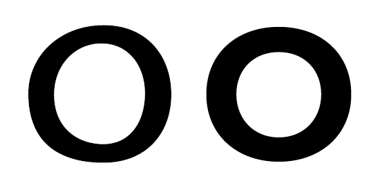
- Looking at the following image: Do you see any problems with the curves in your glyph on the left? And if so, can you see similar problems in the glyph on the right?
hhp
I dont see a problem with either one, what I see is two different intentions. One is very symetrical, one not so much.
I suppose i do want this font to have a little bit of fauve too it, yes, perhaps 15% fauve.
Hrant, in your opinion is it possible to have something that is at once unsymmetrical and polished?
I don't think lack of symmetry precludes polish; look at a nice fraktur "o" for example. But it is hard to imagine "wobbly" and "polished" coexisting.
hhp

I agree with Hrant. This needs a lot more work.
To me the basics of typography are proportions, balance and great detail. I understand your intent, but I think it's just not working. The wobbly appearance of your font keeps me from seeing the good elements in there.
Try fixing the unbalanced curves and only than take it to the next level.

Hi Rian,
This is nice.
I like the wide proportions, and the almost semi-bold weight.
Of course, still needs a lot of polish here and there.
Here are some recommendations:
- In your /n and /m, the top of the curve are too close to the first stem. Move them to the center, or closer to the second stem. Also, the transition from curve to stem looks unnatural.
- /m and /w are too wide.
- Maybe you can remove the spur on the /w last stem (and, why not, also in the /u)
- The /c has to much weight on the middle, move the outer curve 4 or 5 units closer to the inner curve.
- The ending angle on the /e and /s mach each other, but the /c looks like its from a different font.
- The /g and /s are unbalanced, try to find a better balance.
- The bottom curve on the /k need more work.
- The /y descenders is to much, make it shorter.
- The dots inside the dots doesn't make sense at small sizes
- The angle cut on top of the /l should mach the angle of the others (/b, /d, /h, /k)
- The /f crossbar should be shorter in the outside and larger in the inside (more like the one in the /t).
PDF update:
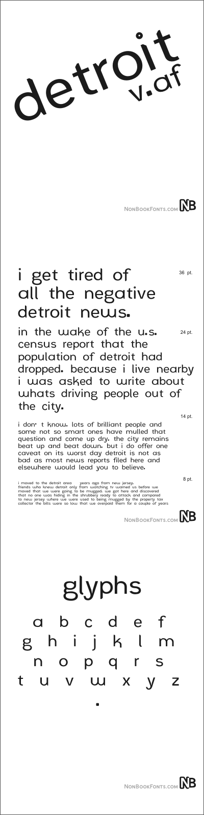
This s is pissing me off. Udged and nudged it out a bit, looking better, not great. g looks a lot better, imo. Scaled the e and o down vertically to facilitate solid x height and baseline better. Started some punctuation, large rounded squares. Scaled back the overhangs of f and y slightly. Extended lower leg of k, and lengthened primary stroke of f. Tightened spacing a bit (wondering if too much?) Didn't like the way the 'humps' of the u and w sloped to the right, but the m and n sloped to the left, so centered up the humps on the w and u. Other small fixes and changes unremembered...
http://nonbookfonts.com/xtra/DetroitAFspecimen.pdf
Critical comments appreciated.
Still looks like it's two decades too late... But maybe it's just retro! :-)
hhp
what are you thinking of from two decades ago?
The grunge era.
hhp
Do you think it is the execution of the letters (not exactly mono-line), or the structure of the letters (the underlying strokes), that makes you think that? grunge was def not was I was going for. More for sophistication, smoothness, etc. Do you see Antique Olive's influence on it?
I'm gonna keep that o exactly how it is just for you, hrant, lol!
still wondering if i should lose the spur on the w. is the e wide enough?

First of all: make that period smaller and space it properly! ;-)
Then: What's the point of having such kind of tittles?
Also: Something's wrong with the overshoots; the letters are dancing up and down the baseline like horses on a carousel.
There's really much work to do. First questions to ask to yourself: "Is there a good reason for constructing ___ in such a way?", "Does the lowercase show consistency in width?".
First of all: make that period smaller and space it properly! ;-)
The spacing is too tight, but the proportions shall stay. Looking at making the period something like 1/3 xheight. Yes, they will be oversized, and likely, to your eyes, ridiculous. I might try to proportion them up to the size of some of the counters.
The overhang was waaaaaay off. Thanks for pointing that out.
I come off like a prick sometimes.
I have gotten a lot of help from the people here.
anyway...
...after all this time i'm surprised nobody has said one word about the font having a single story a and a tow story g. I thought this pairing was fairly rare.
Possible more-than-working-name, name--AntipastaSalad--thoughts?
Captured from commoncrawl.org on 26 Apr 2015. original URL