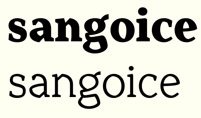
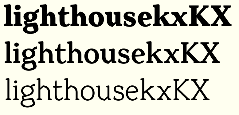
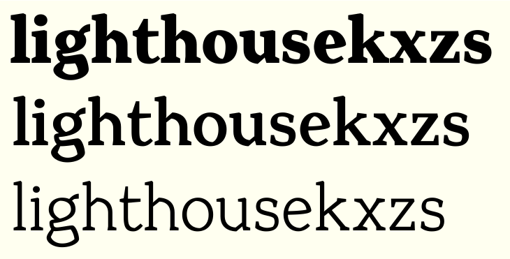
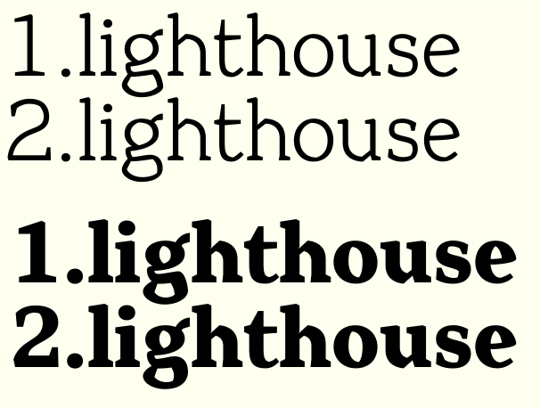
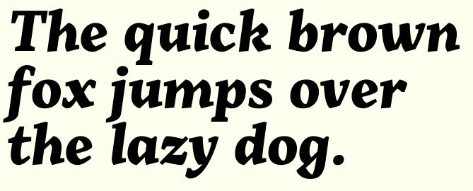
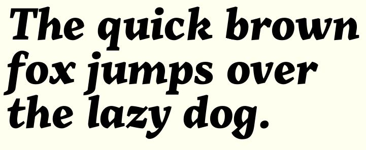
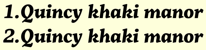
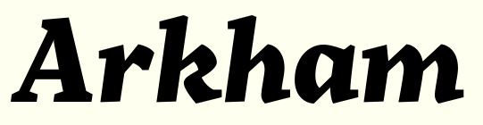
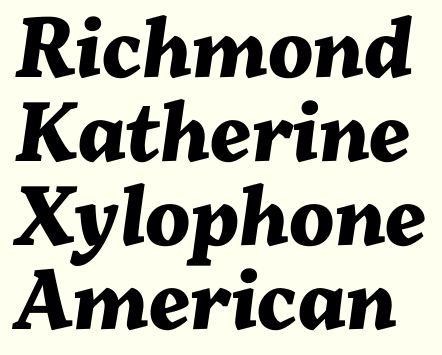
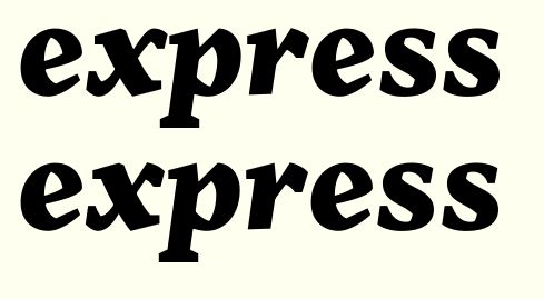
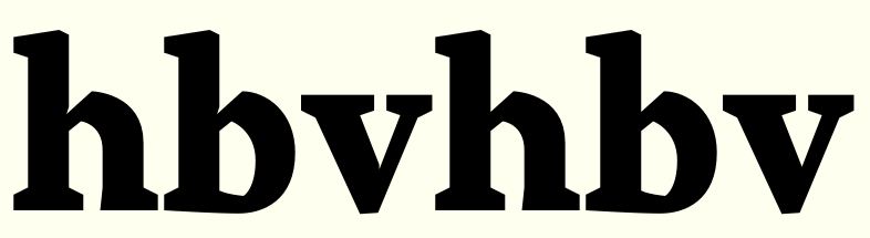
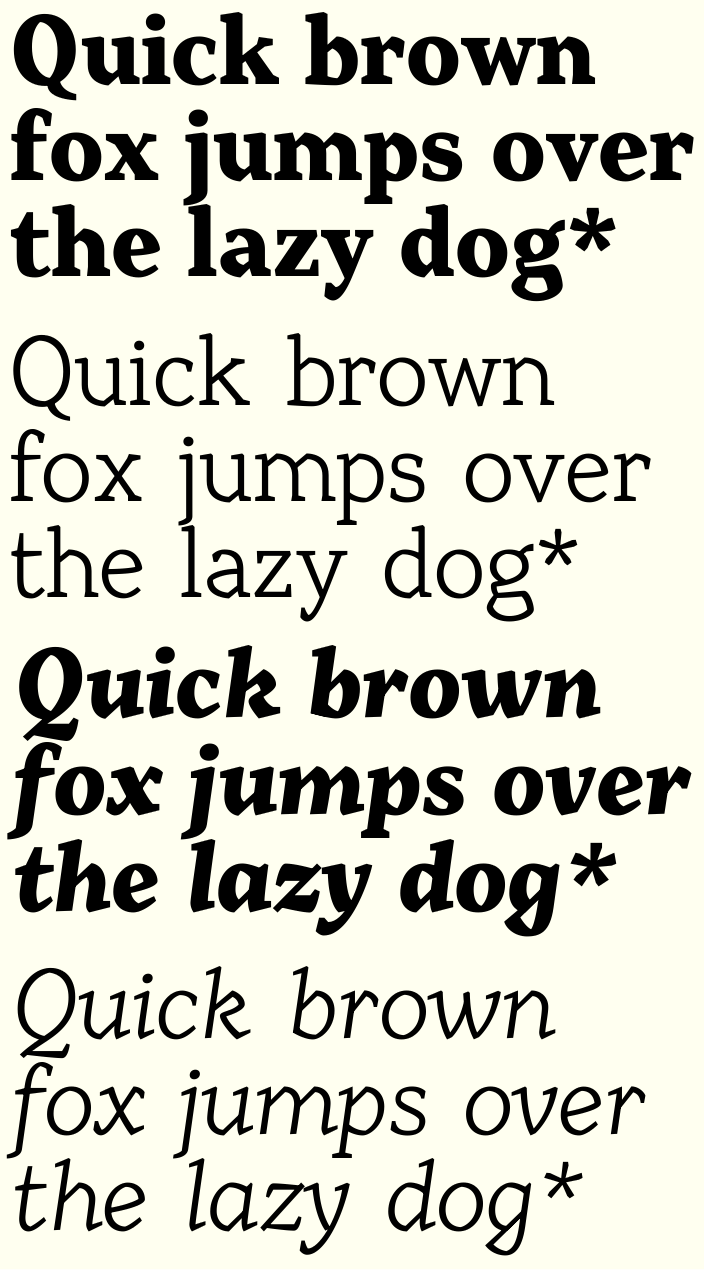
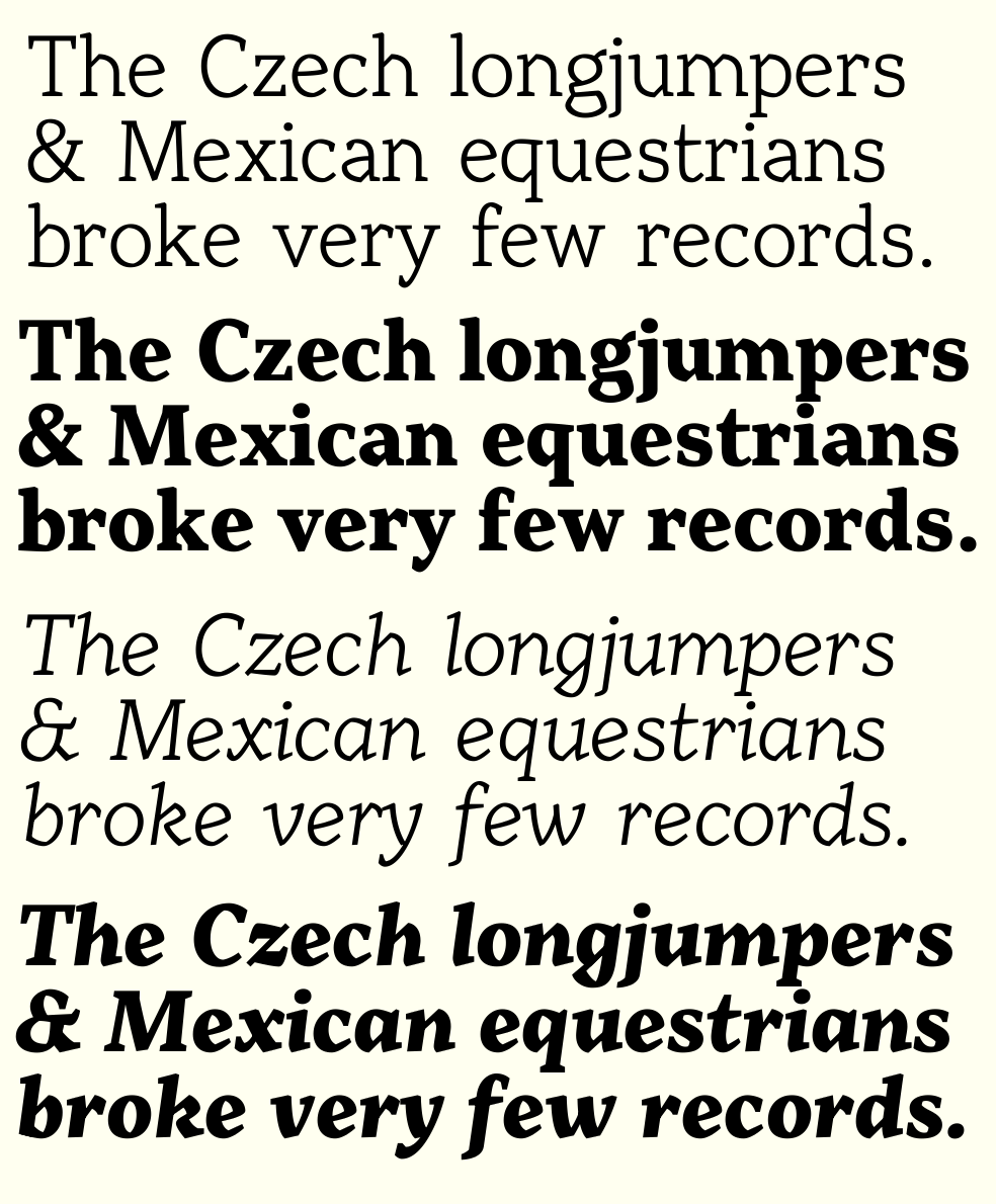
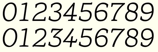
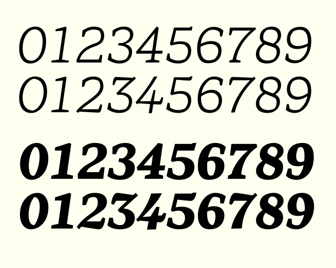
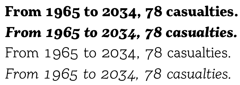
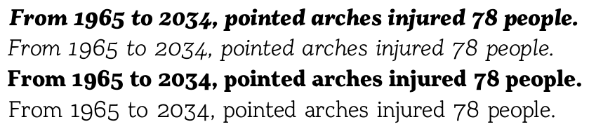
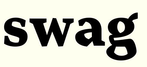
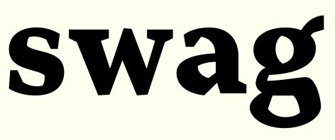
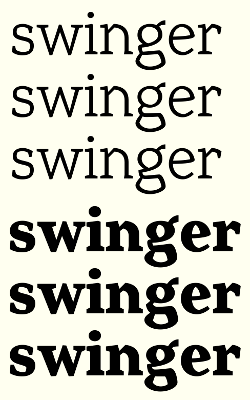
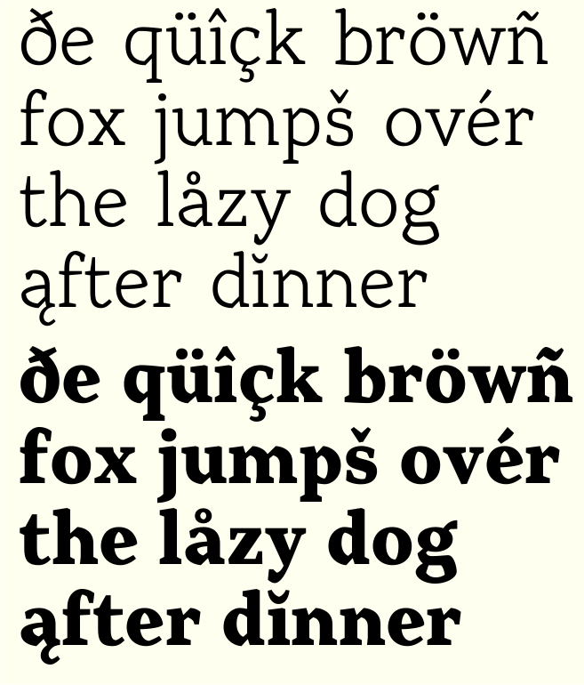
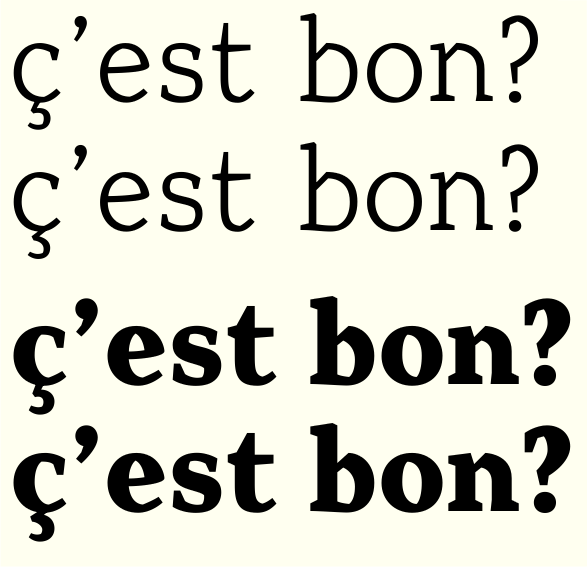
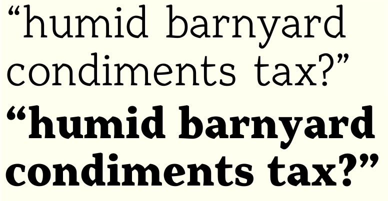
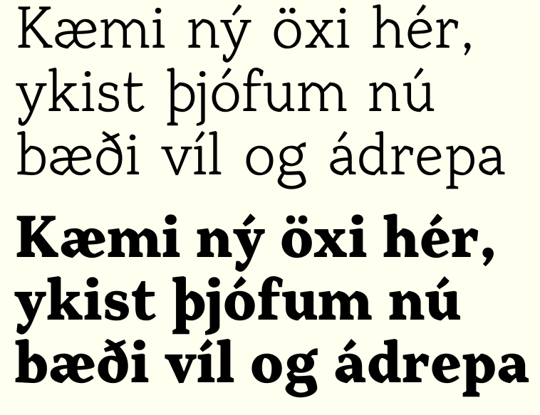
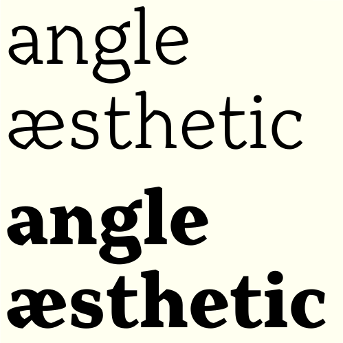
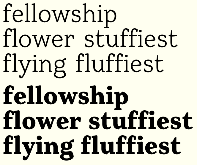
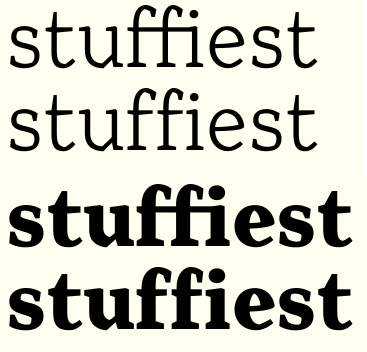
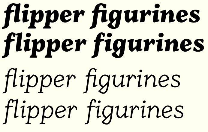
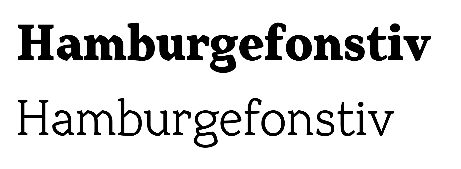
Please critique my latest font in the works. As yet unnamed, I started working on it in December 2010 and it's been left to fester for quite some time. Just started on it again recently. So far it's a very basic character set, light and bold (other weights will be interpolated). I'm not too happy with the spacing yet and there's no kerning.
Anyway, what do you think so far?
| Attachment | Size |
|---|---|
| Angular.pdf | 272.21 KB |
| Sample2.pdf | 320.33 KB |