
I'm looking for fonts that have a /u sort of like this:
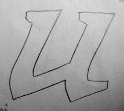
Sans is OK too.
hhp
I'm looking for fonts that have a /u sort of like this:
Sans is OK too.
hhp
Ah, yes! Any others?
hhp

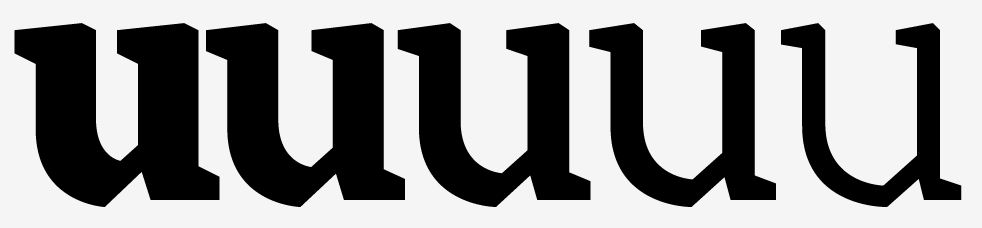
Cool.
1) What made you make that shape?
2) Does it have an italic?
hhp
1) I thought I'd try to do a text face influenced by the marks you might get with a fat marker pen. I never actually used a marker pen so it's kind of an imagined result. All the rounds from stems (b, d, p, q, r, m, n, a) have the same straight bit going to a curve.
2) It barely has a roman, but it will have an italic at some point. I've got a new script font almost done then I might make this the next one I get round to, so it'll probably be in the critique section soon.
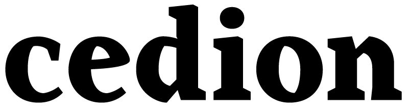

How abrupt the diagonal/curve transition should be?
Aldus Roman sports something similar, but more ink-trap than blackletter (italic is all curves, though).
This one has a similar construction on U too: http://www.myfonts.com/fonts/protimient/pasquinade/
I like that "e" actually (just make the eye larger).
Pasquinade: Nice.
hhp

Omnibus Type's Chivo and Rosario have a 'u' resembling this if a lot more rounded. I think Vollkorn is in that ballpark as well.
I'm not seeing that form in any of those at all.
hhp
Not the exact form, but I'm sure you noted that the tail on Chivo's 'u' looks quite like the bottom curve. That's the similarity I saw, oh, and the raised tail in the others. ATM I recall none near that harsh form you drew.
Reynir, I think what Hrant is looking for is the peculiar shape of the bottom left, where the curve joins the diagonal.
(as an irrelevant bit of info, I fiddled with the same concept on a number of experimentations in fontstruction)
And that is the shape I do not recall seeing elsewhere, but there is another characteristic there: Tail resembling bottom curve.

> Hrant: here one of the mine : http://www.myfonts.com/fonts/psyops/harfang-pro/
Nice one.
hhp

Blado, tha italic of Poliphilus.

I am not sure if you are looking for gotische fonts, but this one is quite simular:
http://www.myfonts.com/fonts/urw/weiss-rundgotisch/
and this:
Tiepolo's arches are a bit "soft" on one side, but it's still a good find - thanks.
hhp

What you work in this front ?
I don't understand. Do you mean what I'm planning with this? A good Armenian Italic (as opposed to a Latinized one). So in reality that's not a "u", it's a "ս". :-)
hhp
Captured from commoncrawl.org on 28 Apr 2015. original URL
