Typophile

Please Read: Typophile (TEMP)

This thread ran to 7 pages of replies and only one was recovered, so replies are missing.

Change is hard.

But the Flash home page had to go. We all knew it was way past its prime.

This temporary Typophile theme you're seeing now puts us back at our roots, in a way. Since 2000, Typophile has been a vibrant community focused around these very forums. It's a community built around a love for the craft of typography and design, and these forums have been home to hundreds of thousands of conversations around type.

Don't worry, this is not the new permanent look for Typophile. It's merely a temporary state while we tighten up a new look for Typophile. Removing the Flash is the first big necessary step toward correcting a number of other bugs (file upload, anyone?) that have been plaguing us. Rather than take the site down while we get things squared away, we opted to keep it up so you can talk type while we're heads-down on the new Typophile.

Yes, we know the theme is not perfect. Go easy, make constructive suggestions and we'll make CSS tweaks as we go.

Most of all, get involved!

Hey, things are happening - awesome!

What about making ALL links open in a new tab or new window? I personally prefer this.

I don't. I hate it when sites do that, because most don't. Just learn the key modifier. (And there is no modifier key to suppress it for sites that implement that behavior for people who don't want it.)

Hm. The new color scheme seems familiar.

I hate tab windows.

Too much red now on list views.

I do like the "Mark-The Hippie-Simonson" retro photo, though :-)

Art school days, Spring 1976.

"are websafe colors still relevant in any way?"

It's extremely rare to find a screen that can only handle 256 colors anymore. So it's mostly irrelevant now.

OK, thanks for the confirmation.

BTW, does a non-websafe color snap to the closest
one "below" or "above" (for each of R,G and B?) or
what? And does this depend on the application or
is it an OS thing?

hhp

When a website is unreadable on my iPad, I click the "Reader" button at the top. That works for most text-oriented web pages. Unfortunately not so for Typophile, as all it brings up is Jared's initial post.

I'm pretty sure that's not something that can be fixed in "seconds".

Fixed (or semi-fixed) center column width is an eye-sore in portrait mode. (I can live with it in landscape -- just.)

Oh well, if it's just a question of screen resolution: a new 'Pad ought to arrive soon in the office.

I thought web-safe color was really more about browsers than monitors. I believe 24 bit color computer monitors and the dawn of the web (at least in terms of popularity) happened at about the same time--early 1990's.

24-bit graphics on computers were still fairly high-end in the early '90s. The only ones who had it were people running Photoshop and other graphics stuff. 24-bit color didn't start to become common until the late '90s. Even then, you couldn't count on it when designing a web page.

The problem lay with the video cards, not the monitors. Some had 'only' 4 MB or less of memory for the frame buffer. If you wanted a high resolution, you'd have to forgo such niceties as TrueColor or even HighColor and make do with a 256-colour palette mode.

It's been years since I;ve been involved—and I used to be involved quite a bit.

Happy to see this transition, and hopefully this will spur me to get back into the community and contribute.

Thanks, Joe, Jared, Zara and all.

I've removed the left sidebar and made the main column wider. For those using Stylish or something similar:

div#sidebar-left {
display: none;
}
div#wrapper div#container div#sidebar-right {
float: right;
width: 25%;
}
body.sidebars div#container div#center div#squeeze {
width: 74%;
}
html body.sidebars div#wrapper div#container.clear-block {
padding: 0;
margin: 0;
}

Really liking this redesign so far, temporary or not. Sorry, as one of the amateurs, that I haven't been more involved in asking 'good questions' but digging through the archives often reveals that many good questions have already been answered. Hoping to resurrect my long-dormant font projects and get good feedback from you all. But most important right now is taking care of my family, which is a long story not at all relevant to this forum. Cheers to all!

Progress may be slow, but at least it’s there… But changing the type in the Comments-box is a bad idea. Please make it it the same type and size as the posts, so Hrant can type shorter lines (a real simple way of WYSIWYG).

On my iPad the lines in the posts are truncated in a strange way. Also the sides take up too much space. [Edit: Sorry, that’s just Hrants posts…}

I do not like or understand the use of orange for ‘New’.

I like having back the "first" etc navigation (didn’t that disappear somewhere around 2008?).

[Edit: typing two left-pointers after each other is a bad idea, I experienced. Or even one.]

:-/

Ideally of course you'd have a mechanism for
implementing an automatic max line length
depending on the viewing device. It would
result in a funny right rag* but to me at least
that's an acceptable compromise.

* Although good auto-hyphenation would help...

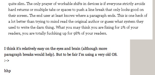
hhp

Which is precisely another reason Markdown would be great.

Note: refraining from manually inserting line breaks to adjust the measure would also correct that particular problem. There is only one person still doing this, as far as I know. Judging by the earliest posts here, just about everyone used to.

> refraining from manually inserting line breaks to adjust
> the measure would also correct that particular problem.

Reminiscent of the last sentence here:
http://www.themicrofoundry.com/ss_uniglyph1.html

hhp

YAY! Black text! Next up, black text in the comments box. That, and I don’t think there’s a need for a 2nd font. There’s no need change the font and colour. It’s already distinct in that its in a box, at the bottom, and underneath a giant “Post new comment.”

And, black text here is quite important given that it is here where one spends their most important (and often lengthy) amount of time.

But thank-you, thank-you, THANK-YOU for the black text so far.

For those of you playing the home game, I believe I've gotten Image Uploads working again. Please give it a try and prove me wrong.

http://typophile.com/node/91491

For what it’s worth: the Insert image uploader for comments doesn’t seem to be liking .PNGs anymore. I keep getting a “Could not copy image. Error” message.

Larger .PDFs can now be attached to first posts. Glad to see this fixed!

This is like having Christmas every day! All our wishes coming true!

Glad to see that orange gone, but the grey ‘New’ is a tad too light. I for one would not mind that being red.

Bert — How would you feel about #cc0000, the hover color on standard links? Too bright?

How about green for the "new" label?

One other thing: Would it be possible to use the "viewport" metatag so the pages don't display so narrow on iOS devices? As it is, the sidebars take up 50% of the screen width, even in landscape orientation. Info about this here:

http://developer.apple.com/library/ios/#DOCUMENTATION/AppleApplications/...

As I understand it, other mobile devices use this metatag the same way, so it would benefit users of Android and Windows Metro devices, too.

+ for green, on list view too.

That 's a bit too fire brigade red. I prefer a more burgundish red (in other words a bit more dirty).

As an explanation: I think the color scheme should be a reflection of the book printing tradition, where black, white and red are the principle colors. Gray is ok, too. Warm or cool is a choice depending on taste.

I second this. I am on an iPad now and the ‘lost' real estate hurts.

(In reply to Mark S. maybe staggered reactions/reply's are a thing to consider?)

I prefer a more burgundish red […] the color scheme should be a reflection of the book printing tradition, where black, white and red are the principle colors.

I agree. But books don’t have hyperlinks. So it will be necessary to distinguish between an accent colour (such as the one used for “new”) and a mean to visually mark hyperlinks. Especially since the two are very close in list views like the tracker.

Well, if one wants to adhere to web protocol, the colour for links should be blue or purple or anything in between these. But, writing that, I had this brain flash: underlined! All sincere designers posting here would refrain from using links because these underlined links would hurt their esthetic personae, right?

Type would look good!

Re mobile, I’m going to guess that this redesign is an effort to cater to this new market.

Question: How many Typophiles who read and post more than once a day do so from a mobile device?

Rhetorical question: Do any of the top 10 posters ever do so?

And thanks for the black serif text in the comments window. The new design is coming along nicely. Next up, line length.

http://typophile.com/node/88554

FWIW (not much) I don't own a cellphone.
I do have my eye on this though:
http://www.samsung.com/global/microsite/galaxynote/note/index.html?type=...

hhp

Well, I'm in the 99% (not in the top 10 posters) and I read Typophile at least once a day on a mobile device.

I never use any mobile device.

Mind you, it would be foolish not to pay heed to developing markets (while being mindful of the analytics). Reading yes, posting, possibly not so much. Perhaps we are moving towards a “social network” where quick and easy posts a-la-twitter will become more commonplace? Lord knows we are seeing an alarmingly increasing amount of posts to the tune of “what’s this font?” and “can you help me with my work?” Just watch /tracker.

I look forward to seeing how our community evolves.

(~65 cpl)

I think it's pretty clear that mobile devices (smart phones, iPads, etc) are rapidly increasing in popularity, especially with younger users, and within a few years the majority of computing will be done on them, with desktop computers used mostly for more heavy-duty tasks that require a mouse and physical keyboard.

To paraphrase Steve Jobs, desktop computers are like trucks and mobile devices are like cars. Some folks need trucks, but most folks will prefer to drive cars.

Personally I don't like reading or writing anything lengthy on my phone, but I know some younger folks who are typing on them constantly. However I do find myself using my iPad more and more.

Hrant, the Galaxy Note is pretty cool. As a phone, it is a bit too big, but as a kind of subtablet it looks excellent. I have one of the Galaxy phones, which I think is about the maximum practical size for a phone -- unless you happen to have small hands -- the HD display is excellent.

Of course, I'm not writing this on my phone. I'm writing this on my 18-wheeler.

Breaker, breaker 1, 9, this is iPeterbuiltMac 27 giving the Hudson 18 Wheeler a roger that! ;-)

Reading typophile on my phone hurts so much that I repeat my offer of helping create the css to make the site more mobile friendly.

John, although I don't like the thought of something hanging
off my ear* to me almost anything is better than using a hand
to hold up anything up to my head for any length of time, plus
I don't have a penchant for tight jeans** so I imagine being able
to leave the device stowed for phone calls (of which I would hope
to make as few as possible anyway). The question is how good
has voice-control become?

* Ideally the audio in/out device should
be hovering around your head on its own.

** Or any jeans at all actually.

hhp

I know this may seem arbitrary, but i've gotten used to it on another forum I frequent, and that's having a bit of a bottom nav. A simple "Back of Discussions" link at the bottom of the page would be nice. When you're bumped down a long page after a post it's nice to have a handy 1-click option to go back the general categories.

A bit of colour separation in either the fonts or the div backgrounds for main categories VS sub cats would be helpful. Or even if there were alternating colour schemes between different main categories. Makes skimming faster and easier.

edit: I realize there's already alternating colour schemes, perhaps a simple line rule or white space.

Now it seems there's a display problem on Mozilla-based browsers:
In the main posts, images appear pushed all the way to the right edge of the centre column, covering the rightmost one.

Could we please have the navigation links both at the top and the bottom of pages (to avoid the endless dreadful scrolling to move on and to come back):

Images in the temp layout seem to be getting scaled. This is Bad, especially in the case of screenshots intended to show pixel rendering. For example.

Images in the temp layout seem to be getting scaled

I don’t see it. Maybe it’s browser-specific?

Captured from commoncrawl.org on 27 Apr 2015. original URL