
Typophile
Why do CAPITAL LETTERS so annoy us?
This thread ran to 4 pages of replies and only 3 were recovered, so replies are missing.

Regarding to the last paragraph: I don't think it's nonsense that lower-case letters are easier to read than capitals. The simple reason is that the distinction between different lower-case letters is much easier to grasp than the distinction between different capitals. I would not like to read a book that's all capitals.
Nevertheless I think that using capitals is not a reason for getting fired ;)

It is absolutely harder to read something all caps. There was also a recent story on E-60 on ESPN about a guy who was almost completely blind, but didn't want to learn braille because of the stigma. He put books right up to his face to read, and used the shapes of the letters to assist him in recognition.

The reason why it's easier to read lowercase is because, when we read, we don't read every single letter, we read words.
Words typed in lowercase have far more distinctive shapes.

In the beginning:
Bouma, H. (1973). Visual interference in the parafoveal recognition of initial and final letters of words, Vision Research, 13, 762-782.
For an easier read check out Wikipedia's definition of Bouma.
For a slightly more in depth read see Larson's article The science of word recognition.
HOWEVER…
Besner, D. (1989). On the role of outline shape and word-specific visual pattern in the identification of function words: None. The Quarterly Journal of Experimental Psychology A: Human Experimental Psychology, Vol 41(1-A), Feb 1989. pp. 91-105.
While it has been some time since I have read this one, this study, consisting of five experiments, showed that cASe aLterAtioN made no significant difference on human performance tasks such as naming and decision making. This refutes the Bouma law.
In my opinion, the jury is still out on this one.

I am relieved to know that poor accountant is still alive. In his Typo Tips Erik Spiekermann calls what she did “A Capital Mistake”.

Arditi & Cho argue that uppercase letters are more legible than lowercase letters, even when the size differences are taken into account. I think they are right.
http://www.pubmedcentral.nih.gov/articlerender.fcgi?artid=2016788
From another thread I started, "Can typography save lives?," I reference this study:
Hailstone M., & Foster J.J. (1967). Studies of the efficiency of drug labeling. The Journal of Typographic Research, 1(3), 275–284.
In experiment 2, it showed that at 6 points, CAPS were more easily discriminated than Upper and Lower Case. Another case (pun intended) that refutes Bouma.
In experiment 2, it showed that at 6 points, CAPS were more easily discriminated than Upper and Lower Case. Another case (pun intended) that refutes Bouma.
At 6 points, the fact that caps are larger than lowercase would make a difference... Or are we talking about small caps?
Then again, were “more easily discriminated” the single letters or the words?
Not that I want to defend Bouma at any cost, but I’m more interested in the overall legibility of a length of text than in constructed experiments (see also the serif vs. sans serif debate).
I think there’s no doubt about the appropriateness of all caps in some cases.

Seems to be a bit of a stretch to do historical forensics on all-caps = yelling in email.
I think it's simply a matter of all-caps being used as emphasis in an ascii (early email)/single face (typewritten) world.
She wasn't fired for using all caps. She was fired for having perceived rude email demeanor. (or so says her employer)
@ riccard0: "Then again, were “more easily discriminated” the single letters or the words?"
Participants (33 nurses) were searching for drug names such as "Hydroxyzine & Phentolamine" in a 10 × 10 matrix of different drug names.

Nevertheless I think that using capitals is not a reason for getting fired ;)
I think they used that as an excuse. If she had used all caps all the time, then maybe people would have found that annoying, but in that case her boss could have asked her to use U&lc... But they only presented one piece of "evidence," in which one line was in all caps... Very fishy.
P.S.: Related post here.
"I think that using capitals is not a reason for getting fired"
While that was my gut reaction, I've changed positions and now say that it's refreshing to see an employer take a stance on typographic integrity in the workforce. ;)

it's a precedent;
certainly bad word
for our own resident
lowercase bird.
I personally feel more attacked by people who are writing e-mails with an average line-length of 300 characters because they are too lazy to hit the "Enter-Key".
;)
"Participants (33 nurses) were searching for drug names such as 'Hydroxyzine & Phentolamine' in a 10 × 10 matrix of different drug names."
I think that with such words (no one knows) there is no difference between caps and lower-case letters, but regarding to what ricard0 said there is a remarkable difference when the text contains words that are well known because people are reading words not letters. Reading is kind of a guess-work, maybe that's why you are getting faster when you're reading more.
I agree, the drug names are somewhat obscure, but due to the fact that participants were selected from the medical profession the confound of complex nomenclature is likely lessened due to their familiarity with the language. The same study run with high-school students would almost certainly produce (significantly?) different results. Cause for a followup study perhaps…

Case alteration ≠ all caps.
—
Joe Clark
http://joeclark.org/
Recognising a word or two in a matrix has almost nothing to do with reading an extended text passage, IMHO. Apples and oranges.
Looking for a word-shape you know is there is not reading.

in the 7-bit ascii-text world of emerging cyberspace,
i.e., usenet, how else would people have indicated
they were screaming, if not with all-capital-letters?
since then, it's been traditionally accepted and taught
that all-caps is screaming.
but they fired that woman for some other reason
-- i dunno, maybe she had b.o. -- and then just
blamed her all-capital phrases as "a good excuse".
-bowerbird
> Recognising a word or two in a matrix has almost nothing to do with reading an extended text passage, IMHO
I think they’re very similar.
When you read an extended passage you look at a single word, recognize it, and move on to the next word. If the next word is a function word or other frequently occurring short word, you may not have to move your eyes to recognize it. Most of the time you will move your eyes to the next word in order to recognize it.
When you read the words in a matrix you will look at a single word, recognize it, and move on to the next word. You will always move your eyes to the next word as there are not function words or other high probability words in the matrix.
The higher level processes of understanding the syntax and semantics will be greatly different, but the low level processes of recognizing words will be the same.

I think this is a bit nonsence and the real issue that should be discussed is that no employer can claim this as a reason to let go of an employee. This would certainly be a case for a complaint at the social security institute, but these are things that have nothing to do with typography, so i'll stop here.
My oppinion is that we cannot, must not, turn written language into spoken language. Screaming is sound, screaming has no correlation to any written letter, the best way you can write a scream is (depending on your particular cultural codes) by the use of onomatopoeia, that's why they exist. Of course all of this can change in the course of history, and the words "must not, cannot" have no meaning anymore realy... But I think it's important to remember that the intent of screaming turned into letters on paper/screan is not screaming at all! And sentences written in capitals are not screaming if the words themselves aren't offensive... but that's just my oppinion.

There should be a rule that published reading studies should include not only their methods and results but also the experimental materials used. The Arditi and Cho paper is interesting, but I'd like to see what they gave subjects to read. The fact that Arditi and Cho clearly do not understand what constitutes font size—‘the sum of cap height plus descent, which is usually specified in points’—is disturbing, as is the fact that they are testing at multiple sizes while apparently having no concept of size-specific type. Then they seek to ‘minimize differences based on relative size of upper- and lower-case letters’ by using ‘a font (Arial) with a relatively large x-height’, but in so doing obscure any possible legibility advantage of traditional book face proportions, i.e. smaller x-height.
I'm perfectly willing to accept that allcaps might be more legible than mixed case or lowercase. But I don't find this paper convincing.
> The Arditi and Cho paper is interesting, but I’d like to see what they gave subjects to read.
Yes, that would be great, but it’s not really possible because of the inherent differences between screen and print. They used Arial (which has no optical size adjustments), on-screen at very large sizes - what information would better help you understand the original material: screen dpi plus ppem size?
> The fact that Arditi and Cho clearly do not understand what constitutes font size.
Since they’re not comparing between two typefaces, they don’t need a more accurate definition of font size for this study.
I liked that they developed a way to control for the inherent size difference between upper and lowercase. They measured the minimal visual angle needed to recognize lowercase and the minimum visual angle to read uppercase. They took those sizes as equal (which involved a smaller point size for uppercase Arial than lowercase Arial). Reading speed at twice the minimal visual angle was faster with uppercase Arial than lowercase Arial.
Their size control is very clever.
I think the unanswered question is why does this study differ from earlier studies that found that lowercase is read faster than uppercase?
Kevlar: Looking for a word-shape you know is there is not reading.
It's almost the opposite. Spot the x, please:
ooooxoooo

All caps in long-running text are a big PITA to read. And it seems like over-emphasis when none is needed. Like someone using a hammer to drive in a needlepoint. It's sloppy and lazy.
palatine said:
> And it seems like over-emphasis when none is needed.
> Like someone using a hammer to drive in a needlepoint.
right, it's screaming.
and sometimes people want to scream.
sometimes people _want_ to
use a hammer to drive in a needlepoint.
not me. i like to whisper.
that's why i use lowercase exclusively...
-bowerbird
i like to whisper. that’s why i use lowercase exclusively...
That's whispering? I thought it meant you couldn't find the shift key.
john said:
> That’s whispering?
actually, it's more like being very soft-spoken. :+)
-bowerbird
p.s. i dunno why you'd think the shift-key would be
hard to find. on most keyboards, it's the biggest key,
except for the space-bar, which is such a big key that
we don't even call it a "key", we call it a "bar"... but yes,
even though it's obvious, i ignore it. just like advertising.

@ Kevlar, I think the unanswered question is why does this study differ from earlier studies that found that lowercase is read faster than uppercase?
The subjects were just reacting to being yelled at and wanted to get the experience over with so they could get back to that laid back feeling that one has when reading bowerbird's posts.
-=®=-
ommmmmmmmmm...
-bowerbird
I read the paper. In fact, I wish Kevlar had an RSS feed (any old blog would do) of interesting research papers he runs across so we can read what he does.
I spent a couple of days with Aries Arditi a few years ago. (His first name, incidentally, is not pronounced like the astrological sign but exactly like “heiress.”) He struck me as not letting anything get in the way of actually helping low-vision people who are the clients of his institution. That includes distorting letterforms and using nonsensical IE6-only CSS. He really doesn’t like it when he or his colleagues are claimed to be wrong, let alone proved to be. Quite obviously I would have no idea whatsoever what that feeling is like.
At any rate, the paper showed the difference between all-UC and mixed-case text was pronounced at small sizes. There was a discrete threshold at which such a difference became large. I view this as merely a finding that below a certain size, raw height of character is an overriding factor. Capitals are taller than mixed case on average even with his method of smoothing out UC/U&lc differences.
Now, it would be interesting to rerun this experiment with Cyrillic, as its U&lc is essentially caps and small caps, and any unicase alphabetic script, like Hebrew.
—
Joe Clark
http://joeclark.org/

Kevin, this paper tells us little about the readability of extended text by readers with normal vision under good conditions, as opposed to the legibility of a few words under difficult conditions.
In fact this paper's results, together with others they reference, support the reality of the distinction between readability and legibility.
A misinterpretation
But first of all let me clear up one misinterpretation, to some extent by the authors, and also by you.
>Arditi & Cho argue that uppercase letters are more legible than lowercase letters, even when the size differences are taken into account. I think they are right.
First of all, contrary to what you infer, they do not establish that Caps are more readable when size differences are taken into account. As they relate, Smith, Lott and Cronnell (1969) found that when you compare x-height caps with lower case, lower case wins in legibility. As they say, there is really no apples-to-apples comparison here, but you can also use simply the caps of the same font size.
However, when you do use caps of the same font size, these are bigger in the sense that you have more white space within the caps than within lower case letters--which the Clearview Highway tests indicate is a key to legibility. Further, when everything is larger, they say the caps' advantage in legibility tends to disappear. Thus the more accurate inference from their data is that size of counters is critical to legibility, not that caps have a special advantage.
I think the authors also wrongly interpret that their results conflict with Tinker's, because, if I've got it right (I haven't read Tinker), Tinker had readers with good vision reading continuous text under normal conditions.
What Arditi and Cho were testing
In Arditi and Cho, their main tests paper create very difficult reading conditions. The words are deliberately made hard enough to read that readers miss the correct words 50% of the time. In some cases the difficulties were created by readers' poor vision, and in others by making the text small or far away enough that acuity of those with normal vision declined precipitously.
Thus they were testing "legibility" in the sense of ability to decipher words under difficult conditions, not speed and comfort of reading with good comprehension, under good conditions, or "readability".
Hence under this long-standing typographer's distinction, the results of Tinker and Arditi and Cho are consistent, and complementary. The readability of all caps of the same point size of a font is lower, but the legibility is higher--because of larger visual size.
I don't know what your view is, but this paper does NOT establish that there is no difference between readability and legibility, nor that caps are more readable.
> I don’t know what your view is, but this paper does NOT establish that there is no difference between readability and legibility
I’ve never quite understood the division of labor between legibility and readability. Can something be readable without being legible? I would propose a different division for reading: decoding and comprehension. Decoding is the ability to recognize words. Typographic quality is important here, but knowing the letters of the alphabet and the cipher between letters and sounds is a big part of this. Comprehension is the ability to make sense of the series of words. Under normal conditions comprehension is the limiting factor for reading speed. Easy-to-comprehend Harry Potter can be read faster than a difficult to understand book of philosophical writings. The philosophical writings take longer to comprehend even if the typographic quality is amazing.
> The words are deliberately made hard enough to read that readers miss the correct words 50% of the time.
While typographic quality does result in reading speed differences in normal conditions, the differences have to be pretty large to detect them. The time spent comprehending the philosophical writings can swamp any effect. Without running hundreds of people (as Tinker did), differences will frequently be missed. Instead it has become common to test typographic quality by measuring words under time or size constraints. The Clearview study was a size constraint study for instance. Typographic conditions that are easier to read under time or size constraints will also be easier to read under normal conditions.
@ Larson & Berkson: Which Clearview studies you are referring to?
This is the relevant Clearview study. To my knowledge it is not available online:
Garvey, P.M., Pietrucha, M.T., & Meeker, D.T. (1997). Effects of font and capitalization on legibility of guide signs. Transportation Research Record, 1605, 73-79.
"And sentences written in capitals are not screaming if the words themselves aren’t offensive... but that’s just my oppinion."
Sure. But the majority likely has a much different opinion.
Communications are increasingly becoming informal-text centric rather than voice or traditional long-form formal text. Email, tweets, SMS, IM, etc.
As such, there are definite and defined type styles that do communicate things such as 'screaming'.
And just as screaming in a work environment would potentially be seen as inappropriate communications, I find it very plausible that abuse of all-caps in email communication could be seen as inappropriate as well.
Kevin: Typographic conditions that are easier to read under time or size constraints will also be easier to read under normal conditions.
Is that a hypothesis or an observation?
It seems to me possible that, just as difficult content such as your ‘philosophical writings’ can diminish or overcome positive effects of reading speed derived from good typography, so ‘normal conditions’ might diminish or overcome the positive effects of some typographies under time or size or other constraints. Consider two different typefaces or settings: just because one is more easily read than the other at 6pt does not mean that the same type will be more easily read than the other at 12pt. It is entirely possible that the one is better suited to 6pt than the other, but that both might perform equally well at a larger size or, even, that the other type is better suited to use at 12pt.
> Is that a hypothesis or an observation?
I would call it a theory. There are multiple pieces of data that support this. For example, typefaces with letters that can be recognized with size constraints tend to be read faster at normal sizes. I don’t know of any data that goes against this theory.
Optical sizes is an interesting test for this theory. Clearly a font designed for 4 point is going to perform better than a font designed for 12 point when tested under size constraints. The theory would predict that the designed 4 point design would be read faster than the 12 point design when both are displayed at 12 point. That could be wrong, I don’t know.
“Participants (33 nurses) were searching for drug names such as ’Hydroxyzine & Phentolamine’ in a 10 × 10 matrix of different drug names.”
I was going to say that using such antiquated drugs as these would almost guarantee lack of familiarity to the nurses in the study. But then I saw that the paper dates from 1967.
This however brings me to two further points: firstly, it is quite possible that the nurses engaged had no more familiarity with those names than Mr Dean's hypothetical high school students. The practice of using generic names such as phentolamine & hydroxyzine was much less common in 1967, and the proprietary names (brand names) would probably be much better known to the nurses involved. And secondly, the problems of the literature around this issue do not seem to have changed much since then. Others have pointed out that the methods, materials and outcome measures used in readability/legibility studies (I'm ducking that one) are not standardized, and therefore there isn't a comparable set of research studies pointing to a reproducible outcome. You can always find at least one study to reinforce your preconceptions, if you so desire.
It is perhaps similar to Alex Poole's review of the literature on readability of sans vs serif -
http://www.alexpoole.info/academic/literaturereview.html
Paul Hardy
UK

I'm curious to know what Arditi and Cho mean by mixed case. Do they mean standard upper and lower case such as used in this message (capitalizing the initial letter of sentence-initial words and names), or classical mixed case, where every other letter is capitalized?
That is, are experiments 2 and 3 comparing all capitals with normal upper and lower case, or classical mixed case?
I second issue is the claims about all subjects performance in experiment 1 manifesting a word superiority effect. As I read the charted results only in the normally sighted does this reach robust significance in both upper case and lower case. In the low vision result there is a weak trend in that direction, with a proportionately stronger effect for upper case than lower case with low vision. Why aren't the reasons for this explored? Are the authors too quick with their inferential logic? Is legibility the only factor at play here?
Also, the results for words in mixed case are not shown. Why?
>I’ve never quite understood the division of labor between legibility and readability.
Well I'll explain it to you, in operational terms. Legibility is whether words can be deciphered under difficult conditions, such as poor vision, poor light, distance. Readability is is whether they can be read under optimal conditions with comfort, speed and comprehension. Operationally defining comfort may be a little tricky, but the others are pretty straightforward.
Do you understand it now?
So defined, readability and legibility are conceptually different. The question of the relationship between legibility and readability then can and should be experimentally investigated. There is no reason that they *have to* be the same. The gears in a car that are optimal for going up a steep hill are not optimal for going fast on a flat road. Similarly, the type that is optimal for very small size or viewing at night at a distance may well not be optimal for normal reading under good conditions.
>For example, typefaces with letters that can be recognized with size constraints tend to be read faster at normal sizes. I don’t know of any data that goes against this theory.
Hello? You have before you that Tinker found that all-caps reads more slowly, and you have Arditi and Cho showing that caps of the same point size are more legible under difficult reading conditions--including small visual size for normal readers.
So you have before you clear evidence that more legible type is *not* more readable. So you unscientifically dismiss Tinker, or do you retest and refine his results, as good scientific method would require?
>Without running hundreds of people (as Tinker did), differences will frequently be missed. Instead it has become common to test typographic quality by measuring words under time or size constraints.
As I think you have evidence at the very least that agate proportions don't give an advantage in reading print at normal sizes a decision to *not* run tests that are harder to execute for the experimenter seems to me terrible methodology.
It is like the old story of the drunkard who was looking under the street lamp for his keys. A fellow asks "where did you lose them?" And the drunk answers: "Over there in the dark, but I can see here."
And to repeat my earlier suggestion here, readability can be tested, and I think more efficiently than Tinker did. Have students do a lot of SAT reading tests, timed, over several hours, with different fonts. Then you can compare comprehension and speed among different fonts and layouts. Then you can get some real answers, instead of looking under the light, where there are no keys.
>Can something be readable without being legible?
To be readable the words have to be legible *under the conditions* which you are reading them, in the sense that you can readily identify them. But there is no logical compulsion that the *most* legible under difficult conditions are the most readable under optimal conditions, which is what the distinction legible vs readable is designed to make.
In fact we know that very small type intended to be read over the centuries has generally been done with larger x-heights, somewhat wider and bolder, and with looser spacing. And these specifications have generally not been preferred by readers of extended text. Agate type is used for agate size, and text type for text size.
Thus the evidence of hundreds of years of preference would put the burden of proof on showing that agate type is more readable, whereas you are assuming without testing that it is so, which is hardly scientific.
In the tests you reported at Typecon, it seemed that you were assuming that legible glyph would be more readable. Since this is important to readability on screen, I don't understand why you don't have a priority on testing it, because otherwise this direction of research may well be irrelevant to screen reading.
Ps. Under good conditions and legible type, we are talking about relatively small differences in readability, but still significant. For example, we can read on current computer screens, but most of us prefer to read extended text in print.
Arditi & Cho say in the methods section that they used conventionally mixed case text in the RSVP study. The MNREAD corpus does not contain any proper nouns, but by default the first letter of each 56 character sentence is capitalized. I assume that only the first letter of each sentence is set in uppercase.
> I second issue is the claims about all subjects performance in experiment 1 manifesting a word superiority effect
Peter, you don’t seem to be questioning that there is a word superiority effect. Words had lower thresholds than random letters for both groups of participants. I think you’re asking if there was an interaction effect between word superiority and visual condition. It might be interesting to know that, but I don’t see how it’s relevant.
The text of the article refers to two different Figure 2’s: one for normally sighted participants and one for low vision participants. Something went wrong here.
"I assume that only the first letter of each sentence is set in uppercase." [Kevin]
Than why is the chart labeled MiXeD?
"I think you’re asking if there was an interaction effect between word superiority and visual condition. It might be interesting to know that, but I don’t see how it’s relevant." [Kevin]
I'm wondering if there is an interaction effect between word superiority, visual condition and type of subject.
> Do you understand it now?
Yes, I see that you have described legibility and readability differently. What I still don’t understand how these are different concepts. Sure, we happen to have two different words in English, but that doesn’t mean they’re actually different. In both cases light from a surface reaches our eyes. We use that light to recognize features, which we build up into recognized words. We read one word, then the next; our eyes move in predictable patterns. Environmental conditions can be good or bad, but the eyes do the same thing under any condition. I call this all decoding.
Decoding is materially different from comprehension. I can comprehend text by listening to someone else decode it and read it to be aloud. They are distinctly different tasks. Are legibility and readability different tasks? According to your own description legibility is a component of readability. Can readability be separated from legibility?
> Thus the evidence of hundreds of years of preference would put the burden of proof on showing that agate type is more readable, whereas you are assuming without testing that it is so, which is hardly scientific.
William, I am disappointed that you twice accused me of being unscientific. I put forward a strong, falsifiable theory that hypothesized that agate type is more readable. I even followed up that statement with: “That could be wrong, I don’t know.” Nothing could be more scientific that to create a theory that can be demonstrated false. I wish you would propose a theory of readability distinct from legibility that could be falsified.
> Than why is the chart labeled MiXeD?
Study 1 on size thresholds had 5 conditions including a mixed case which they describe in the methods as ‘randomly selected case’. Study 2 on RSVP reading is described in the methods section as using both uppercase and conventionally mixed case.
Thanx Kevin. The distinction wasn't clearly made and the labeling confusing.
Kevin, I admit I am frustrated because I did define legibility and readability so that they may turn out to operate in a testably different way. And I explained the two tests. I am not using the words in a conventional way, but in the technical sense that typographers have for over fifty years. It is a technical distinction, but a difference that can be tested for. It is testable, and I explained how, but I will again:
You test legibility of types as Arditi and Cho did or the Clearview tests did--testing decoding under difficult-to-read situations. Then you test the highest legibility type for reading speed and comprehension in the manner I said, in normal text conditions using the SAT tests. And you also take a good text font, like Minion in normal text case (lc with caps as conventionally), also test both under difficult circumstances, and using the SAT test. It may turn out that the more legible type--the type that comes out better in difficult-to-read situations--does equally as well or worse in the readability tests. That would experimentally establish that there is a meaningful distinction between legibility and readability.
Sorry to have been so brusque, but what upsets me is that you seem to dismiss the difference as non-existent or not worth testing, even though you now concede that your theory is untested. That's what struck me as not in the scientific spirit.
The heart of the matter that some type designers keep disagreeing with you about comes down to whether there is a difference between ability to decode letters or single words under difficult circumstances vs what is best for reading normal text, in terms of speed, comprehension, and comfort.
Now that John has added his voice on this--thanks John--you concede that agate proportions may in fact turn out not to be superior at bigger sizes. Yet in the beginning you seemed to dismiss this possibility--which is one case of exactly what I have been talking about--as not worth testing because contrary to the current weight of evidence.
And this in spite of the evidence from Tinker on one hand and Arditi and Cho on the other, which seem to me together to show that on the contrary, one type that is more legible under difficult conditions--small size all caps--is in fact less readable in normal text sizes and conditions in terms of speed with comprehension, or in other words readability.
Please address the issue of the different results of Arditi and Cho on one hand, and Tinker on the other. For they, as I understand it, are tests of legibility, on one hand, and readability, on the other.
The issue here shouldn't be one of terminology. I can put the theory without using the terms readability and legibility: the type that can be decoded best in difficult circumstances--distant, small, low light--is not the type that reads most quickly with comprehension and comfort in normal circumstances in print at text sizes. Is that understandable? Do you think it's testable in the manner I described?
Bill: I can put the theory without using the terms readability and legibility: the type that can be decoded best in difficult circumstances—distant, small, low light—is not the type that reads most quickly with comprehension and comfort in normal circumstances in print at text sizes.
I can go one better:
The type that can be decoded best in circumstance A is not necessarily the type that can be decoded best in circumstance B.
It is easy to imagine two extreme but distinct circumstances, e.g. very small type or type viewed at an angle, in which different types will perform better. From this it follows that the same may be true of the circumstance of 'normal' or preferred reading conditions.
I think contrasting normal conditions with undifferentiated 'difficult conditions' is misleading, because each distinct condition may favour selection of a particular typeface. There are different kinds and degrees of difficult condition, and what more or less characterises typefaces that are optimised for these conditions are describable as distortions away from the characteristics of traditional text types. So to posit that any one such distortion will be better decoded in circumstance B because it was better decoded in circumstance A seems to me foolish.
John, your succinct formulation is helpful, thanks.
However, I do not want to reduce readability to accuracy of decoding, or even accuracy of decoding at a given speed. The 1967 definition of readability of my Uncle Ben Lieberman, in his book Types of Typefaces is: "Ease with which the eye can absorb the message and move along the line." To me this implies a combination of speed, comprehension and comfort. And more important, those are the basics that readers actually appreciate in a text type.
So I would be happier reformulating your sentence as "The type that can be read with the best speed, comprehension and comfort in situation A, is not necessarily the type that can be the read with the best speed, comprehension and comfort in situation B."
Less comfort could be measured, I have suggested, by a decline in speed or comprehension with time. You might be able to decode one font as well as another in a short time, yet one might have superiority as far as comfort. In fact, I suspect that reading comfort may be the most important difference between reading current computer screens and reading print on paper.
This also answers Kevin's question above, "Can readability be separated from legibility?" They can be distinguished because accurate decoding is only one factor in readability; there is also speed and comfort at a given level of comprehension.
I find 'legibility' a useful term in the narrower sense I have used it because there are specific design qualities that help decode type in difficult reading circumstances--such as large counters for the point size. But in larger sizes these same features though still more 'legible' in that restricted sense--if you bring in darkness or poor eyesight or distance from reading matter they still are an advantage--but they do not help you decode more quickly in normal circumstances.
> Please address the issue of the different results of Arditi and Cho on one hand, and Tinker on the other. For they, as I understand it, are tests of legibility, on one hand, and readability, on the other.
On Sept. 4 I said “I think the unanswered question is why does this study differ from earlier studies that found that lowercase is read faster than uppercase?” I agree that the Arditi & Cho findings are divergent from other findings, and that there is something interesting to be learned when a type decoded best in circumstances A is not the same as a type that is decoded best in circumstances B.
I don’t take this as evidence that legibility and readability are distinct, because there was no finding here that could have falsified the hypothesis that legibility is distinct from readability. If Arditi & Cho had found that lowercase performed better under stressful conditions would you say that legibility and readability are the same? Likely no.
Similarly, I hypothesized that agate proportions would perform better both in a legibility/threshold test and in a readability/ reading speed test. This obviously goes against typographic wisdom and could be proven wrong – falsified. If agate proportions perform better in a threshold test and reading speed test, would that falsify that legibility and readability are distinct? Also likely no.
> Sorry to have been so brusque, but what upsets me is that you seem to dismiss the difference as non-existent or not worth testing, even though you now concede that your theory is untested.
Yes, I am challenging the theory that readability is distinct from legibility because I am not convinced by it, but that doesn’t mean I don’t think it’s worth testing. I am looking for a meaningful test of the theory. As you know a test isn’t meaningful if the theory fits equally well with any result. There has to be a finding that the theory absolutely can’t coexist with, else it is a useless theory.
I put forward a strong, falsifiable theory that hypothesized that agate type is more readable.
I hypothesized that agate proportions would perform better both in a legibility/threshold test and in a readability/ reading speed test.
Personally, I have problems even with your terminology. Theory requires proof. A hypothesis does not.
see, capital letters really _do_ annoy people! :+)
you get all testy and unproductively argumentative... ;+)
-bowerbird
First, I should have kept to the definition of legibility in "Types of Typefaces": "legibility is based on the ease with which one letter can be told from another." By keeping legibility to letters, and readability to words in extended text, the distinction is cleaner. I used a different definition: what can be read best under difficult conditions vs good conditions.
Kevin: "I don’t take this as evidence that legibility and readability are distinct, because there was no finding here that could have falsified the hypothesis that legibility is distinct from readability. If Arditi & Cho had found that lowercase performed better under stressful conditions would you say that legibility and readability are the same? Likely no."
Any claim that "you can find that x and y behave differently in some way" is not in a refutable form--you are correct. However, if you specify the ways in which they should differ, the list is finite and it becomes testable. And I did give the list: speed, comprehension, and comfort. Further the hypothesis that "x and y never behave differently" is in a refutable form, and refutation and finding of a difference is enough to establish the utility of a distinction. And in this case the hypothesis of no difference is refuted.
Arditi and Cho have refuted the claim that there is no difference. For they found that speed in reading at 50% accuracy is different between all caps and normal mixed case of the same point size under difficult reading conditions, but these differences disappear for normal readers at bigger size. That is a difference. If the same holds for identifying single letters--and in their tests ability to identify single letters was a factor--that would establish the difference under Lieberman's clearer definitions as well.
I'm sorry I missed your Sept 4 statement saying that the question remained of the reason for the differences between Arditi & Cho and past results; had I read it, I would not have been so skeptical about your willingness to experiment on this issue. But I am still curious as to what earlier studies made you think that the same design conditions are equally legible (speed + comprehension, leaving out comfort) under difficult conditions and easy ones?
I would be delighted if you are willing to do experimental tests on this issue. If you are, another test of readability under relatively good reading conditions is frequency of proof-reading mistakes. It is widely recognized that it is easier to proof extended text on paper than on the screen, so that, as well as the timed test of speed + comprehension with difficult material, seems to me a promising indicator of readability.
Yes, the theory that any typographic variable (e.g. uppercase versus lowercase) will show that one condition (e.g. uppercase) performs best in all tests has been refuted. I will have to develop a better theory.
William, I think you’re proposing that for any typographic variable that one condition will never perform best in all tests (speed, comprehension, comfort, size threshold, and time threshold). I think I can refute that with a thought experiment: I hold the firm belief that 12 point text is a better size for reading than 2 point text (I am hopeful that everyone else holds this impression too). I believe that 12 point text will perform better than 2 point text in all of these tests.
>William, I think you’re proposing that for any typographic variable that one condition will never perform best in all tests.
No, I didn't and I'm not proposing that. I don't pretend to know about all conditions in all circumstances.
What I am saying is simply what is regarded by type designers for a very long time as fundamental: different designs are most suitable for different purposes: very small type, extended text, headings, display, screen, newspaper, etc. So *some* conditions are best changed, depending on the intended purpose of the type.
And the changed conditions affect readability under different circumstances, such as size, print medium, or computer screen.
In the case of agate proportions, I would be willing to bet money that a face with such proportions will not beat out in readability (measuring speed comprehension and comfort) a good text face like Minion in print at normal sizes and decent layout.
I do think that somewhat longer extenders have a readability advantage at normal sizes, but I concede that this is going to be hard to test. I think it is most likely to show up in the tests I have mentioned--either the one using the SAT or the frequency of proofing errors.
I do think that such tests--rather than under small sizes, low light, etc.--are also most likely to enable us to identify reliably the characteristics which make screen less readable than print, the effects of spacing, etc.
You are right, bowerbird. All yours.

Kevin, if a single powerful vendor decided 2 point was the "new world order", you know as well as I do we'd just all have to design 2 point masters and fit up the masses with thick glasses (it sounds catchy-phrase-able already), until the monitor manufacturers could fit their products with thick glasses for the poor, while the rich would 'go nano' and not need glasses, (or fossil fuels;). Then...I believe 2 point text would perform better than 12 point text in all tests. Even I could design that study.
Bill>And the changed conditions affect readability under different circumstances, such as size, print medium, or computer screen.
I agree completely. This is why I think that tests in cleartype labs and optometrically designed studies are so far away.
In print, from the type's contrast to paper to the light the user employs, there is plenty of 'positive' wiggle room and designers and readers use it... On screens, e.g. it's only a little funny that the style is selected by one user, before the size, scaling and rendering are selected by the reader. Positive wiggle room is scarce, and we see that in the number of both complaints, studies on the topic, and reader flight to better platforms.
Fortunately, identifying reliably the characters who've make the major platform's screens less readable than print, is becoming easier.
Cheers!
Thanks, Kevin, for your gracious acknowledgment that the Arditi and Cho paper refutes the idea that all characteristics which work better under difficult reading conditions also work better under normal conditions. That's the true scientific spirit!
> In the case of agate proportions, I would be willing to bet money that a face with such proportions will not beat out in readability (measuring speed comprehension and comfort) a good text face like Minion in print at normal sizes and decent layout.
Swell, but there is no theory if every set of conditions is decided on a case by case basis. What is the theory that determines that agate proportions will perform well at small sizes, but not at larger sizes? The theory that legibility is separate from readability is unscientific (according to Popper) because there is no set of conditions that would show it to be false. It is useless because it can't predict anything.
> Kevin, if a single powerful vendor decided 2 point was the “new world order”, you know as well as I do we’d just all have to design 2 point masters and fit up the masses with thick glasses
David, you caught on to my master plan. Listen up people, buy your shares now in glass manufacturing companies!
“What is the theory…” [Kevin]
I'll propose one.
At thresholds simple discrimination affordance issues become the dominant and limiting factor, and these depend on 1) the detectability of distinctive features like closure, aspect and where role architectural components meet; 2) the difference in perceptual distances between lower case glyphs as compared to the perceptual distances between the comparable glyphs in upper case.
At peaks or performance plateaus issues surrounding the the rapidity and automaticity of ‘visual word-form resolution’ or ‘gestalt processing’ become the more decisive factor. Here gestalt integrity is probably the dimension around which performance varies.
The consequence of this is that adjusting the size of counters or the proportions of the letters relative to each other at agate sizes to enhance threshold-level performance might create problems with the rhythmic tuning of counters and the phase alignment beneficial to robust, rapid and automatic visual word-form resolution on the plateau or at the peaks. As well, the phasal structure of an all caps setting and the relatively greater salience of the whites in caps that an agate setting allows (compared to all lower case or conventional upper and lower case) might be beneficial to the subject's making out what's there at thresholds, but suboptimal for gestalt integrity at peaks or plateaus.
>The theory that legibility is separate from readability is unscientific (according to Popper) because there is no set of conditions that would show it to be false. It is useless because it can’t predict anything.
I didn't explain clearly enough. The general idea that there are differences between legibility--ability to identify letters under difficult conditions--and readability under good conditions is a general research program, and not a testable theory in itself.
However, specific claims of differences are testable and scientific. For example, the theory that bigger counters are helpful to identifying letters at very small visual sizes--helpful to legibility--but those bigger counters do not help readability (speed, comprehension, comfort) at larger sizes is testable. Thus the terminology of legibility and readability can be useful, as you can couch testable theories in it.
And, given Arditi and Cho, as well as typographic practice, the theory I have stated is very likely true, as well as testable.
As Popper always said, we don't want to be stuck on terminological debates, and the theories of what features work best in what situations are what are important, and not the terminology. The point is, the idea that all features that help reading in one situation help in every other has been refuted, as you say. The question is what's next.
Peter's discussion (which I think I understand) gives some ideas on how to further identify and test such features.
Kevin: I don’t take this as evidence that legibility and readability are distinct, because there was no finding here that could have falsified the hypothesis that legibility is distinct from readability.
Bill has put forward two different definitions of legibility and readability: one his own and one from Lieberman's Types of Typefaces. The latter is closer to my use of the terms, and how I believe most typographers reckon the difference. I believe this usage and Kevin's belief that legibility and readability are not distinct can be reconciled.
I would put it this way: legibility is the property of individual recognisability of letters, and readability is a hierarchical set of properties of text including both perceptual or input properties (recognisability of words, eye comfort) and cognitive or output properties (ease of comprehension, clear use of language, etc.). I suspect Kevin would simply say that what I call legibility is simply another part of the readability set of properties and operationally indistinct from the whole ‘decoding’ process. In his favour, it must be said, we have a word ‘reading’ but no parallel gerund for recognising individual letters and, of course, the etymology of the word legible is synonymous with readable. Further, since Kevin maintains that we recognise words by recognising their constituent letters, ‘leg-ing’ is simply part of reading.
Yet it remains the case that recognisability of individual letters -- within the superset of properties that constitute readability -- is distinct from other properties, and why shouldn't it have a name. Further, because the set of properties is hierarchical, each property relying on the lower properties, one can say of legibility, as the foundational property, that it is necessary but not sufficient for readability. In the same manner, one can say that word recognition is necessary but not sufficient, or indeed that any of the perceptual properties are necessary but not sufficient: it is perfectly possible to recognise all the words in a text and still not understand what the text means. [Yes, I think reading requires comprehension, and if we have not understood something -- even imperfectly or incorrectly -- then we have not really read. I know how to pronounce Latin, such that I can speak it aloud from a text and am good enough at recognising Latin words that I can sight sing them. But I can't read Latin, and need to refer to an English translation to understand what I am singing.]
The ‘not sufficient’ clause of legibility may be expressed this way: individual letters may be recognisable while not contributing positively to readability. This is easily demonstrated. These four letters are all legible: d r w o. But would a word set in this manner be readable? Would a page of such words? Letters of different sizes may be legible, but do different size letters make readable words when mixed together? [Building on an idea I put forward in my lecture at St Bride's, one can summarise all these distinctions by saying that letters of different spatial frequency may be legible, but will they create readable words when mixed together?]
It seems to me that in order for an operational distinction between legibility and readability to be ignored, it is necessary to assume consistency of letter proportions, style and weight, i.e. to assume the characteristics of a single typeface applied to, at minimum, words. Much of the time, this is a very reasonable assumption. But only because type designers have already absorbed and applied the assumption.
John, I agree that Lieberman's definition is better.
>one can say of legibility, as the foundational property, that it is necessary but not sufficient for readability
I would add that once a threshold of legibility--of letters--is met under a given condition, it may well be that increased legibility under other conditions is irrelevant to the reading process under that condition.
As you know, at my talk at TypeCon this year I also argued that considerations of evenness of color and rhythm, aside from legibility of individual letters, also contribute to readability.
And as I said, color and rhythm are important whether or not one accepts Peter's view that gestalt processes are at work in word recognition. (And I do suspect that Peter is right.) Frankly, I think that my slides--similar to your "word" illustration here, but more extended--made the case for the importance of even color and rhythm. And of course it doesn't have to be made to type designers, who have by and large been very sensitive to these issues.
Ps. I am curious as to when the distinction was made. Lieberman has on the same page as that definition photos of Beatrice Warde of Monotype and Paul Standard of Linotype, and his book is dedicated to them. He consulted them in the writing of the book, along with many others including a young James Mosley. I suspect that the distinction was introduced by Linotype folks in the 1930s, but I am guessing.

Griffith and Dwiggins, corresponding in 1939, did not make the distinction -- certainly not terminologically. For the most part, I've seen the terms used pretty much interchangeably. I'm sure they would recognize the broad concepts being differentiated here, but I don't think they ever articulated them quite as we do today.
Bill: And of course it doesn’t have to be made to type designers, who have by and large been very sensitive to these issues.
Although I suspect, insofar as type designers think about why they are sensitive to evenness of colour and rhythm, they probably do so in aesthetic terms or, if they relate it to reading, they do so intuitively, anecdotally, or presumptively. This is why I am excited about Denis Pelli's spatial frequency study, because it suggests to me a strong perceptual bias for evenness of colour and rhythm: we will read more faster and more comfortably if we do not have to adjust to different spatial frequencies. That strikes me as a key insight into why we're sensitive to evenness of colour and rhythm, i.e. sensitive to maintaining consistent spatial frequency, within a single channel.
@ John Hudson: Is this the study you are referring to?
Majaj, J., Pelli, D., Kurshan1, P. and Palomares, M. (2002). The role of spatial frequency channels in letter identification. Vision Research, 42(9). 1165-1184
(doi:10.1016/S0042-6989(02)00045-7)
Yes, that's the one. It helps to understand the basic concept of spatial frequencies before tackling that study, particularly the concept of spatial frequency channels, which provides an explanation for the easily testable phenomenon of perceptual adjustment when spatial frequency changes. See: http://www.yorku.ca/eye/spafreq.htm
JH> http://www.yorku.ca/eye/spafreq.htm
No saccades, no accolades.
KL>What is the theory that determines that agate proportions will perform well at small sizes, but not at larger sizes?
Well, in theory small sizes with agate proportions bring more light in just the right places to a reader.
And in theory large sizes with agate proportions bring more cost in just the wrong places to the publisher.
So, until 5 or so years ago, it was almost never done. No one complained that it should be. So, in theory, it shouldn't be done.
Just because people are now using agates large (out of desperation from causes unrelated to 'reading'), and there is no proof that it is inferior to use of properly designed large sizes, is it a bad theory Kevin? or just a bad situation being made worse by bad developers of bad font software for bad systems? being studied, of course, by 'good' behavioral psychologists? :)
Cjeers!
Okay, another Enne-Bomb.
I have grave difficulties with the terms of reference in these debates.
On the one hand, for Kevin, decoding is decoding. On the other hand, Bill and company refuse to seriously address issues of construct validity and quickly resort to easy operationalism.
[Kevin] “We use that light to recognize features, which we build up into recognized words. We read one word, then the next; our eyes move in predictable patterns. Environmental conditions can be good or bad, but the eyes do the same thing under any condition.”
The eyes might do the same thing under widely diverse environmental conditions, but does the visual cortex follow suit? The possibility exists that under good conditions the visual cortex “build[s] up features into recognized words” one way, and that it does so another way in poor conditions. I tried to contrast these two ways in my TypeCon Atlanta presentation. Denis Pelli draws a similar contrast in his “The uncrowded window of object recognition” when he says “some objects are recognized through a single combining of features over the whole object, whereas other objects require separate combining over each of several regions of the object.” His work demonstrates that both happen.
The relevance of this is that the distinction could anchor a stronger differentiation of readability and legibility, where legibility becomes associated with performance under conditions in which the latter (slot-processing, as I like to call it) is provoked, and readability becomes associated with performance under conditions in which the former (a single combining) is enabled. This might not be entirely satisfactory however, because it doesn't tell us which functional dimensions of perceptual processing in reading legibility and readability relates to.
I tried to lay a basis for specifying which functional dimensions are in play in legibility as distinct from readability in my earlier post. This post contrasted perceptual discrimination affordance with another kind of affordance which I associate with rapid automatic visual word-form resolution. Pelli draws a similar contrast when he differentiates between feature detection and feature integration. So then legibility becomes associated with performance under conditions in which the slot-processing is provoked and perceptual discrimination affordance comes into play; and readability becomes associated with performance under conditions in which the former (a single combining) is enabled and issues surrounding and extending the rapidity and ease of visual word-form resolution ( a single “transglyphic” gathering or combining) come into play.
This brings me to my ‘refusal to address’ complaint with Bill and company. Kevin raised the ‘construct validity’ question. Ole Lund in a Reading dissertation made it the key issue in Legibility research, and complain about the dependence on easy operationalism to make up for it. Bill, leaning on Popper, doesn't want to get into endless terminological debates, but in my opinion sustained reflection on the construct validity of the terms and a social contract is the only way to resolve terminological disputes. (I almost wrote ‘therminological’, I guess because these disputes get heated.)
Neither the avuncular Ben Lieberman definition or it’s Berksonian replacement are fully serviceable. Why? Because Uncle Ben’s definition doesn’t specify what in psychophysical functional terms eyes moving along a line, or telling one letter from another, or —most flagrantly — eyes absorbing messages are. This doesn't make the definition garbage. It just makes it unserviceable for eliciting informative interpretations of empirical data, no matter how it is operationalized.
Bill’s definition leaves unexplained whether or not the contrast between deciphering and reading is intended or not, and if intended, what in function perceptual processing terms distinguishes the two. Again, this doesn't make the definition garbage. It just makes it unserviceable for eliciting informative interpretations of empirical data, no matter how it is operationalized. What I find potentially useful in Bill’s replacement is the difficult versus optimal contrast, because I can relate them to different positions on the typical reading performance curve, which, no matter what the variable, typically show a steep rise in performance, than a wide plateau followed by a gradual decline.
So while I am sympathetic to Kevin’s complaints I am frustrated by the unquestionably attractive and ostensibly benign straightforwardness of his scheme. And while I am sympathetic to Bill and company’s insistence that the broad experiential sense of distinguishable dimensions (which has crystallized into language) is real and able to be investigated, I am frustrated by his willingness to leave them be floating signifiers in terms of what in psycho-physically tractable perceptual processing or functional affordance terms the one as distinct from the other has a bearing on.
What my provocations lead to in the context of the topic for this thread is a partial explanation of why we tolerate all caps on signage but are annoyed at them in extended text unless perhaps when they are used in the Bob, Bath comment to the story at the opening link.
>[Lieberman's] definition doesn’t specify what in psychophysical functional terms eyes moving along a line, or telling one letter from another, or —most flagrantly — eyes absorbing messages are.
I strongly disagree that this makes Lieberman's distinction between legibility and readability useless. On the contrary, when you load theory into it, as you seem to want to, you muddle the concept, and make it hard to understand. His definition is so well formulated that I regret departing from it. The idea that "legibility" applies to letters and "readability" to lines of words is a clear and understandable distinction, and serviceable for discussion and theorizing about type.
Whenever people create technical terms it causes a new barrier to communication. Sometimes it's worth it, but the meanings should be a clear as possible, and not loaded with theory. The more you load it the higher the barrier to communication.
Furthermore, I agree with Popper that theories, and not terminology are what is important. Classical physics can be formulated taking force and mass as primitive terms, or work and energy as primitive terms, if I remember rightly. That shows that terminology is not decisive. It is only helpful or not.
Furthermore terminology is never, never, never completely clear and precise. Max Jammer wrote books "The Concept of Mass" "The Concept of Force", etc., and if you read them the punch line is more or less that nobody knows really what these are.
I think Lieberman's distinction is helpful because it enables you to formulate what is to me the "fundamental principle of type design": legible letters are not enough to make highly readable text. There's more to it. There's at least color and rhythm, and probably the gestalt effects you have theorized about.
Bill, I wrote: "This doesn’t make the definition garbage. It just makes it unserviceable for eliciting informative interpretations of empirical data, no matter how it is operationalized."
I could have said "fully informative."
Furthermore, I agree that Lieberman’s distinction might be helpful insofar as it associates legibility with letters and readability with words, but I need something more than 'ease' and 'identification,' or 'ease' and 'absorption' to tell me what functional factor performance measures. I want to understand why and in what sense it makes sense to say legible letters are not enough to make readable text. Clearly it is in any normal sense. Legible letters are enough: they make readily readable words. What sub-processes does the eye absorbing messages consist of? And what part of that does or should a test of readability measure? What does telling one letter from the other consist of, and what part of that does or should a test of legibility measure.
I can't believe that you have no sympathy for my hesitations.
Adding some further thoughts.
Your alternative allows one to say that what is good for deciphering or decoding or at thresholds -- a function signage must accommodate -- is not necessarily good for continuous reading under good conditions.
All I'm trying to say is that to articulate a theory of perceptual processing in reading that is able to correct or underwrite and deepen or extend our understanding of what we say or do, it is not enough to stay with what we are prone to say in our ordinary everyday engagement with these things using words and metaphors that are ready to hand and modally non-specific. Yet what we are prone to say can be an excellent place to start.
Fundamental principles don't always provide us with conjectures that support effective refutation in their native forms, as Kevin insists
Peter, the specific hypotheses I discussed with Kevin are refutable, as I said. And I explained the experiments to test readability.
I think the demarcation between identifying letters and reading words in text is useful, but I'm ready to drop it in an instant if it's not helpful. It's not important. If you want to separate different aspects of readability, such as speed, comprehension, comfort--or different aspects of comfort--that is fine. There is no need to have a precise definition of readability, or legibility. There is a need for better theories of how all these factors work in reading.
I think my disagreement with you about scientific method is over how much should be stuffed into terminology, and how much should be put in theory. I am saying that the ideas should should be put into theories. Theories are statements, and can be testable. Terminology is never testable, only useful or not.
Theories are statements connecting different terms, as in "mass = force x acceleration." The sciences that have grown most successfully focus on testing the statements, not inventing or defining new terminology. I think that if physics spent its time on first getting the definitions of mass, force, and acceleration right, there would still be no physics. Instead there would be a mass of terminological disputes, with little progress.
I know that Popper's advice in this situation would be to focus on creating theories to solve the problems of how we read. His view was that new terminology should be something that is forced on you to express your explanatory theories, not something you seek as a way to the truth. Pursued directly, they are a path to the swamp, not to the truth.
Bill, what in the process of reading as described by Kevin or Pelli or myself do your indicators of readability or legibility pick up on? Are they different for readability and legibility?
You misunderstand what impels me and how I proceed. In my forays into the literature I feel the terms that are often used to elucidate a reality I am interested in are too crude to express what I -- having read about the way the visual cortex and neural transmission works, and having been sensitized by philosophical critiques of representationalism and the rest -- see going in. So I import and adapt possibly exotic but -- to me at least -- transparent terms I have found elswhere in my hunting and gathering, and think might be applicable. Here I am doing nothing unusual in the scientific domain.
Peter, I think I do understand your frustration with existing literature on reading. Since you have interesting ideas, I can't say you have gone into a swamp, even though at times I feel your language sometimes has gone there. I don't want to belabor this, but I would just say two things: first, seeking precision in terminology can become an endless quest and a distraction from finding testable theories. Second, it is hard to communicate new ideas in any case, and new terminology can be an additional obstacle to communication. If it is possible to keep new terms to a minimum, it promotes communication. And communication is actually quite important.
Because I don't think terminology is very important to the content of a scientific theory, I don't want to put up a big defense of the distinction readability vs legibility. But to answer your question: on readability, I have said this involves speed, comprehension, and comfort. I think all of those are in the psychological literature. Legibility is different because it is, as defined by Lieberman and understood also by Hudson, a measure of ability to identify individual letters. Such tests of letter recognition are also in the literature.
In fact, Arditi & Cho tests began with legibility tests, and then switch to readability tests. To me these categories are helpful in thinking about what is going on in these experiments and others.
Also I would also add that because my introduction to type was the book Types of Typefaces I have been more ready to listen to your theories of how reading words differs from letter recognition. Perhaps you think that a benefit, and perhaps not :)
Peter: I want to understand why and in what sense it makes sense to say legible letters are not enough to make readable text. ... Legible letters are enough: they make readily readable words.
Readability is qualitative (and also measurable in terms of speed, comprehension and comfort), so saying that something is ‘readable’ isn't saying much unless you qualify the observation to indicate how readable, on a continuum from minimally readable to optimally readable (for a specific condition). Legible letters are enough to guarantee that text is minimally readable. Consider the classic ransom note made up of letters clipped from different newspaper headlines, in different types, sizes, styles and colours and pasted on a page: all the letters are legible and, of course, the message is readable (it has to be, otherwise junior's gonna get his ear cut off). But we don't typeset books like this, and not only because it takes too long and uses too much glue.
As I wrote above, all the discussion about word recognition being derived directly from letter recognition presupposes, so far as I can tell, a single typeface set in a single style and size. In other words, the model presupposes factors that Bill has identified -- colour (what I prefer to call texture) and rhythm -- and, I would argue, consistent spatial frequency, which are characteristics of good type design. It is easy to say that legible letters result in readable words -- even very readable words -- if the other factors of typeface design are a given. If you remove those other factors -- mess with spacing, mess with different typefaces, mess with different weights and styles, transcend spatial frequency channels within a word --, reducing the components of words to merely legible letters, you'll pretty quickly see 'why and in what sense it makes sense to say legible letters are not enough to make readable text'.
>Readability is qualitative (and also measurable in terms of speed, comprehension and comfort)
Show me a single study of one font vs. another, believable after even the simplest typographic vetting.
>[C]onsistent [S]patial [F]requency, which are characteristics of [g]ood [t]ype [d]esign
CSF is now more than ever, a characteristic of output that can absolutely override gtd.
And, since all this talk is aimed at screen readability...
Cheers!
Bill, my issue isn't terminology, but construct validity. John, when I say “I want to understand…” I mean I want to know what specific, single item, perceptual processing operator or primitive is at stake when questions of legibility or readability are raised.
Let me explain. Readability and legibility have a specialized meaning in typographic discourse as compared with plain language. Ben Lieberman’s definition is couched in the language of everyday ordinary lived experience, which depends on experientially tractable wholes like identification, ease, line following and message absorption. This makes the definitions palpable and the terms potentially useful as an evaluative category but not necessarily suitable as a fertile term for building greater understanding. Letter-identification, line-following and message-absorption are complex acts, and the task and beauty of science is it’s ability to break these down.
Let us say that letter identification involves feature detection, role-unit discrimination and some kind of combining or feature integration. When issues of legibility are on the table, I feel it is enriching / clarifying / disambiguating and productive to put forward that all or some of the items in this complex are under the loupe. And that a different complex of items or primitives are under the loupe when issues of readability are on the table. I feel this is a better strategy than just breaking down readability and legibility into matters of comfort, speed and comprehension, as signitors of ease.
John, following up on David's comment, it seems more informative to me with type to talk about narrow phase alignment, than having a consistent spatial frequency. You seem to associate the latter with weight. I'm not following here. I associate the former with distribution of role-unit level information. Weight I associate with salience and cue value.
Bill, to phrase my frustration another way:
I ask, what is legibility about.
You say ease, which equals speed + comprehension + comfort.
I say, ease of what?
You say, identification or deciphering.
I say, yes, but do you mean by these the gathering, streaming and assembly of the criterial visual information, which I think has to be, following Pelli and others, assessed at the role unit or distinctive feature level?
You say, maybe, but let's not get into that to deeply because it gets confusing / it's a swamp / others will recoil / 'deciphering' or 'identification' is clear enough for me.
I say, 'deciphering' and 'identification' and 'absorbing' are the swamp. Let's jump in and see what new things we can turn up.
You say, go ahead, but don't shout back to me about micro-processes and microorganisms, because I think they're microorganisms are ugly and micro-processes hard to visualize.
I say, sorry, but that's just how it is and this is why I'm here. It would be easier if you jump in which, to some extent you and others have begun to do.
I find it easier to work with the definition that legibility is the ease with which letters can be absorbed and readability is the ease with which sentences (or any larger amount of text) can be absorbed.
John proposed that there are effects of readability that are independent of legibility, such as consistency of spacing and consistency of letterform.
Therefore, it is possible to have good legibility, but poor readability by badly spacing well designed letters, or by combining well designed letters of different typefaces.
Is it possible to have the converse: poor legibility but good readability? Or is legibility a subset of readability, so letters with poor legibility will always also have poor readability?
Are lowercase letters an example of poor legibility but good readability? Ignoring the Arditi & Cho findings, uppercase letters perform better in letter recognition tests, while lowercase letters perform better in sentence or passage reading.
If lowercase letters are an example of poor legibility but good readability, is it because lowercase text tends to have better spacing or letter design consistency than uppercase?
Peter, I have no problem with discussing and testing how sub-letter features operate in reading. I'm all in favor of it. I'm afraid I haven't successfully communicated my concerns about your approach, and the role of terminology in it.
In any case, the key problem is not terminology, but lack of tests. I've suggested some tests of your theory, and that direction is the only one that will advance your theory within science, IMHO. That's the bottom line. Lay out the tests, and your theory will be clear enough for science, however lucid or awkward the terminology.
>John proposed.
As did I extensively at my presentation at your panel TypeCon, right? Here is a key slide:
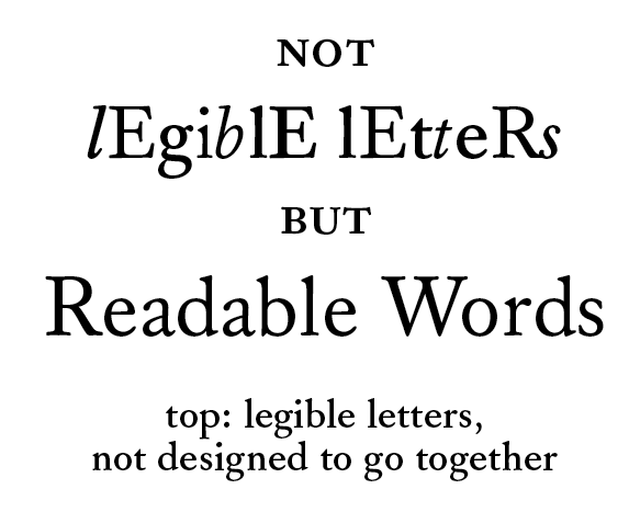
The point is that all of the letters in the "legible letters" line are very readable when they are with their "mates" in style and weight, but as is the two words are barely readable. It was interesting to me that mixing both case and italic/regular, as well as mixing weights, results in such a dramatic deterioration in readability--much more than mixed case alone.
>If lowercase letters are an example of poor legibility but good readability, is it because lowercase text tends to have better spacing or letter design consistency than uppercase?
Well, it's not "poor" legibility, but sub-optimal. A threshold has to be reached, I believe, before reading can take place. I think you now understand the problem that Peter has been wrestling with, and what all we type people have been talking about.
And yes, lower case has both more even color and better spacing than upper case. If you look at lower case, most of the letters have 'four corner' adjustment of black within the x-height, so that more even color is possible. Eg compare T and t. The cap t inevitably gets more "holes" that can only partly be compensated for by spacing. In addition ascenders and descenders I think increase ease of recognition of word image--a gestalt effect.
Peter in particular has argued that letter recognition is worse in normal spacing of lower case, because of crowding. But that closeness is actually better for getting the word image, the gestalt formed by a collection of interpreted sub-letter features across the word. Thus words and letter combinations read better and single letters worse. That accounts for the Word Superiority Effect.
And the experiments I suggested to you were designed to test that in more revealing way than previous tests. The apparatus unfortunately did not allow you to get the short exposure times of the original experiments of Purcell, and so were not dispositive on the issues.
If they are repeated with the short times, I think they will be more revealing. I can discuss this at more length with you.
I have also suggested an experiment using the WSE and missing letter parts which will be even more revealing, I think. This was in part of my TypeCon talk that I didn't get to because of lack of time.
Separating the benefits for readability of only good spacing and even color from the gestalt effects is something I haven't thought about yet, but that should be doable also.
David: Show me a single study of one font vs. another, believable after even the simplest typographic vetting.
Sure: I sat down and read one book and then I sat down and read another book, and I found one easier to read than the other and got through it quicker. This is what I mean when I say that readability is qualitative and measurable in terms of speed, comprehension and comfort. This isn't a conclusion based on laboratory studies; it is a quotidian observation based on doing reading, not studying reading.
And, since all this talk is aimed at screen readability...
It is? I suppose Kevin's engagement might be, because that's his job, but I don't see anything in what Bill, Peter or I have written that indicates that this talk is aimed at screen readability or, indeed, aimed at readability at all. I believe it is aimed at understanding how reading works and being able to describe that in meaningfully precise terms. Readability is, I argue, a set of properties of text, and hence largely irrelevant to understanding reading as an activity of eyes and brains. As Peter memorably wrote on another occasion: ‘trying to construct a science of readability might be like calling physics the science of the fall-down-ability of falling objects’. Readability is only relevant to understanding reading insofar as empirical testing must try to isolate and control readability properties.
Kevin: Is it possible to have the converse: poor legibility but good readability? Or is legibility a subset of readability, so letters with poor legibility will always also have poor readability?
Are lowercase letters an example of poor legibility but good readability?
I agree with Bill: a baseline of legibility is necessary to readability. This baseline can probably be defined as the distinction between illegible and legible letters, with the caveat that if you have one or two illegible letters but put them in context of legible letters the results will be readable on the basis of context. If most or all of the letters are illegible, readability is defenestrated.
I wouldn't characterise lowercase letters as having ‘poor’ legibility. Obviously they have ‘good enough’ legibility: writing systems don't tend to develop poorly legible shapes, and if letter recognition tests indicate that particular letters are very difficult to identify that would suggest to me that identification of those isolated letters is not very important to reading that writing system.
Re. spatial frequency
My understanding is that spatial frequency involves both quantity of periodic changes across space and quality of the transitions between those changes. So yes, it relates to weight, because different weights of type have different spatial frequencies due to different arrangements of dark and light shapes within the same area. But it also relates to what I call stroke density, and the resulting quality of the transitions between dark and light shapes, and this is an area in which type on screen differs significantly from type on paper and, indeed, in which different kinds of rendering on screen differ significantly from each other, and how different monitor gammas make type in the same rendering differ, etc. However, insofar as within any one of these conditions the letters have consistent spatial frequency, spatial frequency can be isolated as a factor.
I should also clarify that when I talk about ‘consistent spatial frequency’, what I mean is restrained within a single spatial frequency channel. In other words, the reader doesn't need to change channels in order to be able to perceive different letters in a word. Within this channel, there is obviously quite a lot of room for variation of letterforms -- enough to allow of all these typefaces -- so consistency in this case does not imply uniformity.
Kevin>What is the theory that determines that agate proportions will perform well at small sizes, but not at larger sizes?
Your organization did a study where Verdana was compared to Arial. What was publicized, is that the people studied preferred Verdana. I encouraged you to investigate all the results, which showed that the Verdana preference faded as the size increased until Arial was preferred.
Finish, and perhaps you will have a theory, if you want one.
KL>Is it possible to have the converse: poor legibility but good readability?
Yes, the study that showed helvetica e more 'readable' than the garamond e 'proved' that beyond a doubt. ;)
KL>Or is legibility a subset of readability, so letters with poor legibility will always also have poor readability?
I think it depends on the poorness of the legibility and whether or not it can be hidden, (like the garamond e), in familiar ways.
But in general, poor legibility in letters will always yield poor readability because those who choose, or are condemned to fonts of poor legibility will not likely be 'super-typographers.'
DB>And, since all this talk is aimed at screen readability...
JH> It is? I suppose Kevin’s engagement might be, because that’s his job, but I don’t see anything in what Bill, Peter or I have written that indicates that this talk is aimed at screen readability...
>...and this is an area in which type on screen differs significantly from type on paper and, indeed, in which different kinds of rendering on screen differ significantly from each other...
How about now? Can I talk about crappy anti-aliasing scaling now?
>...the reader [shouldn't] need to change channels in order to be able to perceive different letters in a word.
... then why make them? ;-)
>Sure: I sat down and read one book and then I sat down and read another book, and I found one easier to read than the other and got through it quicker.
Ahh, but you read two different books. And how can you sit down twice without standing up. Show me a STUDY. I can tell you tales all day of people who can't, won't or don't read their screens John, because of spatial frequency terror. But if that's not good enough, what do we care about your book reading tales?
Cheers!
A study that shows what, David? That readability is qualitative? That we can speak meaningfully about a text being more or less readable than another text? That we reckon readability in terms of speed, comprehension (also retention) and comfort? This is all I asserted, and I challenge you to show me a study that doesn’t show this or, indeed, doesn't presuppose this, based on common sense and everyday experience. You don't need a study to prove that when we read we use our eyes and our brain. Some things are obvious to casual observation, and the fact that some things are easier or harder to read than others is one of them.
Studies may or may not have something to tell us about why some things are easier or harder to read than others -- and I agree with you about the typical faults of reading studies --, but I wasn't making any comment on that question.
David: How about now? Can I talk about crappy anti-aliasing scaling now?
Only if you take into account what else I wrote: ‘However, insofar as within any one of these conditions the letters have consistent spatial frequency, spatial frequency can be isolated as a factor.’ In other words, the fact that spatial frequency varies across reading conditions is irrelevant to the impact of change in spatial frequency so long as it is consistent within a single reading condition, whether that condition is deemed positive or negative. Crappy anti-aliasing scaling is a (presumably negative) reading condition.
Now, independent of the impact of changes in spatial frequency on reading, there is the separate question of whether specific spatial frequencies are better or worse for reading. And in looking at this question, you need to isolate different factors to determine the specific effect of changing spatial frequency within a particularly reading condition. This is where you can start talking about crappy anti-aliasing, as resulting in a specific spatial frequency. What can we say about it? Well, it is a relatively low spatial frequency, because we're losing sharp edge contrast. Is it worse for reading than a higher spatial frequency and sharp edge contrast? Is there a point at which edge contrast becomes too sharp, at which reading benefits fall away? Or is the sharpest edge contrast permitted by the medium always to be preferred, all else being equal?
And just try getting everything else equal!
> the reader doesn’t need to change channels in order to be able to perceive different letters in a word
I was reacting to this. The reader should not need to change channels in order to be able to perceive different letters in a word. It's saccadicide.
>This is where you can start talking about crappy anti-aliasing,
And I lump this together with misuse of extreme sized masters. So when one does both... and studies readability without making reference to these conditions, then what?
>And just try getting everything else equal!
That is what some of us do.
Reaching back to the comedy of definitions,
>writing systems don’t tend to develop poorly legible shapes,
The I's have it. Think about those definitions relative to sans, Ills.
Cheers!
David: I was reacting to this. The reader should not need to change channels in order to be able to perceive different letters in a word. It’s saccadicide.
Yes. We are agreeing. The point I was making is this: it is not enough for individual letters to be legible in order for text to be readable: the letters also have to work together and one aspect of this is achieving consistent spatial frequency. This is par for the course in type design.
Think about those definitions relative to sans, Ills.
I have thought about it: every style of writing the Latin script prior to the modern sans serif typographic letter made a visual distinction between I and l. The writing system didn't have a problem with this: only some type designers did.
>The writing system didn’t have a problem with this: only some type designers did.
And today?
Cheers!
I've been off the grid in the woods for the last week or so and have fallen behind in this thread. As I continue to read read I notice references to Tinker and his studies.
Which specific studies are we referring to?
I am in the process of reviewing:
Tinker, Miles A. (1965). Bases for effective reading. Minneapolis: University of Minnesota press.
(for fun, here's what I get to see what I wake up in the morning at the camp)

@ Moderators: Is there a formal way to re-direct conversation from a thread that goes somewhat off topic? For example:
Let's continue this conversation of in another thread: CAPITAL LETTERS versus Upper and lower case.
David: And today?
Most recent sans serif types I've looked at seem to make some effort to distinguish I and l, either through height difference, or distinct terminals, or some combination.
> writing systems don’t tend to develop poorly legible shapes
I saw you at ATypI Vancouver tell us in the audience that you tweaked individual pixels in your Hebrew fonts to make the roughly two dozen letters that look like rectangles vaguely less illegible.
Oh, and? Chinese much?
You have used up your annual allotment of “What was I thinking?” statements.
—
Joe Clark
http://joeclark.org/
Joe, the challenges to legibility in low resolution environments, which may affect one script more than another, are generally not anticipated in the development of writing systems. Also note that in the full comment from which you quoted, I contrasted ‘poorly’ with ‘good enough’. I stand by the comment, because I do believe that writing systems are intended to be read, and are read, and this implies that the shapes used within those writing systems are indeed ‘good enough’ for reading, presuming that they are legibly made. And that's the kicker: legibility of forms within a writing system means something like ‘ability to be made in a legible way that is good enough for reading’, not inherently legible or illegible. This leaves the onus on writers and type designers to interpret the normative forms in ways that are more or less legible. And this is what we do: we don't invent new letters in order to be more legible, we interpret the existing letters. This leaves the door open to styles of writing that are less legible than others, some deliberately so.
Christopher, Typophile has followed the Talmudic model: if a more interesting topic comes up in the course of a discussion, that new topic is followed, and recorded. That's fine with me, because I love the Talmud. The main drawback might be that the topic title is misleading, but in the case of the internet, everything is indexed anyway, so the topic title actually has no special significance in search.
Also the new topic is not capital letters vs lower case, but legibility and readability. So why not leave well enough alone? What is gained by breaking the thread? I don't see it. And what is lost is something: the continuous narrative findable in one search.
*
At any rate, I wanted to clarify that there are several different issues here. One question is how legibility of letters in difficult conditions relates to their legibility in optimal reading conditions. It does seem that this is different. Another issue is how the identification of letters under optimal conditions relates to the identification of words. Neither Lieberman's definition nor my earlier one above--not so good--really captures that there are two issues here.
On the issue of what more there is to reading than identifying letters, I mentioned in my TypeCon talk three things: good rhythm, even color, and the formation of a word image or "gestalt" or "bouma". I do think it should be pretty easy to show that uneven spacing eg destroys the Word Superiority Effect. But this does not yet prove that "gestalt" effects are happening. This is because what may be critical is just that the letters fit into a grid. The brain may impose a grid, and look for letters within it. So the disrupted spacing may just affect our ability to identify letters.
Still, is might be possible to separate the two effects by seeing whether it is significantly more difficult to identify letters in unevenly spaced non-words vs evenly spaced non-words. When testing is done in all variations for both words and non-words, I think the result would be interesting.
I am also struck by how deadly mixing italic and roman is to readability. Testing the effects with words and non-words would also be interesting as to what it says about our mental grid or matrix.
>Most recent sans serif types [...] make some effort to distinguish I and l, either through height difference, or distinct terminals, or some combination.
Yes they do. But if I had to add an extra nose to be more easily recognized, I'd pass.
The true features of I and l that distinguish them in their character groups, are the slight exaggerations to stem thickness and spacing, relative to their nearest kin, not characters from distant groups. The writing systems can definitely handle this, (to prevent what MS calls, "the BIll Hill problem") But because of other closely related problems, they don't. So now... we've got simplified Latin, i.e. minimal information designed into the font for the reader, poor scaling and not enough pixels.
And, the challenges to legibility in low resolution environments, though not specifically anticipated in the development of writing systems, are...in the form of grids upon which most classically love fonts are plotted. But even these are defeated by the one thing no writing system could ever anticipate, a lack of competition leading to a constraint of development and trade leading to what we see today on most people's screens.
Cheers!
Most recent sans serif types [...] make some effort to distinguish I and l, either through height difference, or distinct terminals, or some combination.
funnily enough, I recently came across a sign where the font in use had "l" with a curved tail to disambiguate lc "l" from uc "I", where a double "ll" could be confused with lowercase "tt". (And was by me) Admittedly when when set too tight and viewed in poor light while in a hurry… and before a first cup of coffee.
-=®=-
> I do think it should be pretty easy to show that uneven spacing eg destroys the Word Superiority Effect.
Bill, in the study that you and Peter proposed, but decided to not discuss at TypeCon, the data showed that there was a statistically reliable Word Superiority Effect for alternating case words. That data doesn’t directly falsify your above statement, but does falsify any claim that lack of rhythm destroys the Word Superiority Effect.
If someone found that a Word Superiority Effect was still there with uneven spacing, would that falsify your above claim?
Kevin, in the experiments graciously you did, the times of exposure were too large to replicate Purcell's findings. In our communication with Purcell, he anticipated problems with the experimental set up you were using, as we related to you. In your experimental set up, with the longer stimulus times, you could not get a normal WSE except with letters as masks, rather than the overlaid Xs and Os of Purcell.
Our hypothesis concerned two levels of WSE, one at shorter times primarily due to visual effects and the second cognitive, based on an influence of word memory. The fact that the exposure times were longer, and that letter masks interfered more with stimulus identification made it plausible that memory was involved. Since no shorter times were involved, our hypothesis wasn't really tested.
Since our predictions involved longer and shorter exposure times for the exposure of stimulus, and your experimental set up did not get those, I felt it wasn't a valid test of our hypothesis. If you replicate this with a set up that can get the longer and shorter times, and careful control of the SOAs (time gap between stimulus and mask),it would be valid, and either refute or corroborate our hypothesis. Because your experimental set up did not really test what we looking for--the set-up first needed to replicate Purcell, and didn't--I felt it wasn't worth explaining the whole thing at TypeCon.
Presence of a WSE with mixed case that you found under your conditions has as you know been been found before. --In fact our hypothesis is an alternative explanation for that effect. And it does not in itself refute "any claim that lack of rhythm destroys the Word Superiority Effect." We were only using three letter stimuli, and no disrupted spacing, which still gives a pretty even look. If the s pa ci n g were like this, with longer words, I do expect there would be a destruction of the WSE, such as Purcell found a destruction of the WSE with very wide spacing of letters.
Further, with timed tests with comprehension, rather than a WSE test, I think it will be possible to show that disrupted spacing slows down reading--ie will hurt readability.
I should add that I don't think that reading test by itself it would test Peter's theory of gestalt effects. It would, though, test the idea that letters falling near a regular rhythm is important to readability.
>... I can provide a screen shot of the rendering with y-direction AA enabled.
Thanks, but we've already established this does not work in 'the wild'. When y direction AA works on a majority of Windows machines, let me know. We have a full deck, and we're launching to make room for more.
Cheers!
Captured from web.archive.org on 10 Jan 2018. view this capture