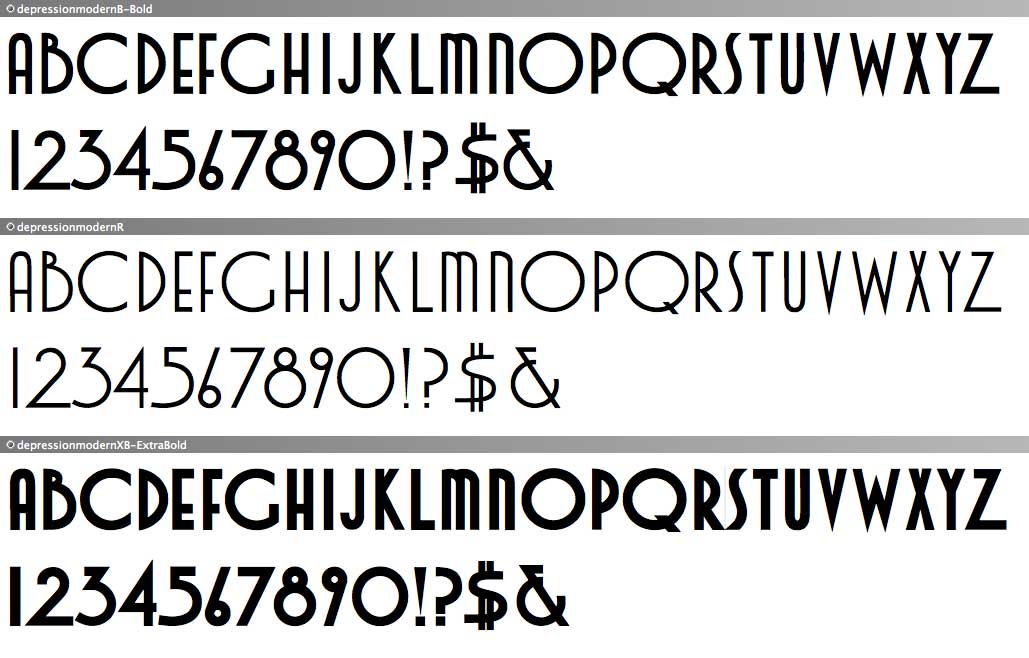
My original post is here:
http://typophile.com/node/83424
I'm starting a new post here only because the previous one might be a bit confusing as I included my inspiration as well as a similar typeface along with my design.
I still have a lot to work out but could really use some Typophile-eyes to help me on the finer points. I'm sure there's a lot I am completely missing!
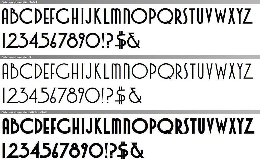
At the moment, aside from some very obvious bad widths and inconsistent heights here and there I'm not really liking the dollar glyph. It seems too organic somehow. I do like my take on the ampersand but maybe it could use a tweak or two?
Also, are there certain things to watch out for when making it bold(er)? I'm using FontLab and it seems to give me contrary advice at times, to what I think looks better. I created the 'regular' size in Illustrator--because I know it better--and worked from there.
A side question would be: I am only getting left-side quotation marks to come up, how does the char map work with the keyboard?!
Thanks for any and all suggestions and criticisms.
~Wanda
| Attachment | Size |
|---|---|
| dep.mod_.jpg | 79.36 KB |