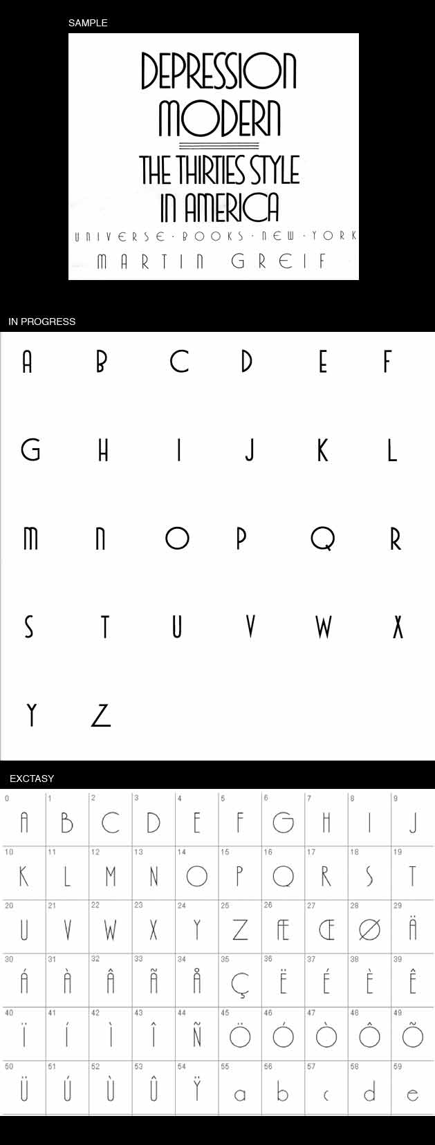
I originally posted the sample on the ID Board and got a 'similar' hit with Xctasy Sans. The file is a first attempt and I'd like some opinions on:
- Size: I started in Illustrator with the sample as a template but when I brought the characters into FontLab--even though I resized them by 600% to be almost 42 pt.--they're still a fraction of the default background shapes. What should I shoot for point size-wise?
- Case/Alternates: Probably more of a personal preference but I'm not sure I'd like to see a l/c with this. Instead, I like the idea of alternates but unsure of where to place them on the char map in FontLab...?
- Shape:
-Unsure about the top-heavy B
-Is the top of the Z too short?
-I think the X cross either too high or too narrow
-I would prefer 'K' similar to X & Y (a higher horizontal center)
-Should V & W follow suit with the rounded N & M?
Thank you for your input!
Wanda.