Typophile

FF Ernestine released

nina


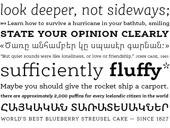
At long last, after three years of work, I am extremely happy to announce the release of my first commercial typeface, FF Ernestine, with FontShop International today!

Microsite with typeface showings and further info:
http://ernestinefont.com/

Get the fonts here:
https://www.fontfont.com/fonts/ernestine

This typeface took its first little stumbling steps at the CAS Type Design program in Zurich, as well as right here on Typophile, where Ernestine's own critique thread, started in January 2009, has seen it mature quite a bit.
After I stopped posting updates there, I teamed up with Hrant Papazian, who drew an Armenian companion to my Latin design while I was making the Italic. We've drawn four weights, and every font now encompasses almost 1200 glyphs (in the complete "Pro" version).

My warmest thanks to my friend and project partner Hrant, to the brilliant folks at FSI who have taken such good care to make Ernestine really ready for market, to friends and teachers from the CAS 2008 class, and last but most certainly not least to Typophile itself, especially Ben, Craig, Sindre, and everyone else who helped this insane journey reach an actual, tangible end. ♥

Fantastic, I'm so thrilled to see FF Ernestine. Well done to both of you.

My own part in this is "only" two years old. :-) It started when Nina took a leap of
faith and agreed to let me make an Armenian component (nicknamed "Vem", which
means "monolith") and even convinced FSI to publish their first Armenian design!

Now the fun part will be watching Ernestine used widely and wisely.

hhp

Hallo Nina,
die Fonts machen einen guten Eindruck - Gratulation!

Drei Jahre - wie schnell die Zeit vergeht.

My very best wishes for Ernestine, and warm congratulations to you both!

It was great fun to see this develop, and a long-awaited pleasure to see it released. Congrats and best of luck!

Lovely font, great job! I just purchased it and am very excited to put it in use.

Nice work, keep it up!

I especially like the 'ff' ligature solution.

That's different. Interesting...

I just got the Fontshop.com newsletter and Ernestine really struck me. Beautiful!

Well done, Nina! Gratuliere!

Congratulations!

Thanks for all the amazing feedback, here and elsewhere – I am overwhelmed! And so glad to hear that some of you find it useful and nice.

I purchased the font as well, it's wonderful. Thank-You!

Congratulations!

Congrats, Nina!

One thing that confuses me: As it seems, you can buy Ernestine either from fontfont.com or from fontshop.com. Only the latter is offering Pro and Offc versions. What's the strategy?

Thanks, all!

Tim: I hope someone from the FSI side will chime in, but as far as I know both fontfont.com and fontshop.com should sell the same versions – 3 formats (OpenType, Office, Web) × 2 character set «sizes» (Standard & Pro). On fontfont.com, after you hit «Buying Options» you should be able to select both file format and character set.

Ah, thanks for the clarification. Of course, it's controlled by the buttons. Somehow, I (or some part of my brain) was expecting these options to appear in the lists below so I missed them.

Congrats, Nina. I love Ernestine and purchased it, as I told you on Twitter.

Warm, clear, lively, and strong. Mazel tov, Nina and Hrant!

Thank you warmly, gentlemen.

This is a really nice addition to the humanist slab genre. It makes a good alternative to Archer and Adelle, among others.

Congratulations to both of you! I plan on using this "wisely" in the near future

Late to the party.
Congrats.
I was about to wonder if it would ever be released ;-)

Dude, 2-3 years is nothing. :-)

hhp

It sure felt like a long time. But as I was doing this for the first time I also did a bunch of things in really roundabout ways (and/or multiple times: for instance the spacing of the Roman was completely re-done 3 times over the course of the project). I am sort of hoping the next one will be quicker. Too daunting otherwise :-)

Congratulations Nina, it looks beautiful! :-)

BTW, one hopefully interesting factoid is that Ernestine
is the first* retail font to have used the Trapping Flower**,
which Nina leveraged comprehensively and consistently.
In fact I used the parameters she nailed down for the Latin
when I trapped the Armenian. :-)

* Actually, I should say the first that I know of,
since I've explained the thing to numerous designers.

** http://themicrofoundry.com/ss_trapping1.html

hhp

Thanks again for all the nice comments. It's truly beautiful to see this out there now and received so warmly after all the work!

I just wanted to put in a friendly reminder that the outrageously cheap (no, really) introduction sale on FF Ernestine Pro family packages* is only good for 2 more days. On 1/1/2012 all prices will hit «normal» levels.

*Specifically, intro prices are good for all 3 «Pro» family packages: OT Pro, Offc Pro, and Web Pro.

Ideally of course you should have too much fun for New Year's,
forget to buy it at the steep discount, and then kick yourself and
make a New Year's Resolution to fork over the full amount. ;->

hhp

Good work Nina! Have a great year sales. \·>

ÜBERКРУТО – Want Armenians in the K FAMILY too!

K.

That would be remarkable Mister K.

SB

So good!

nice one, love it!

Thanks! :-)

I'm beginning to see the appeal of seeing one's fonts used by other people. Loving it. Definitely something to continue...

Captured from web.archive.org on 14 Nov 2014. view this capture