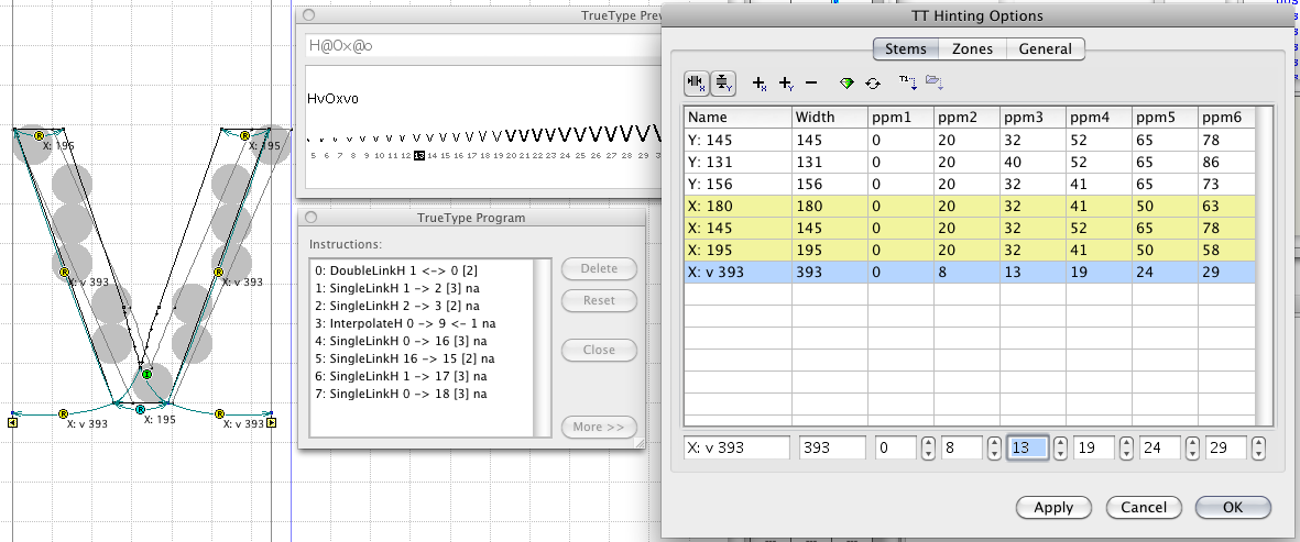
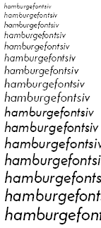
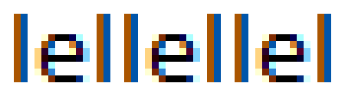
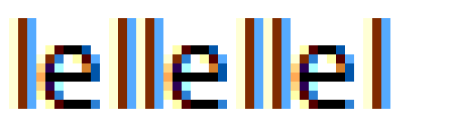
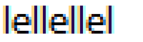
Suffice to say, the documentation of TT hinting is either too shallow (not explaining enough, as in the case of the Fontlab manual) or highly advanced (The Raster Tragedy). I have some questions that I'll just get right to:
1: What is the difference between single and double links?
2: The Raster Tragedy seems to say that with the correct hinting, very few deltas are needed, but doesn't describe a method (or I just couldn't decode the advanced language) to do so. Take for example an "o": with simple links, the stems are easily controllable, but the northeast/northwest/southwest/southeast areas will still have stray pixels or odd widths. How do you deal with those without deltas?
3: How far can the interpolation links move a point?
4: How do you approach diagonals?
5: How do you approach intersections, like in an "x"?
6: Is there a way to move an alignment zone one pixel for the whole font at a given ppm, or do I have to do this manually for each glyph?
7: How do you hint an "s"?
8: How do you hint diagonal terminals?
I realize this is a lot, but I've read all documentation I've been able to find in and out +10 times now and this baby ain't giving up her tricks.