
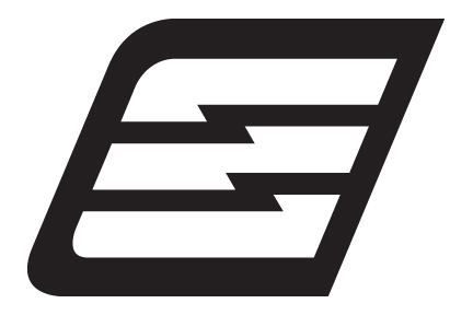
looking to get some feedback on this mark. Holding on to the details on purpose. Will share later. Thanks.
This thread ran to 2 pages of replies and only one was recovered, so replies are missing.
looking to get some feedback on this mark. Holding on to the details on purpose. Will share later. Thanks.

Italic E. So is it a charge point logo for electric cars?

I don't see a letter.
I see speed, and maybe electricity.
And it could be related to Chevrolet.
BTW, the curves are bad.
hhp

An italic "e"? I assume the zig-zag represents energy.
Have you looked at it in a tiny size like it'll be on a business card? I think the horizontal lines and zig zags will need to be bolder. Also I'm not sure if the black field helps it or not; might be stronger without the background and just have the horizontal lines in black.

Frankly, I don't see here anything... or rather nothing jumps out in terms of an obvious concept or a reference. Might be an E, but the slant makes it hard to recognize as such. Combined with a zig-zag, I would guess it has to do with e-lectricity, but again the slant is just too strong, and IMO it overpowers everything else in the mark.

I'd say it's an E, something to do with electricity, or could it be a clenched fist — boom!?
Agree the slant is too much, and curves need some attention.
Thank you all. Nick Job hit on the nose. Agree with all you suggestions. i have been given the opportunity to create an identity for a Mobile Electric Charging vehicle. The brief outlines the need to create branding for a "pilot" launch for a mobile electric charging station (vehicle) for 100% electric vehicles. the service will be available to eligible members in the US. The focus is to deliver/create something "green" and "environment" safe, convenient and service member focused.
I originally had the E without the black border and without the slant. felt it needed a little more movement/emphasis, so i quickly used the slant tool in ai to get a feel for 'movement' and added the border. anyway, here are a few other ideas i'm kicking around. any thoughts are welcomed.
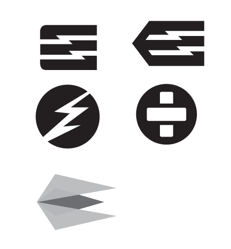

Top left is best.
I'm thinking of calling this E-Charge with the subline Mobile Electric Charge. I don't want to use reFuel or Fuel in anyway. Possibly reFresh. Maybe Charge, but then I'm saying twice. So far, i got control of the whole thing. GULP!
If anyone has/know of any visuals of existing branded "electric" mobile vehicles i'd love to see what other people have done. much appreciated.

There's almost a lower case 'e' in your first image:

which, to me, is a bit more of an interesting form than an 'E'. With a bit of tweaking (rounding the upper right, tweaking the counter space) there might be something there.
thanks aluminum, i'll have to give that a look. currently with a cap E allow me show the 'electric current' traveling through an object. what do think about this?

FWIW I liked the version with two rounded corners instead of three, because it evokes a plug.

To me it says "Easy" or EZ
any concerns the top two read like a's?
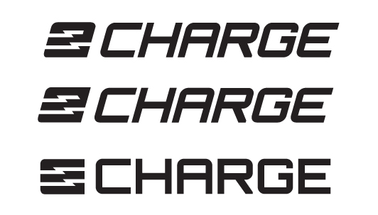
Top one especially reads to me like a 2.
agree. pulled in the bottom right leg of the middle 'e'. i think it reads better. thoughts.
agree. pulled in the bottom right leg of the middle 'e'. i think it reads better. thoughts?
There's still not nearly enough of an "E"/"e" in there, sorry.
hhp
thanks. i'm liking both options right now. i'll have to live with the ideas for bit to see what else i can do. this where I stand, above option and these two. have a great weekend everyone. =)
okay, okay. last idea and I'm done. =)

That last one has enough of an "e".
hhp

Have you tried making the white lightning bolts end with a point on the left and enclose the left edge? And the potential for the square ends to be plug terminals might be worth exploring more. But I think what you have is working aside from the slanted tagline, but I am not sure the symbol reads as part of the name, if that is your intention.
If you see a letter, it will be read [as part of the name].
hhp
The way "CHARGE" is set reminds me too much of "CHASE" bank. Perhaps some other type treatment will lessen the similarity?
Why are you creating the type for 'charge'? The widths and central crossbars look very unnatural.
I am not sure that is always the case hrant, if I might respectfully disagree. In the last example I do see the mark as an /e/ but I don't read it inline because the style is so different - I certainly could be in the minority here. Do you read this bottom logo as AADOBE?
http://www.logoorange.com/upload/famous-logos2.gif
Or perhaps something less ubiquitous, eego or ego?
http://logopond.com/gallery/detail/126510
Maybe you're right (although those two examples are extreme).
hhp

although those two examples are extreme
And they both feature a logo which is the first letter of the name. Which isn’t the case here.
In the last one (http://typophile.com/node/82752#comment-467000) I read e-charge. But, while I think it’s the best iteration yet, I agree it could be improved by trying to tie more the "charge" type to the style of e.
I agree that they are extreme examples, and perhaps defining what about them is extreme would be helpful to hola if the project is still in process. I think what complicates the e-charge reading is 1) echarge is not a word, and therefore not easily read, and 2) the hyphen (e-charge vs. echarge) helps a lot to make sense of the whole, but I can see why it might be avoided for graphical reasons. On another note, what about bringing that left side curve into some of the other letters and playing with the line weight so that the /e/ feels like it came from the same font as the rest, and was a bit modified to add lightning?
@Luma - yes, it's intended to read as part of the name. i like your suggestions. i'll take a look at those today.
@Bendy - i altered an existing font to try and match the 'e', but looks like i need alot more work to there. =)
this is great feedback everyone.
Ha, I was a little too harsh, I meant to say 'a little forced' having the crossbars all the same height. Counterspace of C is large, I'd narrow that letter so the whitespace has a similar area to the G. Still to me, I think you could find a better font for that part of the logo. Something a bit smarter and more fresh...maybe that's just me though.
here are some very quick modifications to text 'charge'. i think it reads as e-charge better. i plan on using a two color option for logo. which should hopefully improve the readability of e-charge. thoughts?
That's getting there. the letters need to be optically weighted a bit better, though. The G appears extremely narrow, for example.
like the feel of this. thoughts?
I'd make the top of the "G" just straight.
Also, to make the "e" easier to see (I think it's still borderline) try making the last "E" the same lowercase shape.
Lastly, I think you can find something better than over-the-hill Eurostile...
hhp
hrant - i had just finished modifying the G. =) As for the lower case 'e' vs upper case 'e'. i'm not sure i want a lower case 'e' and upper case 'a'. i do however like the straighten out G. I wasn't sure with A and R having rounded corners if it would contrast to much. and as far a Eurostile i'm on the look for something new.
I was actually saying to dump the top serif of the "G" entirely. BTW reverting to your earlier round bottom-right might tie the "A" and "R" in better.
> i'm not sure i want a lower case 'e' and upper case 'a'.
You don't want to mess with the others, but maybe you could try a lc "a" too...
> i'm on the look for something new.
You can't get any newer than this... :-)
http://typophile.com/node/82830
hhp
nice.
i have the same concern on the 'e' readability. it needs to read clearly and i just can't seem to find the right solution just yet. i'm still bouncing between these. i think i'll rest on this for a few. =)
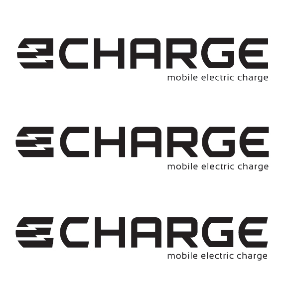

Kerning anybody? Last /E/ stands to far away from the rest. And bit of width wouldn't hurt either.
I also don't like the vertical curve of /E/ being thinner than horizontal strokes.
About your /e/ thing and resemblance to actual letter. Have you tried your arrows (or bolts) within to be as wide as they are on the right but making them gradually thinner while leading to the left. Thin parts on the left will connect left sides of the strokes a bit more hence may look more as an /e/.
Just don't keep the connection between the top two lines on the right because it clearly says /2/.
But the connection is the only thing making it barely enough of an "e"...
In fact what I might try is curving the top-right to make it more like a lc "e".
BTW, I usually like shears, but I think here they're just make it a bit busy.
hhp
Definitely going in the right direction. The top one is the only one where the white space feels balanced in the e symbol. The G & E are both too narrow to work with the amount of negative space in C & H. Try to even out the space between the letter forms rather than the actual letters. Still not reading eCHARGE, but you might have to ask some non-designers to take a look and evaluate it based on their first reaction. Good progress!
You should keep in mind that the mark should look nice on the grille of the car.
I still think your first idea for a mark is the best. In my opinion it just needs a little bit of tweaking. A less agressive angle and equal stroke withs for the outline should take you a long way.
Maybe you can give it a more organic look too.
I don't like your type. In my opinion it looks clumsy and unprofessional.
Good luck!
thanks everyone. =)
I agree that the first version is the strongest icon, if you will. The curves need to be corrected, but I think it certainly conveys the concept of what you are trying to achieve here, and as a mark I think it is quite nice. Where it falls apart for me is in the later version when it tries to become the "e" in "e-charge." It feels like it is really trying too hard to become an "e." And I also agree with typeidentity, the type looks very clumsy and overly tweaked. Have you looked at pairing your first exploration with a simple logotype that says "eCharge?" As opposed to having the icon physically be the "e" in the logotype? Just some thoughts.
hey everyone, here is the almost final version of the e-charge logo. Went through several renditions of the E and found the green E the best fit for what it will represent and readablity. Stylized the E a little to give the feel of a plug/pump without getting to detailed. The pump image is pretty close to what the actual charging mechanism looks like, but felt it was too redundant. The logo will be used on a promotional electric charge vehicle and will have supporting messaging/graphics. pretty content on where it's at. any glaring issue you might see, type, kerning, balance...etc...and if it's to clumsy of type be specific as to what bothers you. =) muchas gracias.

I would move the hyphen/dot a bit to the right.(By the way, have you tried, if you’re allowed to, to use a double hyphen?)
riccard0 - tried it. but seemed a bit busy with the double hyphen stacked and the "bolt" in the E. maybe one to many elements?!
Ah yes! I finally read it as e-charge! Verticals on the H look thin to me. That green color looks a bit to light to compete with the black, and the tagline seems to light and slightly too close to charge. Way to push through!
luma vine - do you mean the tagline is to close in space relation or font selection? I'm thinking space relation, right? thanks. =)
Captured from web.archive.org on 5 Aug 2014. view this capture
