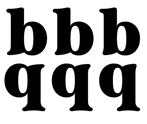
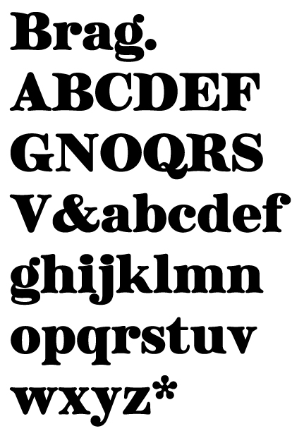
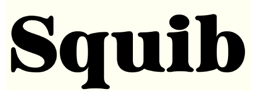
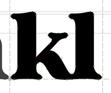
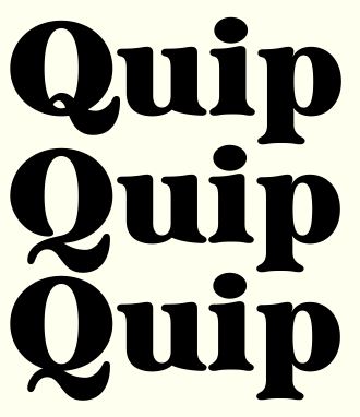
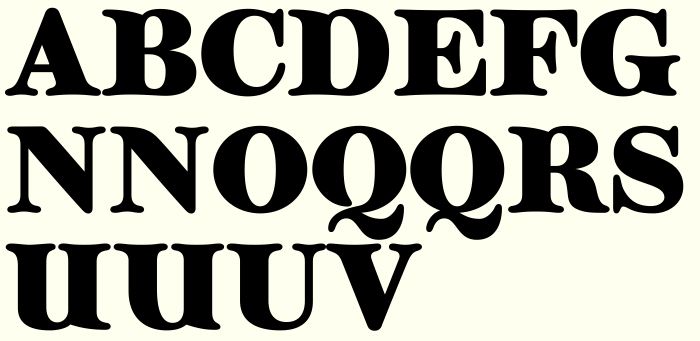
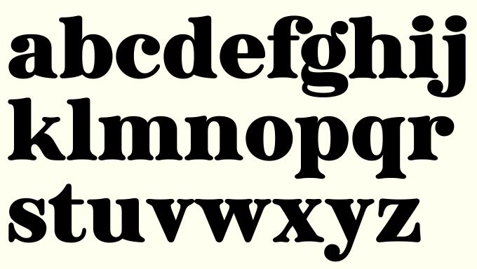
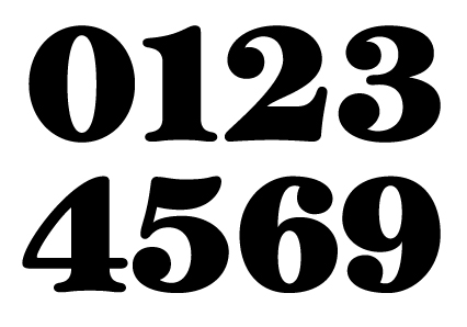
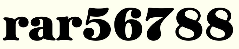
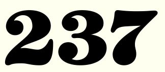
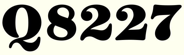
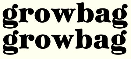
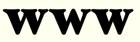
Hi everyone. Please critique my latest work in progress, Brag, a black serif display font. Lower case and a few upper case characters at the moment. No kerning and very limited spacing (I'm concentrating on drawing the glyphs first). What do you think? I'm not sure about the top part of uppercase B, D and R (not pictured) how the thin comes out of the stem. Thinking of going for a more normal look but maybe keeping that as an alternate form, but then maybe it might get too samey. I put the characters into what the font to see if there's anything really similar out there, as it feels quite familiar to me, but nothing really came up as being anything like it. Anybody know of any similar fonts that I can look at for inspiration / problem solving. I'm already dreading spacing this one. I want it to track quite tight so I think there's going to have to be a lot of kerning. Anyway, any thoughts and criticism much appreciated.
Cheers
Dave