
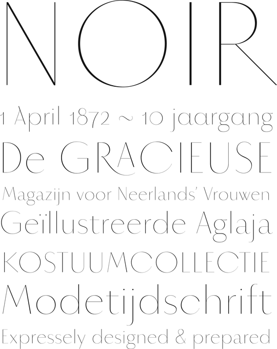
Ok guys. I’m finally putting this up for crit. I’ve been reluctant to, but here goes. What do you think?
| Attachment | Size |
|---|---|
| noir.pdf | 288.31 KB |
Ok guys. I’m finally putting this up for crit. I’ve been reluctant to, but here goes. What do you think?
| Attachment | Size |
|---|---|
| noir.pdf | 288.31 KB |

I've liked it since you first posted a sample of it and I hope you find time to finish it one day.
I can see you had some fun with alternates? I really like the \A\ in April (is that a trial for a smallcaps A?). And the Rswash_A ligature, in which I love little loop.
The horizontal connection in the \K\ stands out to me, although I see you have the same line in the \R\. IMHO, I think it's a bit too modern for this typeface. It might work in smaller sizes though.

Awesome! That's seriously elegant. It already looks pretty refined to me, but I'd like to share some ideas. Cool to see some Dutch words in there ;-)
The style of w and W, might be a personal or historical thing, but it tends to become a little dark (even in such a light typeface) and distracting. I'm not saying you should change it, but at least try a different structure if you haven't already tried that.
The style of k and K looks a bit out of place to me and I'd make one of the diagonals thicker.
Perhaps s and S should have one or two terminals thickened as in the c?
The g looks a bit too geometrical to me. It seems to lack part of the elegance. Definitely stick with a double storey g though!
I think your M needs rethinking. I prefer the middle part to almost reach the baseline and the side parts to be more vertical.
The proportions of your capitals are much different from the usual humanistic proportions. I'm not sure it looks 'wrong', but I'd like to see what it looks like with more humanistic proportions, e.g. much wider D, H, N, U, T, narrower K, wider E and F.
Keep going! I'm looking forward to updates on this one!
Perhaps you could redesign your regular R based on the alternate R. Just a thought ;-)
Kill your darlings, eh?

Comments above are very good I think.
The figures are looking especially nice.
Is the mismatch between the top terminal of /C/ and /G/ a problem?
Perhaps try an open loop on /g/
Is the jutting of that /R/ leg going to make spacing really difficult?
I’m absolutely ready to play with the shapes here, but I think the rough proportions are good. It started out as an uppercase alphabet only, and the first iteration had more typical proportions. I landed on this because, 1: it’s most definitely a display face and should be eccentric 2: The narrow caps are accentuating the naïve geometry in letters like O/C/G. I intended the contrast to be larger than usual.
Perhaps you could redesign your regular R based on the alternate R. Just a thought ;-)
I thought about commenting on that as well, but it will change the entire style of the face. As it currently is, it's kind of modern, but it will become a lot more retro if frode desides to change that R (and possibly K).
Also, I don't mind the different widths of different characters, as I understand their historical origins. Evening them out will result in a more 'modern' look.
I've always liked the 'double v' take on the \w\. Maybe try to widen it a bit to allow the character to be a bit lighter.

Wow, this is deliciously beautiful Frode. Congratulations on such a graceful design. I like the way you've mixed wide and narrow proportions.
To me the M sticks out, it's rather narrow — I think I'd try bringing the centre vertex to the baseline but keep all the angles the same. The W may look a bit narrow too.
Head of ampersand seems to be nodding to the right.
Q: longer crossbar?
K/k: try a branched structure?
Numerals are splendid.
£: I think I'd go for a slanted stem in the roman, for this style of typeface, more elegant, the current one looks a little stiff.
Italic /ae/ may be too much like /oe/?
Wonderful. Are you thinking about any other weights?
Like this?
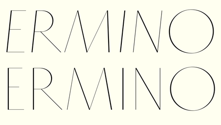

It’s the upper bowl of g a tad too big? The letter seems a bit uncomfortable.
The “new” M is very nice, if a little less distinctive.
Absolutely. Maybe bring that centre up ever so slightly — to me it's dipping below the baseline in some optical illusion. That would be a nice name for the font BTW.
Think Riccardo's right about the g, I couldn't put my finger on it.
I believe it’s already taken, although not yet released: the proportional non-stencil sibling of Nitti and Stanley. Anyway, I have a name.
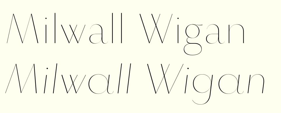

I like it, very elegant.
Just a thought: perhaps try a single story a for the roman? Now it's troubling me a bit that italics and roman don't match that well, especially because of the large bowls on the a and g. I prefer the single story a (but without the hook, perhaps a little less round?) as it brings it a bit closer to futura elegance rather than didot elegance. The double story a is a bit too 'nice' and tame, IMHO.

Frode, congratulations. Very beautiful and distinctive.
I smell the joy you have while shaping.
Please add Greek.
:-)

Very nice! Do finish it.
> Kill your darlings, eh?
Not for a display face!
hhp

Please, don’t take this personally, but I I think you should avoid getting too close to SangBleu.
Hi Frank! Don’t worry, I’m not! I actually just got a (somewhat angry) mail from them. What do you guys think about that? The selection of ultralight stressed sans serifs is rather slim, and I wasn’t aware of Sangbleu Sans until very late in the process. If this was a regular weight grotesque or humanist I don’t think anyone would worry about being to close to something else. None of my shapes were inspired by Sangbleu — in fact this started out as more of a "fixing Fashion Thin" thing. I drew inspiration from Futura (rythm) and Neutraface (lowercase), Optima and Peignot (stress) and a bunch of concepts I’ve been wanting to explore that people said you shouldn’t, particulary retaining the geometry in the cursive.
Hope the US is treating you well, btw!
They’re angry just because your font is nicer than theirs ;-)
I wouldn't say that. They're talented guys.
You're not treading on claimed territory here, IMO.
a bunch of concepts I’ve been wanting to explore that people said you shouldn’t, particulary retaining the geometry in the cursive http://typophile.com/node/74092
Which you egregiously achieved. But have you though or tried to rotate the stress’ axis?

Frode, you can't call your font Millwall Wigan ;-)
Seriously though, very elegant.
What is the resolution of the grid? What size have you enjoyed printing this at?
FWIW I don't see any cause for concern re. SangBleu.

This is very nice, and I see the Optima influence here. To me the only similarity to Sang Bleu is the weight. Keep on.

How long until this is complete? I love it.
… have you though or tried to rotate the stress’ axis?
Yes, some of the letters breaks free from the typical stress.
What is the resolution of the grid?
A little unorthodox, but I needed more precision: 3000 upm
To me the only similarity to Sang Bleu is the weight.
Thanks for the support.
I’m really happy for any comments on the shapes, well anything really. I’ll try my hands at some of the suggestions above tomorrow. Keep in mind this is a poster size typeface.
Yes, some of the letters breaks free from the typical stress.
I wonder if he meant as a way to distinguish the italic from the roman (in the absence of distinct geometry).
- -
I wonder if a little curve to /y/'s tail would make it more suitably graceful.
How often do you need to emphasize an uppercase word in a headline?

Ian Party is still calling it a rip off http://twitter.com/#!/ianparty/status/74182837133246464
When you say "fixing fashion thin" is that in reference to Alex Wiederin's 'Fashion Thin'?
I wonder if he meant as a way to distinguish the italic from the roman (in the absence of distinct geometry).
How often do you need to emphasize an uppercase word in a headline?
That’s what I meant :-)
And italics could be used for more than emphasis, especially in headlines. For example, something like this:
The axe is buried, so leave Ian alone. He's a good guy and a very talented type designer.

The axe is buried
That's great news. The world of type is more than big enough for this great typeface and the very good Sangbleu Sans to peacefully coexist.
Riccardo, feeling Nick today? ;-)
hhp
‘Anybody who rides a bike is a friend of mine.’
I love that quote. Gary Fisher right?
The very same! It prefaces Naïve. Super by Erlend Loe, which you may have read.
Yes I have. Didn’t know it was out in English.
It's good to hear things are settled then.
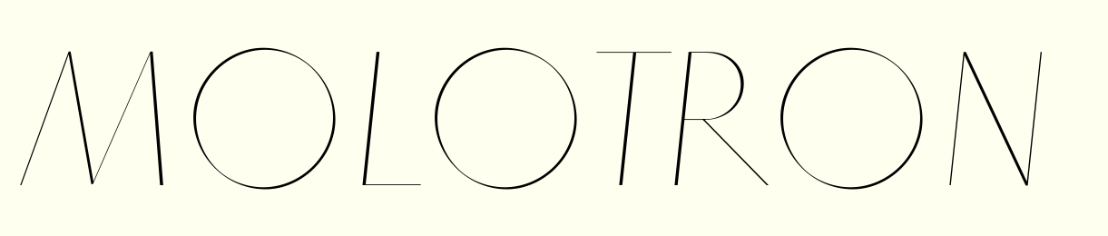
I love the contrast, but I think it should be
more circular - it looks flat at the thick parts.
hhp
I find it nice. It gives the text a sort of "dimensionality".
That said, maybe something even subtler could work.
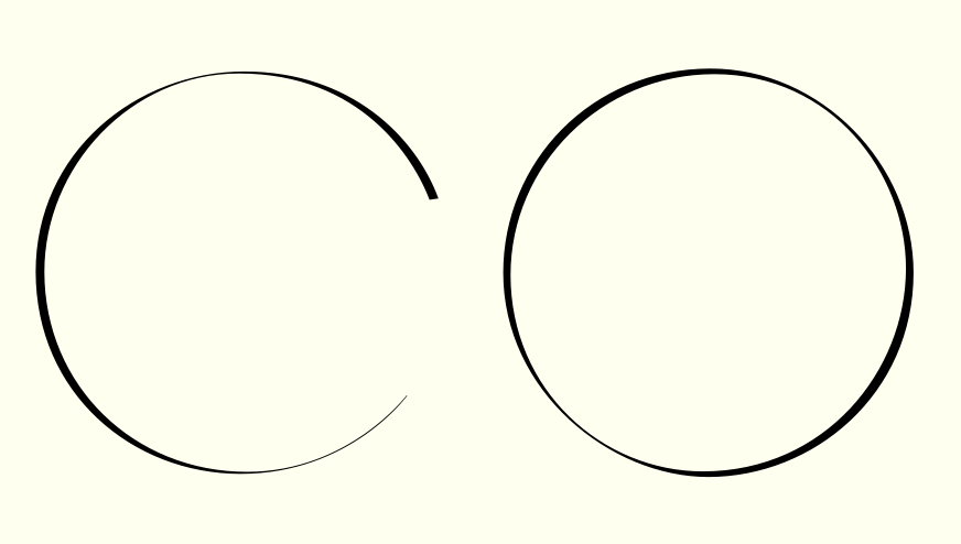
Better?
Seems to my eye like that /O/ flattens out both at the thicks and the thins (looks diamond-shaped)
Thanks. You like the contrast, I can always polish and the opticals.

It's really nice! Reminds me a bit of Sang Bleu.

Frode, this is looking gorgeous indeed! I couldn't see a similarity to Sang Bleu aside from it's weight.
Keep it up and will be looking forward to this.
Btw, one cool trick with the geometry in the italic is switching styles in the middle of words.
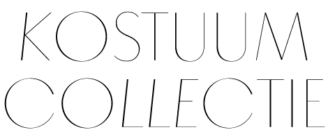
It's not a bug, it's a feature! ;-)

This is beautiful!!!
Frode, how does my Greek?
Andreas? I don't understand what you mean.
;-) take it with a grain of salt.
I was only dreaming about how marvelous Greek would look in this design of your typeface.
:)
(Only) Latin Extended A for now.
:(
Congrats!
hhp
Frode, Herzlichen Glückwunsch!
Eine sehr schöne Schrift.
Tusen takk, Andreas!
Captured from web.archive.org on 16 Apr 2015. view this capture