
How come geometric italics never have geometric O's?
How come geometric italics never have geometric O's?

Because the circle wouldn’t relate to anything else in the font.
I don't get that. How does a circle relate more to a vertical line than a slanted line?
It’s because for it to work the bowls of letters like p and b would need to be perfect circles, and that would look like circles tacked on to slanted letters. But for the o to work it has to relate to them, so it has to slant like them.

Churchward Design has geometric O's in it's italics. I've always thought it was an interesting idea, but I'm not sure it really works. How would you be able to tell whether a word like "GOO" is italic or not?
Yes, other round shapes would have to stay geometric, but I'm not sold on that necessarily being a bad thing. Churchward Design's G is still upright - it doesn't have to be.

A circle as geometry has the same visual angle upright or when rotated. But slanting a geometric figure yields a change in all geometric forms creating an ellipse of the circle. This is in keeping with the system of italics. To keep the O as a circle just makes it look out of place to most readers. What would happen if you slanted say the "H" in an upright roman face? It would call undue attention to itself and give the reader a reason to be confused.
I was going to post some sketches, but I had someone break into my office this morning so I'll have to wait for the police to release my computer (luckily they stole nothing, just smashed the door ...). Just because something is unusual doesn't mean it can't work. Look at Avant Garde's alternates for example! They are in reality slanted and backslanted forms in an otherwise upright environment.
Anyway, an ellipse is not all that logical in an otherwise geometrically constructed environment and may very well be something we just brought with us from preceeding styles and never really questioned. Or?

Your computer must have been too old -- "Nah, it's previous year's model, with the unreliable hard disk and slow screen updates. I might as well leave it."
Wouldn't a slanted character to the left of an "unslanted", perfect 'O' intrude too much into the top space? Perhaps your sketches will show how much.
>>Look at Avant Garde's alternates for example! They are in reality slanted and backslanted forms in an otherwise upright environment.<<
Yes, but you never confuse them with other glyphs or ask yourself, "What is that?"
The convention with italic is that the letters all lean to the right. You could imagine that an italic geometric "O" could lean to the right simply by rolling or rotating, but there would be no way to distinguish it from upright. The usual solution to this is to design it as a tilted ellipse, which has the advantage that you can see which way it's leaning, and that it is leaning.
Still, an ellipse in a geometric face is a compromise, just as not being able to separate (unless you consider context) an italic O from an upright is a compromise.
Well, all I can say is that type design tends toward the pragmatic over the ideal.

Here you go. In theory I would say it should fit if everything else in the face is also rotated instead of skewed, and that's kind of how it works in this case — the ends of strokes are square, the tops of letters slope downhill — but the o still stands out terribly, and not just for the obvious reason, I think.

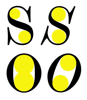
The presence of circular forms in the counters of the Scotch Modern italic is one of the things that attracted me to it.
This circularity is more pronounced in the italic than the roman.
However most, if not all, didone revivals (other than mine) opt for more skewed counters.
Very interesting, Nick!

Geometrically, rotating and slanting are different operations:
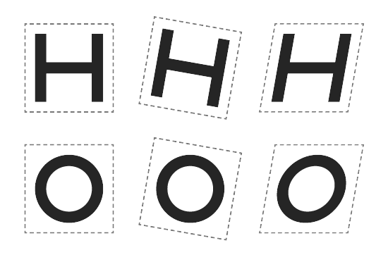
Look at it this way, Riccardo: If you started drawing an italic geometric face from scratch (without a preceeding roman) and your only tools were pencils, a drafting compass* and a ruler - how would it look?
* Is this the correct term?
If you started drawing an italic geometric face from scratch […] how would it look?
If it was drawn by me, surely it would look rather clumsy! ;-)
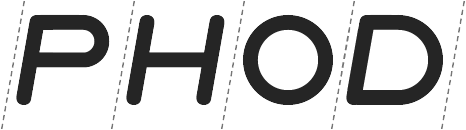
I think the problem lies in the shape of the counters.

If I ever study I'm going to be such a pain in the ass for the professors ;)
If you started drawing an italic geometric face from scratch (without a preceeding roman) and your only tools were pencils, a drafting compass* and a ruler - how would it look?
But strictly geometric typefaces don’t look especially good; most of them are really conceptual exercises. The geometric designs that designers commonly use are the ones that compromise the geometric ideal to give us something attractive to look at.
Definitely.
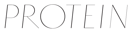
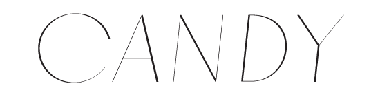
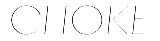
Both C and O suffer from some optical problems that I’ll have to resolve.
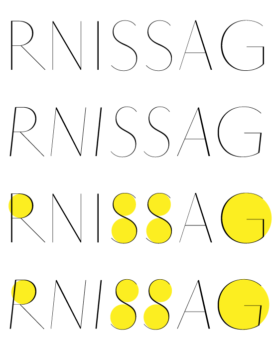

Frode, the bowls of the P and R do look slightly slanted?
There’s some slight optical adjustments and possibly some compression artifacts.
Given the slight angle of slant, and the fact that the face is high contrast, circularity does not appear to be a problem.
Now, about the overshoots...
Yepp. They should be a little taller/deeper. I noticed it too.

Don’t forget The Ever-useful Rotalic.
Huh. Might be useful for listings.
Rotalic is only half a design.
The awkwardness created by the difference in glyph "footprint" hasn't been addressed.
(This is the same problem that upsets type on a circular path.)
Related: Platform
Captured from web.archive.org on 20 Aug 2013. view this capture