
Hello typophiles.
Do you find this ampersand shocking or OK?
< image below edited : version n°2 >
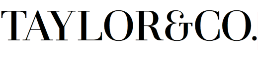
thanks a lot (again)
Hello typophiles.
Do you find this ampersand shocking or OK?
< image below edited : version n°2 >
thanks a lot (again)

I think it's really cool in this context - it just might be too much like an "E" for text.
BTW, I would:
- Make the ends of the "T" heavier.
- Maybe loosen the spacing around it, and definitely tighten up "TAYLOR".
hhp

I agree about the spacing. O/R and R/&/C are especially problematic. (I would kern the . too)

Maybe the ampersand could be a different color to set it apart.

To help us provide more than aesthetic commentary, can you describe the context? What do they do, who are their customers? Is this personal, professional or academic?
kerning and spacing are not finalised yet.
I'm wondering to ask iKern to do the work. anyway..
The context: this should be a font I'd like to release and sell one day…
It's a modern revisited not a re-digitalisation of classical cuts. It will have 3 ampersands, 2 more classic and one more contemporary (the one you see) as the default one.
I like it to have an unconventional shape but to look like a ligature of /E/ and /T/ as the first /&/ was. And to be readable of course! :)
@hrant
- Make the ends of the "T" heavier.
you mean the uppercase /T/ or the T end of the ampersand? If the 1st case, so I should do the same on /L/ isn't it?
Oh, sorry, I haven't checked where you posted this, and wrongly assumed it was for a logo or something like that.
For a typeface, it seems to me that R is darker than the rest, especially the joining of bowl and leg. Also the top bar of T could be a little more contrasted.
I thought it was a logo too.
T: I meant the serifs off the horizontal, in the ampersand.
hhp
I've edited the initial image.
Is it better like this?
You should really post them both. Nothing to compare it to now. Post the edited one here, not at the top. That way people can follow the progress of the work and discussion that surrounds it. And is this work professional, personal, or academic?
uh! I haven't the old image any more..
I guess it is professional. I mean, I'm trying to do a good font. And if it's good, I'll try to put it on some online font reseller and see what happens.
But of course I'm a junior; I'd like to study at Reading but I'm too old an have no possibility to do it :p
[double post. moderator please delete]
By my definition:
Professional = A client is paying you to do it
Personal = I’m doing it for fun
Academic = It’s a school project
By “I’m a junior” do you mean that you are in school (3rd year of an undergraduate degree if we are speaking of the American school system), or simply new to the field of type design?
I agree with Christopher: the best critique threads are the ones that show the evolution of the typeface.
See, for example, http://typophile.com/node/60316
@ Mr. Dean
So "personal" but I'd like to differentiate my activity (graphic designer).
I'm junior = I have 8y experience in graphic/web design and I'm into type design for 1.5y more or less. But in last 6-8 moths I spent a lot of time on this.
@Riccard0
right! It's just forgotten I can post an image on each reply :) I'll definitely do this next times; sorry.
@Synthview: In the spirit of fun, do you know of other fonts/have visual specimens of other &persands (cute, yes?) that you find noteworthy (positive or negative)? Minion Itallic, Linotype Univers, Baskerville Italic, http://ampersandampersand.tumblr.com/ , http://typophile.com/node/39812 , spring to mind. True story: I once dislocated my shoulder while trying to describe a Minion ampersand by drawing it in the air.
Hardcore.
hhp
Captured from web.archive.org on 23 Jul 2014. view this capture