
What are one or two of your favorite slab serif fonts? Extra credit points for providing options for fonts to pair with it.
What are one or two of your favorite slab serif fonts? Extra credit points for providing options for fonts to pair with it.

Egyptian 505.
Silica.
hhp

Nick Shinn’s Bodoni slab interpretation.

Hellenic Wide

Chaparral
Thanks for the responses everyone. Good link Riccard0.

FF Olsen
https://www.fontfont.com/fonts/olsen


More than one or two, but:
FF Zapata light, Neutraface slab(pair with Houschka?), Unit Slab, Bodoni Egyptian, Stag(pair with Avenir?)

Popular and Boomer Serif, both from Font Bureau.
http://www.fontbureau.com/fonts/Popular/
http://www.fontbureau.com/fonts/BoomerSerif/

FYI — The Boomer fonts are next up for Retail release from Font Bureau. Note, however, that the name had to be changed because of trademark issues. You should see them released pretty soon as Salvo Serif and Salvo Sans.

Silica, Volta, Memphis, Beton, Museo Slab

I must admit I am a great fan of slab-serif faces… Among my favourites are:
Fann Street Clarendon
Antique Number Six
Blanchard
Antique Number Three
Caslon Antique
Ionic Number One
Ionic No. 5 and the Linotype Legibility Group
Monotype Ionic
ATF/Linotype Century type family
MT Clarendon
Clarendon
Consort
Antique Nº 3
Egyptienne
Giza
Rockwell
Most of them work fine with moderns and grotesque sans-serifs:
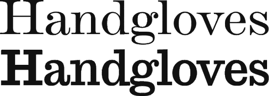

Sorry, but the fact is that slab serifs do not mix easily with either serif or sans faces, lacking sufficient differentiation from either.
However, if there is a large contrast in weight between the slab type and either the serif or sans face, then it might be OK.
In the past, typographers would often set the entire job in a slab — e.g. Cheltenham in the 1900s, or Beton/Stymie/Rockwell in the 1930s.
I think one does indeed need a weight difference to make a slab stand out from a serif (without resorting to a strong clash in style) but those huge serifs certainly make a slab stand apart from a sans! Especially when you consider that stroke contrast difference can also be leveraged (with both slab and sans capable of going either way).
BTW Cheltenham's serifs (especially printed letterpress, like during the time period you mention) are too adnate for it to be considered a slab. I myself like calling it a "Doric serif" font. :-) And I don't know about using Beton/Stymie/Rockwell for an entire job, but Cheltenham can certainly handle that with poise... not least because it's not a slab.
hhp
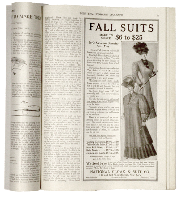
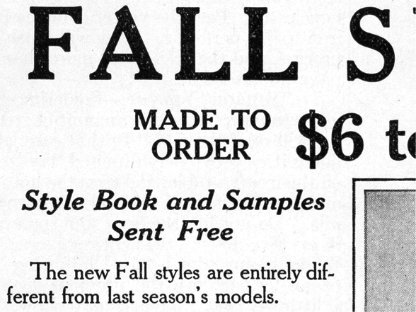
This is what I had in mind for Cheltenham as a slab serif, being used exclusively in a document in multiple styles:

I have been looking at a lot of slab serifs and I haven't had any luck finding one with a range of styles. My ideal font would have everything from hairline ultra compressed italic, to extra black entended italic. I have found some with italics, and I have found some with a wide range of styles but without italics. I haven't come across one with both yet. Is there a reason why something like this wouldn't be created? Are there technical limitations? Or does anyone know of anything out there like this that does exist?
United is sort of fits what I am looking for: http://www.houseind.com/fonts/unitedcollection/viewfonts. I would prefer it with some curves as opposed to all straight lines. Close but not quite.
I think Joshua Darden`s Jubilat should be on the list too. Weight range from extra light to black, with corrosponding italics. But it lacks of narrower styles or extended.
http://www.dardenstudio.com/typefaces/jubilat
> Or does anyone know of anything out there like this that does exist?
Receiver might come close. It’s a slab serif version of Antenna and was designed by Cyrus Highsmith and David Jonathan Ross. There are 7 weights and 4 widths, all with italics, same range as Antenna.
It is in the FB queue for Retail release (some time this year, I believe, but don’t quote me on that).
Maxim: United has both sans and slab serif versions of each style. The sans is listed first so the slab is down the page a bit. I just now noticed that there is only one version for the italics. Kind of a mix between both.

FF Unit Slab:
http://www.fontshop.com/fonts/downloads/fontfont/ff_unit_slab_ot_collect...
PTL Qugard Slab:
http://www.primetype.com/faces_info.php?fid=8
Edit: Both have Grotesk / ‘Sans’ companions.

Pair Serifa with Univers, or Stag with Stag Sans.
Update: Salvo Serif (the font family formerly known as Boomer ;-) has just been released.

Probably not as many styles as Eric is looking for, but still plenty to work with.
As seen in AARP, TV Guide, and Outside magazines. Last I checked, AARP was combining with Mercury Text for body copy, while both TV Guide and Outside match up with Quiosco for text. Of course, the sans companion in all cases is Salvo Sans.
Kent, I like Salvo Serif a lot. There are a good amount of weights but unfortunately it still falls short.
Trevor, Serifa and Univers is a great font pairing.
I would love it if there were a slab version of Knockout. I may ended up going with Knockout and Sentinel. Unfortunately Sentinel doesn't have a variety of compressed to entended styles, and Knockout doesn't have italics. I am thinking Chronicle Text/Chronicle Deck and Display when I want to be fancy.
I am branding a construction company so I think a slab serif fits perfectly. I would like to start with the slab and base my other typefaces around it. I like mixing different styles of typefaces. Tyler Galpin's website is a good example of what I mean. His site uses the font United that I mentioned earlier in this thread.
Captured from web.archive.org on 18 Feb 2015. view this capture

