
Currently I'm in love with Archer. Now it's your turn… ready, set, go!
Matt
This thread ran to 2 pages of replies and only one was recovered, so replies are missing.
Currently I'm in love with Archer. Now it's your turn… ready, set, go!
Matt

i'm saving up for soho

Psst … if you are rather on the humanistic route, and don’t need italics: Silica.

I like the look of Silica. And I think Amasis is real nice.

I've got a few favorites but none of them have been released yet.

So many huh? I like the good and old STYMIE

out of ones I own: Clarendon
out of ones i wish i owned: Archer
And I agree. I wish I did have a license for Archer too.
2 x 2 = 5
Overall, I guess I'd use Silica, but Caecilia italic is great. The roman is fine, but the italic is charming and lively, particularly at large sizes. Well, I guess all slabs work better at large sizes.
If you include it as a slab, Chapparal is terrific and CAN work at small sizes because of optical sizes. Pricey, though.

\m/
Also, Brioni is lovely. Sort of reminds me of Caecilia in a way that probably has nothing to do with type and everything to do with Atonement.
I enjoy that James Montalbano likes Enclave...
Actually, *I* like it, too and appreciate being reminded about it. It has the forthrightness of slabs without the heavy handedness. That may well be a purchase in the new year.
I've been waiting for a thread like this! :P
I've been thinking about slabs; I think there's a shortage of nice slabs… most of them look a bit off, to me, like those old ones, Rockwell and Stymie. Serifa is kind of nice, but I think those three work best when setting all caps. Not to mention the fact that they lack cursive italics. Anyway, I for one love Caecilia. And what about TheSerif? And Officina Serif?
I didn't know some of these you all mentioned, but none of them really won me over… Vista was almost begging to become a slab, that's a great one (I love Vista, so I love Vista Slab), and Black Sabbath is great in that quirky glitchy way. Should make some sweet posters!
But I see a possibility, here… I really need to start working on a slab. :P

Unit Slab will be pretty sweet when we're done with it.
--K

United Serif (assuming it qualifies)
Archer!
No love for Lubalin Graph?

I've used Chapparal a number of times, and continue to admire it very much. It is a very comfortable read, which is more than can be said for most slab serifs, which tend towards stiffness and lack of interaction between letters.
I've just seen the newly released Brioni [PDF link] from Nikola Djurec, and it seems to me a clever piece of work.

I've recently used Chaparral for the first time directing this graduation catalogue publication and everybody was happy (you can see a section here, .pdf).

Chapparal!
I think Chaparral is great, somehow the angles soften things a bit and make me forget it's really a slab serif.
So who is creating a Slab Serif wiki page?

kris : is there any sketches available for us to look at?
I really enjoy Glypha. It is really smooth and is pretty versatile.
>So who is creating a Slab Serif wiki page?
Then don't forget PMN Caecilia.
Of course Clarendon rules all of this "genre", hehe
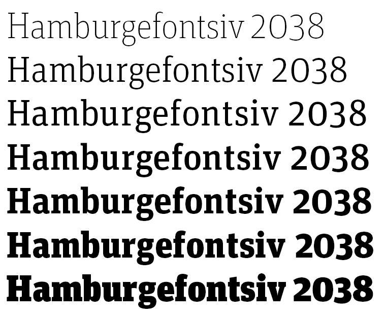
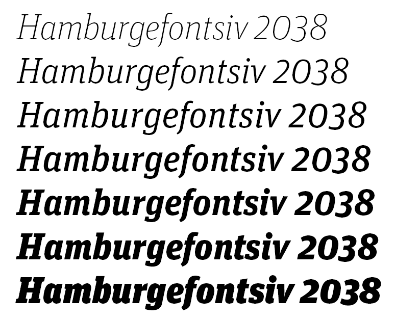
Hey vicone, no sketches but here is a screenie of the weights:

I have used Caecilia and Serifa for some projects, I also like Glypha.
And now I am saving for Unit slab...

Wow, a lot of great fonts on this page. I really like the more geometrical slabs like:
Guardian Egyptian Unfortunately not for sale
Polular Unfortunately not for sale
And FF ZIne and Lubalin Graph, which I have used for many projects.
I really think Archer can't be a great and new alternative to the very used Serifa, Rockwell, Stymie etc. but I wish they would make a black/heavy weight of the font. Has anyone heard of plans of this? With Gotham they released a black version some time after the initial release.
Oh, and speaking of Black Slabbath have you seen Facebuster?

I have to say, still have a soft spot for good ol’ Rockwell and Memphis, although they lend a definite historical note. Lubalin Graph is so much like a slab-serif version of Avant Garde I can only use it in a similar way, and it’ll be a few years before I want to go that route! For a more modern feel I quite like Enclave.
Don't have it but as I saw it just recently am currently in lust with Archer.
Since it was mentioned: Guardian Egyptian I've been seeing a lot of lately (partner’s newspaper) and I don’t like the light, but the italics I loathe. Overall I really don’t like the way they use it.
Personally I don’t really feel that bracketed serifs really belong in the same class as what I think of when I hear slab serif so definitely no Clarendon for me.
I just thought of Rockwell again this morning and was surprised nobody had mentioned it yet. I know it's used a lot, but I think it's an absolutely classic slab serif.

It has been mentioned. Multiple times. Including the two posts directly before your latest.
If you are going to start a thread it would be polite to read the replies.
Therese, I've subscribed to the RSS feed of every thread I've ever started on typophile. As far as I know, nobody had mentioned it yet when I checked my feed reader this morning. I just found it interesting that I'd think of it, go out the door, and see two posts relating to it when I returned home. Maybe you misunderstood me.
Actually, the first time it was mentioned was on the 18th. Maybe you should get a new feed reader.
i have to agree with peter, Stag is amazing, i use it all the time, and Prelo Slab and Guardian Egyptian look great, and i'm seriously thinking of getting Facebuster... i just can't think of a use for it right away... oh and yes, archer looks amazing too!
of the more 'classic' slabs, i like Rockwell... a

I love the strict geometry of Lubalin Graph, but after recently working with the typeface on a job, I have to give it up for Caecilia. Very clean, without looking too turgid.

Aptifer. Too bad I never get to use it.
Prelo does look pretty good, strange that I had never noticed it, seeing as it's one of the only portuguese slab-serifs. There's also Morgan Avec, but I think Prelo is more to my taste. Also, I just thought of Nexus Mix, which might be a nice, different choice.
Nice suggestions from everybody! Reminds me why we DO need typophile… :P
i've heard about neutra slab being in the works... now that sounds great, but i haven't seen any sketches or anything... maybe if christian or someone from house is on here they could give us an update? *wink wink* :-)
Simon: Neutra 'Slab' (PDF link) courtest of Kris Sowersby.
I prefer Archer :)
It seems there is a certain 'renaissance' for the Slab, perhaps especially for the more humanist ones. Would you agree? Or am I reading too much into my own current predilection, seeing slabs just about everywhere?
Last May a colleague wanted me to spot a typeface he loved, from The Central Saint Martin College of Art & Design, 1999 BA degree show catalogue ; it was ITC Officina Serif.

Archer, easy.
- Scott Sullivan
www.trifepdgm.com
@erichson - sorry i missed this thread update - wow, neutra slab looks nice.
i want both archer and neutra slab!
an update - i've used facebuster and LOVE it!

What about FF Tisa?
Captured from web.archive.org on 18 Feb 2015. view this capture


