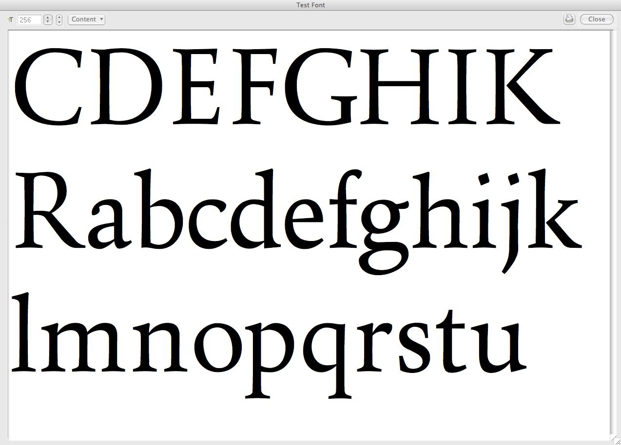
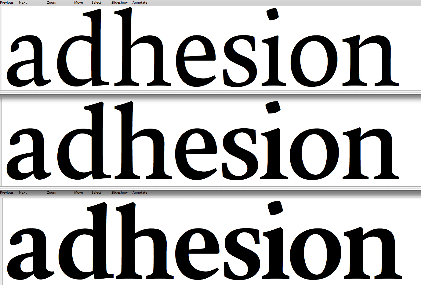
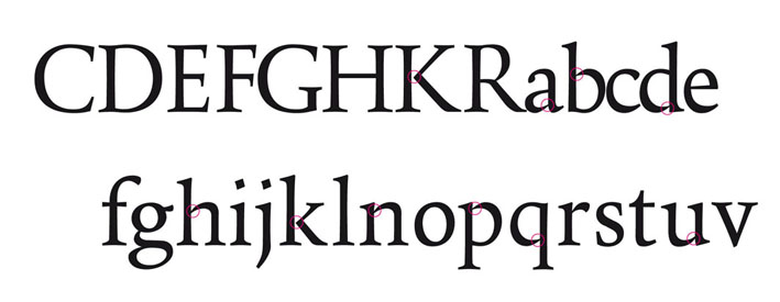
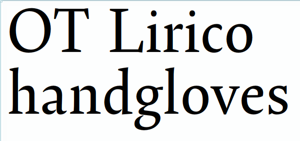
One of the problems with designing a typeface is getting feedback. Most designers work in a vacuum and that's why a forum like this is so useful.
I have started looking very critically at my half finished type projects and decided that my passion for Dutch typefaces could provide enough impetus to design a really nice text face.
So I looked at a lot of the typefaces I really like such as Lexicon, Van den Keere, Swift, and Lectura. I started drawing without referring to any of these in particular and tried to make the characters as quiet as possible. I'm looking at a useful typeface for extended reading.
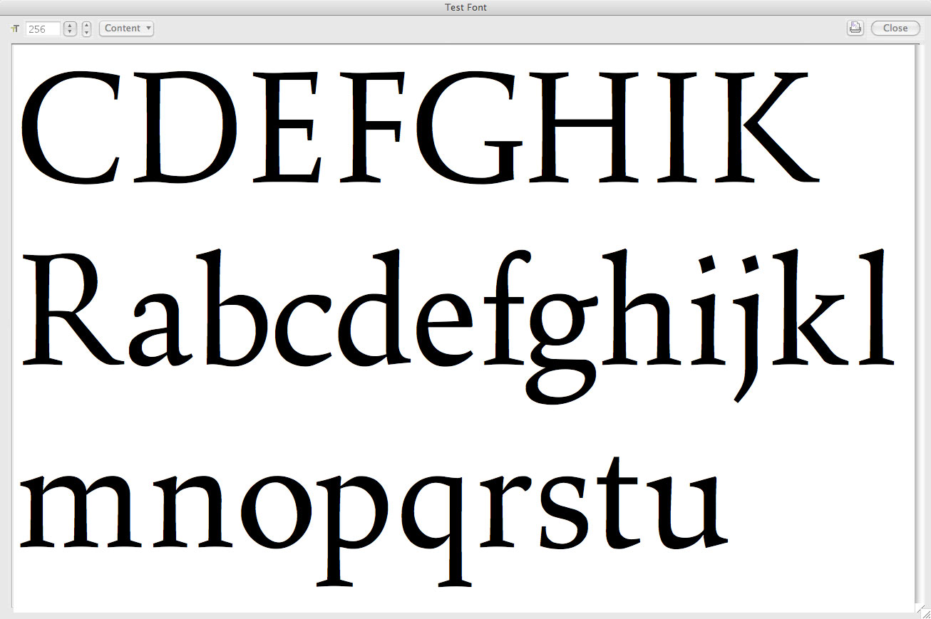
Here's a first jpeg of work to date and i would really appreciate any comments.
| Attachment | Size |
|---|---|
| amarach.pdf | 20.03 KB |