
Headland One is a text typeface designed to be highly legible and comfortable for screen reading
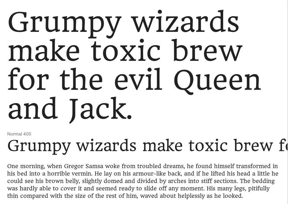
Headland One is a text typeface designed to be highly legible and comfortable for screen reading
Apologies I meant to put this under Critique

You still can: use the "Edit" link to move it.

It's tempting to critique this existing version (for example pointing out that the spacing is pretty rough) but maybe it's too late, so you'd rather we focus on the making of a "print version" (which BTW is an interesting way of looking at things).
The x-height is indeed too big (for normal-size text*) in relation to the ascenders and the caps, but not the descenders; what I'm getting at is that you generally need to have the ascenders longer than the descenders, and your descenders are fine. Since it's better to avoid messing with the Em space I'd say the best approach would "simply" be to reduce the x-height; the ascenders would then be given more to room to participate in reading, and the caps wouldn't look so unusually short (which besides being ungainly is bad for skimming a text for proper names, plus creates confusion with ones that have lc-similar structures). First thing though: decide on what point size you're shooting for.
* It's fine for very small sizes (where it would need to be looser though) and for large sizes (with some refinement of details). Some people think large sizes should have small x-heights, but many uses of large type do in fact favor generous proportions (think of newspapers for one).
Besides the vertical proportions, you really do need to get the spacing right - it's key to comfortable reading. Things like the way "toxic" sets above are bad news.
Italics: looking at the Roman I guess I would have to recommend a pretty classic cursive style; just do me a favor and at least give a non-descending "f" a shot. :-) Or you could look at something like Eidetic Neo* or even 21012Headline** for inspiration...
* http://www.emigre.com/EF.php?fid=91
** http://typographica.org/on-typography/a-fruitful-discomfort-the-face-of-...
BTW, when you do make a print version make sure not to give it away! Or at most give away one weight to entice people to buy the rest.
hhp
I like non descending italic fs and I like non kerning fs. An example of this is Trump Italic which is as you know a masterpiece. I mean the original the new Linotype version has kerning fs.
I love slanted-Romans (when done right) and Trump Italic is indeed one of the best ever. Very glad to hear you're looking in that direction. You might also check out FF Ernestine's Italic:
http://ernestinefont.com/
hhp
Concerning screen-versus-print, see this (about half-way down):
http://imprint.printmag.com/typography/turnip-patch-meets-type-technology
hhp
Captured from web.archive.org on 19 Apr 2015. view this capture