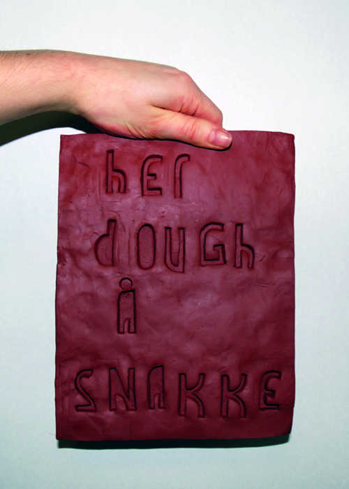
Hello everyone, this is the very first font I post on the forum.
I created Gaffel after an intership I did in Oslo. It was inspired by the many sculptures you can find in the town, especially those that were put in almost wild places, and the handmade posters in shops and small restaurants. I liked the idea of creating a font directly from the paper you use to write, reflecting how you make scupltures out of huge blocs of granite. So I used a cutter to draw the letters on paper and their shapes depend entirely on the movements of my hand. I'm left-handed, that is why most curves are on the left side of the glyphs.
I first made a simple version to be used like stamps in clay, then I played with ligatures and open-type on Fontlab. Some shapes were difficult to get right because of hte restraint of the technique (I can't have negative spaces).
Tell me what you think of it! It's complete but I'm sure there are things to improve.
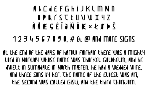
Update 14th April: There is now a pdf version showing the font. It should be better.
| Attachment | Size |
|---|---|
| Gaffel_glyphs_and_text.pdf | 38.39 KB |