Typophile

Thoughts on Web Licencing

Tristan Bowersox

I've been researching the various means to embed fonts on the web off and on lately, and aside from giving me a headache with its numerous options and implementation methods, there was something about it that didn't sit with me. Foundries are starting to charge extra for the right to embed fonts on the web. I'm sure you're all aware of this by now, and from the lack of discussion about it that I could find here, I'd suppose you range from okay with it to gung-ho.

Before I go on, let me say that I am an aspiring type designer who would, if it were viable, prefer to make a living on that alone. I have not, however lost touch with the needs, wants and rights of the consumer. Therefore, I can't feel right about this "give them the car, sell them the gas" policy. Incidentally I also believe that every typeface should be available free for non-commercial uses, though that's just an ideal of my own and I respect others' option to charge for it.

There used to be a time when you owned something after you bought it.

Fonts are not cars. Having said that, you actually can buy and, somehow, ‘own’ a typeface. It is called custom type (or ‘exclusive rights’) and will cost you the equivalent of a car. Licensing a font is more akin to renting a car. Most providers will prohibit taking the fonts to the web, or charge extra for it. Just like most car rental services do for taking the car across the border.

There are discussions on the topic. Just do a google search for "site:typophile.com web licensing". As of now, the discussion is more geared towards the quality (hinting) than price: http://typographica.org/2010/on-typography/the-webfont-revolution-is-ove...

I'm not sure I follow the argument. If you accept that @font-face distribution is new functionality that has value to their customers (in the same way as extended character sets and OpenType features have value), the font designers have two options. Charge more for a font and include these rights in their standard license, or charge separately for these extended rights under a supplemental license. I think option 2 seems more sensible, most customers don't need the distribution rights.

>There used to be a time when you owned something after you bought it.

That's a myth. :-)

Tristan, you are entitled to distribute your fonts under any model you choose. I believe what you'll find is that there are some common models that tend to resonate better with customers. Yes, one of the reasons that many type designers and foundries have been slow to adopt web fonts is that they require an extended license beyond the current EULAs covering desktop usage.

In addition, as Frank pointed out there indeed significant quality and technology issues that need to be considered as part of any web fonts solution.

Foundries are starting to charge extra for the right to embed fonts on the web.

That's one way to look at it. Foundries who are investing massive amounts to optimize their fonts for the web see it differently.

One of the points of my post is that a good webfont is not the same as a print font. Sure, you can do nothing to your fonts and simply allow them to be used online. But if you want to do it right, you must spend money and/or time on extensive preparation (kerning, redesign) to make it work as well on Windows as most paying customers expect. This makes it a separate product deserving of its own price.

That price is most fairly determined by the size of the user, be it a single blogger or a Fortune 500 company with a popular website.

@ Florian

Fonts are not cars.

Wow! If a deserved member of this forum admits that, it is like the Pope would admit, that god has not created the human.

@ Tristan

I couldn’t agree more. Or no, I can: If someone already has licensed a font, which then becomes available as webfont, it is pure rip-off, if he has to pay for a license a second time, especially if the font was not optimized for screen use. Furthermore it is pure rip-off, if you have to decide, if you want to license the PostScript or the TrueType flavored version of a font. And it is rip-off, if you license the pro version of a font and you get only the pro version, although it also is available as subset variety.

Actually many foundries don’t sell webfonts, but webfont licenses only. Webfont does not mean, that you just pack a font into the woff, eot or svg format. Where is the effort of the foundry, that justifies an extra payment, if that, what they call a webfont, is absolutely not legible on screen? And if the half of the character set in that, what they call a webfont, can not be accessed by the browser, because it is not uniencoded (small caps in the pro version of a font, which is sold as webfont), why does the licensee has to pay the full price? And all these licenses, that forbid any modification, subsetting for example, they are beyond real life! It is like you would selling your childs to a factory and in the same time, you expect, that they don’t work there, because they could be harmed.

Some of you cannot decide, what they want to be – exalted creators or manufacturers. Especially body text typefaces are not primary art, but objects of utility. But many license agreements are so beyond real life, that I think, the licensee obviously is only allowed to put the fonts into a vitrine. One example: The license agreement of TypeCulture. The user is not allowed to embed the font into PDF, but has to convert the outlines. And in their specimen you can read, that the font may be printed more fat, because it was converted. On the other side this license was obviously no protection, because Expo and Expo Serif are floating around the web in original condition. Really, a psychiatry can only come to the conclusion, that the authors of those agreements are paranoid. And auto aggressive, because there are probably many potential licensees, that don’t purchase licenses, because they had to break the license, if they want to do anything else with the fonts than putting them in a vitrine.

Except from that there are masses of people, that are willing to accomplish cultural contributions for free. But they have to pay for each and everything. They cannot publish their work, because they would be liable to prosecution. And in the end the world looses their work. Alternatively they could do extra work for earning the money for the payment of all their digital materials (which cannot be stolen, because they are not physical stuff). And the more they work for money, the more they loose time for being creative. There is a point, at which strong copyright restrictions lead to cultural impoverishment, because you only can be creative, if you are professionally creative. And commercializing in art often ends in banalities.

—One of the points my post is that a good webfont is not the same as a print font. Sure, you can do nothing to your fonts and simply allow them to be used online. But if you want to do it right, you must spend money and/or time on extensive preparation (kerning, redesign) to make it work as well on Windows as most paying customers expect. This makes it a separate product deserving of its own price.

I agree with this. To clarify, I was referring to what Arno is talking about—the webfonts by licence only. And even if there are optimized versions of a font available, I reserve the right to convert a non-optimized version I already own into a .woff, etc and use it on the web. That's something I can do for myself, as opposed to optimization which is legitimately a service done for me. It's ridiculous to charge for the former. I see it as being in the same category as trying to charge for the right to print a font on certain types of paper.

—Fonts are not cars. Having said that, you actually can buy and, somehow, ‘own’ a typeface. It is called custom type (or ‘exclusive rights’) and will cost you the equivalent of a car. Licensing a font is more akin to renting a car. Most providers will prohibit taking the fonts to the web, or charge extra for it. Just like most car rental services do for taking the car across the border.

The car metaphor is weak here. Having exclusive rights to a font is more like owning an entire line of cars, or maybe having a single custom car made. The renting argument doesn't make any sense—you don't return fonts, they can't be damaged, etc. If anything, a car-rental-related parallel would be if a new street was just paved and the rental place wanted to charge extra for you to be able to drive on it with their car. But really I don't think any of this car talk is illuminating or useful.

Shop around. Some font companies don't charge extra for web embedding through certain sites. Some charge a little more for autohinting and a CSS stack. Some allow you to do your own conversions.

Incidentally I also believe that every typeface should be available free for non-commercial uses, though that's just an ideal of my own and I respect others' option to charge for it.

Be careful with that. I used to offer a lower or zero price for non commercial use. When I investigated, I found that customers don't understand the meaning of personal use. Personal use apparently means "I'm going to personally use this font for my business."

Ad agencies were constantly buying personal use licenses to use for commercial use. Roughly half of the personal use purchases were from domains which happened to be ad/design agencies.

I think it's human nature to buy the lowest price item and ignore the license agreement. If you make a font free you may as well make it free for commercial use because that's what people are going to use it for anyway.

The expression personal use invites to misunderstanding. Non-commercial use is the better expression in my opinion.

Micropayment like Flattr could be an alternative to the free non-commercial use. And I assume, that it is easier to make out the illegal use of commercial webfonts than the illegal use of fonts in documents, that are created for printing, because in most cases you don’t have access to the digitized document, PDF for example. But in case of a webfont you can download it and check, if it is legally used.

Edited: Micropayment shall mean in this context, that not the owner of the website pay for the font, but the visitors of the website. The owner of the website places a button with the text “webfont donation” on his website. (But not on each page. Only on the start page.)

Or why not do the following: Someone wants to use a font for a non-commercial project. The address of the project is xyz.com. The commercial license costs 50 dollar per style. You could sell it for 10 or 15%, if it is used in a non-commercial web project and you only accept payments from an email-address, that belongs to xyz.com, alphabeta@xyz.com for example. In this way, you could check, if the project is really not commercial. As far as I remember you can connect a Moneybookers-account with more than one email-address.

Addition: Yes, why not place the licensee under the obligation to specify, on which website he wants to use your font? If you see, that your font is used on a website, that is not stored in your database, you know, that it is illegally used. If the website is non-commercial, the user pays 10 or 15%. If it is commercial, he pays 100%, but he gets additionally a free license for the print version of the font. But letting the customer pay twice (the FontFont model for example) is rip-off.

And an idea for Germany: The citizens pay a culture tax dependent from their income. And they get a Flattr coupon for the tax. There could be different kinds of Flattr coupons. One for music, one for movies, one for software. If the citizen does not redeem the amount of the coupon in a certain period, the remaining amount is moved to a culture money pool. With the money in the pool projects like the renovation of historic monuments could be financed. Or a commission, that consists of non-politicians, which have outstanding services to culture, distributes the money to cultural projects. At the moment in Germany mainly politicians decide, which projects are worth to be financed, although most of them seem to miss any aesthetic feeling.

Arno
I didn't know that Flattr existed. I will give it a try
Thanks!

If one thinks of web font serving, as web font embedding, I'm not surprised. If foundries charge only for a license, for the customer to do all the the rest, that'd be an issue.

>I reserve the right to convert a non-optimized version I already own into a .woff, etc and use it on the web.

...that's clear enough! I want to reserve that right too! How many fonts do You Own?

Or a commission, that consists of non-politicians, which have outstanding services to culture, distributes the money to cultural projects.
What would prevent the politicization of such a public servant position?

I'm all for micro-payment, and look forward to the day when neural implants assure me a fee every time someone reads text in one of my fonts.

But then as now, type publishers will no doubt be free to decide how much they want to make off their work, be it a lot, a little, or nothing at all.

The market is wide open with products and licensing options, and this thing will sort itself out.

I would rather a fair market decide the outcome, not a bureaucracy.

Following my practice of distributing through multiple online retailers, Shinntype web fonts are available in several licensing options (FontSpring, WebINK and MyFonts), and the types I designed for FSI as Web FontFonts via FontShop. As always, it will be interesting to see how the different retailers and financial/technical/licensing formats fare relative to one another.

Nothing like a case study:

Coles has a point in that a web font ain't a print font. And the two require separate handling. (Amost always - IMHO.)
Now, Fontspring offers @font-face licenses. But if you take a look at Beaufort Pro, Nick Shinn's font - as a hinted TTF on the @font-face demo page - it has some glaring wierdnesses even in the mid-size range. Due to the hinting, of course - I'm looking in Windows GDI. I'm sure as a print font, it performs great.

This happens a lot.

Is someone going to pay more for a font adapted to browsers because it's free of distracting irregularities? (That does kind of seem like what SC is implying.)

Don't know. But it seems unlikely.

On the web, for anything in digital form, you compete with free. That's very difficult, of course. But the fact.

Due to the hinting, of course - I'm looking in Windows GDI

It looks pretty good on a Mac screen.
I make no apologies for how it appears on Windows at certain sizes.

I supplied FontSpring with "desktop" OpenType CFF files, and they made the conversions to the web formats.

As I see it, the responsibility for screen-font appearance is split five ways:
- Foundry
- Reseller (also something of a manufacturer)
- User's device manufacturer
- User's browser application
- Web site designer: caveat emptor. The web designer is tasked with choosing a suitable font for the web page design, just as with print.

And to an extent, end users can bump up the type size if they want to improve the rendering.

However, as the typographer and font licensee, it is the web site designer who ultimately bears the most responsibility, and will control the market and how this plays out.

Also, in future there will be better screen resolution, and Windows will improve its font rasterization to take account of how poorly it deals with all these fonts which are now available through @fontface, compared to Mac :-)

@ Nick

Also, in future there will be better screen resolution, and Windows will improve its font rasterization to take account of how poorly it deals with all these fonts which are now available through @fontface, compared to Mac :-)

I cannot comprehend, how someone can be in the opinion, that fonts are better rendered on the Mac.

And to an extent, end users can bump up the type size if they want to improve the rendering.

This proposal is so devious. I will for sure neither expect from the visitors of my website, that they bump up the type size, nor I will define display sizes per default. If that is required, than I prefer Arial, Verdana, Georgia, Trebuchet MS. Except I want to embed a font just for decoration or headlines.

I have asked Bitstream/Myfonts last week about their consent, that I subset Charter BT Pro. I am still waiting for a concluding answer. In case of Charter, it should be less problematic to give me the consent, because Myfonts is a subsidiary of Bitstream. If they insist in their beyound-real-life-EULA and if they expect, that I am waiting another decade, until the most used browsers can access all the unencoded characters in that font, I will not license it. Except from the missing encoding I want to subset it, because I don’t need all characters and I want to keep the files small. Just kick this absurd prohibition to modify anything in a font to trash! If I wanted to “steal” a font, I would just download it from a Russian website, because you only can break agreements, if you agree in agreements. So where the hell is the sense in the prohibition of modifications?

@ David Sudweeks

What would prevent the politicization of such a public servant position?

That is indeed a problem. How to ensure the independence of those commissions? At least I would expect, that no member of such a commission was/is member of a party. And naturally there should not be financial dependencies. Members of that commission had to make public, for which companies they have worked in their lifes, from whom they get money, in which organizations they were/are member and so on. But that is partly the same, as I expect it also from politicians and it cannot be all.

I make no apologies for how it appears on Windows at certain sizes.

Don't get me wrong: I agree that this burden can not be on the type designer, but you still have the responsibility to offer a product that is what it claims to be. IMO, many type designers don't when it comes to web fonts.

Don't get me wrong: I agree that this burden can not be on the type designer, but you still have the responsibility to offer a product that is what it claims to be.

Why should the burden of explaining how a font will render as text on Windows be dumped on type designers? Nobody expects type designers to explain that black italic type sucks for text in print. Web designers should be testing fonts themselves and making their own decisions about appropriateness and not expect type designers to hold their hands.

… you still have the responsibility to offer a product that is what it claims to be …

It's a web font: the format is for web use, and so is the licence agreement.
As far as the rendering goes, the distributor presents a "cascaded size" specimen for potential licensees to appraise its appearance in action -- which is a better "look-see" than purchasers of fonts for print get—unless there is a comprehensive offset-printed specimen, which is quite unusual these days.

Web designers should be aware that all these new fonts they can now use instead of Georgia and Verdana are not hinted to the same standard. That's the trade off: way more selection, not so good rendering on Windows.

To summarize:
- There is a concern that B&W hinting on most web font is not good for windows users.
- There is another concern, that licenses should allow the buyer of a webfont license to subset the font, to make OT features available (be it SmallCaps, OsF, Swash, etc..)

All I have to said, is that both concerns seems valid, but you have to keep in mind that all this web-fonts thing is really new and it's still evolving from his first steps.

Luckily, in some time:
- Web browsers will evolve and support OT features (I believe that the latest FF betas already support some OT features. FF 3.6 already have ligatures enabled by default) and hopefully sub-setting won't be needed (apart from file size optimizations).
- How fonts renders on Windows will evolve too??? I really hope that.

Manual TTF hinting to achieve a quality similar to Verdana, Gerogia, etc... is really really hard and time consuming, not to mention that only few people master that art.

As I see it, 4 or 5 years from now, fonts will render better (even without hinting), and OT features will be supported.

And good bless the new display technology, allowing for 4X pixel resolutions.

TT Hinting has never be as important as the last year and a half, it's for sure that most web typefaces don't make the cut for start licensing as webfonts, that for most indie foundries costs are prohibitive.
But, we'll get there soon.

As Nick points out, it looks a good strategy to test the fonts on several licensing models.

@dunwich type

"Web designers should be testing fonts themselves and making their own decisions about appropriateness and not expect type designers to hold their hands."

So, let me get this straight, except for the two weights/styles of Lorimar that you are offering for free, web designers should test the rest and not expect you to hold their hand. (And gee, I was looking forward to that, too... ;)

Is it on the p2p's already? Let me know and I'll test them out. And you can keep your hands in your pockets. But I won't be testing at $30.00 a throw. For thirty bucks, YOU test, not me.
It's not that you're wrong about testing, it's just that what you're saying is absurd in light of the demand that the user first buy, and then test.

And BTW - I think developer Ethan Dunham at Font Spring has done a bang up job.
But what is, is. Just wanted to get a range of opinion and find out how others see the situation. Sorry to put Nick Shinn on the spot, but he's a big boy and I was glad to hear his views, too.

It's not that you're wrong about testing, it's just that what you're saying is absurd in light of the demand that the user first buy, and then test.

With Fontspring it’s possible to view web fonts, using whatever browsers you wish, in a wide range of sizes, before purchasing. What assurances am I supposed to provide a user that would be of more use than actually seeing a preview of the fonts in a browser?

>What assurances am I supposed to provide a user that would be of more use than actually seeing a preview of the fonts in a browser?

30 days for free testing? A history of quality? Documentation of the font's recommendations for use?

>... but you still have the responsibility to offer a product that is what it claims to be. IMO,

Lol, you mean just because it's called a web font, and offered on a web font web site, it should work on the web?

>I would rather a fair market decide the outcome, not a bureaucracy.

The fair market is snow-blowing money at solutions centered on unhinted ttfs, smart rendering and resolution-appropriate devices, brought to us by a bureaucracy known as Apple. Now what?!

James and Nick: I’m sorry, but I don’t agree with you. To me, this feels just like those advertisements where you can buy a telephone for $1 but in reality won’t get a usable product unless you spend a hundred times that for the subscription. It’s all in the fine print off course, but nevertheless bad ethics.

@ Nick

When you are talking about Windows, it sounds like you would talk about a potato, that is only eaten in Papua New Guinea. But it is just the other way around: Apple is the food, that is eaten in the Pampa.

If the license is for webfonts and if the format is a webfont format, it does not mean, that it really is a webfont. Woff is basically a container for the source font. And the license is totally unimportant with regard to the question, if a font is a webfont. Wow, I have a font with the license to be used as webfont. It must be a webfont. Where is the logic in that? Wow, I bought a fish. Doesn’t matter, if the fish is dead or made of plastics. I have the license to believe, that it is a fish. And therefore I can put it into my aquarium.

@ Pablo

Even if the most used browsers support OpenType features in the near future, I would like to keep the file sizes small. I want to remove the characters in Charter, that I will not use on my website. The superior alphabet for example. Except from the fact, that I don’t need it, it is incomplete. And I don’t know yet, if I need the small caps of the bold style.

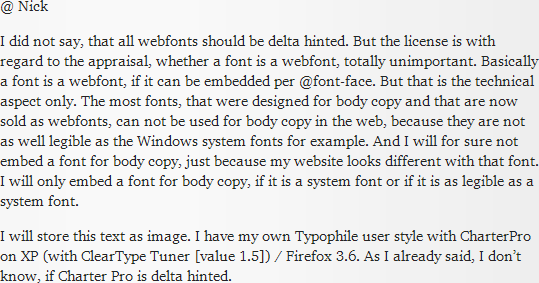
Charter Pro renders on XP with the ClearType module very fine. It is more legible than Georgia! I don’t know, whether it is delta hinted.

If the license is for webfonts and if the format is a webfont format, it does not mean, that it really is a webfont.

Arno, the train has left the station.

There is no technical standard for web font rasterization or hinting, which seems to be your main issue.
In order to open up the typeface world to web designers, and make available the vast range of typefaces promised by "@fontface", which, after all, is the point of the exercise, foundries and webfont distributors are selling types that have:
- a web licence
- format that works in web browsers to support "@fontface" and protect the rights of licensor and licensee
- TrueType hinting

De facto, that is the general definition of "web font".

The fair market is snow-blowing money at solutions centered on unhinted ttfs, smart rendering and resolution-appropriate devices, brought to us by a bureaucracy known as Apple. Now what?!

What am I supposed to do David, miss the boat on a point of honour?
Would you have I not make Shinntype fonts available for web use, because they only have basic hinting, not delta?
That would be poor business.

My fonts are distributed as web fonts by reputable companies, following the direction in which the industry is going.
Those distributors approached me and wanted my PostScript fonts, as is, and said they would turn them into web fonts (licence, wrapper, and TrueType autohinting), which they did.

The ball is in the web designer's court.
The smart ones will use fonts such as Beaufort more for display than body copy.

It's not like a font isn't a web font just because it's not delta hinted for optimum rendering in small body text.

Where is the logic in that?

By that criteria, any magazine display font that reads poorly in body text is not a print font.

Well this goes to show that personal preference has a lot to do with screen render quality: Arno says he likes his Charter better than Georgia, and Windows rendering better than Mac, but I prefer Georgia on Mac any day over what I see in that spindly, boney, pixelated image above.

That’s Georgia, as it is displayed here (ClearType value 1.5):

.

And Charter Pro, this time with ClearType value 1.0 (maximum):

.

The shapes of Charter have a tendency to be a bit more open (bigger counters) and I think the rhythm is better. I wonder, if you really would prefer Georgia on the Mac, if you could compare these fonts.

Hey Berlow, stop picking on type designers. That's my job!

To get back to licensing - and leaving "quality" (whatever it means) alone for the moment, I find it tough to come to any conclusion about web font licensing except that we are at an impasse.

A Mexican standoff of sorts caused by the fundamental nature of digital tech.

Let's consider two general classes of developers looking to use web fonts:

1) Those working on existing sites looking to "swap out" text-as-images and SIFr generated text. And, to some extent, the web safe system fonts.

2) Those working on new sites or redesigns.

The first group is probably a lot more amenable to the services solution, at least at first. They're swapping font-like elements for actual fonts. And they know what they are looking for. (Something like what they are already using but in another form.)

The people in the second group, however, can't come away happy under the current system.
Most web protoyping is done in Illustrator/Photoshop and - barring a ground-breaking new app - that situation will continue for the foreseeable future.
And without an installable font how do you preview anything resembling what you're proposing for the client?
"Well, we're showing it you like this, but you have to imagine it with that font there."
Anybody who's ever had to pitch a development project to a client or management will find this hysterical. Once you use the word "imagine" you're ordered back to the drawing board.
And once they sign off, if anything's different in the final project, you'll be called on the carpet.

The current system just forbids previewing. The price structure forbids it. And if you want to show a variety of fonts, the costs are nuts.

But is the type industry about to suddenly change to a "try and then buy" lending-library type of solution?

One three-man web design shop out of Indiana reported to me:

"We don't like the idea of having to charge clients additional fees for fonts! Up till now we've struggled with what to do with fonts and haven't reached a solution.
We're playing with ideas and, perhaps mistakingly, are looking for economical solutions."

I think that's very typical of what's going on. Barriers at every turn.

One solution would be for the Adobe apps - or an Adobe competitor - to have a feature for breaking free of the system fonts and directly accessing fonts for preview just as the browsers now do, but with, dare I say it, some kind of DRM restriction built in. (Just an idea off the top of my head. I don't know if I'm in favor of it, or opposed!)

Extensis' WebInk app - from what I've seen of it - is a step in this direction.

But that's where we stand today - a standoff.

What am I supposed to do David, miss the boat on a point of honour?

This sums up the problem.

@dunwich type

Sorry, started waxing eloquent and forgot about ya.

Yes, you are doing about all you can do. It's true.
But I gather you get my point that the buyers on the other end are caught in a bind also. It isn't laziness. It's fear of having bought something with no ROI if it proves inadequate for whatever reason. Few web devs can afford to speculate in this way.

I'm reminded of a video Erik Speikermann did at ATYPI 2009 where he painted a picture, very charmingly and optmistically of how the web would just kind of naturally accept a situation similar to what happens in the print industry. With the font figured into the total cost and everybody lives happily ever after. (I hope I'm paraphrasing accurately. Erik's upbeat, winning personality masks all doubt about the plausibility of the scenario. It's so reasonable and so right, surely it will come to pass!)

Look, you can make anybody swallow anything if you've got enough negotiating power, but the structure, the rhythm, the expectations in web work are entirely different and those who do it are not going to twist themselves into pretzels just because Puckett or Fink have got bills to pay.

But enough already...

Arno, here's how Georgia looks in Quartz (OS X), albeit slightly darker gray:

Yes, Quartz’s soft antialiasing might seem blurry until you get used to it, but I prefer the added weight and its trueness to Georgia’s original form over single-pixel, snap-to-grid crispness.

@ Stephen

The blurry effect is just that, what I dislike. You are right. It is a question of personal preference. And for sure it is also a question of habituation. But even if you dislike the look of Charter on Windows, you probably can see, that the thickness of the strokes is very even (because of the good hinting and in contradiction to many other webfonts). I am not competent in TrueType hinting, but my impression is, that Charter is very well hinted. And it also is very well legible, if it is printed. And it is very robust with regard to the printing conditions. I want to use a webfont, that also looks good in print. Well, it is not optimal for my poems, but I have very different kinds of content and at least Charter looks not totally strange in combination with my poems. No font can cover all kind of texts. I want to use the same font on my whole website. Charter black (the upright only) looks nice as display font.

However, the topic is web licencing. I am focused on Charter these days. And I still don’t know, if Bitstream/Myfonts gives me the consent, to subset it, if I purchase a webfont license.

In the long term, no professional web developer will want a hosted webfont service. They will want to get a WOFF file, put it on their web server, and get on with it. Any type foundry serious about being in the webfont business needs to tune into that. FontShop, WebFont, MyFonts are already selling self-hosted licenses. Good for them. I hope others follow suit.

Quality is a separate issue. Hinting, for instance, is great for people who need hinting. Those who don't — e.g., people who are exclusively targeting iOS — won't care to pay a premium for something they don't need. Foundries are free to make whatever bet they think is right and make their case to the customer.

Previewing is a separate issue. MyFonts has no preview system. That's bad. TypeKit, last I tried it, had an inaccurate preview system. That's even worse. FontFont has fontfonter.com, which is good. Tim Ahrens has a similar kind of previewer for Facit.

Pricing is a separate issue. I have reservations about subscription-based and usage-based pricing. But if foundries can make it stick, good for them. No idea how "ethics" come into it. Customers who need these rights can pay for them. Some foundries will eventually roll those rights into the main license; some won't. Compare PDF embedding. FontShop allows PDF embedding in its standard license for FontFonts. Other foundries charge extra, or don't allow it at all. Life goes on.

@Nick -

> The smart ones will use fonts such as Beaufort more for display than body copy.

I just happened to spend over a week pouring through Serifs in a search for a heading font. Here's a shot of Beaufort at 30px on Windows, courtesy of FontSpring -


To put it bluntly, such appearance is unacceptable for any form of production use. Unless someone's is targeting exclusively Apple devices, Beaufort is simply not fit @font-face use an offering it for sale as a "web font" does not make much sense as it will be bought either by a mistake or due to a shear professional ignorance.

A foundry is certainly entitled to make money off these people, and it can certainly point a finger at FontSpring saying "They sold it", but in the end it reflects poorly on said foundry who allowed a subpar version of its product to be sold in the first place.

people who are exclusively targeting iOS

Those people are in the minority. Probably less than 0.25% of all websites are exclusively targeted to iOS.

@Nick
I would rather a fair market decide the outcome, not a bureaucracy.

The slave trade was a free market. A laughably extreme example, but what I'm saying is that my concern is ethical. The right to use a font file in a certain way is not the foundry's to grant, the consumer already has it.

The conversation has drifted somewhat, but I'm glad to see I started such a lively discussion. I didn't see anyone mention Google Fonts yet; do you see it as viable? (http://code.google.com/webfonts)

Again, sorry about the slave trade example, but I'm not going to bother coming up with a different one :P

I said fair, not free.

The slave trade was a free market.

The slave trade was the exact opposite of a free market. Think about it.

We admittedly offer products that may not always render well in Windows. However I think Fontspring bests many distributors offering third party fonts because our webfonts are always autohinted instead of a “dumb” conversion from OTF->TTF that others seem to use. (This same autohinter, used by our sister site Font Squirrel, is converting thousands and thousands of webfonts every month.) By doing this we open the webfont market to all font designers. You may argue whether this is good or bad philosophically. Our experience is that the vast majority of early adopters understand the rendering issues and choose accordingly. Foundries who 1) invest their time and money in hinting their fonts by hand and 2) Offer those fonts as webfonts are quite rare as you know. I see this as a temporary problem and a tradeoff worth making to move the font business forward.

The right to use a font file in a certain way is not the foundry's to grant, the consumer already has it.

No. It's the opposite. The customer has no rights to use a font except those that the foundry grants as part of the license. That's the standard model for all proprietary software. Sorry to be a nitpicker, but there's enough Typophile threads that are polluted with urban legends like these.

If you, in your career as a professional font designer, want to make your fonts free for noncommercial use, or offer them under a liberal commercial license, great. That's your choice. But those are rights you grant your customers as the owner of your work. Until then, those rights don't exist.

The slave analogy is both inappropriate and unhelpful. I sense Godwin's Law about to kick in…

Tristan, as others have pointed out, the standard model for software including fonts is licensing, i.e. what you purchase is a license that grants certain rights to the use of that software and that may also reserve other rights. Unless a font license explicitly grants a permission for web linking with @font-face you can't assume that your purchase of that license includes such permission.

In this model, the rights granted or reserved, like the price, is determined by what the market will bear. If all font users declined to purchase licenses that did not include permission to convert to and serve WOFF or another web font format, then foundries would need to respond to that. Of course, they'd likely raise their prices as part of the response, in order to recoup some of the income they would lose from being able to sell separate web font licenses or subscription services. And you might give some thought to whether you might not actually prefer a licensing model in which you pay a smaller amount for discreet rights rather than a larger amount for an exhaustive bundle of rights.

Specific legal jurisdictions may have some say about what rights might be reserved, which are fair play, etc., but the basic licensing model is the same. Even open source software operates under a licensing model, just one in which few or no rights are reserved (but which may, in fact, involve imposition of responsibilities, such as requiring all products incorporating the open source code to be available under the same open source license).

I see it as being in the same category as trying to charge for the right to print a font on certain types of paper.

If a license were to prohibit printing a font on a particular type of paper, that might be perverse -- although I can think of reasons why a font designer might desire such a restriction, just as I can think of reasons for restricting the range of sizes at which a font might be used, i.e. to prevent users from making a the type designer's product look like crap --, but it would be entirely within the rights of the font license vendor to impose such a prohibition.

AE> Probably less than 0.25% of all websites are exclusively targeted to iOS.

Is that 1 in 400? Lol. Sorry. I couldn't help it. My tummy says more like 1 in 750,000 to 1 in 2,500,000. And?

Nick, I'm not sure you're on the boat as much as ya put your fonts on it, waved farewell, and are hoping they land well as web type. At least you finished drawing and spacing them! More than can be said for some. In general, I applaud your unstated stand to say the hell with windows rendering and all this silly format bs.

Hopefully, in the near future, you'll be able record in metadata what your fonts are good for, so downstream that data can inform users n smart apps of your recommendations. (this is also 'bout all that's Missing from the whole dang OSX-iOS solution too). We'll see my pretties, but it looks more n more like freedom's just another word for more fonts not to use.

Oh, Berlow... Now I have "Me and Bobby McGee" stuck in my head, ya ... !

Is that 1 in 400? Lol. Sorry. I couldn't help it. My tummy says more like 1 in 750,000 to 1 in 2,500,000. And?

And? I am the one, who should ask and. And then all the more! If you are not interested, how your website looks on Windows, although the very most people are on Windows, you are an idiot. Webdesigners seem to know that better than you, David.

1) There's more to the Internet than websites. iOS lets you develop apps that are native, "web apps" that behave like apps but live on the web, and hybrids in between. (Many "native" apps you can get today are essentially a light wrapper around a web browser.) This approach is apt to accelerate with the advent of HTML5. Because these apps are based on web technologies, webfonts will provide the typography. But Windows is not an issue.

2) The huge installed base of Windows is a fact, but not always relevant. Specific sites may have substantially different usage profiles. For instance, I run a website where only half the visitors are on Windows, and only half of those use XP. I have two choices (as all web developers do): spend money on a webfont solution that accommodates the lowest common denominator, or use platform-specific CSS to give Windows users Georgia, and something different for everyone else. The best business decision is to spend my dollars on features that all the visitors can appreciate, not just 25% or 50%.

I also consider the problem from the other direction: if half my visitors are on Mac, why should I limit myself to fully-hinted webfonts? Because that imposes unnecessary design limitations.

Again, I'm glad folks are doing fully-hinted webfonts. For some websites, they will be essential. But for others, they won't be practical, and not because the people who run those websites are "idiots."

I love that line in the song about the iOS:

♫♪♫ "Hintin' ain't worth nothin' but it's free..." ♫♪♫

I also consider the problem from the other direction: if half my visitors are on Mac, why should I limit myself to fully-hinted webfonts? Because that imposes unnecessary design limitations.

Woah. I just had massive "This site is best experienced with Internet Explorer at 800 x 600 resolution" flashback.

MB>Again, I'm glad folks are doing fully-hinted webfonts.

Exactly. And we are proud to hint for Windows. In fact when not a single founder would touch TT for fear of their Adobe marriages, and when there were but two people in the world able to antialiased hint serif fonts, I opened my heart to the windows poor and poured hinting intelligence into fonts. And Matthew Butterick was there to help when I got too busy or confused to go on.

So, I'm the idiot wind, blowing every time you open your font menu, and proud.

I meanwhile got a concluding answer from Bitstream: “Let us know if you're interested in the development work, if not, I do not have another suggestion.” This obviously means, that I had to pay the Bitstream developer service for building a custom version of Charter for me. Lol! My web project is not commercial, which means, that I already would pay 200 Dollars (for the webfont license) just for the visitors of my website without getting anything back than a positive critique, if Charter Pro improves the legibility. And I am able to subset the font by myself! Naturally I don’t want to pay for anything, that I can do by myself (and probably better!) especially not in case of a non commercial project.

No one mentioning the Open Font License?
I don't know how much money you guys make from your fonts, but releasing under the 'Open Font License' and taking donations have been really great for me so far.

@ Pablo

You belong to the first ones in the Google font directory. I assume, you are getting less money, when the directory grows.

Foundries don’t make distinctions between the commercial and the non-commercial use of their fonts. If they would do that, they could get more paying customers. In case of webfonts, foundries could easily control, if the project is non-commercial. One reason for this unflexibility is the wrong assumption, that a user, that has paid for a font, will not spread it out. In case of webfonts, this assumption is even more absurd, because it is in the nature of webfonts, that are spread out.

However, I am starting a non-commercial project and Bitstream is not interested in my money, because my condition is, that I am allowed to subset the font in which I am interested. Instead of taking that money, Bitstream makes the offer, that I pay more money for a custom version of the font. This is so foolish, because the half of the character set of the webfont, in which I am interested, does not work in browsers because of missing encoding. One more time: Bitstream/Myfonts does not sell webfonts, but webfont licenses only. So the half of the money is for a digitized frazzle of paper and the other half is for the characters, that the browsers can access. Not to talk about the terrible hinting of the majority of the fonts, for which they sell webfont licenses.

What I am doing now? Maybe providing a detailed tutorial, how to download webfonts with the help of certain Firefox plugins, how to preper these webfonts for editing in font editors like FontLab, namely the restoration of the name table, in which the specification was violated, providing a woff-to-sfnt-converter and so on. Nothing illegal. And instead of a translation of Adam’s TrueType hinting tutorial to German. Naturally strictly copyrighted. And additionally I recommend online-translaters “Russian to ‘your language’”. Why? Because my compassion for all you victims of piracy is actually decreasing. I meanwhile think, some of you are willingly victims. At least there is a point, at which the difference between a latent paranoia and masochism is almost not perceptible anymore.

@ Anro

Welcome to the club :P

Arno:

»What I am doing now? Maybe providing a detailed tutorial, how to download webfonts with the help of certain Firefox plugins, how to preper these webfonts for editing in font editors like FontLab, namely the restoration of the name table, in which the specification was violated, providing a woff-to-sfnt-converter and so on.«

Together with this:

»Everyone seems to be allowed to sell fonts like Bembo or Garamond. I assume, they have taken the names from Softmaker and the font data from the Std and Pro OT versions of Adobe, Linotype and Monotype (taken from the web, torrent or any other sharing service!). Just decompiled with TTX and the names and the copyright info replaced. I think about doing that, too.«

Sounds like a business model. Keep us updated how it's coming along.

»In case of webfonts, foundries could easily control, if the project is non-commercial.«

Why should foundries care if it's non-commercial? Every use, commercial or non-commercial, is decreasing the exclusivity value of a typeface.

And I assume you get hosting service and domain registration for free too, because it's a non-commercial project?

"...my compassion for all you victims of piracy is actually decreasing. "

One founder, one font, one project, one user goes wrong, and everyone is held responsible. The Mongols operated that way too.

butterick > The customer has no rights to use a font except those that the foundry grants as part of the license. That's the standard model for all proprietary software. Sorry to be a nitpicker, but there's enough Typophile threads that are polluted with urban legends like these.

It's not a legal belief but an ideal. Call me a pinko, but I've become embittered by the rampant money grubbing via DRM and proprietary software and fine-print licences and so on. Type design is based on an exceedingly unproprietary idea—recreating the shapes of the same set of symbols over and over.* As one in love with the process, I desperately want the field to rise above the impurities of other businesses.

*as a side note, someone in another thread (one about the new Ubuntu font, I think) said that it is not illegal to make a blatant rip-off of a font, only to misuse the file. Is this an "urban legend"?

butterick > The slave analogy is both inappropriate and unhelpful. I sense Godwin's Law about to kick in…

It served its purpose. I meant to say "fair," though. Not that it really changes the argument, which is, more clearly put, a "fair" market can still be unethical.

In response to John Hudson, et al, I am not really interested in the legal issues here. I know the thread has been mostly derailed and that's okay, but if you are addressing me, just remember I'm talking about ideals (read: I'm the one with my head in the clouds). That said, someone did bring up one tidbit relevant to my arguments, whether or not they meant to... My view that a font should be free for non-commercial uses is contradictory to my view that sellers should not be able to dictate the uses of their fonts. I'll have to think about this, but I'm more likely to drop the former view than the latter.

I'd just like to throw one more thing out there. Not an argument, but an observation:

As Information Age Philosophy* becomes more prevalent, the trend is going to be that, where possible, people will only ever pay for something they respect.

*If someone knows of a better or more official term for this, let me know.

@Arno:
Being in the first group of fonts in Google Font Directory was great, and that was in part because that the font was released under the OFL.

Donations are still coming strong after 1 year. And also there is an awesome non-stop stream of people tweenting about it. ¿How valuable is that for a new designer?
So I really encourage all new and aspiring type designers (like me) to release his first fonts under the OFL.

Having said that, I also understand that established and reputable foundries will like to charge for his great fonts and offer restrictive licenses, and that's Ok too. I just wonder: How much will they raise if they try the OFL/Donations model? Maybe more..maybe not. who knows...

Donations are still coming strong after 1 year.

Would you mind actually telling us what kind of donations you have coming in? I’ve considered releasing a project using a donation model, but it did not look especially promising based on what I know about donationware software projects.

@ Jens

Together with this: […]
Sounds like a business model. Keep us updated how it's coming along.

A culture model.

And I assume you get hosting service and domain registration for free too, because it's a non-commercial project?

For the money, that I spare now (200 Dollars) I can finance my fat webspace package for 1782 days. And just for the case, that you are writing now “And how about your car – do you also want to have that for free?”:

1. I don’t have a car.
2. Car industry is the contradiction of culture.
3. If I had a car, I would be the one, who primary profits from the comfort.

@ David

#444849

Donations are still coming strong after 1 year. And also there is an awesome non-stop stream of people tweenting about it. ¿How valuable is that for a new designer?
So I really encourage all new and aspiring type designers (like me) to release his first fonts under the OFL.

Amen.

Type design is based on an exceedingly unproprietary idea—recreating the shapes of the same set of symbols over and over.*

Nonsense. Modification and personalization are not recreation.
All cultural products follow the procedure of adaptation, otherwise they would be totally alien and incomprehensible.

As one in love with the process, I desperately want the field to rise above the impurities of other businesses.

All business is inherently impure, because the bottom line is the bottom line, not ethics.
However, there is no reason why any particular business should not proceed according to its own moral compass, and that is certainly true in the font business today, when there are so many independent foundries and distributors. It's much more open than prior to digitization, and type designers are in a much better position to call their own shots.

@ Pablo

Donations are still coming strong after 1 year

But after a year the Google font directory is almost empty. I mean, how many fonts are in there? Fifty? And how many good ones? Five? Naturally I wish you all the best for the future with regard to the donations, that you get for Lobster.

James, Absolutely

Most of them are $5, $10 or $20. A few are just $1.
Some days 1, some days 2 or 3, someday none.
Random but steady. On average, I will say about $10 per day.

Also, from time to time, big consumers products companies (milk, yogurt, clothes, books, etc) ask for signed papers where I gave them written, non-exclusive, permission for using the font for logos, display it in TV ads, and things like that. They usually make bigger donations, in between $50 and $500. (I did not ever tell they any amount, that's totally up to them).

Not unlike font sale numbers, aside from losing out on the occasional 40-seat studio license. Thanks.

@Arno
There are a few that have great hinting that looks great even on WinXP with cleartype off at 12px, such as Droid Sans & Serif, Cousine, Arvo, Lato, Arimo, PT Sans, Anonymous Pro, Ubuntu, Nobile.
And if you follow the project activity (http://code.google.com/p/googlefontdirectory/updates/list) you will notice that many others have been improving on the hinting, kerning and expanded char-set.

Of course, you have exquisite tastes (I know of your admiration for masterpieces like Rongel, Merlo, Berthold VanDijck, Expo Serif & Pradell) and maybe expecting fonts like that ones to be released under the OFL on the GFD is a bit to much.

I also know that you have great skill and great technical acknowledgment.
I really, really, really encourage you (I beg you) to create your own font and release it. I can bet that you will create a masterpiece also. I'm just looking forward to the day when you go ahead and start drawing your own font.

James, I'm also curious.
Would you mind sharing your numbers?

I don’t sell directly so I shouldn’t post exact numbers as it’s not just my data. But in terms of sales actually coming in it’s very sporadic, sometimes I make nothing for a few weeks, occasionally $1,000 in a day. I’m not making a living off my fonts; unless I get a nice surprise in my Q4 checks I’ll bring in somewhere between $9,000 and $10,000 from font royalties.

¿How valuable is that for a new designer?

Throughout history, designers have been asked to forgo their fee and accept exposure, prestige, or other hard-to-quantify benefits in exchange for their work. If that gamble pays off 1% of the time, designers seeking exposure will point to that 1% as proof that it's a good bet. Meanwhile, experienced designers will point to the 99% as proof that it's not.

The Google Font Directory is no different. I wouldn't try to talk a type designer out of participating. But if the main criterion for inclusion is your willingness to give your work away for free, it's not a very prestigious club.

Put it another way: the big problem most new type designers have is not lack of exposure, but mediocre design skills. Releasing a font under the OFL, or on Google, will not make you a better designer. Subjecting your work to the scrutiny of better type designers will. (And posting samples on Typophile is not quite what I mean.)

As one in love with the process, I desperately want the field to rise above the impurities of other businesses.

One of the qualities that distinguishes the "process" of type design from others is its tradition of craftsmanship and exacting detail. There are notable exceptions, but usually, excellent type designers are made — through training & practice — not born.

Is there a place in the world for things like Google Font Directory and OFL fonts? Sure. But they don't support this tradition of craftsmanship, because a) they don't reward typographers who have learned the craft and b) they don't help educate new type designers in that tradition.

So, if you're a new type designer who thinks "I care about the craft of type design" but also "OFL is the best," you need to think harder, because those are contradictory ideas.

You can certainly have a career as a designer of free or cheap fonts — you can even make good money at it. But you're not going to be a very good type designer. Just like working at Burger King is not going to make you a very good chef.

You can certainly have a career as a designer of free or cheap fonts — you can even make good money at it. But you're not going to be a very good type designer. Just like working at Burger King is not going to make you a very good chef.

Nonesense, or, dare I say, pure FUD.

@Matthew
Would you say that doctors working for Doctors Without Borders will not become good doctors because they are not charing money on their patients?
Have you ever listen to great street musicians that plays for coins?

The only things that makes you better at whatever you do is always keep learning and practicing, even if you don't charge money for it.

…they don't reward typographers who have learned the craft…

From Pablo’s experience it sounds some end users of free fonts are rewarding type designers. And Google has dipped its toes into rewarding type designers who release libre fonts; it makes meager contributions for the design of OFL-licensed fonts. The contributions are hopelessly out of touch with both the costs of developing fonts and the market value of a font over its lifetime, but it’s a step in the right direction.

Nonsense, or, dare I say, pure FUD.

"FUD" is a term associated with Microsoft and other companies that have tried to suppress customer choice by creating unjustified apprehension about the alternatives. "I guess you COULD use Linux on your server, but maybe you'll get sued for patent violations…"

What I'm saying here is the opposite. Tunnel vision of any sort is dangerous. To me, OFL fonts serve a purpose; so do proprietary fonts. We can have both in the world.

But to say that the OFL approach is intrinsically better — that's extremely limiting. And wrong. It's good for some things. It's not good for others.

The analogy to other forms of open-source development, like software, is very weak. Successful open-source software projects have a person or small team that guides the project and decides what code makes the cut. These projects are nonprofit, but they're still meritocracies.

There is no meritocratic pressure applied to OFL fonts. They're done when the designer says they're done. I guess "learning" to make mediocre fonts is a type of learning. I just don't think much of it because it doesn't allow new type designers to rise to their highest potential.

Would you say that doctors working for Doctors Without Borders will not become good doctors because they are not charging money on their patients?

But that just proves my point — they had to go to medical school to become doctors before they could work for DWB. A guy like me can't just show up with my forceps and scalpel and say "hey, I'd like to try my hand at an appendectomy. Don't worry, I watched one on YouTube."

The only things that makes you better at whatever you do is always keep learning and practicing, even if you don't charge money for it.

The standards you set for yourself also matter.

The feedback I get from paying designers is more valuable than the feedback I get from free font users. It feels nice to get compliments, donations and praise but I've rarely received useful feedback from a typographer about a free font. How rarely? In 13 years, I can only recall a single instance of useful advice from a professional about a free font*. All useful feedback I get is from paying customers. While you'd think there's no shortage of people looking gift horses in mouths on the Internet, it never happens.

The people with the most typographic knowledge are precisely the same people who are the least likely to even consider using a free font. Put that on a t-shirt, hippies.

I'll give you an example: vertical metrics settings. Even tho I released hundreds of free fonts with bad vertical metrics, not a soul mentioned it. When I started selling fonts in 2001, I started getting feedback from customers who noticed that the vertical spacing was inconsistent between Mac/Windows, accents getting clipped. I also got feedback about Mac PS font families not appearing properly in specific application menus. Unless you happen to already be a typographer, how are you going to discover these things on your own? If someone uses a free fonts and it doesn't perform well, they'll just skip it and choose another font.

With free fonts you're just going to get praise. Advice from free font users is like having an art teacher who praises everything you do. It makes you feel nice, reinforces ignorance and helps you develop bad design habits.

* About 11 years ago, one kind, bold typographer pointed out how the overshoots in my free fonts were always too subtle.

@db
Gee, allusions all the way from Kris Kristofferson to Bob Dylan. Nice gamut.
Keep throwin', I'm catchin'.

@ray
Thx. That's extremely useful. At least to me. (And it gibes with what my instincts tell me, too.)

Rich

@ Ray

But it is on you to invite to constructive feedback, on this forum for example.

Tristan: Type design is based on an exceedingly unproprietary idea—recreating the shapes of the same set of symbols over and over.

Oh come off it! If that were the case you would only ever want -- let alone need -- one typeface. Typefaces have value precisely because of the differences that make them individually desirable.

In 13 years, I can only recall a single instance of useful advice from a professional about a free font*.

I would believe that depends on how aggressively you solicit such feedback. My own first and only (OFL) font is still an unusable work in progress, and yet I've received (and still do) more emails with highly technical critiques than I can count. In what, 8 months? Obviously, if hundreds of your fonts are floating around everywhere on the web, that's not going to happen.* And yes, I think we do have to make a distinction between free fonts and free fonts.

I'm an open source guy, but I view it as a privilege, not a law of nature, that I don't [have to] live off my font work. And I will humbly attest to the fact that amateur font designers often suck :)

*Sorry if that sounds cheap, Ray. I admire your work, I really do.

In 13 years, I can only recall a single instance of useful advice from a professional about a free font*.

It's a conspiracy aimed at preventing the design of fonts from falling completely into the hands of trust-funders, people living in heavily socialist countries and type designers working in large corporations. On the other hand, tons of free, non-specific advice is here on typophile each and every day for trust-funders, people living in heavily socialist countries and type designers working in large corporations willing to spend at least some effort on self education.

Oh geeze I forgot about the people who live off suits against the medical profession and then go into the font biz to demand free typographic care, like we all have taken some kind of typocratic oath. ;)

To clarify my comment to Ray:

I found the marketing/complaint info interesting. As far as help from type designers, I've never had a question go unanswered so no beef from me there.

@pablo

Regarding the donations you receive for your fonts: I'm very skeptical of your report. As my accountant says, "I believe it when I have a bank statement in hand and even then, the question is, where did the deposits come from and where did the money really go?"

In short, I find it hard to believe your report.
It sounds, ummm... overly optimistic.
(Sorry, I mean no offense, I'm a skeptic. And I like it, too.)
It just doesn't gibe with my experience, but if anybody has had a similar experience to Pablo - in receiving a steady stream of donations, however modest - for an open-source font, please report.

@db
Ahhhh, the myth of the self-made man! As if it was not society that secures the conditions necessary for success - yours, mine, or anyone else's. Did you attend any public schools, pray tell?
Damn those trust-busting font funding commies demanding free typographic care!
What's next, dental? (I could use that one, big time.)

rich

I see no reason to doubt Pablo’s claims. He was part of the initial wave of Google Font API offerings, and there’s no denying the service has received a lot of publicity. Donating is super easy, the “download” page implies that paying is the right thing to do if you want advanced features, and the font has been “viewed” over 112,000,000 times.

http://code.google.com/webfonts/family?family=Lobster&subset=latin#download

Having said that, I doubt his experience will be matched by every designer as the library grows. But who knows. It's a shame other sites that exploit free and open source font designers don't make donating as easy.

Richard, I think Pablos experience is indeed exceptional. Unlike most other fonts in the directory, Lobster was (and is)

a) done, as in "usable for real work", and
b) original in a way that may actually interest, say, an ad agency.

I can't say the same for my project and most others. I've received one donation so far, over $10. I definitely couldn't live off the project even if I worked on it full time. (Which was never my intention, though.)

It's a shame other sites that exploit free and open source font designers don't make donating as easy.

Like which sites? And how can a font designer who's chosen to issue their work under a free license be "exploited"? Doesn't the designer bear the costs and benefits of that decision?

@sii

"I see no reason to doubt Pablo’s claims."

But if I hadn't we wouldn't be getting this feedback. And with maybe a little dander thrown in, too. (Sorry Pablo, I don't know you and there are reasons, ideologically, to exaggerate. My bad if the approach was, umm... unsubtle.)

One source of mine, who's font is also on Google, reports that designers are asked to sign a confidentiality agreement, leaving it unclear to what extent the designers represented are free to talk about their income from it. Of course the confidentiality agreement probably forbids sharing the terms of the confidentiality agreement so naturally I haven't seen it.

(Give me a minute, I'm getting a little dizzy........... need to call my lawyer.... ok, he says it's alright to continue... ;)

I did plenty of looking at Google fonts when I wrote Google Fonts Failing For Internet Explorer Users and I didn't see a 'donate' button at that time. Kind of hard to miss. Does anybody know when it went up? Was there another one for Lobster elsewhere previously?

And thanks for responding sebastian_k.

Rich

@ Sebastian

As far as I have seen, there is only the regular style of Crimson in the Google font directory, although you offer the whole family for free. And it is not well hinted and contains almost no kerning. If you would provided a well hinted and kerned TrueType version, you had very good chances to get more donations. Lobster was kerned with iKern, as far as I know. I don’t know, if Pablo paid for the iKern service, but why don’t you ask Igino Marini? Maybe he does the autokerning for free, because the font is for free. And with the help of Adam’s TrueType hinting tutorial you probably can improve the look of Crimson.

By the way, I think that characters like G and O should “undershoot” the baseline a bit more in Crimson.

The regular styles really look promising. But the bold style looks like you have used an embolding action during the design process and the semibold style obviously is the result of blending regular and bold. So Crimson is a work in progress.

And I notice a problem with the connections of the diagonal strokes in A, V, W and so on. The stroke width should become smaller in the direction of the connection of the diagonal strokes in the bold style.

There you go Ray, good technical advice -- hooray for being completely OT now :)

Arno, Crimson is being iKerned right now. I'm hoping to get it back soon; Google will then offer the latest version of all weights. Hinting is planned too at some distant point in the future. Unfortunately, I can't put in more than two hours a week since I'm overwhelmed with school work. I agree with all your points and shall keep your suggestions in mind!

Rich, the donation thing hasn't been around for more than a couple of days.

@Richard:
You can be skeptical, that's ok with me. No offense.
I just wanted to add that most of the donations comes from the Lobster font mini-site, that maybe you where unaware of it. Check it out at: http://www.impallari.com/lobster/

Most free font are just shared in a zip file on a free font site, not explaining nothing about the font nor the font designer. Not making any connection with the people downloading the font.

I believe that most people donating to me, are not doing so just because of the font, but also because they have learned something on the site. They learned about ligatures, terminal forms, alternates, and things like that. (Keep in mind that most normal people don't even know what open type features are, or how they are activated. Even a lot designers didn't know about OT features are at all).

So... if you take a little extra care to explain why you do what you have done, in a way that normal people (not only font freaks like us) can understand, then those people understand it, they start to care about it, they have learned something new, they feel smart, and they donate.

I really have to update the list of donors, will do so during the weekend.
Maybe once I publish the full list of people you will be less skeptical.

@Arno:
Lobster needed very little kerning, because letters connect to each other.
Cabin Bold was beautifully iKerned by Ignino.

Alrighteeeeeeeeeee then.

Now, the question is whether the donation button will help or hurt.
Unfortunately us internets users are easily confused.
When we see $5.00 in a box, we tend to click away and go elsewhere.

Analytics, analytics, tous jour analytics.

When we see $5.00 in a box, we tend to click away and go elsewhere.

AFAIK, it is an experimental feature, so may be that one of the things they are testing.

Myself: Type design is based on an exceedingly unproprietary idea—recreating the shapes of the same set of symbols over and over.

John: Oh come off it! If that were the case you would only ever want -- let alone need -- one typeface. Typefaces have value precisely because of the differences that make them individually desirable.

I think the inclusion of differences is implied be the term "recreating." Perhaps you misread.

-

I found the comments on the amount of feedback given to free fonts to be very interesting. The idea that if a free font doesn't work, a designer will simply ditch it rings true, BUT I wouldn't have guessed that it would be different for a paid font. Does it really happen that way?

There are other sources of critique, though, as others have pointed out. And I definitely think it would be prudent to train as both a fontographer and typographer so you can test your fonts personally. In any case I would hope that the kinds of critiques you're getting after sellingcan't be a good one without selling their fonts using a more traditional business model is kind of ridiculous.

I think the inclusion of differences is implied be the term "recreating."

I would have thought the opposite.
With Poliphilus it was the goal of Monotype to be able to set a 20th century facsimile of a page by Griffo—recreating it— that was indistinguishable from the original. (I have produced a type with similar pretensions, Scotch Modern.) Revivals that hew so close to their models are the exception rather than the rule.

Okay. You're right. It can be read that way. I was thinking along the lines of "to create anew." I should have said something like "reimagining."

I'm looking at Nick Shinn's Figgins Sans rendered with the standard greyscale rendering, and I'm so impressed I think I might have to retract my earlier statements. From what he told me, this is all auto-hinting done by Fontspring. There are obviously some issues, but all in all it looks great.

It looks way better than my own hand hinted (not by me) sans at small sizes.

Tristan, whichever way you read it, your comment misses the point that it is the differences that convey value, that make the new typefaces independently desirable. This contradicts your claim that this ‘recreating’ is ‘exceedingly unproprietary’, because what is proprietary to each typeface and what invites ownership or licensing of each typeface is those things that distinguish it from other typefaces.

Part wrong, @Hudson. You are mistaking the result for the act. The act of recreating is not proprietary, as witnessed by the number of type designers. The result of recreating, otoh, is as proprietary as you let it be.

What is "an exceedingly unproprietary idea"? (In the expression in question, 'proprietary' relates neither to act nor result but to 'idea' which makes it kind of a no-sense phrase.) I would suggest to avoid the term 'proprietary' completely. That is, unless you have a specific agenda and use 'proprietary' ideologically to imply 'baaad' ...

As to the original question, why don't you, rather than merely discuss, do what you propose and in two to five years tell us about your experiences? And to make it a real test, no support by parents, rich girlfriend, etc, are allowed.

@k.l. I used the term proprietary because I was responding to someone else who did. It had nothing to do with any of its connotations. I know you understood my statement and are merely dissecting my grammatical choices for the sport of it. That's okay, I guess, though it does represent yet another derailment of the thread.

Here was the post: butterick > The customer has no rights to use a font except those that the foundry grants as part of the license. That's the standard model for all proprietary software. Sorry to be a nitpicker, but there's enough Typophile threads that are polluted with urban legends like these.

"As to the original question, ..."
Did type designers struggle to survive before they started charging for web rights of their non-hinted fonts? I know there have been a lot of side discussions, but if you are truly responding to the original question*, this is what you are implying.

*With one tweak I made to it within the fist ten posts or so, I think.

-

@JHudson: I see what you're getting at now. Compare it to other fields, though. For programmers who create proprietary products and formats, they may have continuing goals, but they solve the problem in an entirely new way—which is what makes it proprietary. Even graphic artists are always seeking out new visual languages**. We have only one language (excluding dingbats I guess). If we took another swing at the English alphabet, that would be parallel to creating a proprietary program. We could cut out 'c' and 'q,' maybe bring back Thorn, if we're feeling fancy, or just change the symbols for all the existing letters, optimizing them for maximum differentiation.

Additionally, the differences in type that you're talking about are not strictly proprietary. Anyone can use those ideas in his own font—if he wants to put the work into making a font that already exists. New ideas in fontography are increasingly rare—especially in text fonts. No one ever responded to my query about the legality of ripoff fonts, but as someone in another thread mentioned, the shapes of a font are not protected, only the file itself***.

**Or at least tweaking them.

***I know I said I wasn't interested in the legal issues, but I also think this is the right way to handle it.

I think you (Tristan) and Matthew mean way different things by »proprietary«. As you keep using the word, you should settle on a definition first ...

>Did type designers struggle to survive before they started charging for web rights of their non-hinted fonts?

I think the answer is clearly yes. Type designers struggle to survive, and very few earn enough for type design to be their sole source of income. @font-face represents a new market, which may help them devote a greater proportion of their time to designing type. Income may come from selling extended licenses, doing paid work for Google, offering their work through service providers like typekit, or doing custom work for corporate clients. Open-sourcing some fonts may be part of that business strategy.

For programmers who create proprietary products and formats, they may have continuing goals, but they solve the problem in an entirely new way—which is what makes it proprietary.

I think I know what you mean, but you should phrase that differently. "Solving problems in a new way" sounds like they're doing something clever and great. "Creating incompatibilities to tie clueless users to their software" better represents the practice of creating proprietary formats. As for any software itself, rarely does it solve any new problems, let alone in new ways. Writing good code may require some brains, but clever ideas shouldn't entitle you to anything.

That said, I think Sii is right. You have yet to come up with a business model that allows fontographers to support a family and at the same time gives users unrestricted rights. I don't think there is one, because most people are like my grandparents: "You draw what? Letters? And you get paid for that?"

In all seriousness, why don't you just go and occupy "ethical licensing" as your personal market niche? After all, it's still a market, with competition and all, and maybe your model will give you an edge over the rest?

"Creating incompatibilities to tie clueless users to their software" better represents the practice of creating proprietary formats. | Quoted for truth, but I was giving them the benefit of the doubt because Butterick was referencing the practice as analogous with type design. Judgement calls regarding proprietary formats seemed extraneous.

In all seriousness, why don't you just go and occupy "ethical licensing" as your personal market niche? After all, it's still a market, with competition and all, and maybe your model will give you an edge over the rest? | Well, I'm a ways off from occupying any market (I with the critique thread for Albuquerque Regular got this much attention), but I may very well do that. Let me restate my views on business models for font licencing...

Here are my suggestions:
- Make multiple versions of a font—Basic, Pro, maybe Web if it's not included in Pro
- If you make something called a Web Font, it had better be hinted
- Charge based on the amount of work put into each
- Make the licences identical—what they are paying for is the file
- (The thing I like about this method is that you don't have to rely on other people. It's self enforcing, except for people's ability to copy the file. But you have to just accept that no matter what you do. Also, if you have a basic version available, that's all most people who are inclined to steal fonts want anyway. I hope that people operating on a professional level are not as insensitive, but, again, it's an occupational hazard.)

Here are my opinions:
- It is reasonable to limit the number of users
- It is unreasonable to limit the applications
- If they want to embed or create a .woff, that's their business
- If they want to use it poorly, that's their business
- If they want to buy a $900 dress and make it into a toilet seat cover...
- I think you can tell where this is going

Here are my preconceptions:
- There is no hope for a type designer to make a living solely on that trade
- Type designers are under-appreciated and not respected by most people
- I can not comment on whether type designers are under-paid, because that is a very complex question that could only be easily calculated in situations where a salary is being paid.
- Font licences are often ignored

I think you (Tristan) and Matthew mean way different things by »proprietary«. As you keep using the word, you should settle on a definition first. | Good call. I'll get back to that when I don't have a headache :)

Here are my preconceptions:
There is no hope for a type designer to make a living solely on that trade

I'm sorry, but I don't have a very polite way to say this: you don't know what you are talking about. There are plenty of people who make a living solely as type designers. Some of them not only make a living at it, they employ other people and pay them a living too.

The fact that you appear to treat it as a hobby and a way to make beer money doesn't mean that other people don't treat it as a profession. They are called professionals, and by your comments you have identified yourself as an amateur. That's fine, there is nothing wrong with amateurs and hobbyists, many of whom are talented and some of whom could, if they chose to, become professional. But amateurs generally shouldn't go around lecturing professionals about how to do their job, let alone telling them that the job doesn't exist.

- Make the licences identical—what they are paying for is the file
- It is reasonable to limit the number of users

I haven't heard your response to my post near the beginning of this thread:

That price is most fairly determined by the size of the user, be it a single blogger or a Fortune 500 company with a popular website.

A fee system that measures use is more fair than one that measures users.

@John Hudson: My comments were clearly labeled. I have nothing to apologize for.

...by your comments you have identified yourself as an amateur. | Was it this one? "I am an aspiring type designer"

@Stephen: I never saw that comment... Do any type designers do it this way now? (Have I not been reading font licences closely enough?) I have heard of exclusive rights, of course, which is something only a large company would want or could afford, but are most fonts licenced to limit the extent of use? (or are you just suggesting they should be?)

What are the other resources large companies pay more for? Programs have to be available for many users, but unless the fonts need to be available for all the employees, the company would at most only need enough for each member of their graphic design dept. (if they have one). When they pay for graphic design, they pay more just because they want the best. Design firms might charge based on how much they think they can squeeze out of a client, but not all of them. I have not heard of a design firm charging based on the extent of use, but I'm starting an internship at one today so I'll ask them. On the other hand, I guess that would be a royalty, so maybe I have...

Okay, so if we're talking about royalties, it makes sense to compare with music. A company would pay every time a piece of music is used, and the amount of work put into a font is comparable to producing a song...

Here's something that throws a monkey wrench in the gears, though. If a design firm owns a font, aren't they allowed to use said font on behalf of their clients? I couldn't find anything about it in the licences from MyFonts, though. Could someone elaborate on this?

And once again, that "proprietary" definition is forthcoming.

Was it this one? "I am an aspiring type designer"

Nope. The "by your comments" refers to about everything you said and how ...

And once again, that "proprietary" definition is forthcoming.

There is no need for it. Just look up what 'proprietary' means and use the term properly. And if you mean something else, use a more appropriate term. If you speak about originality/newness in type design, then just call it so.
Addressing your other comment, I do not have the time to argue "for the sport of it". Also it does not matter much whether you introduced a term or anyone else did – it is up to you to pick it up (or not) and (once you decide to do so) to use it properly. Which you didn't, including in this other comment (your reply to John Hudson in the second half of it) when you continue abusing the term in question.

Design firms might charge based on how much they think they can squeeze out of a client, but not all of them.

Dude, you should get over being so cynical, and transcend the notion that the ethics of business is deciding where to draw the line between ripping off clients and altruism.

As Elbert Hubbard put it:

… the first requisite in success is not to achieve the dollar, but to confer a benefit … the reward will come automatically, and usually as a matter of course.

The benefits of @fontface and the gazillion web fonts it has spawned are increased selection, availability and low cost.
Sure, there are quality issues, but three-out-of-four in the tetrad of Price/Quality/Selection/Delivery ain't bad.
Quality is always an issue at first, which is why the edge bleeds.
Quality will improve (better rasterization, better resolution, better auto-hinting), but in the meantime the early adopters who are most discriminating and assiduous in their use of web fonts will be able to offer a genuine benefit to their clients, and they will flourish.

Butterick was referencing the practice as analogous with type design. Judgement calls regarding proprietary formats seemed extraneous.

Tristan, I was not drawing an "analogy" between the world of fonts and the world of proprietary software. I was pointing out that most fonts are proprietary software. This is a fact.

Compare it to other fields, though. For programmers who create proprietary products and formats, they may have continuing goals, but they solve the problem in an entirely new way—which is what makes it proprietary.

Not true at all.

More broadly, if your contrarian views on font licensing depend on redefining common terms, that's a major flaw in your reasoning. (Not the only major flaw, by the way.)

Tristan, as Karsten points out, it is everything you have written that I thought identified you as an amateur, not a specific statement. Re-reading, though, I note

I am an aspiring type designer

and later

There is no hope for a type designer to make a living solely on that trade

which makes me wonder if you are yet an amateur, or only aspiring to become an amateur, since apparently having type design as a profession is beyond hope (which in turn makes me wonder what it is that I have been doing for the past seventeen years).

Seriously, you don't know what you are talking about and are coming across as kinda foolish. You're talking to some type design professionals here, people who make a living doing this, and do know what they're talking about even though they often disagree. When David Berlow or Matthew Butterick say something -- even if I have trouble figuring out what David means a lot of the time and sometimes disagree -- I take it seriously because they have years of experience and a body of work to back it up. I'm sorry, Tristan, you don't have the basis of experience and knowledge to be making the kind of pronouncements you are spouting. Now, I won't hold this against you, because in 1994 I was young and inexperienced and shouted my mouth off on the comp.fonts newsgroup, but I reckon no one had grounds to take me seriously until about 1998, by when I'd actually done something. I look forward to the day when I can take you seriously.

Butterick: Tristan, I was not drawing an "analogy" between the world of fonts and the world of proprietary software. I was pointing out that most fonts are proprietary software. This is a fact.

Dictionary: having analogy; corresponding in some particular: A brain and a computer are analogous.

You did and continue to present proprietary software as analogous with fonts. They are not literally software.

Not the only major flaw, by the way. | Please continue. The ratio of snark to useful comments in this thread is sad.

-

k.l.: Just look up what 'proprietary' means and use the term properly. And if you mean something else, use a more appropriate term. If you speak about originality/newness in type design, then just call it so. ... it does not matter much whether you introduced a term or anyone else did – it is up to you to pick it up (or not) and (once you decide to do so) to use it properly. Which you didn't, including in this other comment (your reply to John Hudson in the second half of it) when you continue abusing the term in question. | I realize my delay in defining the term is suspicious, but can you not assume the worst about me—just for the sake of a civil conversation? We all use words based on the definition we have in our heads. The reason I hesitated to post the definition I was using was that I wanted to give a thorough presentation of the way I was thinking of it, the way the definition defines it, and the connotations it has in the context of software. You should be aware that the connotations of a word make its use more complex than its meaning alone would, and that they are often more important. I, being aware of this, looked up both the Wikipedia article on proprietary software and the dictionary definition of proprietary. I found that the definition "Belonging to a proprietor" was less than helpful, and was thus discouraged. I also had a headache, so I procrastinated my quest.

My apologies as well for assuming this to be a civil discussion among equals, and thus that I would be allowed some fair leniency. It is apparently more akin to a hearing.

I might point out that in your post you "picked up" both 'amateur' and 'proprietary' (the latter by implying a contrary opinion about it) without offering a definition for either. (How about being proactive?) Also, somewhat incidentally, the paragraph you refer to actually kind of comes close to defining what I meant by proprietary, but I'll get to that presently...

Here are my thoughts on the word "proprietary" (which I am now sick of hearing)...

Firstly, I will describe my understanding of it at the time I used it. Something that is Proprietary is both unique and can not be legally simulated by the competition. A proprietary format is one used solely by a particular program (though, technically, some such formats do get picked up by third parties, such as .doc, which can be opened and saved by OpenOffice"). John Hudson was using only the first half of this when he said that a font's proprietariness (paraphrasing here) is what makes it valuable; this is what I was pointing out when I said "the differences in type that you're talking about are not strictly proprietary." At this point, I admittedly should have supplied my definition in a more strict fashion, but I merely elaborated thusly: Anyone can use those ideas in his own font—if he wants to put the work into making a font that already exists.

From the dictionary (5th entry): manufactured and sold only by the owner of the patent, formula, brand name, or trademark associated with the product: proprietary medicine.

This is kind of vague, and fails to explain the commonly understood term "proprietary format" since formats are not sold, but it was the most relevant definition of the six. None of them came close to supporting Hudson's claims, but they also came short of fully justifying my own.

From the Wikipedia article "Proprietary Software": Proprietary software is computer software licensed under exclusive legal right of the copyright holder. The licensee is given the right to use the software under certain conditions, but restricted from other uses, such as modification, further distribution, or reverse engineering.

The type of associated licence agreement is indeed similar to those of fonts, probably justifying some people's arguments, but I can't remember whose.

From the Wikipedia article "Proprietary Format": A proprietary format is a file format where the mode of presentation of its data is the intellectual property of an individual or organization which asserts ownership over the format. ... Proprietary formats are typically controlled by a private person or organization for the benefit of its applications, protected with patents or as trade secrets, and intended to give the license holder exclusive control of the technology to the (current or future) exclusion of others.

This gives some credence to my "can't be legally simulated" clause, and in all of these I think it's fair to say that uniqueness is implied [waits for off-topic flamewar].

Lets look back at my first use of the word, which was to say that type design is based on the superficial redesign of an non-proprietary catalog of symbols—an act, the idea of which I mistakenly referred to as unproprietary, confusing some. This was in response to Buttericks assertion of the similarity between proprietary software and fonts. I maintain that thinking of fonts as proprietary is at the very least ironic, and is not supported by the law. I'll repeat my previous statement regarding this:

Additionally, the differences in type that you're talking about are not strictly proprietary. Anyone can use those ideas in his own font—if he wants to put the work into making a font that already exists. New ideas in fontography are increasingly rare—especially in text fonts. No one ever responded to my query about the legality of ripoff fonts, but as someone in another thread mentioned, the shapes of a font are not protected, only the file itself***.

**Or at least tweaking them.

***I know I said I wasn't interested in the legal issues, but I also think this is the right way to handle it.

-

Myself: Design firms might charge based on how much they think they can squeeze out of a client, but not all of them.

Nick: Dude, you should get over being so cynical, and transcend the notion that the ethics of business is deciding where to draw the line between ripping off clients and altruism.

*sigh* I said "might." I was giving a tentative example of a business that might charge based on "the size of the user" as Stephen put it. I can buy that you are merely passionate about these issues to a point, but as you devote more of this thread's space to vitriolic sniping, it becomes harder for me to assume the best about you.

Elbert Hubbard, via Nick: … the first requisite in success is not to achieve the dollar, but to confer a benefit … the reward will come automatically, and usually as a matter of course. | This is fantastic advice and relevant to the conversation. Thank you for posting it.

The benefits of @fontface and the gazillion web fonts it has spawned are increased selection, availability and low cost.
Sure, there are quality issues, but three-out-of-four in the tetrad of Price/Quality/Selection/Delivery ain't bad.
Quality is always an issue, which is why the edge bleeds.
Quality will improve (better rasterization, better resolution, better auto-hinting), but in the meantime the early adopters who are most discriminating and assiduous in their use of web fonts will be able to offer a genuine benefit to their clients, and they will flourish.
| I agree with all of this as well.

-

Sorry if I missed any points, but I really need to be going now. Let me just remind you all that I appreciate your contributions that are on-topic. I am enjoying the discussion and am eager to consider your contrary views.

…as you devote more of this thread's space to vitriolic sniping…

You must have me confused with someone else! — other than explaining my (foundry's) policy, I've tried to address the ethical issues you're dealing with.
For vrai vitriol, check out some archival Typophile Shinn vs. Papazian bouts :-)

Do any type designers do it this way now?

Yes, webfonts offer the opportunity to charge a fee based on pageviews or bandwidth, which is what most webfont providers are doing. This use based system is more equitable than the user based system of desktop fonts in which a single designer at CNN could buy a $35 license and produce work that would be seen by millions while a lowly blogger is paying that same fee.

It's important to note that, while the Wright Brothers were strictly amateurs, the Marx Brothers were polished professionals.
This is key.

Wright Bros, professional printers and garage (bicycle shop) proprietors, prior to their aeronautical business venture.
Marx Bros, home-taught entertainers, whose Uncle got them their first vaudeville gig.
This too is key.

civil discussion among equals, and thus that I would be allowed some fair leniency. It is apparently more akin to a hearing

Dude, you can't expect to go onto a discussion board populated with professional typographers and expect a safe haven for flagrantly incorrect statements of fact and law.

You did and continue to present proprietary software as analogous with fonts. They are not literally software.

Not true. You are confounding font designs and font software. In the US, the design of a font is not copyrightable. (A font design can be patented, but that seldom happens.) But the instantiation of the font design as a digital file, including the placement of the points, and hinting, is copyrightable software. Moreover, unless the designer chooses some kind of open license, these font files are proprietary software.

Proprietary is both unique and can not be legally simulated by the competition

Not true.

From the Wikipedia article "Proprietary Software": Proprietary software is computer software licensed under exclusive legal right of the copyright holder. The licensee is given the right to use the software under certain conditions, but restricted from other uses, such as modification, further distribution, or reverse engineering.

That's an accurate definition. Note there is no reference to uniqueness or whether something can be simulated by the competition.

And this all goes back to the original posting — your opinions about how webfonts should be licensed seemed to be based on a misunderstanding of what rights font foundries are entitled to assert. But having received some excellent clarifications, you're still contending that "proprietary software" means something different than it does, and that fonts aren't proprietary software.

I'm reminded of the joke: What do you tell a man with two black eyes? Nothing, because he's already been told twice.

This was in response to Buttericks assertion of the similarity between proprietary software and fonts. I maintain that thinking of fonts as proprietary is at the very least ironic, and is not supported by the law

Too bad we don't have a lawyer on this board to clarify these things.

Too bad we don't have a lawyer on this board to clarify these things.

Laugh out loud.

Tristan — On the off chance that you are not aware of this fact: Matthew Butterick is both a published type designer and a practicing lawyer.

I say this not because it conveys on him any particular infallible authority, but in the hopes that it will invite you to lend his comments greater credence than perhaps you’ve been granting them so far.

>Laugh out loud.

One more outburst like that and I’ll have you disbarred :-)

"Reimagine" is a weasel word if ever there was one. Imagination is an intensely personal process, and cannot be redone by another individual, any more than one can reinvent the wheel, nor re-envision anything. In all of the previous noted instances, someone else has already done the heavy lifting; the person claiming to re- anything is merely repurposing someone else's ideas and claiming them as his or her own.

@kentlew

"I say this not because it conveys on him any particular infallible authority, but in the hopes that it will invite you to lend his comments greater credence than perhaps you’ve been granting them so far."

Why? His being a lawyer says nothing about what he knows or doesn't know about the claim of copyright privilege as it applies to fonts. He's just another Joe sounding off on this thread.
Bounce over here to find out why.

@butterick
What kind of law do you practice, BTW?

Rich

@Stephen: Interesting. Is this being used by one or more specific embedding methods? In some ways it sounds reasonable, but in some ways it does kind of feel like trying to squeeze as much money out of a buyer as possible, you know? I can see it both ways. Thank you for remaining civil, by the way.

-

@oldnick: You're getting into pure semantics, which I just can't make myself interested in. I'm sorry. You have some interesting philosophical ideas, which could be a thread in themselves, but I don't feel like trying to apply them to this discussion.

-

In the US, the design of a font is not copyrightable. | Thank you for confirming this!

I think we once again are using different definitions, this time of "software." By technical definition, software is a program or set of programs and its (their) associated data. Are you using a "legalism" that allows files that are merely read and cannot execute any functions on their own "software"? If so, I don't know why you expect me to know that.

The uniqueness clause comes from the patent or trademark—"manufactured and sold only by the owner of the patent, formula, brand name, or trademark associated with the product"—and from the common connotation that Hudson was referencing when he used the word to mean unique. (Incidentally, I didn't see anyone jump down his throat about it...)

Dude, you can't expect to go onto a discussion board populated with professional typographers and expect a safe haven for flagrantly incorrect statements of fact and law. | All of my opinions, preconceptions and beliefs have been clearly labeled*, and I have been open and receptive of any and all corrections. But we've spent most of our time backing over the same posts and rephrasing ourselves and assuming things that needn't be assumed. Apparently people who scored above 15 in Reading Comprehension are in short supply.

* My comment that "Proprietary is both unique and can not be legally simulated by the competition," for example, was explicitly delineated as the way I understood the word at the time of the comments in question. It was worth stating, because how else will you be able to understand those posts?

Regarding my statement: I maintain that thinking of fonts as proprietary is at the very least ironic, and is not supported by the law... The last part of that was referring to this: In the US, the design of a font is not copyrightable. I can see now that it is a poor phrasing. I was referring to Hudson's usage again—that the characteristics of a font are what makes it proprietary. Either way, though, you can't supply a counter definition and act like I'm ignoring it in the same post (you're still contending that "proprietary software" means something different).

As for the first part, can we agree that the English alphabet is not proprietary?

The comment "It is apparently more akin to a hearing" was directed specifically at k.l., who was bitching that I hadn't written up my definition.

-

Tristan — On the off chance that you are not aware of this fact: Matthew Butterick is both a published type designer and a practicing lawyer.

What do you say to the guy with two black eyes?

"Watch out. He's a pro boxer."

"Thanks for the tip, man." ;)

Are you using a "legalism" that allows files that are merely read and cannot execute any functions on their own "software"? If so, I don't know why you expect me to know that.

With all due respect, you, sir, are either a computer illiterate or a troll. Given the amount of effort you have put into this thread I shall assume the latter.

Tristan: I was referring to Hudson's usage again—that the characteristics of a font are what makes it proprietary.

What I said, quite carefully, was this:

‘...what is proprietary to each typeface and what invites ownership or licensing of each typeface is those things that distinguish it from other typefaces.’

There's a play on words in here: those things that distinguish typefaces from each other -- what you have referred to as ‘characteristics’ -- are the properties of the typefaces that make them individually desirable and, hence, own their potential value. This seems to me self evident: if it were not the case, no one would want, let alone need, more than one typeface. The very fact that people do want more than one typeface means that they recognise independent value in different typefaces, and that value can only subsist in the ways in which those typefaces differ, i.e. in their individuating properties or, as you will, characteristics.

From this, it seems to me to follow that the value that subsists in the individuating properties of the typeface make it possible for someone to claim certain rights, rights of authorship, to that typeface, without in any way prejudicing the common rights to that which the typeface shares with other typefaces i.e. the alphabet.

PS. I typically avoid the use of the term ‘proprietary’ when talking about type, except in the strict sense of a typeface that is commissioned by and reserved for the private use of an individual or institution, a usage typified by the essays in the book American Proprietary Typefaces, edited by David Pankow. The opening sentence of Pankow's introductory essay is not, however, without relevance to my comments here:

‘For a printer, a proprietary typeface is the ultimate mark of individuality, one that sets the products of his press apart from all others.’

‘For a printer, a proprietary typeface is the ultimate mark of individuality, one that sets the products of his press apart from all others.’ | i.e. it is unique?

As to your restating of your use of proprietary, the only other interpretation I can glean from it is this: that the individuating properties (nice word choice) of a font do not make it proprietary directly, nor are they proprietary themselves, but they do justify making a font proprietary. Is that what you are saying?

As an aside, if you are trying to be understood, it is probably not the best time for wordplay. (Then again, it can be effective if utilized correctly)

As a lawyer, my policy is not to discuss legal issues with nonlawyers, except for basic issues that are ordinarily known to practitioners in a given field. For instance, most professional type designers correctly understand the distinction in copyright law between font designs and font software. That's basic. Or the mechanics of a proprietary-software license. That's basic too.

That policy hasn't come about because I'm stingy or rude. It's come about because one inevitably runs into folks who are more interested in protecting their misinterpretations of the law, rather than educating themselves. (See, e.g., "Area Man Passionate Defender Of What He Imagines Constitution To Be".)

For instance, if you're someone who really thinks fonts aren't software, why should the burden be on me to persuade you otherwise? Or if you're someone who assumes that a lawyer experienced in intellectual-property law knows no more or less than anyone else about intellectual-property law — no lawyer is infallible, and some issues in the law are genuinely ambiguous, but come on. As a matter of probability, that's just wrong.

Typographers who carry around defective ideas about the law or the court system do themselves a disservice, because any intellectual-property business is deeply intertwined with the law. Typographers who spread defective ideas about the law do everyone else a disservice, like an ignorant teenager disseminating bad information about birth control.

Typophile, for its many virtues, ends up being a bad place to learn about the law of typography because of the large quantity of opinion, speculation, and occasionally crackpot invective held out as "the law." Some folks get it right, but I can tell the difference only because I know better.

For what it's worth, I find that lawyers are much more receptive to learning about typography than typographers are to learning about law. Which is the reverse of what I'd expect, since lawyers' livelihoods don't depend on typography.

Which is the reverse of what I'd expect, since lawyers' livelihoods don't depend on typography.

Not so.
Printed (not scribed) law reports are the backbone of legal precedent.

However, you are right in that legal contracts are the glue that holds the type industry together, and in many ways influence what is possible in the appearance of types.

You're getting into pure semantics

Words have meanings, and it appears that you consistently use words whose meanings you misunderstand. Proprietary has nothing to do with uniqueness, but everything to do with ownership. There are very few things in creation which are truly unique, but a great many to which individuals, rightly or wrongly, claim ownership.

Until this thread, I always used the word 'exclusive' for fonts licensed to a single customer. Now it seems like a better idea than ever.

...that the individuating properties (nice word choice) of a font do not make it proprietary directly, nor are they proprietary themselves, but they do justify making a font proprietary. Is that what you are saying?

Roughly. They form the basis of ownership by establishing a particular typeface as individually value-able. If something is individually value-able, there is something that may be owned, traded, licensed, etc. without impinging on the ownership, individual or collective, of other things whose own value is independent. Ownership itself is a matter of law (whether legislative, common, natural: there is no law without a philosophy of law, excepting arbitrary tyranny). I happen to think that natural law favours ownership of made things by the people who make them; indeed, I think it is the soundest basis of ownership that exists, much sounder than e.g. that used to justify private ownership of land.

[I've written 'value-able' rather than 'valuable' because the latter term is so common now as a synonym for 'worth a lot' that we tend to overlook its primary meaning of 'can have a value assigned to it'.]

David, yes, exclusive is a useful term for a font licensed to a single customer. I make a distinction between exclusive licensing of rights and proprietary purchase of rights.

well, I might be a little late, but I gotta chime in on a couple subjects.

1. As far as charging an extra licensing fee for web use, I'm amazed at how affordable it usually is. I have my fonts available through a number of webfont distributors and I think they offer a great value to web designers who want to broaden their type selection with some more interesting fonts. If I were to make the prices for web fonts, I'd ask for a lot more. But because I trust my distributors, I just let them charge what they think is fair, per evolving industry standards. It doesn't cost much to implement web fonts in a website, and as per usual the ones you pay for are going to be better than the ones that are free.

2. Re: Ray's thing about not getting feedback from freefont users: I've had a different experience. I feel like I DO get good suggestions and feedback from the freefonts I put out there. It is often this feedback that helps guide me in making improvements to new fonts and building them up to the quality level that justifies charging for them as commercial fonts later.
Most recently I released a family of 16 freefonts called Panefresco (on Fontsquirrel: http://www.fontsquirrel.com/fonts/panefresco ;) and within days of release somebody wrote to tell me the left-double-smartquotes were broken in 6 of those weights. I was giddy that I was able to fix this (substantial) bug quickly after the font went out to just a few hundred people, instead of finding out about it later after it'd gone out to several thousand users.
Yes, most freefont users don't offer feedback, and just switch fonts instead. But there have been many occasions over the years where freefont customers have sent me bug reports and suggestions that have helped me make my fonts better.

3. Re: Pablo's success with donations: Even though I've probably given out millions of freefonts over the years, donations have NEVER been a significant revenue stream for me. Waiting for donations for freefonts will never get a type designer fairly paid for his hard work on a font. I agree that Pablo's success in donations is probably mainly because of his brilliant Lobster font micro-site page (so proud to have gotten mentioned on there!) Most type designers don't have the time, patience or writing skills to produce such an effective pitch page for each font they make. Consequently most font designers are not going to be as happy with the amount of donations they receive for a font.

4. Yeah, how about those Google Web Fonts? Seems like a really mediocre set of font offerings they've brought us to use on the web. Kinda like a half-assed freefont site, just converted to webfonts. And without the broad selection offered by most crappy freefont sites. I was happy to read Richard's article on the subject (http://readableweb.com/google-fonts-failing-for-internet-explorer-users/ ) to know I'm not the only one seeing this as a colossal font-fail from a great big corporation that's capable of doing so much better.

@chank

Thanks for chiming in. I found your comments about user feedback extremely useful. And yeah, what's up with Google fonts? Google Dafonts is more like it.

@butterick

"Or if you're someone who assumes that a lawyer experienced in intellectual-property law knows no more or less than anyone else about intellectual-property law — no lawyer is infallible, and some issues in the law are genuinely ambiguous, but come on. As a matter of probability, that's just wrong."

Kent implied that Tristan should give your opinion, in light of your being a member of the bar, more weight. And there's no rational reason he should, IMHO, that's all. (I am not looking to expand my remit and start picking on lawyers, too. Fear not!)

And you're certainly right about Typophile being a crappy place to learn about author's rights. But I think that's just a reflection of the times we're living in. Making practical judgments about what's copyrightable and not in the world of atoms is pretty straightforward. Thirty years ago, you knew where you stood. But today? Fuggedaboutit!

In one of the rare instances I agree with Antonin Scalia, I agree with him on this:

"As laws have become more numerous, and as people have become increasingly ready to punish their adversaries in the courts, we can less and less afford protracted uncertainty regarding what the law may mean. Predictability, or as Llewellyn put it, "reckonability," is a needful characteristic of any law worthy of the name. There are times when even a bad rule is better than no rule at all."

Today, intellectual property law - especially in regards to software - is mostly being made by judges on a case-by-case basis. Highly experienced IP lawyers are constantly, constantly surprised by court rulings. It's like the joke about particle physics: if you think you understand it, you don't understand it. There is no law worthy of the name. It's a crap shoot. And an expensive crap shoot, at that, where the wealthy hold a decided advantage.

No point debating the "probabilities" of what the average lawyer might or might not know about IP law.

For fun, here's today's font IP quiz:

What was the basis of The Font Bureau's complaint against NBC?

1) Breach of contract
2) Copyright infringement
3) Trademark infringement

Multiple answers are permitted. (For example, 1 AND 2)
This is NOT open book, you gotta answer without looking it up. (And, BTW, I've seen online articles that get this very wrong.)
Extra credit if you can name the two typfaces involved.

rich

Rich —

What I said was credence — i.e., “plausibility, likelihood, benefit of the doubt.” I thought I took pains not to imply that MB’s opinions had greater authority (which is how I take “weight”).

I just figure if someone is going to debate intellectual property law as it pertains to typeface design with a typeface designer who also practices intellectual property law, then he should a) be aware of the fact, and b) consider that said designer/lawyer probably has some idea of what he’s talking about. That’s all.

Then go ahead a debate the merits all you want.

(1) Breach of contract.
IIRC, NBC paid for a basic licence, then used the font(s) company-wide, on more terminals than stipulated in the EULA.
That's something which a foundry would be likely to notice—first the sales report, "Hey, NBC bought our fonts", then seeing the fonts in a campaign and knowing that they would have been installed on more CPUs to make that happen.
And I remembered that, because it's a classic faux pas.
Sorry, can't recall the faces, don't watch NBC.

Antenna and Bureau Grotesque, IIRC.

Gee, I wish I had a free t-shirt to give out or something.
Kent, totally correct.
Nick, mostly correct - as is typical in cases like this, you throw as much sh-t up against the wall as you can, give the other side as much to answer for as you can, see what sticks, and look for a quick settlement. (As Martinez web site says - or used to say - is his usual strategy.)
Since the names of the fonts were trademarked, it would have been neglectful of Martinez NOT to throw in some claims about trademark infringement.
They were bogus, they would have been tossed out, but smart lawyering, nonetheless.

rich

Sorry for the delay. I'll keep this one short.

I missed this post by Hudson (I think it was posted as I was writing one of mine):

--------

Tristan, as Karsten points out, it is everything you have written that I thought identified you as an amateur, not a specific statement. Re-reading, though, I note

I am an aspiring type designer

and later

There is no hope for a type designer to make a living solely on that trade

which makes me wonder if you are yet an amateur, or only aspiring to become an amateur, since apparently having type design as a profession is beyond hope (which in turn makes me wonder what it is that I have been doing for the past seventeen years).

Seriously, you don't know what you are talking about and are coming across as kinda foolish. You're talking to some type design professionals here, people who make a living doing this, and do know what they're talking about even though they often disagree. When David Berlow or Matthew Butterick say something -- even if I have trouble figuring out what David means a lot of the time and sometimes disagree -- I take it seriously because they have years of experience and a body of work to back it up. I'm sorry, Tristan, you don't have the basis of experience and knowledge to be making the kind of pronouncements you are spouting. Now, I won't hold this against you, because in 1994 I was young and inexperienced and shouted my mouth off on the comp.fonts newsgroup, but I reckon no one had grounds to take me seriously until about 1998, by when I'd actually done something. I look forward to the day when I can take you seriously.

--------

I should not have teased you for confusing your arguments with wordplay when I have been guilty of tongue-in-cheek comments that I should have known would be misinterpreted. I thought by labeling such things as "preconceptions," however, I would at least avoid people thinking they were "pronouncements." Of course people have made livings on type design. My hyperbole was based on comments in this forum, mostly. ("As to the original question, why don't you, rather than merely discuss, do what you propose and in two to five years tell us about your experiences? And to make it a real test, no support by parents, rich girlfriend, etc, are allowed." "I think the answer is clearly yes. Type designers struggle to survive, and very few earn enough for type design to be their sole source of income.") Those were both on this page. There were other influences too...some books I'd read maybe. I don't remember. That's why it was nothing more than a preconception. My preconceptions are wrong, you say? Well thanks for the tip. As a rational* person I already assumed that.

Let me say one thing about amateurism, professionalism, and credibility. In a discussion, you are only as credible as you present yourself. Just saying "you're wrong" "you're an amateur" doesn't win arguments—there is no winning. If you are right, present your arguments (courteously).

-

Okay, as to Butterick's legal issues post... What you are saying makes sense. I can see how you would come to such a policy. But. I am not arguing to win here. You'll have to just take my word on that. I didn't mean to sound like I was discrediting your definition by calling it a legalism, I really do want to know if that's the reason we're at a stalemate about it. | For instance, if you're someone who really thinks fonts aren't software, why should the burden be on me to persuade you otherwise? | Because we're in a discussion. I don't run things by you to check whether or not they're right (except for those legal questions), I expect you to provide a counterclaim. My definition of software came from experience, and was confirmed by Wikipedia's definition: "a collection of computer programs and related data that provide the instructions telling a computer what to do and how to do it." I even got dragged into playing 20 Questions with you, coming up with a possible theory about why your definition is different. Could you meet me 1/4 of the way? 1/8?

For someone with no time to argue for sport, you are sure dragging this out.

You know what might be fun? I've often fantasized about doing this in a heated debate... What if we switched sides? I'll start arguing against my original thesis and Hudson, butterick, Nick, others, you start supporting my idea. It'll be good for all of us.

Richard, you can remain in the peanut gallery, critiquing both sides; you seem to be good at it. Most of the others are more involved in the side-arguments, so you can throw in on the opposite side of whichever one you would normally fight for. Or give up on this thread entirely, like most of you already have.

Stephen, we were actually having a decent conversation about amount of use being the ideal determining factor for pricing. If you'd like to continue that, I could retain my position for such purposes.

Tristan: In a discussion, you are only as credible as you present yourself. Just saying "you're wrong" "you're an amateur" doesn't win arguments—there is no winning. If you are right, present your arguments (courteously).

I have presented my argument regarding typeface design and what I believe to be the moral proprietary rights of the creator of a thing insofar as that thing possesses unique value. I don't think I need rehearse those arguments again.

In a discussion, there sometimes comes a point when one is obliged to look outside the content of the discussion itself to make sense of the behaviour of the participants and to form judgements of their credibility. This is certainly true when one of the participants seems ignorant of a preceding decade or more of discussions on the same or related topics and is putting forth opinions on matters of law.

If credibility in discussion were based solely on how one presents oneself, then it would frequently be hard to credit David Berlow, on account of the obtuse way in which he chooses to express himself. We're obliged to credit him, though, on account of his long experience and expertise.

_____

As to your suggestion that we switch sides: what is this, the high school debating society? I have neither time for not interest in taking up ideas that I find incoherent and founded on a mistaken understanding of both the common and legal use of words? Nor do I see any need for such an exercise, if you are so clever and so uncommitted to be able to entertain yourself in debate.

>As to your suggestion that we switch sides: what is this, the high school debating society?

No, it's just standard MO for internet trolling.

Hi folks,
I'm an accountant and hobbyist type designer. I run an open source and copyleft type foundry VTF (www.vtf.fadebiaye.com) publishing my own typefaces (some are used in the real world) and starting to publish typefaces from professional type designers.
So I am not as established as most type designers, but I know economic rules and I've review most foundries EULA's (http://www.fadebiaye.com/type/guide_sat.pdf) and most type designers are very wrong.
Due to an increasing competition, they won't survive without a valid economic model. Copyright is not an economic model ; copyright is just begging for money in most cases.

Type designers should apply a payback ratio BEFORE making typefaces, over and over, like fools. Like cars makers, they make typefaces without looking at the market and then complain with copyright, apply stupid EULAs and so on.

But as there is too many competitors, I'm not sure that type designers is profitable as such ; with a payback model rather than copyright, you can have your time and your money, not sure that you'll earn billions of bucks.

Most type designers will have to diversify their business (e-books, ...) to survive. I'm perhaps a shit in type design, but I'm quite good and credible in economics (that's my job after all).

For the economically uninitiated, like me, how does that work? What does such a payback model look like, and how does it bring food on the table?

Do you mean designers should work on commission only? Or only cater to the styles that seem to be in highest demand? In that case, many here will complain that you're stifling their creativity and deprive the world of unexpected, revolutionary type trends.

More souscriptions than commissions, actually. Here is a PDF overview of the model:
http://www.fadebiaye.com/type/payback.pdf

Hmm... talking of type designers and e-books... has anyone thought of re-typesetting Project Gutenberg e-books as a way to showcase their faces in actual use?

Topic drift indeed...

Yup, I usually use Gutenberg or Wikisource for test settings :)

@Hudson: Some of your arguments have been made clearly (or made and then later made clear). Some of them have been knee-jerk reactions after misreading my posts. In recent posts, you seem to be preoccupied with what you have misperceived as claims, even though as I have said on multiple occasions that they were clearly delineated as preconceptions (you even included that in your quote). You continue to harp on it, but have not presented any argument for the issue being relevant.

Here's another example:

founded on a mistaken understanding of both the common and legal use of words | It was someone else who suggested we compare definitions, but unless I missed another post, I'm still the only one who has presented one. If you think the definitions are wrong, don't just say that—make a case for a different one.

Of course, the "proprietary" issue has little bearing on my argument anyway. It was just a word we were all reading differently that led to a lengthy derailment. I tried to initiate a philosophical discussion about what it is reasonable for a foundry to limit for a user, but it became mired in the status quo, with people discussing what foundries do limit or whether it is currently legal for them to do so.

Captured from web.archive.org on 23 Apr 2015. view this capture