Typophile

Ambicase Fatface

Craig Eliason

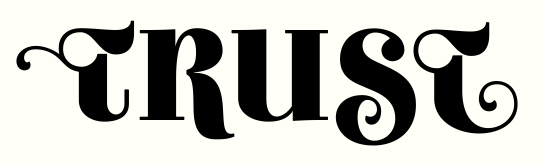
As a follow-up to Ambicase Modern (the development of which was greatly assisted by its Typophile critique thread), I have created Ambicase Fatface. It is considerably bolder version of that single-case font which strove to combine upper- and lowercase forms for each letter.

Character set and OpenType features are much the same as Ambicase Modern, though I have added discretionary ligatures for FT, CT, and ST.
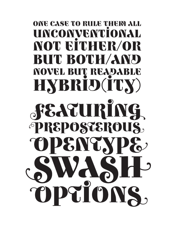
PDF specimen below. I welcome any constructive feedback you have!

AttachmentSize
AmbicaseFatface01.pdf268.04 KB
AmbicaseFatface02.pdf273.17 KB
AmbicaseFatface03.pdf279.24 KB
AmbicaseFatface04.pdf334.14 KB
ambicasefatfaceletters.pdf80.24 KB

Awesome! Almost as good as Ambicase Modern ;-d. The first and second o in 'options' seem have a dent in it where you made space for the swash. perhaps make the swash a little smaller? The ()/ look a little bit as though there from a different typeface to me. Why not give them a little contrast?

You're a much better typedesigner than I am, so take it with a grain of salt.

Cheers, Jasper

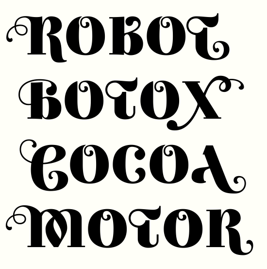
Thanks Jasper. You zoomed right in on an area that really is unresolved - the overlap on those swash /O/s - so thanks for prodding me to think more about it. Here are a few options for different approaches (each line has different treatment of the /O/ top; ROBOT is as before).


Of these I think COCOA works best.

Those monoline, thin parentheses etc. were a design decision with Ambicase Modern that I've kept here. Perhaps oddly, I kind of like the mismatch. Maybe it reminds me of old-school typesetting where those types of characters were furnished by generic sorts rather than designed and cast for each different font design. If there's a clamor for some with more weight and contrast, I suppose I'd consider furnishing some, at least as an alternate.

Delicious.

Agree, Cocoa is best for the Os. Is there some s.alt you can include to deal with the space between the O and the A? (Swash the top of A??)

I also like the thin parentheses, but can see some benefit in including alts.

Middle of M looks heavy (esp left diagonal) but it's such a weird shape I'm not sure how to balance that. Weird in a good way of course.

Like the new ligs, and wow, the new rupee sign!

I'd love to see how a monoline thin might look...

Wonderful as always! :-)
I like the MOTOR O, because it keeps the curves symmetrical and because it resembles both a baby’s forelock and a taiji symbol.
I also think the monoline sorts are an essential part of the charme of this face.
And yes, while they would require a rethinking of many solutions, a thin and an ultrablack weights would be definitely interesting to see.

Yes definitely COCOA.

Is there some s.alt you can include to deal with the space between the O and the A? (Swash the top of A??)

Well, that pic doesn't show kerning for the tryout characters - the class kerning for OA would be 5 units closer, which might help a little.

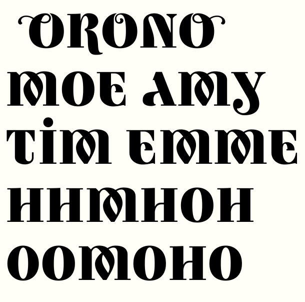
Here's how that O treatment looks in all the swash forms.
Also tried a little rebalancing of the M. It's a bear of a glyph to adjust!


Maybe a thin someday, and riccard0 you're not the first to suggest an even blacker weight, but I haven't yet convinced myself it could work.
Here's what my most playful swash diacritics look like in fatface:

That's Scedilla.medi and Aogonek.fina

This, and Ambicase Modern, are both really nice looking. I love the A and the Q and the alternate F. It's a nice touch that the P and the Þ descend even though they are more capital than lowercase.

The Y feels backwards. I'm not so sure I would be able to tell what letter the swash/alternate Q was in running text.

Try as I might, I can't see the IJ ligature as anything by Ÿ... maybe give the tail of the J a ball terminal like the normal J? Or connect the pips to the main verticals with a flourish, like the alternate I and J?

Again, really great!

Thanks for the compliments!
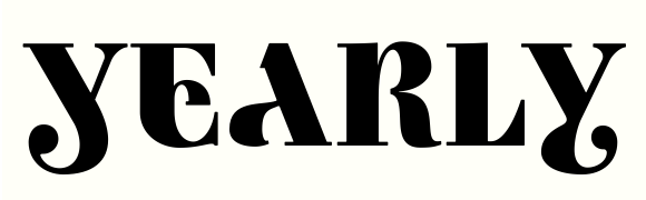
There are two /Y/s - which feels backwards? (The second is a contextual alternate that subs in after /A/ or /L/ to help letter fit.)


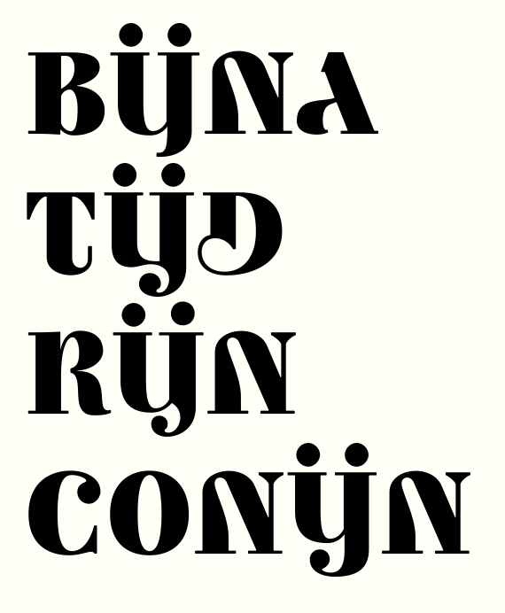
On the IJ ligature - it's not a general ligature but rather a Dutch-specific digraph, so I'm not too concerned about confusion with /Ÿ/ (context should make clear which is intended, I would think). But here are some alternate designs to consider which grant the J a ball terminal. (BIJNA is as before.)

I think there’s no escape for ij resembling ÿ. By the way, I like the RIJN version.

Unrelated: do you plan a display version of fat face?

I think I like RIJN too.

do you plan a display version of fat face?

You mean a poster cut? Not for sure. I thought the thick thicks would be contrast enough, but with those IJ samples above, perhaps I can see how thinner thins could be useful. I haven't set up multiple masters or anything, so it'd be a considerable amount of work.

it'd be a considerable amount of work.

But think of the possible fashion magazine market! ;-)

To be honest the tittles are starting to anoy me. I guess you already included them in Ambicase Modern, so there's no way back then. I second Riccardo about Rijn. The first Y feels backwards, but I don't think that's a problem. I prefer it over the second Y.
Cheers!

Minor corrections and changes to a large number of glyphs are reflected in the updated pdf specimen (ambicasefatface02.pdf) attached to the first post.

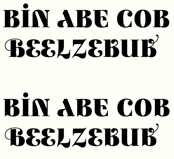
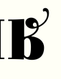
Considering a spurlike structure for the lower left of all the /B/s.

Mmm, looks very accomplished, I like the way it breaks up the rhythm. Just when I thought it couldn't get any more crazy weird :)

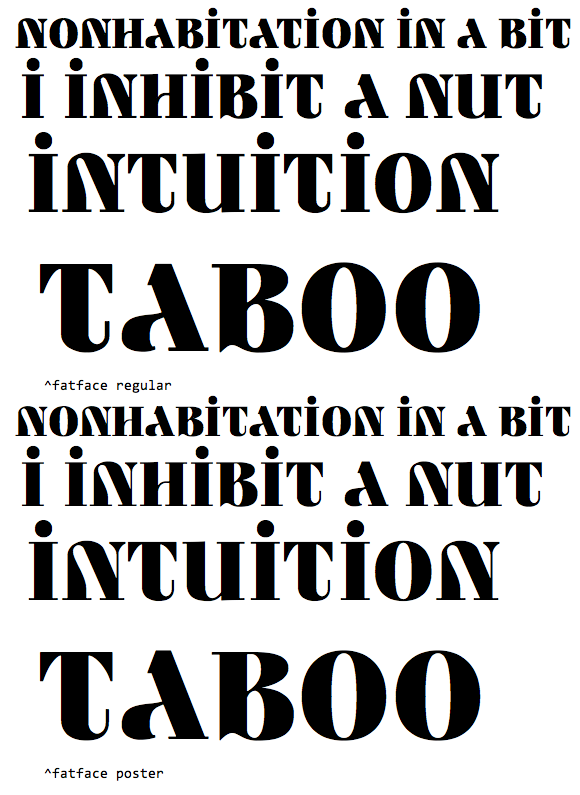
Ambicase Fatface Poster test:

The contrast in the poster seems a little timid ;-)

Amazing to see the difference in colour. The poster face is so much sharper.

Yeah, it's amazing how habituated one's eyes get -- after working for hours on the Poster cut, when I open the Regular I'm taken aback at how thick the thins are!

Fun. And I do agree. I can see this fatter and ultra thin too.

I wonder if the top shouldn't extend more and the bottom be less wide?

Both of the top bowls seem to flat on the underside to me. In fact, you could use them both on a K.

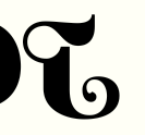
One of my recent changes was to cut that second thickening on T.fina's hook. That brings the center of gravity of the letter leftward. Does that fix the issue you are seeing? Or shall I still try bringing top out and/or bottom in?


The angle from which the upper /B/ bowls set out from the stem was largely determined by the roundness of the lower bowl which I wanted to retain for the suggestion of the lowercase form. But I'll toy with it and see if a more horizontal departure could work.
Thanks for the feedback!

Your answers are logical. My responses are just first impulses.

The T.fina feels more like a backwards J to me. And it could be fun/interesing to have a T.fina with the top extending. But then again you could create it and I could see I was wrong.

Wow. This is just beautiful. (I hadn't seen Ambicase Modern before, so my awe applies to that as well). The ffi ligature and section mark especially are elegant details. (And kudos for including the Rupee mark).

Those monoline, thin parentheses etc. were a design decision with Ambicase Modern that I've kept here. Perhaps oddly, I kind of like the mismatch. | I was going to suggest that you do include the alternates, but after seeing them in context in the pdf, I'm sold 100%.

I think there’s no escape for ij resembling ÿ. By the way, I like the RIJN version. | I agree that that version is the best of the four, but what could you do if you gave both i and j a ball, facing each other? Is there some way they could interact that felt like a ligature without joining them? Or what if you had /i/'s swash connect with the ball on /j/ rather than its stem? I'm just spitballing here...

Considering a spurlike structure for the lower left of all the /B/s. | It seems to me to be more gothic that way (how the serifs all point down, you know?) Then again, I guess it's only in that "Beelzebub" sample that that feeling becomes dominant. In the poster test it looks natural.

One of my recent changes was to cut that second thickening on T.fina's hook. That brings the center of gravity of the letter leftward. Does that fix the issue you are seeing? Or shall I still try bringing top out and/or bottom in? | That does help a lot, but it still seems like the top should come out a bit too. I have a small problem with the other /t/s, too. The curve on the bottom starts a bit too low and in small sizes makes the transition look a bit angular.

I have some beef with a few other glyphs as well...

The Copyright, Registered Trademark and @ don't quite work, IMO. It looks like the circles around the first two have an uneven stroke, and are not geometric. To my eye, an even, circular line would look better. For the /@/, I would rather see Ambicase's take on the more common, single-story a inside. I think the problem might be that without the apex, it doesn't read as unicase, so it's just a two story /a/ with a sloped straight edge on the side, which seems like a completely different font.

The initial swash versions of /M/ and /N/ have a strange negative space on the left side. I'm not sure what should be changed (if anything) because the swash makes sense, it's just its proximity to the straight edge of the, uh, what is that slanted line called in /M/ & /N/?

The alt /N/ (stylistic set 5, I guess) is a bit jarring for me (those points are so violent). It is nice to have a lowercase-style /N/, but I'm not sure it quite fits. I'd like to see more examples of it in context. I'd also like to see a swash coming from that up-turned serif on the inside, but going to the left (and possibly not with that scary xacto blade coming down)

Lastly, I have to say I'm not sold on the standard, upside-down-question-mark /Q/. I think it's the line inside that is the main problem. It's just weird that it's the a thin, vertical line that ends without a ball or curve or anything. I guess the closest thing to it would be the terminal of the /T/, but I don't think they really come across as fraternal. The more I look at it, I'm not sure if that's the only problem with it, but it's probably the same in the Modern version, so...

That's all I saw on my first glance through. Let me reiterate that this is an utterly fantastic typeface. I hope my comments help.

Great, great feedback! Thanks for taking the time. I'll go to work considering the suggestions.

On N: I'd also like to see a swash coming from that up-turned serif on the inside, but going to the left

Do you mean a different initial swash form? Would the swash cross over the middle of the left stem you mean?

I think your fat face and poster versions really suit your design idea with this. As it's very showy to start with, it's more "itself" being very bold and high contrast.

Would the swash cross over the middle of the left stem you mean? | Yep. It just seems like that serif wants to jump on over there :P

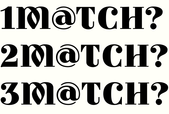
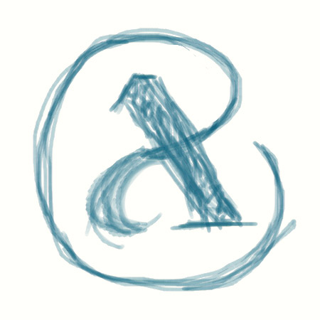
Reconsideration of the at-sign.


Conceptually and visually a better fit, I think.

Ah! That looks much nicer. And the vortex design is in keeping with the face's eccentricity.

To me, the new @ seems out of character...

Do these tweaks get it more in character? (1 is as before)

I know @ is inherently lowercase, but these new designs have nothing ambicase about them.
Also, the vortex design, while beautiful (#1 still the best, by the way), draw too much attention unto itself, making a bad service to the other letters.

Hmm. I was trying to get at a little "ambi-ness" between a one- and two-story /a/ form. My tweaked 2 & 3 bring out the two-story form more, but maybe they get too "wound up"?

Some fonts put the /a/ of the @ on the baseline and dip into the descender area with the ring. Seems like it's always kind of an attention whore. Can we see some tests at smaller sizes?

1, 2, and 3 from above, smaller.

What about something along these lines (sorry for the crude rendering)?

That's the beginnings of a cool logo for something! but way too geometric for this, methinks.
I'm thinking an @ that distinguishes itself from letters is not a bad thing at all.

FWIW I like the vortex design.

I think #1 is still the best one, though it's a closer race at the smaller size.

Although I agree with eliason that riccardo's @ doesn't really work, I think it would be better to use the Capital A as already designed and make an @ out of that. I think that's the only way to keep that 'ambicase' feeling. There are still many more options for the @ (when using the capital A) than the one displayed at january 27th. Perhaps you should try to make the tail (is it called a tail?) start somewhere else. Hope this helps.

That's a very interesting idea. What about taking the normal A and starting the ring/tail from the junction of the two legs then going round anticlockwise?

@Bendy: So the small, left leg would be almost like a swash then? That could be interesting...

I've sketched along those lines but I'm not finding anything visually persuasive enough for me to think it could displace the "vortex" version, with which I'm pretty satisfied.

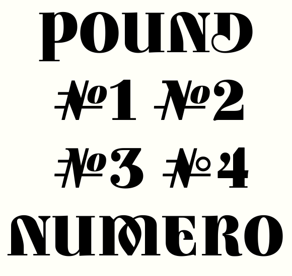
On another topic, here's my first go at an octothorp/numero meld.

my first go at an octothorp/numero meld

Wonderful, I see it shining in chrome on a flying car right out of the cover of Everyday Science and Mechanics! :-)

Tristan, well, I was thinking of the ring coming out of the junction, crossing the spine then circling...but in fact I think the current vortex version is a pretty cool solution already.

Craig, I like the numero idea...does the 'o' need to be further away from the N element?

does the 'o' need to be further away from the N element?

It does look a tiny bit too tight.

I was thinking of the ring coming out of the junction, crossing the spine then circling...

?

It's worth exploring, I think.

[EDIT]

I've sketched along those lines but I'm not finding anything visually persuasive enough for me to think it could displace the "vortex" version, with which I'm pretty satisfied

Oops. Didn't see this before I posted. I think the vortex is great too.

About the octothorp/numero meld, what about a non slanted no-contrast º? (to keep the "generic sorts" feeling of brackets et al.)

I tried that among my sketches but I think it made it harder to read -- it made the heavy diagonal a weird outlier. It also looked a bit like a tic-tac-toe board! But I might return to it and reconsider.

I'll try moving the O out a bit more, though I'm struggling with keeping the weight on the strokes but not letting the glyph get too wide. (I think this would be a much easier glyph to do in the non-fatface versions of Ambicase.)

Some # variants.


Leaning towards #3?

№ 4 or #1

I like 4 too. If you go with 3, you might need to bump up the thins of the 'o'.

Your numeral 4 is very clever :)

I agree. 4 or 1.

Thanks for the feedback guys!

Found this thread while looking for someone responsible to thank for my logo. Thank you, eliason and teeline fonts.

Fatface is coming along. Stuck in the slow work of coverting glyphs to the Poster style one by one.

BTW: The vortex lower case @ seems the most appropriate for this font. It's not generic and it still complements font face even though not perfectly it's much better than any other version. The last (sketched) looks like an /x/ unfortunately and shouldn't be considered at all.

Just keep the vortex version. Doesn't look distracting and it easily reads as an @ sign which is important. And you have to be aware that this particular glyph will be rarely used with this typeface. I tend to think that way.

Looking good!

Thanks for the encouragement Bill.
New pdf attached to the first post.
Biggest question I have: should I drop the medial swash version of /D/ (in the bottom sample below)? That little curl at the top isn't really working for me.

Yes, drop it. It gets too cluttered up there.

Boy, that 'M' is delicious.

At first sight I too would have said to ditch it. But the same would be true of swashed 6 and 9. And I like the “blackletterness” of some swash forms (most notably the wonderful T).
To maintain it, there could be different options:
- Invert the curl and make it go out of the bowl.
- Substitute it with a ball (like in ß).
- Just don’t close completely the counter (which solution isn’t properly a swash, but it offers a stylistic continuity with other swashed letters).

A couple of open counter variants (bottom two):


Looks a little "stencilly" to me.

I think both work. But what about increasing the overshot of the last one, so the curve could reach as left as in the third one?

Looks a little "stencilly" to me.
Just what was still missing ;-)

I think #4 is too undefined at the point. Stencilly, indeed. #3 is better, but the gap is too small. None of the variants are as good as the base glyph, I think.

Yeah, I think I'll stick with the base glyph.
From Tristan's suggestions way back when I did cut off the X-Acto blade sharp descenders from the stylistic-alternate /N/s. I also tried the different swash treatment he suggested


but decided that I didn't particularly like the resulting closed counter.

So you don’t like stencil, nor art nuveau ;-)

I didn't particularly like the resulting closed counter.


;-)

Riccardo: you wink, but there might be something brilliant in that idea! Or not: what do you think. Top two are existing stylistic alternates for /N/. Bottom is a candidate to replace the middle line.


And here's the new one amidst regular (nonswash) letters:

I think it works. The trickiest part is, naturally, the curve. In my mock-up, the left spur gave the eye a “landing point” for the invisible line departing from the vertex of the hook. This is somewhat lost in a more “normally” shaped N.

Still on the N.
Top two are existing alternates.
Third is tweaked version of the new one just shown.
Fourth is a different, new structure.


#3 seems like the most "ambicase" structure. (#1 favors the cap reading and #2 the lowercase.) My hesitation is wondering whether it fits visually with the other letters.
#4 looks very squared and geometrical to me.

#4's lowercaseness is too subtle, and it looks like it has a reversed contrast, like an א.

I think the new #3 works with the rest (maybe a touch wide?)

like an א.

That's it! I knew it reminded me of something but I couldn't figure out what.

An ambicase letter spotted in the wild (in 1883!): look at the /A/s:

Two .pdf specimens appended to the top post.
AmbicaseFatface04.pdf is the full specimen; Ambicasefatfaceletters is a four-page showing of the alphabetics.
Lots of changes but mostly minor since before.
Settled on the /N/s including the new one; raised the swash /L/ and /2/; made C.fina no longer descend; altered the weight on the loops of the swashes; lots of other things.

I think I'm nearly done! All feedback appreciated.

I like the new /n/! And it's definitely better without the stabby part.

I don't remember if I mentioned this, but over the course of looking over the font, I began more and more to see the decisions and reasons behind its eccentricities—the method to its madness, I guess. Anyway, that just made me respect it even more. It's rare to find a display face with that kind of depth of character. It's a damn fine font you've made, and I can't wait to see it released.

Thanks a bunch Tristan, that's very kind.


Tweaks (bottom version of each line is more recent). Added more space in the left counter of /W/, the middle of /R/, and the bottom counter of /K/. Adjusted /K/'s teardrop terminal, added weight to bottom right terminal of /E/, and made minor adjustments to top of /T/. Brought in /J/'s descender rightward for better fit.

Are /W/ and /R/ okay being that wide?

R and W look fine to me. I think the K might still benefit from some extra whitespace in the bottom counter. Perhaps you could try to higher the point where it meets the stem (there's a name for that...) a little bit. The top 'counter' has much more whitespace than the bottom counter now.

Maybe the serif on the foot of K is a bit too short. I get the idea, but a few units would probably make it look much more like it belongs there.

The R seems to be a bit thick at the point where the two curves meet.

Lookin' good as always!

Thanks Jasper.
The K is tricky - I want the join to be low-ish, since that is part of the lowercase flavor. But I agree that if the counters are too out of balance it won't work. Another difficulty is that I can move the leg out to open up the lower counter, but then for proper fit with following letters, the arm should come out too, which of course opens up the upper counter I was trying to balance... Anyway, maybe this latest compromise works okay.
Thanks for the observation on the R - I agree and have changed it.
Some tweaks to the humps of M, and to the swash forms of Q. Getting an agreeable weight is really hard on that Q, since it has three thick vertical strokes in the lower half, and only one (+ a teardrop) in its upper half.

Beautiful work, Craig. Really fantastic!

Thanks Ben! Release is imminent!!

Ambicase Fatface has been released.

Captured from web.archive.org on 22 Jan 2015. view this capture