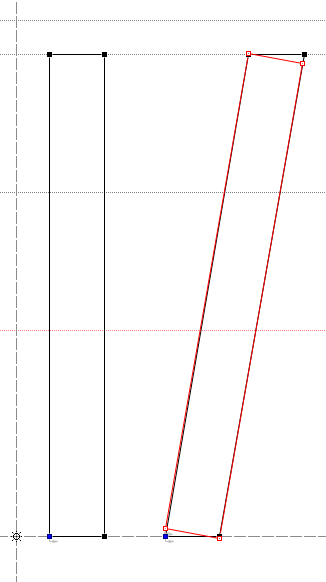
I'm not a type designer, just a tech writer. but I want to rant to the type designers. I'm against narrow constrained italics in text fonts. I'm in favor of full-size and full weight italics. Our language use has changed and the typefaces are not keeping up. Many of my favorite (new) text fonts still have small narrow italics. But two things are changing.
Change 1. Italics are now used for emphasis, instead of the (old) underline or bold type, more than ever. You can't emphasize something with small narrow italics! For tech writing, the Microsoft Manual of Style specifies italics for emphasis. Granted, this is because they use bold type as a replacement for quotes. But italics is still specified for emphasis. And even in novels or magazine articles I am seeing italics as the standard for emphasis all the time.
Change 2. The world is getting smaller and this is changing how we are using foreign language words. In the past, foreign language words were used (sarcasm alert) to show that the writer's parents hadn't wasted their money on the MFA program, or to give a novel that certain "je ne sais quoi." In other word, the foreign language words were there, but you didn't really have to pay any attention to them. No more. Now when writers use foreign language words, it is because the words are important. These may be words that express something that English doesn't quite have. And you should pay attention. The words are not trivial; you will see them again. Jihad. Sendero Luminoso.
So I vote for absolutely full-size, full weight italics (that take up the same amount of space as the Roman) in all text fonts.