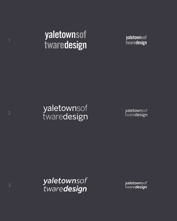
I just can't let go that quirky idea of mashing three words together and then splitting them into two lines.

Just keep in mind that this is not meant to be instantly legible, it's an identity piece that is supposed to be memorable. It is to be primarily used for the stationery and business cards, so consider it in application. Say, letter-pressed:
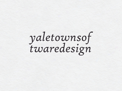
Or a bit more trivial version with lighter part being blind-pressed:
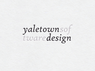
What do you say? How is it as an identity?