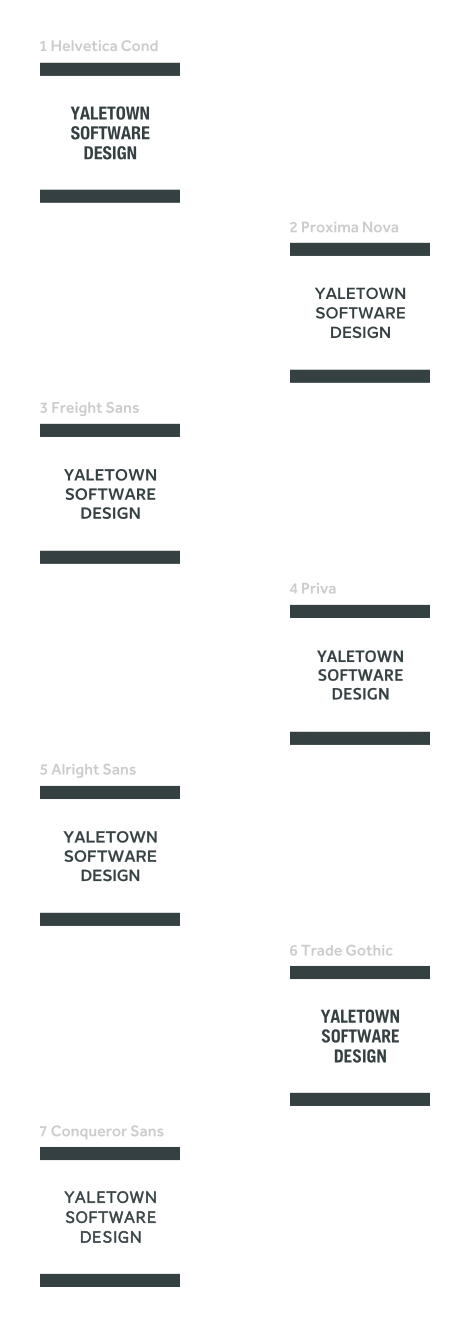
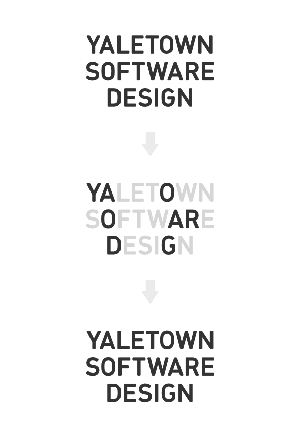
Exploring some options to refresh a software company logo.
The company has a very strong focus on thinking through and developing polished user experiences. Not just the pretty interfaces, but the interaction flows. Trying to build simple, intuitive and smart software basically.
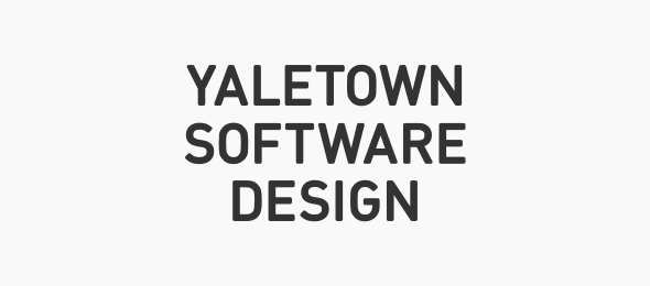
Existing logo is a temporary one, simple FF Din:
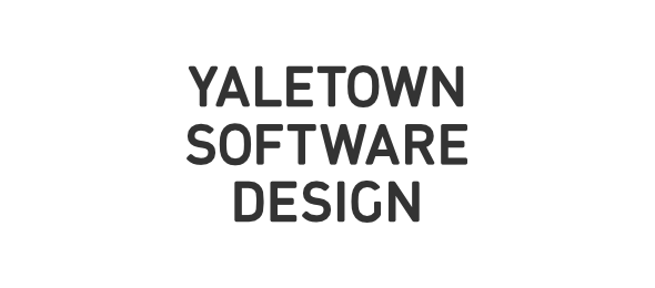
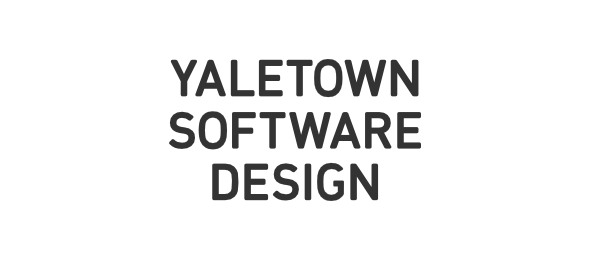
The revised version:
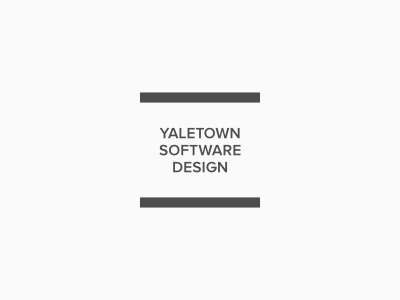
I have mainly focused on selecting the right typeface for it, and trying to communicate the simplicity, elegance and clarity through it. This is Proxima Nova.
So the question is if the change is working. Would love to hear your thoughts. Thanks.