
The font size of the initial post of a thread is larger since a few hours. Please turn that off. It’s terrible, because it lowers the readability.
Instead of those things I wish, you would change the color of links. They are almost not recognizable.
The font size of the initial post of a thread is larger since a few hours. Please turn that off. It’s terrible, because it lowers the readability.
Instead of those things I wish, you would change the color of links. They are almost not recognizable.

Font sizes have been rising on the web, especially on sites like this one where there's a fair amount of on-screen reading. What do others think?

I'd also vote against the embiggening.

Me too. I thought it was a bug — there's something else wrong with the headers for me:
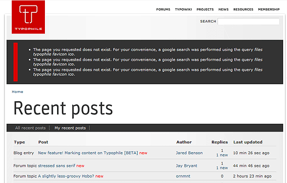

I don't expressly dislike the bigger type in the initial post visually, but logically I think it's problematic. This sort of thing would make sense in say a blog, where the original post is where the core content lies, and everything that follows are «just» comments.
By contrast, in the Typophile forums the bulk of the [valuable] content tends to lie in the complete discussion that unfolds, not just in the initial post (which might just be a question, etc.). So in our case I'd argue that all posts in a given thread should bear the same (visual) weight.
This might be a nice idea for the Blogs though? Maybe. It might make them feel more «blog-like», and would also add an additional visual difference between them and the Forums – which may or may not be desired.
I think, it is not only logically problematic. (Who says, that the initial post is more important? And who says, that the theme does not change during the discussion?) The site is displayed in Georgia here. And at least Georgia is not so well legible in that size. In other words, I simply can better read Georgia in the smaller size of the posts, that follow the initial post.

I wholeheartely agree with Nina on this one.
Also, in the forums maybe you could try a slightly bigger size for all texts (but as Arno points out, smaller than the one now used for initial posts).
I disagree, that it makes sense in a blog, because in a blog it likewise lowers the legibility. But it would make sense to mark it in a different way (in a blog only), with a different background color for example. But not with a body text size, that is big as a headline.
FWIW I do not agree on your «lowers the legibility» theory.
(Repeating it 3 times does not help.)
@ nina
It’s not a theory, but a personal experience. It’s a question of the felt contrast to the background, the thickness of the strokes grows overproportional with the font size from a certain point, the contrast between the vertical and horizontal strokes grows and the characters drag attention to themselves.

It's harder to read, it's harder to read, it's harder to read ;)
Plus it does nothing for me.
Plus did you see the size of some of the initial posts already? For example, Adam's on the upper case germandbls.
I've mentioned the link colour before and I wasn't the only one. Would it be awful to have links in #cc0000? I gather the colour red is lucky in some cultures...
Love the 'mark' shape.
Is it just me or has the leading increased too a fraction? Were you hoping no-one would notice or has that been like it for a while? Or has it not actually changed and I'm the freak?
Is Georgia really the best? What about some sort of poll? Even if it never gets implemented, the result would be interesting.
Apropos leading, the leading is uneven in Firefox, because of its leading bug.
Links in cc0000, which I'm usually a fan of, really are hard to enjoy in large quantity. I've tweaked the current link value to be more visible.
The masses have been heard. Changed the initial post font size back down to match. (Just trying to shake things up!)
@ Jared
What was the color, before you have changed it?

The font size in the whole thread is bigger now, yes? I find it uncomfortable, but don’t we all when familiar things are changed?
I have created my own CSS now.

The larger font size feels good to me. A lot depends on your resolution, so keep that in mind if you have an older display. What may be good for you, may not be good for the modern majority.
Fortunately, text zoom is not a chore in most browsers.
@ Stephen
Do you have seen the larger font-size? I was talking about the initial post of a thread. Jared already has rechanged it. (But I was still not contented with the new color of the links. So I decided to begin with own CSS for Typophile. Verdana is more legible than Georgia. But maybe I am going to use Bitstream Charter.)
My screen is 1680 times 1050 pixels.
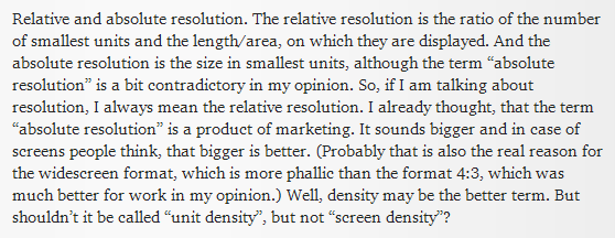
And what size, physically? I guess I should have said screen density, not resolution.
Unfortunately Bitstream Charter is not available as webfont. I think, it would be a good alternative to Georgia. The hinting is excellent in my opinion.
21 inches, I believe. It's a two year old iMac.
@ Frode
(√(1680p² + 1050p²)) ÷ 21 = 94,339811320566038113206603776226
The real diagonal is 21,1 inch. So it is 93,892703210042028453902307075865.
However, you have a screen resolution of 94 ppi.
Here someone has a list of resolutions for the different sizes and formats: http://www.robert-gcm.de/deutsch/display-aufloesungen.shtm. Although the relative resolution is really important, there don’t seem to be many people interested in that information.
But isn’t it odd, that it is relatively hard to find information about the relative screen resolutions?

Unfortunately Bitstream Charter is not available as webfont. I think, it would be a good alternative to Georgia. The hinting is excellent in my opinion.
What keeps you from using it? It's a free font.
This whole thread reinforces the view that it's a bad idea to specify font sizes in absolute units (Pixels) on the web in the first place. Keep the default size at 1em and specify the other sizes relatively, that way everybody will see the font size they have set in their browsers.
@ Jens
The very old Type 1 font is free, but not the excellent hinted TrueType version (with extended character set). I am already using it with my user style sheet, but I thought, that it could be embedded here, if it would be available as web font.
Did you see, that post 441885 is not set in Georgia? That post contains an image.
Charis SIL?
@ Riccardo
The TT versions of Charter are much better hinted than Charis.
Captured from web.archive.org on 17 Mar 2015. view this capture