
I know the text font is Optimo's Hermes, but does anyone recognize the display face on the cover?
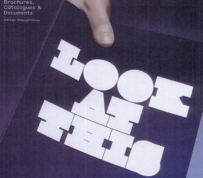
I know the text font is Optimo's Hermes, but does anyone recognize the display face on the cover?

Seems to be common
http://new.myfonts.com/users/fhwv1py2xy/albums/353413/
A first glance, i looked at Rita (Sudtipos), but it's not.
We had this question solved here before, surely.
PS How is the (british?) design firm called, worked with that "filled style" some years ago.



I believe this is the work of Non-Format. http://www.non-format.com
Their typefaces aren't commercially available, except for one they released last year.
You might be hard pressed to find anything similar that is as precisely drawn or well balanced, as their work is quite exceptional. Of the abundance of similarly styled typefaces out on the market, most are of questionable quality.
It looks to me like both Jim and Mike are correct--the outlines are definitely Frank, and it looks like Non-Format added some lines to suggest 'counters' in places.
Edit: ID complete, as far as I'm concerned. Thanks, folks.
Edit again: meant to say 'Pump', not 'Frank'. The outlines are definitely Pump.
Turns out this has come up before--though I thought I looked around carefully enough first before posting:
http://typophile.com/node/29460
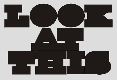
Sorry. FWIW, people there came up with the same kinds of suggestions, and the last in the thread was Burvo's Pump. And it looks to me like Burvo designers started with egyptienne outlines to get their final product.
... it looks like this
Captured from web.archive.org on 14 Oct 2013. view this capture