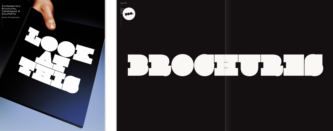
it's custom drawn

You might be able to achieve something similar with Clarendon and a broad stroke added, but I imagine this has undergone quite a bit of extra work.
Tim
looking for something like this ?
http://www.dafont.com/cowboys.font?nb_ppp=50&classt=alpha&text=HYDRO
but not a crappy free font
cheers!

I think this is our good friend Giza 95 again, with a stroke added.
- Lex

This is indeed a heavily stroked Egyptienne. The only way to know for sure what it is would be to simulate it. Anybody owns a license for Giza?
On the other hand, if you want this effect all you need is a nice'n'chunky slab and start stroking the thing. ;^)

Voila, I have stroked the chunky slab.
Below, Giza 77 with a fat white stroke. It would take a bit of tweaking to get it to look exactly the way it does above, but I'd say this is definitely the typeface.
Skylar
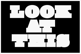
Nice one! i'll give it a go.
Thank you for your time!
Leigh
just though i'd let you know i came across this font today which is very close
Captured from web.archive.org on 15 Nov 2014. view this capture