Good evening/morning,
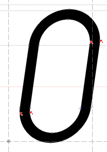
I'm drawing an italic to accompany an old-style face (drafts here and here), and slanting + cursify-ing the Roman just doesn't do. My o looks like an easter egg.
Apart from this wonderful comment, I couldn't find any specific tips on how to do optical correction; neither here nor via Google (Books). So here's the newbie asking for your help:
1. How do you "push out" and "pull in" curves, e.g. in o, c, and e, without ruining the slant, to make round curves round again? Do you, to be precise, just shift control points back and forth til' you're happy? Is there a mathematical function of angle, thickness and contrast factor? — Or could I establish such a thing and become rich?
2. What are good guidelines for slant variation? My f seems like it's tipping over. Again, I can't find numbers, and I don't completely trust my eyes (yet). Then again, I personally dislike the un-slanted capitals in Arrighi- and Granjon-inspired fonts.
Unfortunately – I'm an engineering student, not a designer – I don't own any literature; and the few fonts I've looked at failed at teaching me an efficient way of consistent correction.*
(Recommendations are more than welcome though, there are libraries after all.)
---
One other, unrelated question to the book designers here:
3. Bringhurst §5.3.2 recommends, among other things, upright parentheses in italic text. While I don't disagree with the look of it, I was surprised at the very least. Is this normal practice?
Thanks!
Sebastian
* I'd open the Roman, slant it, paste it onto the italics and look at the differences.