Good evening Typophiles,
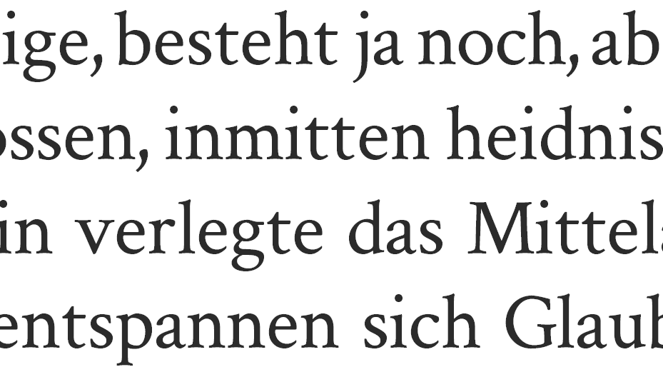
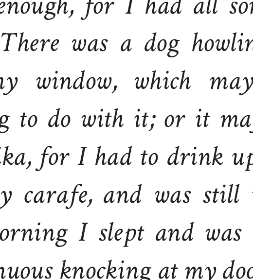
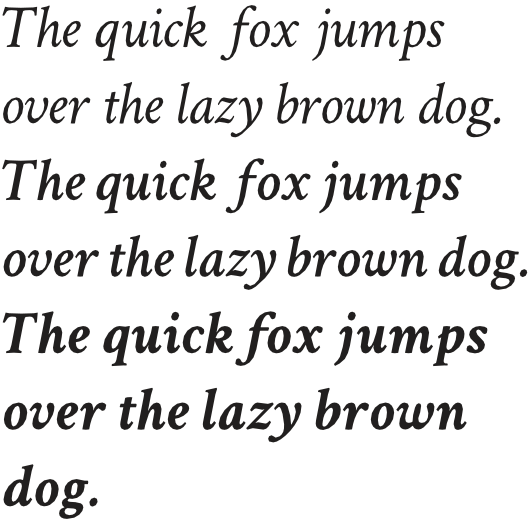
I have attached my first attempt at a text face. I'm particularly concerned about inconsistencies in stroke contrast and overshoots. Screen legibility is definitely an issue as well.
I am aiming for a very traditional, garalde-ish book font; something in between Hoefler, Arno, Gentium, Sabon etc. … but it's drawn from scratch. (Why the effort? I'm hoping to one day arrive at a free webfont and maybe even at a math family for font-deprived TeX users.)
I'd be extremely thankful for your input!
Sebastian
P.S.: I am afraid only few dare to publicly offer their opinions here. I appreciate your thoughts even if you've never designed a font yourself!
| Attachment | Size |
|---|---|
| v0.01.pdf | 16.45 KB |
| v0.02.pdf | 140.83 KB |